Should notifications on Windows 11 be moved to the top right corner?
- Tram Ho
One of the requests on the Feedback Hub wants Microsoft to provide additional options for notifications on Windows 11, including moving notifications to the top right corner.

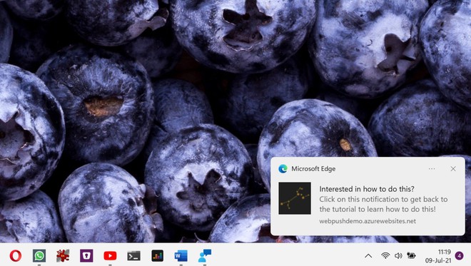
Windows 11 has introduced many changes, including a new Start menu and centered icons on the taskbar, but what has not changed is that the notification system that comes with the operating system is still located in the lower right corner of the screen. , like Windows 10.
But as it turns out, not everyone likes this approach, and overall Windows 11 is a modern operating system, so updating the way notifications are displayed is a good thing to do.
Notice in the top right corner
In theory, the message displayed in the lower right corner makes sense not only because it is a familiar approach for Windows 10 users, so it will make it easier to use Windows 11. Not to mention, This is also the right approach for touch-enabled devices.
Using Windows with touch and interacting with notifications would be much easier if they were displayed in the lower right corner, especially when holding the screen in your hand.
A popular suggestion in the Feedback Hub calls for Microsoft to move them to the top right corner, just as the company originally intended to display notifications in Windows 8.

Although Microsoft can completely do this to please some users and make Windows 11 different from Windows 10.
But there is a big problem with this approach. Compared to macOS where the window controls are in the top left corner, on Windows 11 they are all placed in the top right corner so showing notifications in the same place makes everything unwieldy. much more usable.
Not to mention the possibility of mistakenly closing application windows is quite high when you just want to click on a notification. Especially with touch input will make the wrong press much higher.
Sure, it’s a good thing that Microsoft gives users more customization options, but should notifications really be moved to the top right corner? That is still an unanswered question.
Refer to Softpedia
Source : Genk
