HTML 5.1 What’s New?
A quick look at HTML 5.1
The emergence of HTML 5 two years ago was a major event of the web programming community. Not only because this is an impressive new set of features, but also because it is the first major update to HTML since HTML 4.01 was released in 1999. You probably still see many pages of HTML 5 effectiveness. "Modern" until today.
Although HTML 5.1 is still in the development process, W3C has embarked on draft version 5.2 5.2, this version is expected to be released at the end of 2017. For now, the following is a summary of some interesting new features. and the innovations introduced in 5.1. Browser support is still missing for these features, but we will introduce you to some browsers to test the examples below.
Context Menus uses menu elements and menuitems
The draft of 5.1 introduces two different types of menu elements: context and toolbar . The head used to expand the content (context) is already on the menu, usually displayed by right clicking on the page, and the latter to determine the smooth menu elements. During development, the toolbar is dropped, but the context menu remains the same.
You can use the <menu> tag to specify a menu consisting of a few <menuitem> elements and then bind it to any element with the contextmenu attribute.
Each <menuitem> can carry one of the following three types:
-
checkbox– allows you to select or deselect an option; -
command– allows you to execute operations when clicking; -
radio– allows you to select an option from a group.
The following is a simple usage example that works in FireFox 49, but seems to not work in Chrome 54.
See the HTML Pen 5.1 menu example by SitePoint ( @SitePoint ) on CodePen .
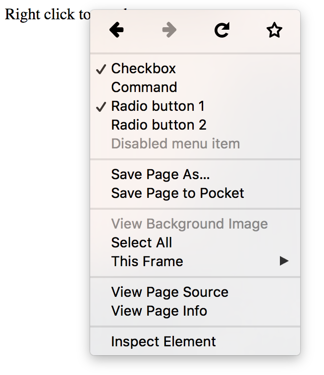
In a supported browser, that context menu should look like this:
Detail and Summary Elements
The <details> and <summary> elements allow the ability to show and hide an additional information block by clicking on an element. This result has been done with JavaScript, and can now be achieved by using the <details> element with the <summary> element inside. Clicking on the summary will toggle currently hide other content from the <details> element.
The following example has been tested on Firefox and Chrome.
See the HTML Pen 5.1 details and summary demo by SitePoint ( @SitePoint ) on CodePen .
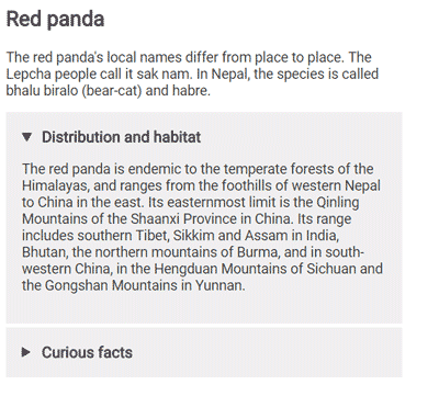
The demo on the supported browser will look like this:
More input types – month , week and datetime-local
The input type set has been expanded with three more input types: month , week and datetime-local .
The first two input types above allow you to choose a week or a month. In Chrome, both types are rendered as a calendar drop-down, allowing you to select a certain month of the year or week of the month. When you access the value from JavaScript you will receive a string that looks pretty much like the following: "2016-W43" for input week and "2016-10" for input month .
At first, the draft of 5. introduced two ways to enter the date-time – datetime and datetime-local . The difference is that datetime-local always specifies the time in the user's time zone, while input datatime will allow you to select a different time zone. During development, datetime type is dropped and now only datetime-local left. The atetime-local input consists of two parts – the date part, which can be selected similarly to the input week or month , and the time part, which can be entered independently.
You can find some more examples of all of these input types in CodePen below. It works in Chrome but still not works in Firefox:
See the Pen HTML 5.1 week, month and datetime input by SitePoint ( @SitePoint ) on CodePen .
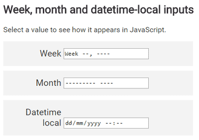
The demo on the supported browser will look like this:

Responsive Images
HTML 5.1 includes many features to help responsive images without using CSS. Each of these features has its own use case.
Image parameters of srcset
The Image srcset property allows you to list many alternative image sources, varying by pixel density. This allows the browser to select quality images that are appropriate to the user's device (determined by the device's pixel density, zoom level, or network speed). For example, you will want to provide lower resolution images to users with smaller phones and slower mobile networks.
The srcset attribute accepts comma-separated image URL lists with its own x modifier (which helps describe the pixel ratio, the amount of physical pixels in a CSS pixel) best suited for each image. Simple example is as follows:
1 2 3 4 5 | <img src = "images / low-res.jpg" srcset = " images / low-res.jpg 1x, images / high-res.jpg 2x, images / ultra-high-res.jpg 3x " > |
In this case, if the user's pixel ratio is equal to 1, then the low-res image will be displayed, equal to 2, high-res appears, and 3 or more, ultra-high-res will be selected. to choose.
Instead, you can choose to display images with different sizes instead of with a different pixel ratio. You can do this with modifier w :
1 | <span class="token tag"><span class="token punctuation"><</span> img <span class="token attr-name">src</span> <span class="token attr-value"><span class="token punctuation">=</span> <span class="token punctuation">"</span> images/low-res.jpg <span class="token punctuation">"</span></span> <span class="token attr-name">srcset</span> <span class="token attr-value"><span class="token punctuation">=</span> <span class="token punctuation">"</span> images/low-res.jpg 600w, images/high-res.jpg 1000w, images/ultra-high-res.jpg 1400w <span class="token punctuation">"</span></span> <span class="token punctuation">></span></span> |
In this case, low-res images defined with 600 pixels wide, high-res are 1000px and ultra-high-res is 1400px.
Image properties sizes
You will want to display a different image, based on the screen size of the device. For example, you can display a series of images divided into two columns for wide screens or just one column with narrow screens. You can do that with properties sizes . The property allows you to turn the width of the screen into the distribution space for the image and then select the appropriate image using the srcset attribute. Here is an example:
1 | <span class="token tag"><span class="token punctuation"><</span> img <span class="token attr-name">src</span> <span class="token attr-value"><span class="token punctuation">=</span> <span class="token punctuation">"</span> images/low-res.jpg <span class="token punctuation">"</span></span> <span class="token attr-name">sizes</span> <span class="token attr-value"><span class="token punctuation">=</span> <span class="token punctuation">"</span> (max-width: 40em) 100vw, 50vw <span class="token punctuation">"</span></span> <span class="token attr-name">srcset</span> <span class="token attr-value"><span class="token punctuation">=</span> <span class="token punctuation">"</span> images/low-res.jpg 600w, images/high-res.jpg 1000w, images/ultra-high-res.jpg 1400w <span class="token punctuation">"</span></span> <span class="token punctuation">></span></span> |
The sizes property defines the width of the image as 50% of the viewport width when the viewport width is greater than 40em, or 100% of the width when lower or equal to 40em.
picture element
Changing the image size for each screen is not enough, and you need the ability to display completely different images, you can use the picture element. It allows you to identify images with multiple sources of different screen sizes by wrapping your <img> with the <picture> element and specifying multiple <source> elements. The <source> element then acts as the source of URLs to load images.
1 | <span class="token tag"><span class="token punctuation"><</span> picture <span class="token punctuation">></span></span> <span class="token tag"><span class="token punctuation"><</span> source <span class="token attr-name">media</span> <span class="token attr-value"><span class="token punctuation">=</span> <span class="token punctuation">"</span> (max-width: 20em) <span class="token punctuation">"</span></span> <span class="token attr-name">srcset</span> <span class="token attr-value"><span class="token punctuation">=</span> <span class="token punctuation">"</span> images/small/low-res.jpg 1x, images/small/high-res.jpg 2x, images/small/ultra-high-res.jpg 3x <span class="token punctuation">"</span></span> <span class="token punctuation">></span></span> <span class="token tag"><span class="token punctuation"><</span> source <span class="token attr-name">media</span> <span class="token attr-value"><span class="token punctuation">=</span> <span class="token punctuation">"</span> (max-width: 40em) <span class="token punctuation">"</span></span> <span class="token attr-name">srcset</span> <span class="token attr-value"><span class="token punctuation">=</span> <span class="token punctuation">"</span> images/large/low-res.jpg 1x, images/large/high-res.jpg 2x, images/large/ultra-high-res.jpg 3x <span class="token punctuation">"</span></span> <span class="token punctuation">></span></span> <span class="token tag"><span class="token punctuation"><</span> img <span class="token attr-name">src</span> <span class="token attr-value"><span class="token punctuation">=</span> <span class="token punctuation">"</span> images/large/low-res.jpg <span class="token punctuation">"</span></span> <span class="token punctuation">></span></span> <span class="token tag"><span class="token punctuation"></</span> picture <span class="token punctuation">></span></span> |
Verify Forms with form.reportValidity()
HTML5 defines the form.checkValidity() method that allows you to check the form's input with a validator that defines and returns a boolean result. reportValidity() is similar, it allows you to confirm the form and return the results, but adds error reports to users right in the browser. The following is CodePen example to show results (tested in Firefox and Chrome):
See the HTML Pen 5.1 report validity demo by SitePoint ( @SitePoint ) on CodePen .
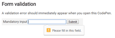
Input "First name" is marked with an error because this input is required but is empty. When working as expected, you will have:
Allowfullscreen for Frames
The new allowfullscreen boolean attribute for frames allows you to control whether content can be displayed on full screen with the requestFullscreen() method.
Spellchecking with element.forceSpellCheck()
The new element element.forceSpellCheck() allows you to enable spell checking on the text element. This is also the first feature in this list that is still not available on any browser. It is possible, this feature can be used to perform spelling error checking on elements that have not been edited directly by users.
Read more
This is not a complete list of changes in HTML 5.1. There are many other small changes and unused features removed. If you want to preview the entire list of changes, read the Changes section of the parameter. For now, let's hope that the browser provider will quickly support the latest changes!
Which side of HTML 5.1 are you most interested in ?! Please comment below!