Xiaomi is about to have a new logo, this time in white and black version
- Tram Ho
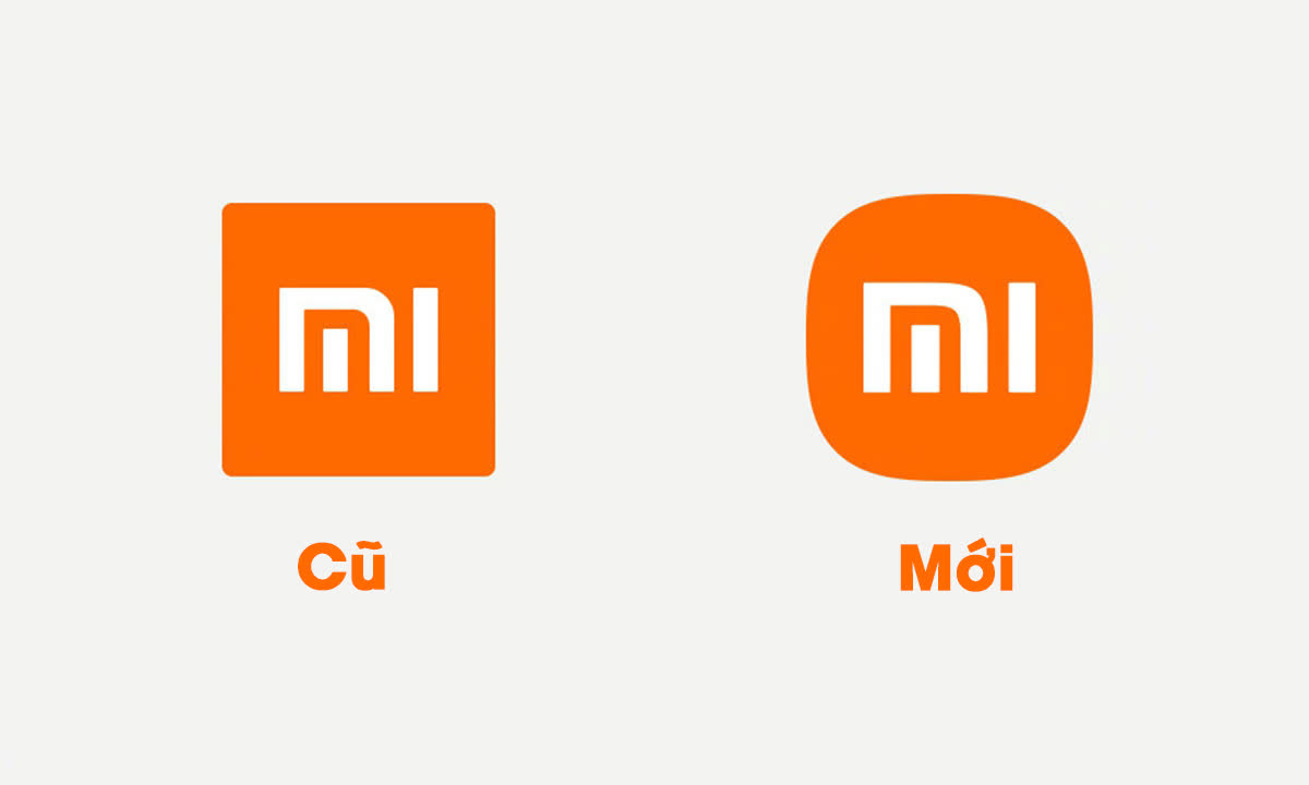
Remember on the 11th birthday in March last year, Xiaomi decided to “play big” when spending up to 2 million yuan (about 7 billion dong) to change the shape of the company’s logo. As explained by Xiaomi, the redesign is intended to show the world that a new era is beginning in the development of this cult brand.
In charge of this logo change is the famous Japanese graphic designer Kenya Hara, who is said to have spent 4 years researching how to infuse the spirit of Xiaomi inside the new logo.

Change the value of 7 billion VND of the Xiaomi logo
However, when Xiaomi announced the new brand identity, many people were disappointed and somewhat “deprecated” when its new logo … was not much different from the old logo. The only change is that instead of the four square corners surrounding the stylized MI, these corners have been rounded, softer, and the font and color remain almost the same.
According to designer Kenya Hara and Mr. Lei Jun – CEO of Xiaomi, the new shape best reflects the company’s transition and entering the era of “intelligent connectivity”.
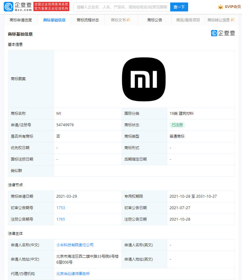
Notably, also during this event, Xiaomi announced that in addition to the traditional orange color, its logo also has a black and white version. However, it took almost ten months since its announcement for the company to be able to register this monochrome version of the Xiaomi logo.

Black and white version introduced by Xiaomi when launching a new logo model
It is not clear where and on which products Xiaomi will use the new version logo. Most likely, the company will still use mainly the brand orange logo, while the black and white version is only used for a number of separate product categories.
Source : Genk
