Why does Microsoft want to change the default font for the Microsoft Office suite?
- Tram Ho
While changing the font of the Office suite doesn’t change core functionality, it’s still a big deal for people who use Office every day.

Calibri has been the default font on Office since 2007, and while many may not know it, millions of users have seen it for the past 14 years. It looks perfectly fine and doesn’t cause any problems with Office, but Microsoft says it’s time for a change.
In a latest blog post, Microsoft looks forward to switching to the new default font. Microsoft said this is an opportunity for Office to “develop”.
According to Microsoft, the default font is best not to leave any impression. Microsoft says: “We rarely let them think a lot … When a font hits the background, people can immediately get into the creative process and maintain their state of mind rather than form. of the “font”.
Calibri has done such a great job since its rollout in 2007 but as Microsoft pointed out, “as the people and the world around us age and evolve, our ways of expressing. also”. Calibri used to be a great fit for Office, but now it’s 2021, Microsoft wants to try something new.
Microsoft has come up with a lot of new Office font choices. Specifically, Microsoft has shared 5 completely new fonts and is considered a candidate for the default font on the Office toolkit in the future. Microsoft wants everyone to share their thoughts and suggestions on Twitter. Microsoft will review all comments for a few months before deciding on a new default font.
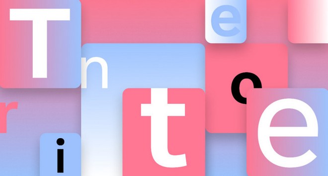
So, what do the candidates look like? The first font Tenorite has “the overall look of a traditional sans serif typeface but with a more warm, friendly style”. Functionally, Tenorite benefits from large punctuation and other accents that make it easy to read on the screen despite the small font size.

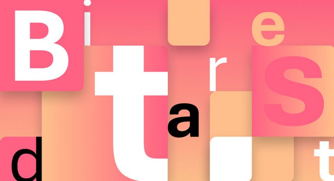
Next up is Bierstadt, described by Microsoft as “a modern, precise sans serif typeface inspired by mid-20th century Swiss”. Bierstadt also seems to be very easy to read, though it’s a bit more subtle thanks to its distinct end touches.

The third font is Skeena. It’s another sans serif option with “adjustments” strokes that create “a contrast between thick and thin and a special slice applied to the end of the text”. Microsoft says Skeena is best used in longer documents and short paragraphs (brochures, reports, etc.).

Seaford is the fourth font with a sans serif typeface that has an older style than some of the other options. Microsoft notes that “its asymmetric form emphasizes the differences between letters, thereby creating more recognizable letter shapes”.

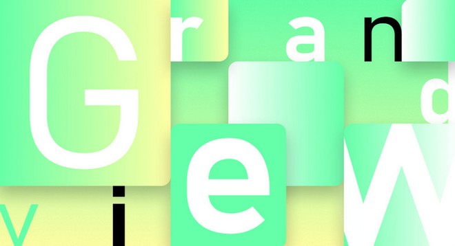
Lastly is the Grandview. Grandview was inspired by German railway signs with easy readability. According to Microsoft, Grandview is designed for use in textual content but retains quality with high legibility and some subtle tweaks to help read long texts.

Microsoft Office users can access all five fonts now through the Office cloud suite. Microsoft will make a final decision on default fonts over the next few months.
Refer to Screenrant
Source : Genk
