Mobile UX Design: Things not to do
Why do we install an application the first time? To make our lives more convenient. But if the application does not meet this requirement, the user will probably leave it. The success of an application depends on a combination of many factors, but the user experience tops all. A great user experience will separate successful applications from other applications.
When embarking on the design of mobile user experience, sticking to practice is the most solid way to go. In this article, I will focus on the basics that need to be addressed to avoid interruption or force users to think about things that should be done simply.
Design user interface for Multi-platform
A huge factor in making your mobile application "shine" is its interface. Most developers want to distribute their applications on multiple platforms. If you plan to distribute your application across multiple platforms, keep in mind that each platform has a separate set of rules and quality. Design will affect the application to look perfect on a platform but lost in the context of another platform.
Do not repeat the interface components and typefaces from other platforms
When you build an application for Android / iOS, don't bring the interface elements from another platform and don't mimic the behavior of those platforms. Because if you copy elements from another platform, you create the risk of affecting the user experience and conversion.
Inputs, check boxes, switches and other functional components need to bring a natural feeling. You should use natural elements as much as possible, so people know how to use them and trust the application with their sensitive data. In the example below you can see the same interface components on Android and iOS.
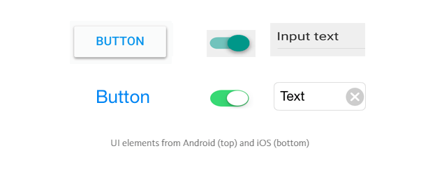
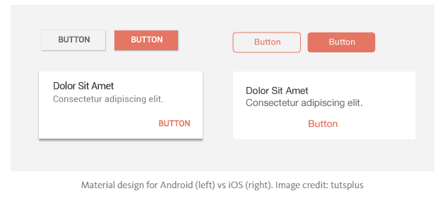
Compared with Material Design, the application on iOS platform is often flat when it appears, does not show the depth and shadow. iOS also has a simple button in plain text style, unlike Android's capitalized style and lighter style font.
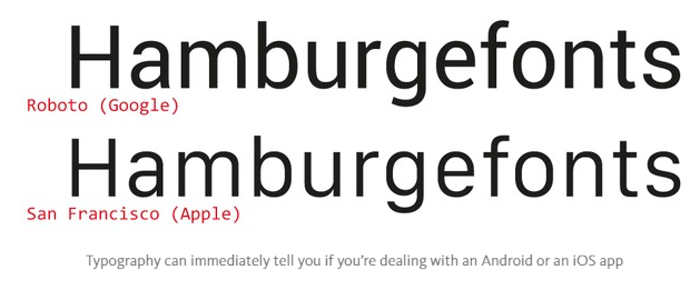
Typography also needs to comply with the standards of each platform: Android is Roboto , while iOS uses the San Francisco font family.
If you want to customize the user interface components in your application, customize it carefully according to your brand – and not preempt any other platform.
Do not be too concerned about separate icons on platforms
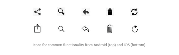
Each platform will usually give you a set of icons for common functions, such as sharing, creating a new document or deleting. When you are bringing your application to another platform, you should switch to the equivalent icons of the new platform.
In addition, you should pay attention to the distinctive style typical of each platform: the icon of the Android system has a thicker definition, while the icons of iOS stand out with very thin strokes. Here is an example of a quick comparison of icons of two platforms:
Do not re-simulate the user experience on the web into mobile applications
Users expect certain interactive patterns and interface elements to look for mobile applications. What we design on the web often makes users feel awkward on a mobile application – it's not necessary because there's something wrong, but because it's simply different from what users expect to see. Let me give you a clear example of this: Underline links. You should avoid using text with underlined links, which are already part of the browser model, but not part of the application model (applications use buttons rather than links. document).
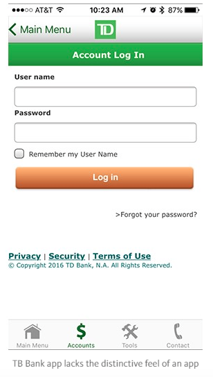
Below is an example of the TD Bank application login form for iOS. It looks like they designed for mobile web rather than mobile apps. As a result, they simply leave the web code of the mobile web and make it look like a mobile application: the link is underlined, and even leaves a copyright notice on the interface.
User flow (User flow)
Do not have the same line in your application
UX design is threaded design, and the flow in most cases is moving forward to complete a certain action. You need to avoid creating dead-end pages in your application, because the same lines create confusion and lead to unnecessary additional action. Sometimes designers create error messages and empty states but a picture is empty, but they really have a chance to make it more useful. See Spotify's error screen:
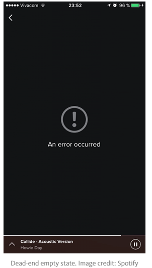
It does not help users understand the current context and cannot answer the question: "What can I do with it?"
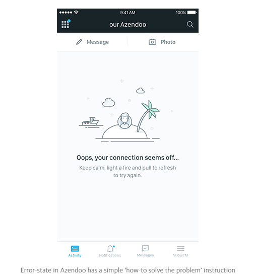
The empty state (and especially the error state) should not be the same, instead it will tell the user exactly what action is required so that the content can appear and the application will work as it should. promised.
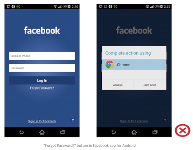
Don't let the user use the browser
Please keep your application users full time. If your app lacks some specific features or content, try using an in-app browser, but don't call your phone's browser or you'll get distracted and don't return to your app. you, increase the abandonment rate and reduce conversions.
Don't ask users to rate your app too soon after they download it
Nobody really wants to be interrupted, though a bit for something useless when they're in the middle of something important. Avoid interrupting the user experience by asking them to evaluate your application if they just downloaded it or used it a few times. Instead, wait until they become regular users and they will be more likely to rate your app and provide more feedback.
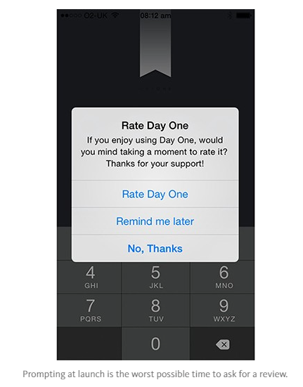
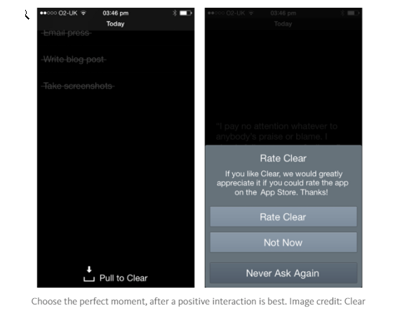
You can activate the review request after a specific number of application or target launches have been completed. Dan Counsell have some look deeply at the right time to ask for feedback. This is what he said about the Clear application, a reminder application:
Clear for iOS displays the "App evaluation" dialog after some conditions are met. First, users must use the application a few weeks. Second, Clear will only ask after the user has completed the remaining tasks on the list. This is a great time in the application, users are comfortable with cleaning their list of jobs and in most cases will exit the application.
There is nothing wrong with asking users for a feedback, but remember that you want to give users a great experience.
Conclude
People expect a lot on the interface of today's mobile applications, and the standards are increasingly enhanced. You need to work hard to meet expectations and make your application interesting, not annoying. Improving the user experience is not a short-term task, it needs a long experience.
Thank you for reading this article. This article is translated from Post by blogger Nick Babich, who writes about UX. If there is anything missing or have any feedback, please leave a comment below.
ITZone via kipalog.com