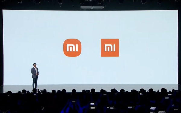
Listening to CEO Lei Jun’s explanation, I see the new Xiaomi logo ‘every penny’: Using the math formula ‘super ellipse’, reaching the perfect balance
- Tram Ho
As reported, yesterday during the Mega Launch event, Xiaomi launched the new Mi Mix Fold folding phone line. Notably, along with that, this company also announced their new logo identity.
It is known that the rebranding project including the logo redesign was launched by Xiaomi in 2017. Over the years of choosing, hiring Japanese designer Kenyan Hara at a cost of 2 million yuan (about 7 billion) until yesterday, Xiaomi officially announced the new logo.

However, it takes a lot of effort and money, but the new Xiaomi logo receives many comments saying that … is no different from the old logo:
– God, looking the same over and over again, what suddenly realized is to replace the square outside.
– Oh, the new one that looks more eye-catching is obvious, with a corner in it is an art worth up to “2 million yuan”!
– His good job is not designing the logo but convincing the company to feel satisfied.
– Too great, the new logo shines a new level with the same impression
– It is true that the new look has more feeling, the feeling of having money haha.
– If you are good, the design is exactly the same and persuade xiaomi to accept the product. You guys are just as humorous as the clients who receive products from designers / copywriters always say “So I can do it too” í.
Even many netizens also expressed their skepticism that this is Xiaomi’s marketing “trick”:
– Just a trick to make brand waves again, everyone.
– The marketing strategy is good, bad and beautiful, but not discussed, but that 7 billion is enough to spread the effect to millions and billions of people around the world, it is not expensive.
– Xiaomi is smart, it costs less but is branding across the five continents haha.
– Too successful marketing campaign with too low a cost.
For his part, at the launch of the new logo event, CEO Lei Jun received a question like this:
“Are you disappointed with the new logo, it’s just rounder than the old one?”
CEO Lei then replied: “Don’t worry, Xiaomi not only changed the logo from square to round but also changed the ‘internal spirit’ as well as the brand’s thinking. Please rest assured.”
CEO Lei Jun explained further, the new logo emphasizes a new identity that the company will bring in the future.
With the new design, the corners of the logo have been softly rounded, looking like smartphone application icons.

In addition, the designer Hara himself said: “The new logo is not simply redesigned, but it also represents Xiaomi’s internal spirit. This design basically reflects the notion of originality. “alive”.
Regarding the name “Alive”, Kenya said that this phrase can convey and visualize Xiaomi’s opinion and mode of operation, bringing a new identity to the meaning: People are alive. ) very in tune with technology – something man made.
That makes technology more soulful and is an indispensable part to meet human needs. The talented designer also emphasized that this is the perfect idea for Xiaomi, the brand that has brought a lot of conveniences to humanity thanks to a series of their technological innovations and inventions.

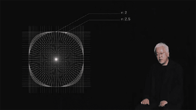
Especially in order to create a new logo with such a profound philosophy, Xiaomi’s designer had to use a lot of technical processes. In it, he used the mathematical formula “superellipse” for the new logo and had to adjust the variables to get the optimal dynamic balance in terms of the image, giving the perfect balance between squares and circles.
Superellipse is super ellipse. Is a curve like an ellipse, has some properties like an ellipse, but the overall is different. This shape is flattened like an ellipse but closer to the circle. It was discovered by a French mathematician Gabriel Lamé and depends on the formula to change from something like a four-pointed star to a shape that looks like a rounded square.
Xiaomi says that it continues to use orange as the primary color tone. However, some black and silver variants of the logo may appear on future premium products.
Source : Genk
