
1. Introduction
The clip-path creates a clipping area where content within it is displayed and content outside of it is hidden.
Here is a basic clip-path: circle .
1 2 3 4 5 | <span class="token selector">.card</span> <span class="token punctuation">{</span> <span class="token property">background-color</span> <span class="token punctuation">:</span> #77cce9 <span class="token punctuation">;</span> <span class="token property">clip-path</span> <span class="token punctuation">:</span> <span class="token function">circle</span> <span class="token punctuation">(</span> 80px at 50% 50% <span class="token punctuation">)</span> <span class="token punctuation">;</span> <span class="token punctuation">}</span> |
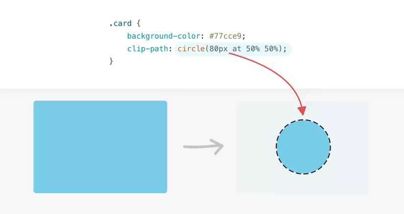
With the use of clip-path , the visible area is only a blue circle ( #77cce9 ).
Any part outside the circle is invisible.
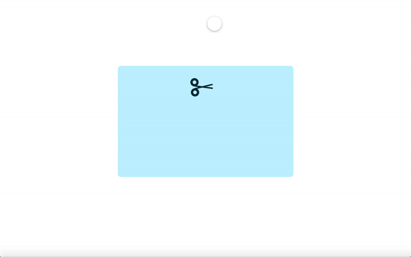
Here is an animation showing a cutout of the circle in the previous example.
2. The Coordinate System
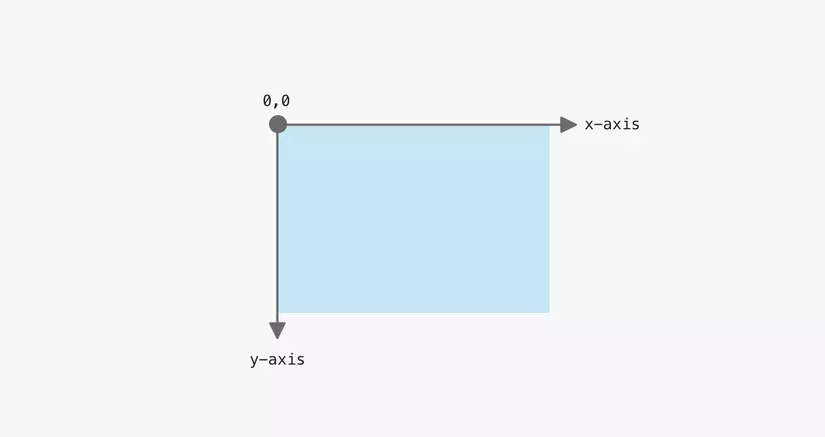
Before going into the details of the clip-path , it is worth mentioning how the coordinate system works.
The origin point is the top left quadrant with the x-axis pointing to the right and the y-axis pointing down.
With that in mind, let’s take a simple example to see how an element uses clip-path .
In the example below, the clipped area is a circle 100px and its center is positioned 0,0 (top left).
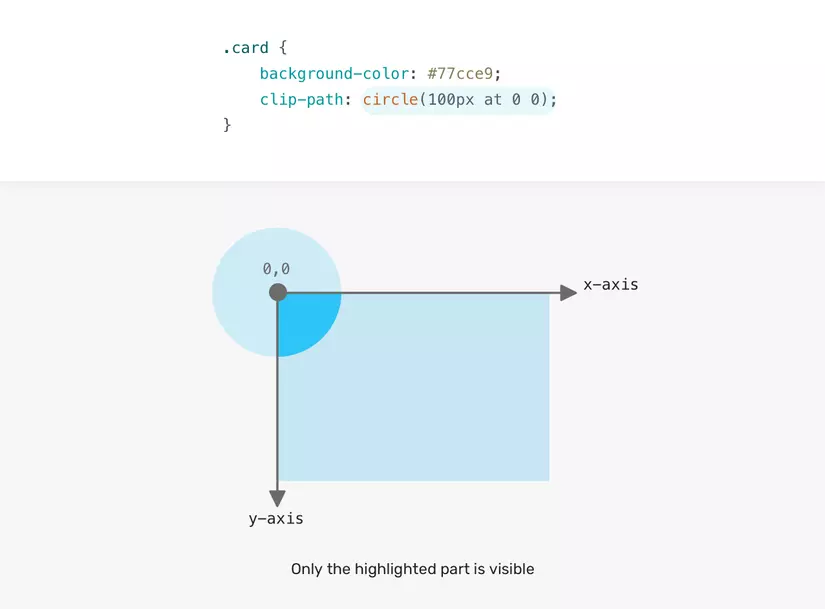
Note that the user can only see the highlighted area (dark blue).
The rest of the circle is cliped.
The question is, how can we display the entire circle?
That is, we need to change the points of the x-axis and the y-axis.
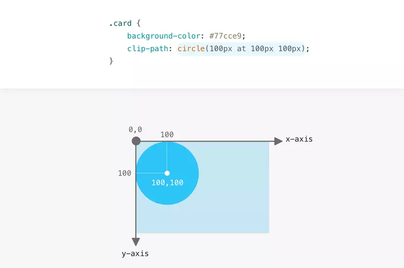
The center of the circle is placed 100px from the left and 100px from the top.
Now that you understand how coordinate systems work, I’ll explain the possible values for the clip-path .
3. The Clip-Path Values
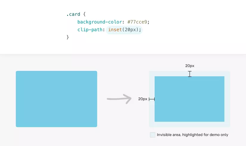
3.1 Inset
The inset value identifies an inset rectangle.
We can control the four edges, just like we do with margin or padding .
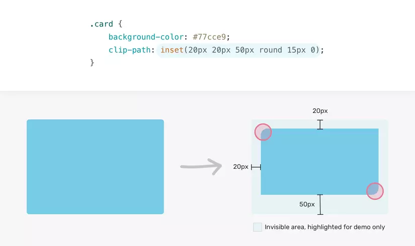
In the following example, the .card is 20px in length from all sides (top, right, bottom, and left).
1 2 3 4 | <span class="token selector">.card</span> <span class="token punctuation">{</span> <span class="token property">clip-path</span> <span class="token punctuation">:</span> <span class="token function">inset</span> <span class="token punctuation">(</span> 20px <span class="token punctuation">)</span> <span class="token punctuation">;</span> <span class="token punctuation">}</span> |
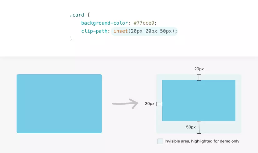
If you need to adjust the insertion from one of the edges, you can. Here’s another example:
1 2 3 4 5 6 7 | <span class="token selector">.card</span> <span class="token punctuation">{</span> <span class="token property">clip-path</span> <span class="token punctuation">:</span> <span class="token function">inset</span> <span class="token punctuation">(</span> 20px 20px 50px 20px <span class="token punctuation">)</span> <span class="token punctuation">;</span> // <span class="token property">hoặc</span> <span class="token punctuation">:</span> // <span class="token property">clip-path</span> <span class="token punctuation">:</span> <span class="token function">inset</span> <span class="token punctuation">(</span> 20px 20px 50px <span class="token punctuation">)</span> <span class="token punctuation">;</span> // theo tứ tự là trên - phải - dưới - trái giống như margin hoặc padding <span class="token punctuation">}</span> |
The eleent has a 50px inset from the bottom.
.card new .card has a 50px inset from below.
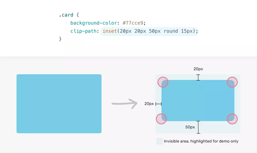
Another question is, can we make corners rounded like normal blocks?
Of course it’s possible thanks to the round property.
Add round <border-radius> that can round corners.
1 2 3 4 | <span class="token selector">.card</span> <span class="token punctuation">{</span> <span class="token property">clip-path</span> <span class="token punctuation">:</span> <span class="token function">inset</span> <span class="token punctuation">(</span> 20px 20px 50px round 15px <span class="token punctuation">)</span> <span class="token punctuation">;</span> <span class="token punctuation">}</span> |
Not only that, we can adjust the radius for each side separately.
Below is an example with a 0 radius for the top right and bottom left corners.
1 2 3 4 | <span class="token selector">.card</span> <span class="token punctuation">{</span> <span class="token property">clip-path</span> <span class="token punctuation">:</span> <span class="token function">inset</span> <span class="token punctuation">(</span> 20px 20px 50px round 15px 0 <span class="token punctuation">)</span> <span class="token punctuation">;</span> <span class="token punctuation">}</span> |
3.2 Circle
To use the circle() value, we need its radius and position. Here is an example:
1 2 3 4 | <span class="token selector">.card</span> <span class="token punctuation">{</span> <span class="token property">clip-path</span> <span class="token punctuation">:</span> <span class="token function">circle</span> <span class="token punctuation">(</span> 80px at 50% 50% <span class="token punctuation">)</span> <span class="token punctuation">;</span> <span class="token punctuation">}</span> |
The radius of the circle is 80px and it is positioned 50% on the x axis and 50% 1 on the y axis.
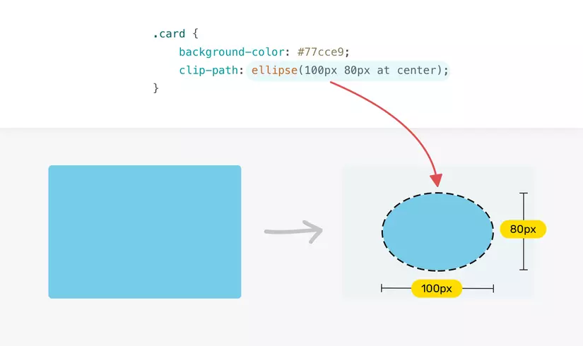
3.3 Ellipse
With ellipse() , we can set the width and height to make an oval clipping.
1 2 3 4 | <span class="token selector">.card</span> <span class="token punctuation">{</span> <span class="token property">clip-path</span> <span class="token punctuation">:</span> <span class="token function">ellipse</span> <span class="token punctuation">(</span> 100px 80px at center <span class="token punctuation">)</span> <span class="token punctuation">;</span> <span class="token punctuation">}</span> |
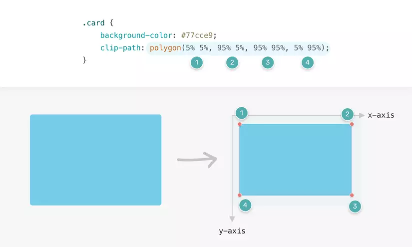
3.4 Polygon
The polygon() value is the most interesting.
We have the ability to control various sets of x-axis and y-axis tuples.
1 2 3 4 | <span class="token selector">.card</span> <span class="token punctuation">{</span> <span class="token property">clip-path</span> <span class="token punctuation">:</span> <span class="token function">polygon</span> <span class="token punctuation">(</span> x y <span class="token punctuation">,</span> x y <span class="token punctuation">,</span> x y <span class="token punctuation">,</span> x y <span class="token punctuation">)</span> <span class="token punctuation">;</span> <span class="token punctuation">}</span> |
Here is an example that uses polygon() to cut a rectangle.
Notice how we map each set of points to its coordinates on the axes.
1 2 3 4 | <span class="token selector">.card</span> <span class="token punctuation">{</span> <span class="token property">clip-path</span> <span class="token punctuation">:</span> <span class="token function">polygon</span> <span class="token punctuation">(</span> 5% 5% <span class="token punctuation">,</span> 95% 5% <span class="token punctuation">,</span> 95% 95% <span class="token punctuation">,</span> 5% 95% <span class="token punctuation">)</span> <span class="token punctuation">;</span> <span class="token punctuation">}</span> |
We can also draw complex shapes with multiple points using polygon values.
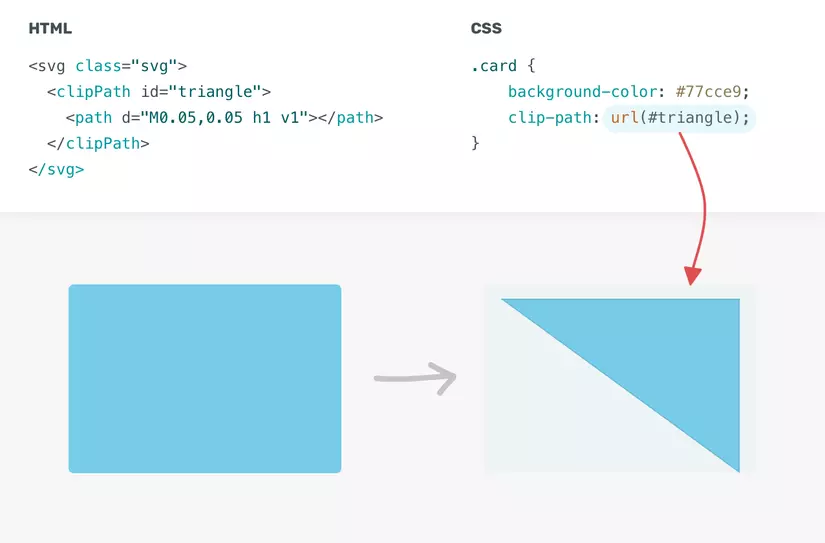
3.5 Path
The value path() allows us to use an SVG path to crop a specific area.
Currently, the support for different browsers is limited.
We need to use inline SVG, then use url() as the value for clip-path .
1 2 3 4 5 6 | <span class="token tag"><span class="token tag"><span class="token punctuation"><</span> svg</span> <span class="token attr-name">class</span> <span class="token attr-value"><span class="token punctuation">=</span> <span class="token punctuation">"</span> svg <span class="token punctuation">"</span></span> <span class="token punctuation">></span></span> <span class="token tag"><span class="token tag"><span class="token punctuation"><</span> clipPath</span> <span class="token attr-name">id</span> <span class="token attr-value"><span class="token punctuation">=</span> <span class="token punctuation">"</span> triangle <span class="token punctuation">"</span></span> <span class="token attr-name">clipPathUnits</span> <span class="token attr-value"><span class="token punctuation">=</span> <span class="token punctuation">"</span> objectBoundingBox <span class="token punctuation">"</span></span> <span class="token punctuation">></span></span> <span class="token tag"><span class="token tag"><span class="token punctuation"><</span> path</span> <span class="token attr-name">d</span> <span class="token attr-value"><span class="token punctuation">=</span> <span class="token punctuation">"</span> M0.05,0.05 h1 v1 <span class="token punctuation">"</span></span> <span class="token punctuation">></span></span> <span class="token tag"><span class="token tag"><span class="token punctuation"></</span> path</span> <span class="token punctuation">></span></span> <span class="token tag"><span class="token tag"><span class="token punctuation"></</span> clipPath</span> <span class="token punctuation">></span></span> <span class="token tag"><span class="token tag"><span class="token punctuation"></</span> svg</span> <span class="token punctuation">></span></span> |
In CSS, we need to add the path with the url() value.
1 2 3 4 | <span class="token selector">.card</span> <span class="token punctuation">{</span> <span class="token property">clip-path</span> <span class="token punctuation">:</span> <span class="token url"><span class="token function">url</span> <span class="token punctuation">(</span> "#triangle" <span class="token punctuation">)</span></span> <span class="token punctuation">;</span> <span class="token punctuation">}</span> |
Now that we’ve covered clip-path theory and its general values, it’s time to put it into practice.
(go)
4. Use Cases
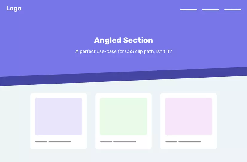
4.1 Angled Effect
In modern web pages, you may have seen many patterns similar to the one below, on the web there will be some sections with a slightly angled background and an uneven side length.
It’s a perfect case for clip-path
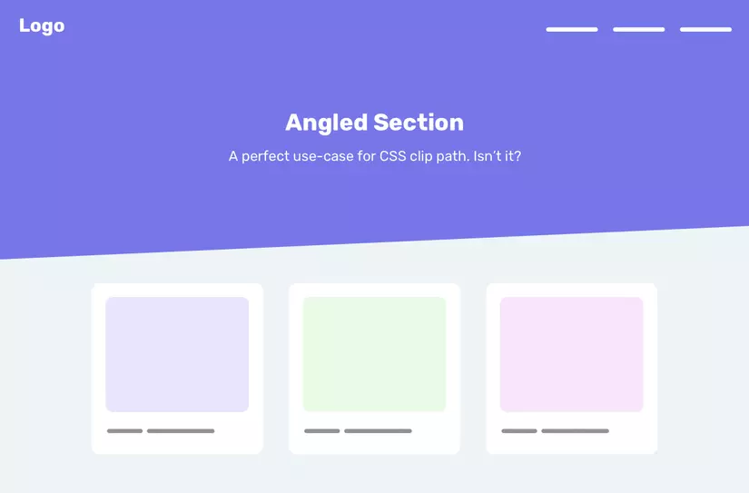
We will use polygon() .
1 2 3 4 | <span class="token selector">.section</span> <span class="token punctuation">{</span> <span class="token property">clip-path</span> <span class="token punctuation">:</span> <span class="token function">polygon</span> <span class="token punctuation">(</span> 0 0 <span class="token punctuation">,</span> 100% 0 <span class="token punctuation">,</span> 100% 80% <span class="token punctuation">,</span> 0 100% <span class="token punctuation">)</span> <span class="token punctuation">;</span> <span class="token punctuation">}</span> |
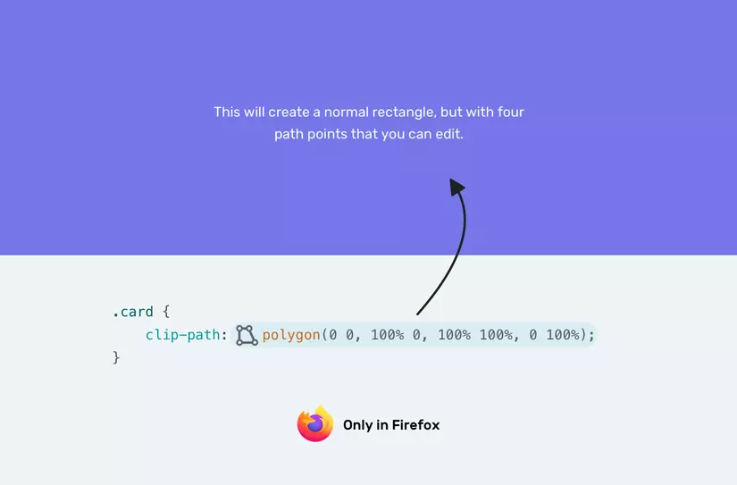
In some cases, adjusting 8 numbers to polygonal value can be annoying.
For that reason, we have a trick that depends on the browser to create the shape we want.
First, we need to add the following:
1 2 3 4 | <span class="token selector">.section</span> <span class="token punctuation">{</span> <span class="token property">clip-path</span> <span class="token punctuation">:</span> <span class="token function">polygon</span> <span class="token punctuation">(</span> 0 0 <span class="token punctuation">,</span> 100% 0 <span class="token punctuation">,</span> 100% 100% <span class="token punctuation">,</span> 0 100% <span class="token punctuation">)</span> <span class="token punctuation">;</span> <span class="token punctuation">}</span> |
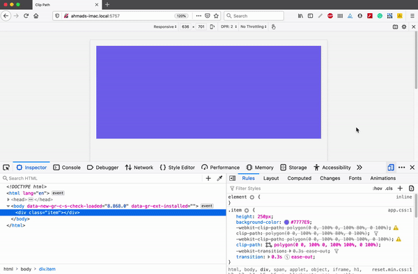
Then we need to test that part of DevTools .
Once done, notice that there is a small polygonal icon on the left side of the polygon() value.
After clicking on that icon, we can edit polygons in browser.
Isn’t that great? The gif below will be an example for you.
4.2 Making The Angle Relative To The Viewport Width
We can also use CSS calc() in conjunction with the CSS viewport unit to make the angle relative to the width of the viewport .
1 2 3 4 | <span class="token selector">.section</span> <span class="token punctuation">{</span> <span class="token property">clip-path</span> <span class="token punctuation">:</span> <span class="token function">polygon</span> <span class="token punctuation">(</span> 0 0 <span class="token punctuation">,</span> 100% 0 <span class="token punctuation">,</span> 100% <span class="token function">calc</span> <span class="token punctuation">(</span> 100% - 5vw <span class="token punctuation">)</span> <span class="token punctuation">,</span> 0 100% <span class="token punctuation">)</span> <span class="token punctuation">;</span> <span class="token punctuation">}</span> |
- References:
https://kilianvalkhof.com/2017/design/sloped-edges-with-consistent-angle-in-css/
4.3 Multiple Angled Effects
I have a question in mind about do we need multiple elements with multiple angles?
The first thing I think of is just adding a box-shadow layer or border .
Unfortunately, they will also be within the effect of the clip-path , so even if we add a box-shadow or border , it won’t appear as expected.
In such a case, the solution is to use multiple elements, with each element having a different cutoff point. Here’s how we can do it.
1 2 3 4 | <span class="token tag"><span class="token tag"><span class="token punctuation"><</span> div</span> <span class="token attr-name">class</span> <span class="token attr-value"><span class="token punctuation">=</span> <span class="token punctuation">"</span> hero <span class="token punctuation">"</span></span> <span class="token punctuation">></span></span> <span class="token tag"><span class="token tag"><span class="token punctuation"><</span> img</span> <span class="token attr-name">src</span> <span class="token attr-value"><span class="token punctuation">=</span> <span class="token punctuation">"</span> bg.jpg <span class="token punctuation">"</span></span> <span class="token attr-name">alt</span> <span class="token attr-value"><span class="token punctuation">=</span> <span class="token punctuation">"</span> <span class="token punctuation">"</span></span> <span class="token punctuation">/></span></span> <span class="token tag"><span class="token tag"><span class="token punctuation"></</span> div</span> <span class="token punctuation">></span></span> |
1 2 3 4 5 6 7 8 9 10 11 12 13 14 15 16 17 18 19 20 21 22 23 24 25 26 27 | <span class="token selector">.hero</span> <span class="token punctuation">{</span> <span class="token property">position</span> <span class="token punctuation">:</span> relative <span class="token punctuation">;</span> <span class="token property">min-height</span> <span class="token punctuation">:</span> 350px <span class="token punctuation">;</span> <span class="token punctuation">}</span> <span class="token selector">.hero img</span> <span class="token punctuation">{</span> <span class="token property">position</span> <span class="token punctuation">:</span> absolute <span class="token punctuation">;</span> <span class="token property">left</span> <span class="token punctuation">:</span> 0 <span class="token punctuation">;</span> <span class="token property">top</span> <span class="token punctuation">:</span> 0 <span class="token punctuation">;</span> <span class="token property">width</span> <span class="token punctuation">:</span> 100% <span class="token punctuation">;</span> <span class="token property">height</span> <span class="token punctuation">:</span> 100% <span class="token punctuation">;</span> <span class="token property">clip-path</span> <span class="token punctuation">:</span> <span class="token function">polygon</span> <span class="token punctuation">(</span> 0 0 <span class="token punctuation">,</span> 100% 0 <span class="token punctuation">,</span> 100% 80% <span class="token punctuation">,</span> 0 90% <span class="token punctuation">)</span> <span class="token punctuation">;</span> <span class="token punctuation">}</span> <span class="token selector">.hero:after</span> <span class="token punctuation">{</span> <span class="token property">content</span> <span class="token punctuation">:</span> <span class="token string">""</span> <span class="token punctuation">;</span> <span class="token property">position</span> <span class="token punctuation">:</span> absolute <span class="token punctuation">;</span> <span class="token property">left</span> <span class="token punctuation">:</span> 0 <span class="token punctuation">;</span> // Đây chính là thuộc tính làm lớp nền bên dưới ở bên d <span class="token property">bottom</span> <span class="token punctuation">:</span> -20% <span class="token punctuation">;</span> <span class="token property">z-index</span> <span class="token punctuation">:</span> -1 <span class="token punctuation">;</span> <span class="token property">width</span> <span class="token punctuation">:</span> 100% <span class="token punctuation">;</span> <span class="token property">height</span> <span class="token punctuation">:</span> 100% <span class="token punctuation">;</span> <span class="token property">background-color</span> <span class="token punctuation">:</span> #4545a0 <span class="token punctuation">;</span> <span class="token property">clip-path</span> <span class="token punctuation">:</span> <span class="token function">polygon</span> <span class="token punctuation">(</span> 0 0 <span class="token punctuation">,</span> 100% 0 <span class="token punctuation">,</span> 100% 80% <span class="token punctuation">,</span> 0 90% <span class="token punctuation">)</span> <span class="token punctuation">;</span> <span class="token punctuation">}</span> |
We have a dummy element of the same size and clip path as the other.
The difference is that it is located below it with bottom: -20% and z-index: -1 .
I used a value of 20% because it was a result of 100 - 80 .
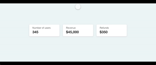
4.4 Reveal On Scroll
By using the IntersectionObserver API, we can render certain elements on the page while the user is scrolling.
The clip-path value that I find useful for this effect is inset .
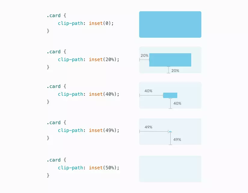
Note that the blue rectangle can be completely invisible by applying the inset(50%) .
The value of making it invisible is 50% since we are applying content from four sides.
In other words, the rectangle is applied from edge to center of the rectangle.
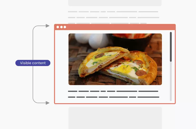
In the image below, the inset is being used to display the image while the user is scrolling.
With it, we can make the image show up by scrolling.
1 2 3 4 5 6 7 8 9 10 11 12 13 14 | <span class="token keyword">const</span> images <span class="token operator">=</span> document <span class="token punctuation">.</span> <span class="token function">querySelectorAll</span> <span class="token punctuation">(</span> <span class="token string">"img"</span> <span class="token punctuation">)</span> <span class="token punctuation">;</span> <span class="token keyword">function</span> <span class="token function">check</span> <span class="token punctuation">(</span> <span class="token parameter">entries</span> <span class="token punctuation">)</span> <span class="token punctuation">{</span> entries <span class="token punctuation">.</span> <span class="token function">map</span> <span class="token punctuation">(</span> <span class="token punctuation">(</span> <span class="token parameter">entry</span> <span class="token punctuation">)</span> <span class="token operator">=></span> <span class="token punctuation">{</span> <span class="token keyword">if</span> <span class="token punctuation">(</span> entry <span class="token punctuation">.</span> isIntersecting <span class="token punctuation">)</span> <span class="token punctuation">{</span> entry <span class="token punctuation">.</span> target <span class="token punctuation">.</span> classList <span class="token punctuation">.</span> <span class="token function">add</span> <span class="token punctuation">(</span> <span class="token string">"is-visible"</span> <span class="token punctuation">)</span> <span class="token punctuation">;</span> observer <span class="token punctuation">.</span> <span class="token function">unobserve</span> <span class="token punctuation">(</span> entry <span class="token punctuation">.</span> target <span class="token punctuation">)</span> <span class="token punctuation">;</span> <span class="token punctuation">}</span> <span class="token punctuation">}</span> <span class="token punctuation">)</span> <span class="token punctuation">;</span> <span class="token punctuation">}</span> <span class="token keyword">const</span> observer <span class="token operator">=</span> <span class="token keyword">new</span> <span class="token class-name">IntersectionObserver</span> <span class="token punctuation">(</span> check <span class="token punctuation">)</span> <span class="token punctuation">;</span> images <span class="token punctuation">.</span> <span class="token function">forEach</span> <span class="token punctuation">(</span> <span class="token punctuation">(</span> <span class="token parameter">image</span> <span class="token punctuation">)</span> <span class="token operator">=></span> observer <span class="token punctuation">.</span> <span class="token function">observe</span> <span class="token punctuation">(</span> image <span class="token punctuation">)</span> <span class="token punctuation">)</span> <span class="token punctuation">;</span> |
1 2 3 4 5 6 7 8 9 | <span class="token selector">img</span> <span class="token punctuation">{</span> <span class="token property">clip-path</span> <span class="token punctuation">:</span> <span class="token function">inset</span> <span class="token punctuation">(</span> 50% <span class="token punctuation">)</span> <span class="token punctuation">;</span> <span class="token property">transition</span> <span class="token punctuation">:</span> 1.2s ease-in <span class="token punctuation">;</span> <span class="token punctuation">}</span> <span class="token selector">img.is-visible</span> <span class="token punctuation">{</span> <span class="token property">clip-path</span> <span class="token punctuation">:</span> <span class="token function">inset</span> <span class="token punctuation">(</span> 0 <span class="token punctuation">)</span> <span class="token punctuation">;</span> <span class="token punctuation">}</span> |
Is it really that simple?
We created a simple scrolling effect with a few lines of CSS and Javascript.
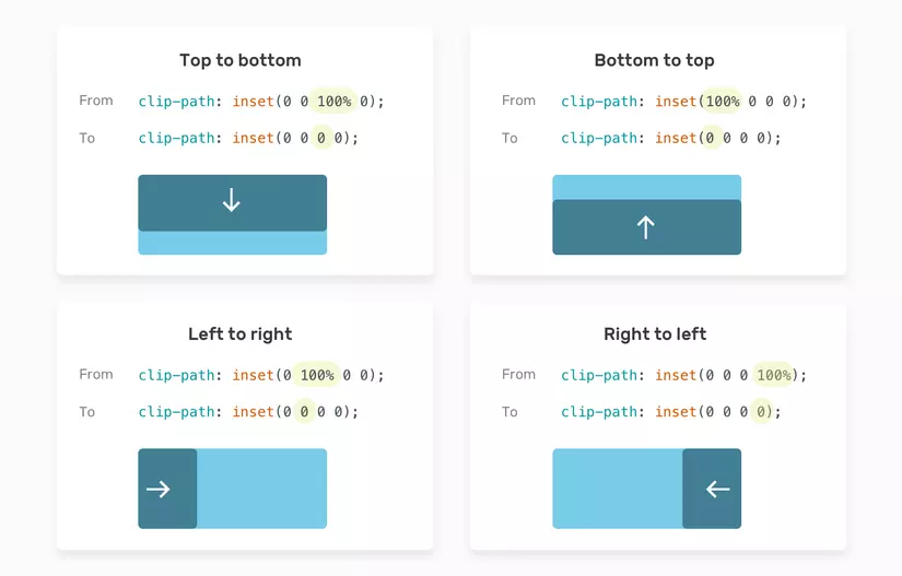
Not only that, we can also control the direction of the transition due to scroll.
To do that, we just need to use a value from the four edges.
For example, if we want to convert from top to bottom, the bottom value must be converted from 100% to 0.
Here is the picture that explains that.
And here is an interactive demo.
And here is a demo:
4.5 Hover And Animation Effects
The possibilities to create hover and click effects with clip-path are endless.
Consider the following example.
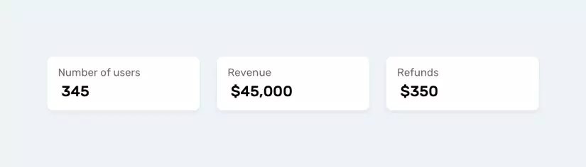
What we need to do is add a hover effect from a specified position.
In this case, use the circle() value.
To make it easier and more maintaince, use CSS variables.
That way we won’t duplicate the entire clip-path .
We will only change the necessary CSS variables.
1 2 3 4 5 6 7 8 9 10 11 12 13 14 15 16 17 18 19 20 | <span class="token selector">:root</span> <span class="token punctuation">{</span> <span class="token property">--pos</span> <span class="token punctuation">:</span> left center <span class="token punctuation">;</span> <span class="token property">--size</span> <span class="token punctuation">:</span> 0 <span class="token punctuation">;</span> <span class="token punctuation">}</span> <span class="token selector">.stats__item:before</span> <span class="token punctuation">{</span> <span class="token property">position</span> <span class="token punctuation">:</span> absolute <span class="token punctuation">;</span> <span class="token property">left</span> <span class="token punctuation">:</span> 0 <span class="token punctuation">;</span> <span class="token property">top</span> <span class="token punctuation">:</span> 0 <span class="token punctuation">;</span> <span class="token property">width</span> <span class="token punctuation">:</span> 100% <span class="token punctuation">;</span> <span class="token property">height</span> <span class="token punctuation">:</span> 100% <span class="token punctuation">;</span> <span class="token property">background-color</span> <span class="token punctuation">:</span> #7777e9 <span class="token punctuation">;</span> <span class="token property">clip-path</span> <span class="token punctuation">:</span> <span class="token function">circle</span> <span class="token punctuation">(</span> <span class="token function">var</span> <span class="token punctuation">(</span> --size <span class="token punctuation">)</span> at <span class="token function">var</span> <span class="token punctuation">(</span> --pos <span class="token punctuation">)</span> <span class="token punctuation">)</span> <span class="token punctuation">;</span> <span class="token property">transition</span> <span class="token punctuation">:</span> 0.4s linear <span class="token punctuation">;</span> <span class="token punctuation">}</span> <span class="token selector">.stats__item:hover:before</span> <span class="token punctuation">{</span> <span class="token property">--size</span> <span class="token punctuation">:</span> 300px <span class="token punctuation">;</span> <span class="token punctuation">}</span> |
Gif below shows how it works.
Not only that, we can change the position of the animation very easily.
I created a demo with the ability to change the location from the drop-down menu.
If you want to dig deeper into animation effects, Mr. Adam Argyle has created a very useful CSS animation library that relies 100% on CSS clip-path .
References:
4.6 Ripple Effect
The ripple effect has been popular since the release of Material design. With clip-path, we can easily replicate this effect.
The ripple effect has become popular since the release of Material design .
With clip-path , we can easily duplicate this effect.
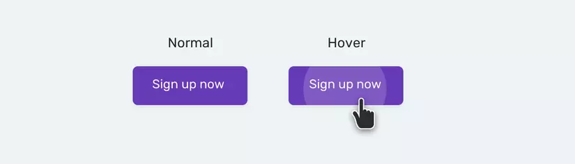
1 2 | <span class="token tag"><span class="token tag"><span class="token punctuation"><</span> button</span> <span class="token attr-name">class</span> <span class="token attr-value"><span class="token punctuation">=</span> <span class="token punctuation">"</span> button <span class="token punctuation">"</span></span> <span class="token punctuation">></span></span> <span class="token tag"><span class="token tag"><span class="token punctuation"><</span> span</span> <span class="token punctuation">></span></span> Sign up now <span class="token tag"><span class="token tag"><span class="token punctuation"></</span> span</span> <span class="token punctuation">></span></span> <span class="token tag"><span class="token tag"><span class="token punctuation"></</span> button</span> <span class="token punctuation">></span></span> |
1 2 3 4 5 6 7 8 9 10 11 12 13 14 15 16 17 18 19 20 21 22 23 24 25 26 | <span class="token selector">.button</span> <span class="token punctuation">{</span> <span class="token property">position</span> <span class="token punctuation">:</span> relative <span class="token punctuation">;</span> <span class="token punctuation">}</span> <span class="token selector">.button span</span> <span class="token punctuation">{</span> <span class="token property">position</span> <span class="token punctuation">:</span> relative <span class="token punctuation">;</span> <span class="token property">z-index</span> <span class="token punctuation">:</span> 1 <span class="token punctuation">;</span> <span class="token punctuation">}</span> <span class="token selector">.button:before</span> <span class="token punctuation">{</span> <span class="token property">content</span> <span class="token punctuation">:</span> <span class="token string">""</span> <span class="token punctuation">;</span> <span class="token property">position</span> <span class="token punctuation">:</span> absolute <span class="token punctuation">;</span> <span class="token property">left</span> <span class="token punctuation">:</span> 0 <span class="token punctuation">;</span> <span class="token property">top</span> <span class="token punctuation">:</span> 0 <span class="token punctuation">;</span> <span class="token property">width</span> <span class="token punctuation">:</span> 100% <span class="token punctuation">;</span> <span class="token property">height</span> <span class="token punctuation">:</span> 100% <span class="token punctuation">;</span> <span class="token property">background-color</span> <span class="token punctuation">:</span> #fff <span class="token punctuation">;</span> <span class="token property">opacity</span> <span class="token punctuation">:</span> 0.1 <span class="token punctuation">;</span> <span class="token property">clip-path</span> <span class="token punctuation">:</span> <span class="token function">circle</span> <span class="token punctuation">(</span> 0 at center <span class="token punctuation">)</span> <span class="token punctuation">;</span> <span class="token property">transition</span> <span class="token punctuation">:</span> 0.3s ease-out <span class="token punctuation">;</span> <span class="token punctuation">}</span> <span class="token selector">.button:hover:before</span> <span class="token punctuation">{</span> <span class="token property">clip-path</span> <span class="token punctuation">:</span> <span class="token function">circle</span> <span class="token punctuation">(</span> 100px at center <span class="token punctuation">)</span> <span class="token punctuation">;</span> <span class="token punctuation">}</span> |
Complement
To make it easier to use the clip-path value, bennettfeely will help you do that
- Reference links:
https://bennettfeely.com/clippy/
Conclusion
Above is to learn about the clip-path in CSS, hoping to help people in drawing or customizing difficult interfaces.
Thank for watching !!!