iOS 14 is having a problem that has long haunted the Windows operating system
- Tram Ho
One of the things that annoys many people about operating systems is when they go through an “overhaul” phase, but the changes are made that don’t apply across the entire user interface.
A prime example of this is Microsoft’s Windows operating system. Throughout all the design changes, there must be times when you are excited about the new user interface, after just a few clicks, the old interface comes out. Those may be the details, but anyone who values consistency wouldn’t be able to accept it.
And many times, you will feel as if the problem comes from the developer trying to change interface elements just because they need to create new, not change because they want to do everything. things get better. iOS 14 is a victim of that thought.
The first is the Clock application.

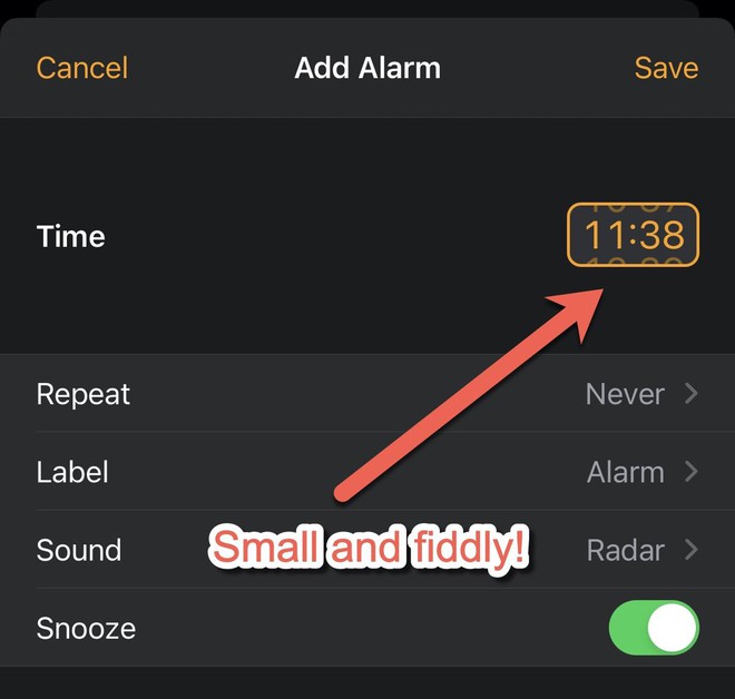
Instead of using the scroll wheel to let users enter the time as before, on iOS 14, you will choose the time through a small “bubble”. Having the option to enter time using the keyboard is a nice addition, but adding the option to enter time with the keyboard and replacing the touch interface with something smaller and harder to manipulate is obviously not much user friendly.
You may be familiar with the new input method, but don’t understand why you need to. Why can’t the old and new time input be present together?
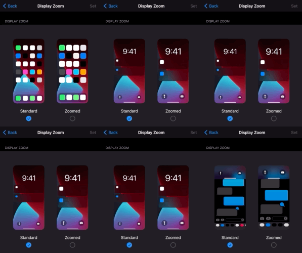
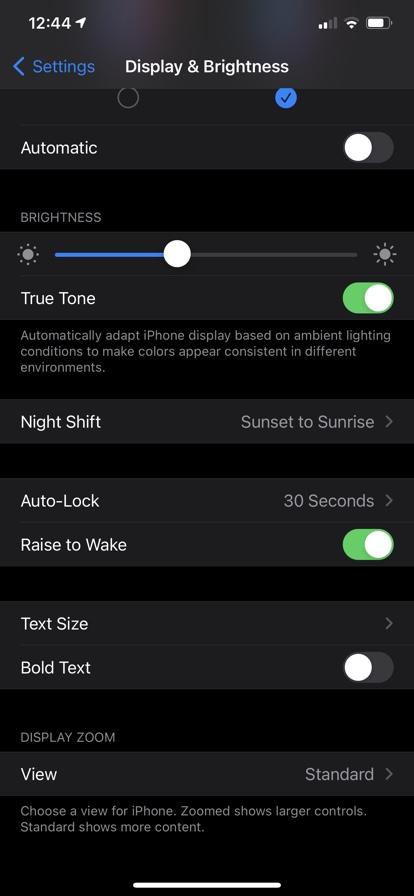
Another thing you’ll notice is the mix of old and new details, especially in the Settings app. Specifically, in some settings, it can be seen that Apple has put a lot of effort into helping users understand what changes will appear when they change an option. For example, the View option under Settings> Display & Brightness> Display Zoom:

What about other places? Good luck finding a way to guess what option changes what!
What a weird thing.
That’s not to mention the Settings app itself has become a mess, reminiscent of the Windows Control Panel. To find anything in Settings, you either have to fumble around, or have to use the search feature that is designed in a patchy way and only works if you know what you’re looking for.)
The optional items were also arranged in a chaotic manner. Why is the ” Picture in Picture ” feature so deep in Settings> General , while the ” Display & Brightness “, ” Home Screen “, and ” Wallpaper ” categories are in Settings ? Why does Wallpaper have a separate section on the main page?
Why does Personal Hotspot also have a separate item in Settings , and can be accessed in Cellular ?
There doesn’t seem to be any logical explanation for how things are organized, and as more new features are added to the Settings, the mess becomes more chaotic.
Why are there so many items sorted into long lists? Apple’s developers tried to align things with their feature set through the use of headings, but again, they showed inconsistencies. Just look at the screen below to see: some things are classified into feature groups with headings, some are not.

Why?
And it seems as the more apps you install, the more confusing things get.
A big part of the problem, perhaps like the Control Panel in Windows or the System Preferences on the Mac, the Settings app is like a closet where you toss everything in there to find them a place to put. The Settings app used to be neat and easy to use, but then there will come a time when you start to hate it like you hate Control Panel because there are so many things messed up inside.
It’s time for Apple to seriously clean up its operating system.
Reference: ZDNet
Source : Genk
