Hello, it’s me. Today’s article I will introduce to everyone a pretty cool trick when using CSS flexbox offline.
Actually, this is because the way flexbox works is a bit weird, if you are not careful, the interface may be overflow. So this tip is used to fix the above flexbox abnormality. Ok let’s start learning right away.
1. Divide the layout with the flexbox
To start, I will pose a simple problem that everyone who uses flexbox knows.
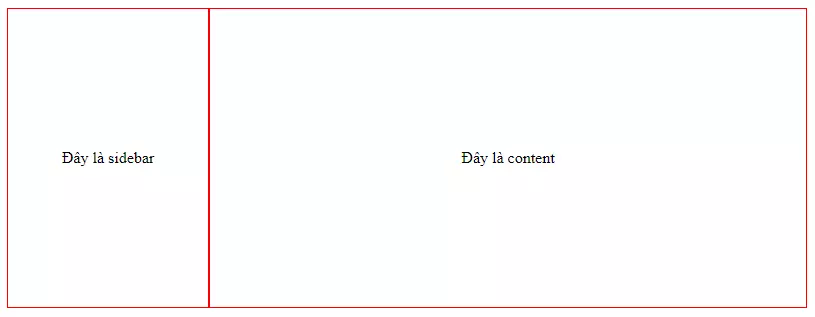
Given a container div outside, inside there are 2 sub divs A and B. How is the code so that div A is 200px wide, and div B has width is the rest.
In a nutshell, the result should look like this.
There are many ways to implement the above layout, such as:
- Set width for B is
width: calc(100% - 200px); - Use the
flex-grow: 1;for B - Use the
flex: 1;propertyflex: 1;for B (also shorthand forflex-grow: 1; - …
With method 1, you use the calc() function to subtract the width of A. However, if you do not know the width of A, you cannot use this method.
So, only the use of the flex-grow: 1; . However, this property has an unusual behavior that is immediately covered here.
2. Overflow error when using flex-grow
Oh forget, I will add the example code here for you to easily imagine.
1 2 3 4 5 6 7 8 9 10 11 12 | <span class="token tag"><span class="token tag"><span class="token punctuation"><</span> html</span> <span class="token punctuation">></span></span> <span class="token tag"><span class="token tag"><span class="token punctuation"><</span> head</span> <span class="token punctuation">></span></span> <span class="token tag"><span class="token tag"><span class="token punctuation"><</span> link</span> <span class="token attr-name">rel</span> <span class="token attr-value"><span class="token punctuation">=</span> <span class="token punctuation">"</span> stylesheet <span class="token punctuation">"</span></span> <span class="token attr-name">href</span> <span class="token attr-value"><span class="token punctuation">=</span> <span class="token punctuation">"</span> ./style.css <span class="token punctuation">"</span></span> <span class="token punctuation">></span></span> <span class="token tag"><span class="token tag"><span class="token punctuation"></</span> head</span> <span class="token punctuation">></span></span> <span class="token tag"><span class="token tag"><span class="token punctuation"><</span> body</span> <span class="token punctuation">></span></span> <span class="token tag"><span class="token tag"><span class="token punctuation"><</span> div</span> <span class="token attr-name">id</span> <span class="token attr-value"><span class="token punctuation">=</span> <span class="token punctuation">"</span> container <span class="token punctuation">"</span></span> <span class="token punctuation">></span></span> <span class="token tag"><span class="token tag"><span class="token punctuation"><</span> div</span> <span class="token attr-name">id</span> <span class="token attr-value"><span class="token punctuation">=</span> <span class="token punctuation">"</span> A <span class="token punctuation">"</span></span> <span class="token punctuation">></span></span> Đây là sidebar <span class="token tag"><span class="token tag"><span class="token punctuation"></</span> div</span> <span class="token punctuation">></span></span> <span class="token tag"><span class="token tag"><span class="token punctuation"><</span> div</span> <span class="token attr-name">id</span> <span class="token attr-value"><span class="token punctuation">=</span> <span class="token punctuation">"</span> B <span class="token punctuation">"</span></span> <span class="token punctuation">></span></span> Đây là content <span class="token tag"><span class="token tag"><span class="token punctuation"></</span> div</span> <span class="token punctuation">></span></span> <span class="token tag"><span class="token tag"><span class="token punctuation"></</span> div</span> <span class="token punctuation">></span></span> <span class="token tag"><span class="token tag"><span class="token punctuation"></</span> body</span> <span class="token punctuation">></span></span> <span class="token tag"><span class="token tag"><span class="token punctuation"></</span> html</span> <span class="token punctuation">></span></span> |
1 2 3 4 5 6 7 8 9 10 11 12 13 14 15 16 17 18 19 20 21 22 23 24 25 | <span class="token selector">#container</span> <span class="token punctuation">{</span> <span class="token property">width</span> <span class="token punctuation">:</span> 800px <span class="token punctuation">;</span> <span class="token property">height</span> <span class="token punctuation">:</span> 300px <span class="token punctuation">;</span> <span class="token property">display</span> <span class="token punctuation">:</span> flex <span class="token punctuation">;</span> <span class="token punctuation">}</span> <span class="token selector">#A, #B</span> <span class="token punctuation">{</span> <span class="token property">border</span> <span class="token punctuation">:</span> 1px solid red <span class="token punctuation">;</span> <span class="token comment">/* Căn giữa text */</span> <span class="token property">display</span> <span class="token punctuation">:</span> flex <span class="token punctuation">;</span> <span class="token property">justify-content</span> <span class="token punctuation">:</span> center <span class="token punctuation">;</span> <span class="token property">align-items</span> <span class="token punctuation">:</span> center <span class="token punctuation">;</span> <span class="token punctuation">}</span> <span class="token selector">#A</span> <span class="token punctuation">{</span> <span class="token comment">/* Chiều rộng A là cố định */</span> <span class="token property">width</span> <span class="token punctuation">:</span> 200px <span class="token punctuation">;</span> <span class="token punctuation">}</span> <span class="token selector">#B</span> <span class="token punctuation">{</span> <span class="token comment">/* Để B tự động căn vừa chiều rộng còn lại */</span> <span class="token property">flex-grow</span> <span class="token punctuation">:</span> 1 <span class="token punctuation">;</span> <span class="token punctuation">}</span> |
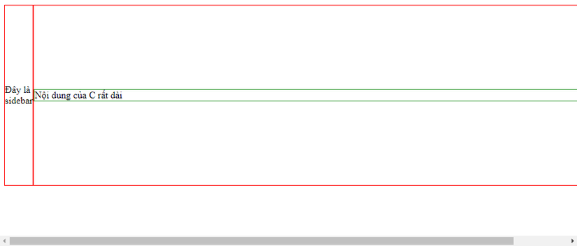
Now let’s add another div C right inside div B. Div C I will give it width: 1000px; to test it out.
1 2 3 4 5 6 7 | <span class="token tag"><span class="token tag"><span class="token punctuation"><</span> div</span> <span class="token attr-name">id</span> <span class="token attr-value"><span class="token punctuation">=</span> <span class="token punctuation">"</span> container <span class="token punctuation">"</span></span> <span class="token punctuation">></span></span> <span class="token tag"><span class="token tag"><span class="token punctuation"><</span> div</span> <span class="token attr-name">id</span> <span class="token attr-value"><span class="token punctuation">=</span> <span class="token punctuation">"</span> A <span class="token punctuation">"</span></span> <span class="token punctuation">></span></span> Đây là sidebar <span class="token tag"><span class="token tag"><span class="token punctuation"></</span> div</span> <span class="token punctuation">></span></span> <span class="token tag"><span class="token tag"><span class="token punctuation"><</span> div</span> <span class="token attr-name">id</span> <span class="token attr-value"><span class="token punctuation">=</span> <span class="token punctuation">"</span> B <span class="token punctuation">"</span></span> <span class="token punctuation">></span></span> <span class="token tag"><span class="token tag"><span class="token punctuation"><</span> div</span> <span class="token attr-name">id</span> <span class="token attr-value"><span class="token punctuation">=</span> <span class="token punctuation">"</span> C <span class="token punctuation">"</span></span> <span class="token punctuation">></span></span> Nội dung của C rất dài <span class="token tag"><span class="token tag"><span class="token punctuation"></</span> div</span> <span class="token punctuation">></span></span> <span class="token tag"><span class="token tag"><span class="token punctuation"></</span> div</span> <span class="token punctuation">></span></span> <span class="token tag"><span class="token tag"><span class="token punctuation"></</span> div</span> <span class="token punctuation">></span></span> |
1 2 3 4 5 6 7 | <span class="token selector">... #C</span> <span class="token punctuation">{</span> <span class="token property">width</span> <span class="token punctuation">:</span> 1000px <span class="token punctuation">;</span> <span class="token property">border</span> <span class="token punctuation">:</span> 1px solid green <span class="token punctuation">;</span> <span class="token punctuation">}</span> |
And this is the result. The interface was overflowed, the scrollbar appeared, the interface was completely broken. It’s so scrary and worsening the user experience.
After a bit of research on the internet, I know this is due to the unusual behavior of the flex-grow . As follows.
By default, flex items won’t shrink below their minimum content size.
By default, the flex item items will not shrink below the minimum width of the content.
That means, if the flex item’s content is too wide (or too high), the flex item will automatically expand accordingly, causing overflow.
3. Super good solution, few people expect
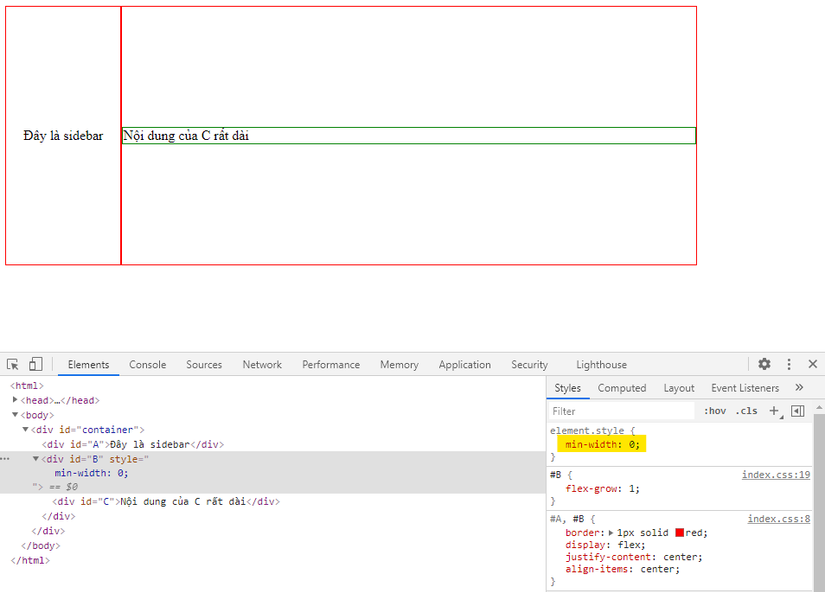
So what is the solution to this problem. It’s very simple, just add the CSS property after min-width: 0; . Surprise
Even though I was surprised (surprisingly hard to understand), with such a simple property, the faulty interface was immediately back to normal.
1 2 3 4 5 6 | <span class="token comment">/* Thêm vào flex item là B chứ không phải C nha */</span> <span class="token selector">#B</span> <span class="token punctuation">{</span> ... <span class="token property">min-width</span> <span class="token punctuation">:</span> 0 <span class="token punctuation">;</span> <span class="token punctuation">}</span> |
This also applies when the layout is arranged vertically. In return just use min-height: 0; instead of min-width: 0; is to be.
Code I share here https://codepen.io/tonghoangvu/pen/QWGOWpw .
Hope through the above article you have learned good tips when working with flexbox. Think back to see if you had a project with a similar layout, and did the same problem happen? Try the solution above, you will be surprised by its benefits.
Article is over here. If you find it interesting and useful, don’t hesitate to vote and clip for me. Bye bye