CSS seems like a fairly simple language, on which it is difficult to make mistakes. You just need to add your rules to style your website and you’re done, right? For small websites that only require a few CSS files, this may be the case. But in large applications, types can quickly get out of control. How do you keep them manageable? The fact is, like any other language, CSS has its own nuances that can create or break your design. Here are 10 tips for CSS – best practices that can help you bring out the best from your style.
1. Do You Really Need a Framework?
First of all, decide if you really need to use CSS frameworks or not. There are now many lightweight alternatives to strong frames. Normally, you won’t be able to use every selector from a frame, so your package will contain dead code. If you only use types like buttons, outsource for your css files. Also you do not use css rules within Devtools.
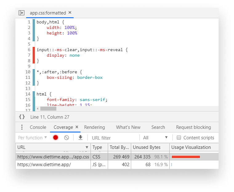
To open it, look for coverage in the tool panel. You can open it with Ctrl + Shift + P. After opening, start recording by clicking on reload icon. All that appears will be red and unused. You can also see that the above example shows up to 98% of unused css. This is not entirely true, there are some css that actually works when it is interacted on the web. For mobile css, it is flagged as unused bytes. So before you remove anything make sure it doesn’t use anywhere
2. Prefer Using a CSS Methodology
Consider a method of using css for your project. The css method is used to create consistency in your css files. They also make the latter easier to expand and maintain. Here are some methods
BEM
BEM: Block, Element, Modifier is the most popular CSS method today. It is a set of name conventions you can create to use as well as reuse. Sample naming rules:
1 2 3 4 | .block { ... } .block__element { ... } .block--modifier { ... } |
- .block is a representation of a component. They often have their own independent meaning and meaning.
- .block__element this is part of .block. They always have to be creamed with a .block, otherwise it doesn’t make sense.
- .block – modifier: They are given a flag for the block or element. We can use them to change the appearance, behavior, element status.
eg .block – hidden.
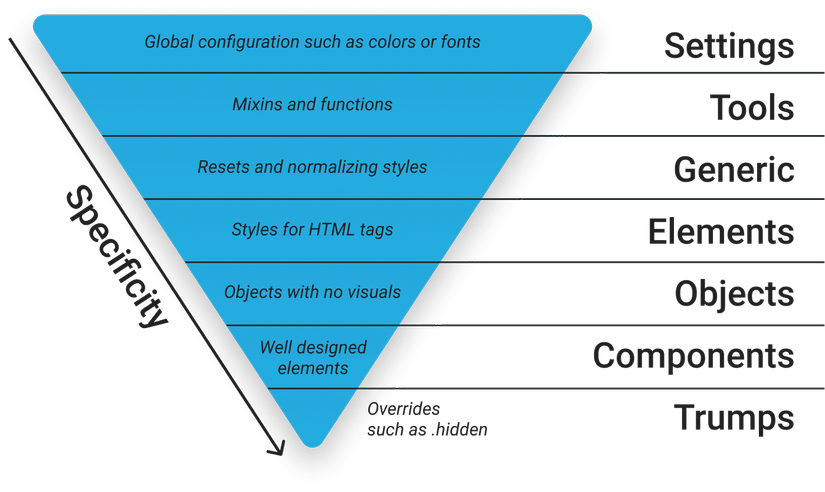
ITCSS
Inverted Triangle CSS helps you to organize your css project by modularization or Idea building css object. New idea of css The inverse triangle is a way of classifying css properties based on their specific level and importance. This is a lesser known method than SMACSS and OOCSS – although both can be combined with ITCSS.
OOCSS
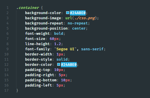
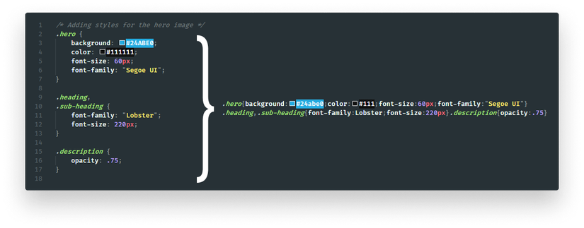
Object-oriented CSS, or OOCSS There are two main principles. This is a technique of grouping multiple elements on a website into a single piece of CSS if they have similar properties. Later on each child element, we can add its own styles if needed to customize
1 2 3 4 5 6 7 8 9 10 11 12 13 14 15 16 17 18 19 20 21 22 23 | /* Instead of */ .box { width: 250px; height: 250px; padding: 10px; border: 1px solid #CCC; box-shadow: 1px 2px 5px #CCC; border-radius: 5px; } /* Do */ .box { width: 250px; height: 250px; padding: 10px; } .elevated { border: 1px solid #CCC; box-shadow: 1px 2px 5px #CCC; border-radius: 5px; } |
2. Separating container and content
This means that you don’t want any element to be dependent on its position. The same elements will look the same no matter where they are on the page.
1 2 3 4 5 6 | /* Instead */ .main span.breadcumb { ... } /* Do */ .breadcrumb { ... } |
3. Set Up a Pre-Processor
Setting up preprocessors is beneficial for you in a variety of ways. The preprocessor is a tool that allows you to use it with advanced features not included in css. These can be variables for even function loops. Many of the earlier processors that are probably best known are Sass, Less and Stylus. I recommend that you use Sass with a very good support community.
Organize your styles better
Preprocessors can help you organize your style better. They can break your file down to a smaller, reusable way
1 2 3 4 5 6 7 8 9 | // Import different modules into one SCSS file @import 'settings'; @import 'tools'; @import 'generic'; @import 'elements'; @import 'objects'; @import 'components'; @import 'trumps'; |
Nest your selectors
This is a great way to increase readability with your nested selectors. This is a simple feature but a powerful boost that css lacks. Hierarchical structure makes it easier to imagine than other cohesive elements
Automatically vendor prefix your rules
There are some features that are not standard or tested with css prefix. Different with each different browser when using the prefix
1 2 3 4 5 | -webkit- : cho các trình duyệt dưa vào Webkit như Chrome, Safari, hoặc Opera version mới. -moz- : FireFox -o- : phiên bản cũ của Opera -ms- : cho IE và Edge |
To support multiple browsers, we have to define properties many times.
1 2 3 4 5 6 7 8 | .gradient { background: rgb(30,87,153); background: -moz-linear-gradient(top, rgba(30,87,153,1) 0%, rgba(41,137,216,1) 50%, rgba(32,124,202,1) 51%, rgba(125,185,232,1) 100%); background: -webkit-linear-gradient(top, rgba(30,87,153,1) 0%, rgba(41,137,216,1) 50%, rgba(32,124,202,1) 51%, rgba(125,185,232,1) 100%); background: linear-gradient(to bottom, rgba(30,87,153,1) 0%, rgba(41,137,216,1) 50%, rgba(32,124,202,1) 51%, rgba(125,185,232,1) 100%); filter: progid:DXImageTransform.Microsoft.gradient(startColorstr='#1e5799', endColorstr='#7db9e8', GradientType=0); } |
The preprocessor helps us solve this problem with mixins – functions that can be used in place of hard coded values.
1 2 3 4 5 6 7 8 9 10 11 12 | @mixin gradient() { background: rgb(30,87,153); background: -moz-linear-gradient(top, rgba(30,87,153,1) 0%, rgba(41,137,216,1) 50%, rgba(32,124,202,1) 51%, rgba(125,185,232,1) 100%); background: -webkit-linear-gradient(top, rgba(30,87,153,1) 0%, rgba(41,137,216,1) 50%,rgba(32,124,202,1) 51%, rgba(125,185,232,1) 100%); background: linear-gradient(to bottom, rgba(30,87,153,1) 0%, rgba(41,137,216,1) 50%,rgba(32,124,202,1) 51%, rgba(125,185,232,1) 100%); filter: progid:DXImageTransform.Microsoft.gradient(startColorstr='#1e5799', endColorstr='#7db9e8', GradientType=0); } .gradient { @include gradient(); } |
Instead of writing over and over again, you can only include the mixin whenever you need it.
Using post-processors
An even better option than a post-processor. It can run additional optimizations for your CSS created by the preprocessor. One of the best PostCss post processors .
You can use PosCss to automatically add elements to your CSS rules so you don’t have to worry about leaving major browsers.
Another great post processor is autoprefixer. With autoprefixer, when you want to support the latest four versions – you’ve completed them all without having to write any vendor prefixes in your CSS files!
1 2 3 4 5 6 7 | const autoprefixer = require('autoprefixer')({ browsers: [ 'last 4 versions', 'not ie < 9' ] }); |
Use configs for consistent designs
In addition to mixins, you also have the option to use variables. Combined with a liar, you can enforce design rules.
1 2 3 4 5 6 7 8 | // Font definitions $font-12: 12px; $font-21: 21px; // Color definitions $color-white: #FAFAFA; $color-black: #212121; |
4. Use Markup Instead of CSS
Now, let’s move to the actual CSS. This is often overlooked. Usually, you can reduce the size of your CSS packages by using the correct HTML components. Suppose you have a title with the following set of rules:
1 2 3 4 5 6 7 | span.heading { display: block; font-size: 1.2em; margin-top: 1em; margin-bottom: 1em; } |
You can use the span element as a title. You override the default screen, spacing or font style. This can be avoided by using h1, h2 or h3 instead. By default, they have the types you are trying to achieve with other elements. You can immediately get rid of four unnecessary rules.
5. Use Shorthand Properties
To further reduce the number of rules, always try to go with shorthand properties. For the above example, we can say:
1 2 3 4 | .heading { margin: 1em 0; } |
This is true for other attributes like paddings, borders or background
6. Reduce Redundancy
This goes hand in hand with the previous point. Sometimes it is difficult to detect redundancy, especially when there are no repeated Typing rules in the same order in both selectors. But if your classes are different in just one or two rules, then it is better to outsource those rules and use them as an additional class. Instead of this:
1 2 3 4 5 6 7 8 9 10 11 12 13 14 15 16 17 18 19 20 21 | <style> .warning { width: 100%; height: 50px; background: yellow; border-radius: 5px; } .elevated-warning { width: 100%; height: 50px; font-size: 150%; background: yellow; box-shadow: 1px 2px 5px #CCC; border-radius: 5px; } </style> <div class="warning">⚠️</div> <div class="elevated-warning">?</div> |
Try to go with a similar approach:
1 2 3 4 5 6 7 8 9 10 11 12 13 14 15 16 17 | <style> .warning { width: 100%; height: 50px; background: yellow; border-radius: 5px; } .warning--elevated { font-size: 150%; box-shadow: 1px 2px 5px #CCC; } </style> <div class="warning">⚠️</div> <div class="warning warning--elevated">?</div> |
7. Avoid Complex Selectors
There are two major problems with using complex selectors. First, your increased specificity will not only make it more difficult to rewrite existing rules, but also increase the time it takes for the browser to match the selectors.
Matching selectors
When your browser is trying to interpret selectors and decide which element is appropriate, they will go from right to left. This is faster in performance than the other way around. Let us take the selector below as an example.
1 2 3 4 | .deeply .nested .selector span { ... } |
Your browser will first start from the span. It will match all span tags then move to the next tag. It will filter out spans within a .selector class, etc. It is not recommended to use tags for CSS selectors because it will fit every tag. Although the difference can only be measured in a fraction of a millisecond, the little things are small. More importantly, it practices well to reduce complexity for another reason.
Understanding the selector
It is not only difficult for analytical machines, but also difficult for humans to do that. Take the following example as an example:
1 2 3 4 | [type="checkbox"]:checked + [class$="-confirmation"]::after { ... } |
When do you think the above rule will apply? This can be simplified by creating a custom class and converting it with JavaScript.
1 2 3 4 | .confirmation-icon::after { ... } |
Now it looks much more comfortable. If you still find yourself needing an overly complicated selector and you believe you have no other choice, please leave a comment below explaining your solution.
1 2 3 4 5 6 7 8 9 10 | /** * Creates a confirmation icon after a checkbox is selected. * Select all labels ending with a class name of "-confirmation" * that are preceeded by a checked checkbox. * PS.: There's no other way to get around this, don't try to fix it. **/ .checkbox:checked + label[class$="-confirmation"]::after { ... } |
8. Don’t Remove Outlines
This is one of the most common mistakes that developers make when writing CSS. Although you may think that there is nothing wrong with deleting the outline that the sketch creates, in reality, you made the site inaccessible. It is common practice to add this rule as a reset for your CSS.
1 2 3 4 | :focus { outline: none; } |
However, this way, users who only have keyboard navigation won’t know anything about what their focus is on your site.
If the default styles seem bad for your brand, create custom outlines. Just make sure there is some kind of indication when it comes to focus elements.
9. Use Mobile First
When you have to deal with media queries, always use a mobile phone first. The first approach on mobile means that you started writing CSS for small screen devices first and built from there. This is also called enhancing progress. This will ensure that you mainly add additional rules to cater to large screen devices, instead of rewriting existing CSS rules. This may reduce the number of rules you end up with. How can you know if you use a mobile phone first? If your media query uses the minimum width, you can be on the right track.
1 2 3 4 5 6 7 8 9 10 | /* Mobile-first media query, everything above 600px will get the below styles */ @media (min-width: 600px) { /* your CSS rules */ } /* Non mobile-first media query, everything below 600px will get the below styles */ @media (max-width: 600px) { /* your CSS rules */ } |
10. Compress
Finally, compress your packages to reduce their size. Compression eliminates comments and whitespace your packages require less bandwidth.
If you have copyright, turn on the server side compression. Another great way to further reduce your CSS size – and markup is to hide the class name.
To achieve this, you have several options based on your project settings:
- Webpack: you can use the css-loader module.
- Gulp: you can use gulp-minify-cssnames plugin.
- Create for yourself You can refer to the instructions here: https://medium.com/swlh/how-i-reduced-my-css-bundle-size-by-more-than-20-76433e7330eb
Summary
Benefits found if you follow the steps above with your css file:
- Lighter
- Easy to maintain
- Easier to expand
Reference links :
http://getbem.com/introduction/
https://medium.com/better-programming/10-best-practices-for-improving-your-css-84c69aac66e
https://thachpham.com/web-development/html-css/oocss-voi-sass.html