Text fields according to Material design standards
- Tram Ho
Text field helps users enter and edit text.
1. Using text field
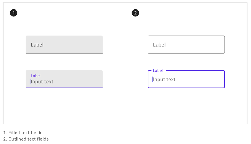
Text fields are divided into 2 types:
- Filled text fields
- Outlined text fields.

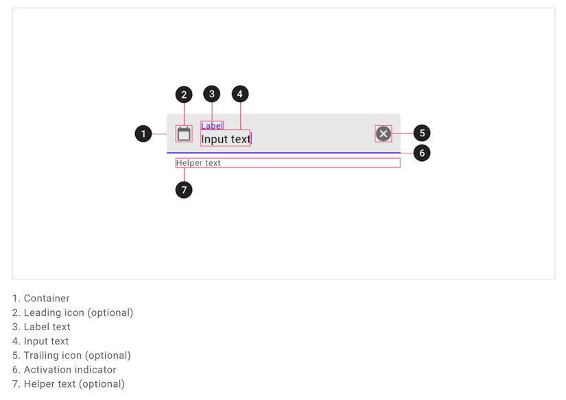
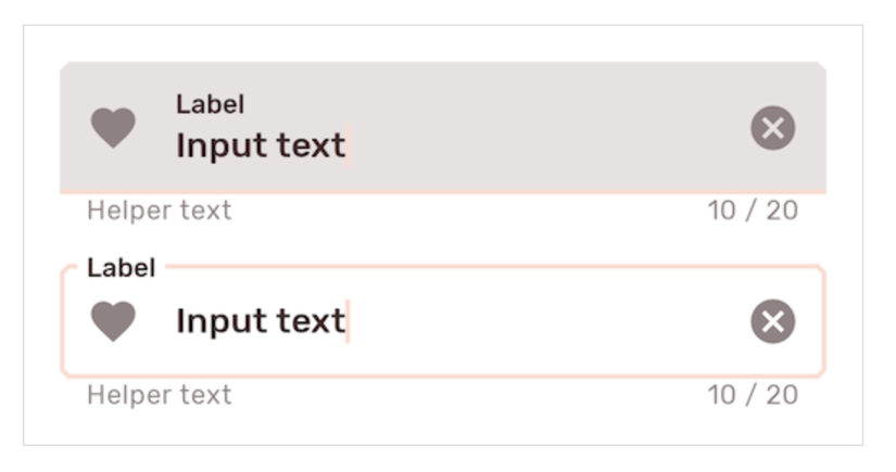
Text field components:
Before you can use Material text fields, you need to add a dependency for the Material Components:
Check if Google’s Maven Repository google() is available:
1 2 3 4 5 6 7 | allprojects { repositories { google() jcenter() } } |
Add library:
1 2 3 4 5 6 | dependencies { // ... implementation 'com.google.android.material:material:<version>' // ... } |
Once done, I will implement the Text field into the xml file:
1 2 3 4 5 6 7 8 9 10 11 12 13 | <com.google.android.material.textfield.TextInputLayout android:id="@+id/textField" android:layout_width="match_parent" android:layout_height="wrap_content" android:hint="@string/label"> <com.google.android.material.textfield.TextInputEditText android:layout_width="match_parent" android:layout_height="wrap_content" /> </com.google.android.material.textfield.TextInputLayout> |
A text field consists of a TextInputLayout and a TextInputEditText as a child.
Add a leading icon to the text field:
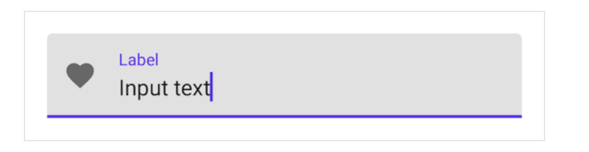
1 2 3 4 5 6 7 8 9 | <com.google.android.material.textfield.TextInputLayout ... app:startIconDrawable="@drawable/ic_favorite_24dp" app:startIconContentDescription="@string/content_description_end_icon"> ... </com.google.android.material.textfield.TextInputLayout> |
Add a trailing icon for the text field: Password touggle:
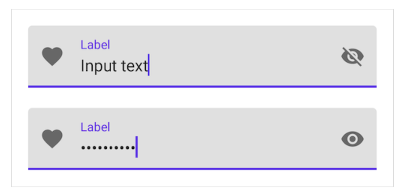
1 2 3 4 5 6 7 8 9 10 11 | <com.google.android.material.textfield.TextInputLayout ... app:endIconMode="password_toggle"> <com.google.android.material.textfield.TextInputEditText ... android:inputType="textPassword" /> </com.google.android.material.textfield.TextInputLayout> |
Clear text:
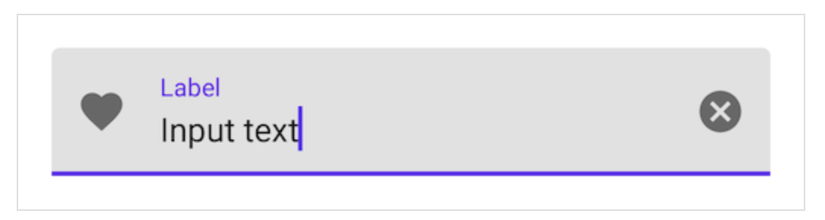
1 2 3 4 5 6 7 8 | <com.google.android.material.textfield.TextInputLayout ... app:endIconMode="clear_text"> ... </com.google.android.material.textfield.TextInputLayout> |
Add text helper for text field:
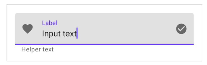
1 2 3 4 5 6 7 8 9 | <com.google.android.material.textfield.TextInputLayout ... app:helperTextEnabled="true" app:helperText="@string/helper_text"> ... </com.google.android.material.textfield.TextInputLayout> |
Add a counter text to the text field:
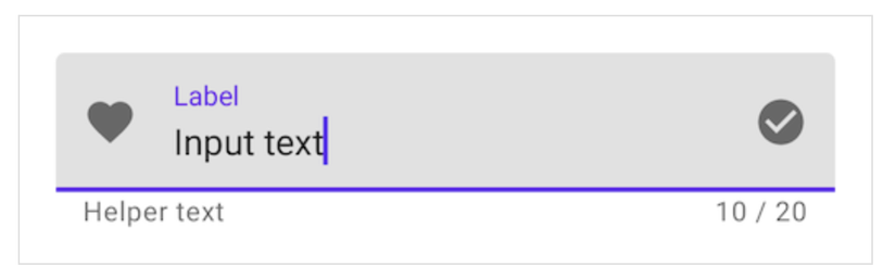
1 2 3 4 5 6 7 8 9 | <com.google.android.material.textfield.TextInputLayout ... app:counterEnabled="true" app:counterMaxLength="20"> ... </com.google.android.material.textfield.TextInputLayout> |
Add error text to the text field:
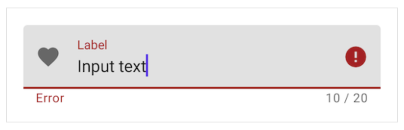
1 2 3 4 5 6 7 8 | <com.google.android.material.textfield.TextInputLayout ... app:errorEnabled="true"> ... </com.google.android.material.textfield.TextInputLayout> |
1 2 3 4 5 6 | // Set error text passwordLayout.error = getString(R.string.error) // Clear error text passwordLayout.error = null |
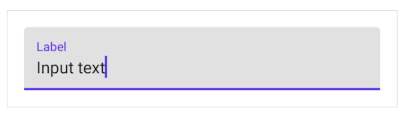
2. Filled text field
Here is a filled text field:
1 2 3 4 5 6 7 8 9 10 11 12 13 | <com.google.android.material.textfield.TextInputLayout android:id="@+id/filledTextField" android:layout_width="match_parent" android:layout_height="wrap_content" android:hint="@string/label"> <com.google.android.material.textfield.TextInputEditText android:layout_width="match_parent" android:layout_height="wrap_content" /> </com.google.android.material.textfield.TextInputLayout> |
1 2 3 4 5 6 7 | // Get input text val inputText = filledTextField.editText?.text.toString() filledTextField.editText?.doOnTextChanged { inputText, _, _, _ -> // Respond to input text change } |
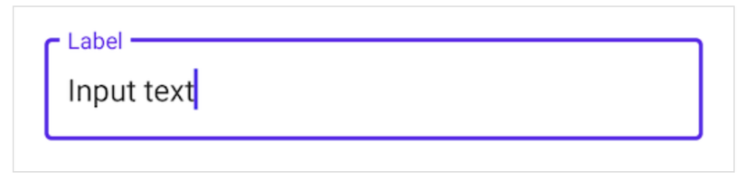
3. Outlined text fields
Here is a outlined text field:
1 2 3 4 5 6 7 8 9 10 11 12 13 14 | <com.google.android.material.textfield.TextInputLayout android:id="@+id/outlinedTextField" android:layout_width="match_parent" android:layout_height="wrap_content" android:hint="@string/label" style="@style/Widget.MaterialComponents.TextInputLayout.OutlinedBox"> <com.google.android.material.textfield.TextInputEditText android:layout_width="match_parent" android:layout_height="wrap_content" /> </com.google.android.material.textfield.TextInputLayout> |
1 2 3 4 5 6 7 | // Get input text val inputText = outlinedTextField.editText?.text.toString() outlinedTextField.editText?.doOnTextChanged { inputText, _, _, _ -> // Respond to input text change } |
4. Theming text fields
Here is an example of filled and oulined text fields using Material Theming:
Implement text filed theming:
Use theme attributes and styles in res/values/styles.xml:
1 2 3 4 5 6 7 8 9 10 11 12 13 14 15 16 17 18 19 20 21 22 23 24 25 | <style name="Theme.App" parent="Theme.MaterialComponents.*"> ... <item name="colorPrimary">@color/shrine_pink_100</item> <item name="colorOnSurface">@color/shrine_pink_900</item> <item name="colorError">@color/shrine_red</item> <item name="textAppearanceSubtitle1">@style/TextAppearance.App.Subtitle1</item> <item name="textAppearanceCaption">@style/TextAppearance.App.Caption</item> <item name="shapeAppearanceSmallComponent">@style/ShapeAppearance.App.SmallComponent</item> </style> <style name="TextAppearance.App.Subtitle1" parent="TextAppearance.MaterialComponents.Subtitle1"> <item name="fontFamily">@font/rubik</item> <item name="android:fontFamily">@font/rubik</item> </style> <style name="TextAppearance.App.Caption" parent="TextAppearance.MaterialComponents.Caption"> <item name="fontFamily">@font/rubik</item> <item name="android:fontFamily">@font/rubik</item> </style> <style name="ShapeAppearance.App.SmallComponent" parent="ShapeAppearance.MaterialComponents.SmallComponent"> <item name="cornerFamily">cut</item> <item name="cornerSize">4dp</item> </style> |
Or use default style theme attributes, styles and theme overlays:
1 2 3 4 5 6 7 8 9 10 11 12 13 14 15 16 17 18 19 20 | <style name="Theme.App" parent="Theme.MaterialComponents.*"> ... <item name="textInputStyle">@style/Widget.App.TextInputLayout</item> </style> <style name="Widget.App.TextInputLayout" parent="Widget.MaterialComponents.TextInputLayout.*"> <item name="materialThemeOverlay">@style/ThemeOverlay.App.TextInputLayout</item> <item name="shapeAppearance">@style/ShapeAppearance.App.SmallComponent</item> <item name="hintTextColor">?attr/colorOnSurface</item> </style> <style name="ThemeOverlay.App.TextInputLayout" parent=""> <item name="colorPrimary">@color/shrine_pink_100</item> <item name="colorOnSurface">@color/shrine_pink_900</item> <item name="colorError">@color/shrine_red</item> <item name="textAppearanceSubtitle1">@style/TextAppearance.App.Subtitle1</item> <item name="textAppearanceCaption">@style/TextAppearance.App.Caption</item> <item name="editTextStyle">@style/Widget.MaterialComponents.TextInputEditText.*</item> </style> |
Or use a style in the layout:
1 2 3 4 5 6 7 8 | <com.google.android.material.textfield.TextInputLayout ... style="@style/Widget.App.TextInputLayout"> ... </com.google.android.material.textfield.TextInputLayout> |
Refer:: Material.io https://material.io/components/text-fields