With color, you can bring something more artistic to your application.
Perhaps some designs should have certain colors and not just black and white.
In this tutorial, you’ll learn more about Color in SwiftUI (mostly what you can do with it).
Prerequisites
To follow this tutorial, you will need some basic knowledge about:
- Swift
- At least Xcode 11
Secondary Color
Apple has created Primary and Secondary colors that can be used on text in headlines, etc.The following is a secondary stacking experiment, which automatically adjusts the colors.
1 2 3 4 5 6 7 8 9 | ZStack { Color.secondary Color.secondary.padding() Color.secondary.padding(40) Color.secondary.padding(60) } .frame(width: 250, height: 250) .padding() |

When you turn on Dark Mode in the simulator, it changes color. Secondary processing Light and Dark modes for you.
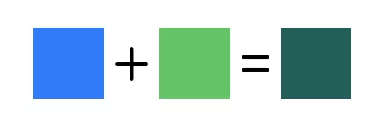
Color Multiply
You can also add colors together and see the results.
1 2 3 4 5 6 7 8 9 | HStack { Color.blue.frame(width: 50, height: 50) Image(systemName: "plus").font(.title) Color.green.frame(width: 50, height: 50) Image(systemName: "equal").font(.title) Color.blue.colorMultiply(.green).frame(width: 50, height: 50) } .padding() |
Opacity
Sometimes you need a lighter color of a certain color. That is where opacity plays an important role.
1 2 | Color.blue.frame(width: 200, height: 50).opacity(0.2) |

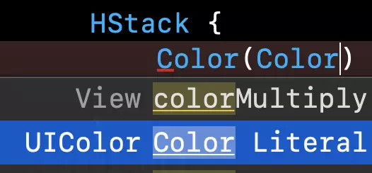
Color Literal
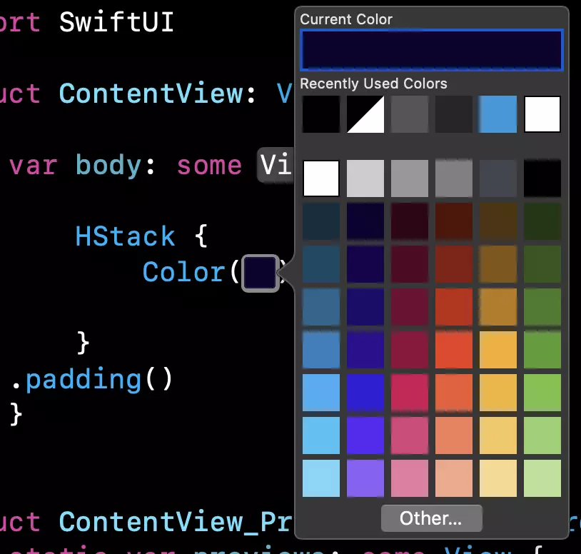
If you like color viewing, you can choose Color Literal . To enable that, you can do the following and select Color Literal .
Now a color will appear and by double clicking on it you will be able to choose your own color.
If you have an idea, you can do more with Color in SwiftUI.
Discover and share what you find.
Thank you for watching this article here.!
Source: Medium.com