Learn about the CSS Box Model
Inside HTML with every element we can call it a “box”. And in CSS, the term Box Model is used to talk about design and layout. We can think of the CSS Box Model as a box around our element and in it there are many different thin layers, those thin layers include: margins, borders, padding and finally the part Our content (text and images). We can see the image below to make it easier to imagine Box Model:
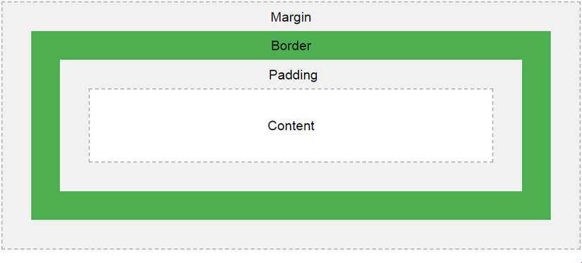
Content: As mentioned above is the part where our text and images appear. Padding: is the next space around the content border: the frame around the padding and the content Margin: finally, the margin is the outermost part of the Box Model, just a blank space. Next, we will go to each part of a Box Model to better understand the properties as well as the correct calculation for a Box Model.
Nội dung
Keep repeating the content as the appearance of the text and the image, this part is nothing special to say, the total size of the text how much (can be large or small if we customize the font-size) or image If the image is large, that’s the size of the content. However, one thing to note is that the content and the two attributes height and width, when we set a height or a width or even both for an element, this height and width only affect that single area. is content, not to mention padding, border or margin. So, the first dimension of the Box Model is content.
Padding
Simply put, padding is the attribute used to create a space around the content and it will be inside the border. When considering padding for an element, we can consider two types:
Consider each side of the element: top, right, bottom and left as follows: padding-top padding-right padding-bottom padding-left Or it is an abbreviation: padding: 5px 6px 8px 7px (top right bottom left) padding : 5px 6px 7px (top right & left bottom) padding: 5px 6px (top & bottom right & left) padding: 5px (for all 4 sides) And we have units to consider padding like:
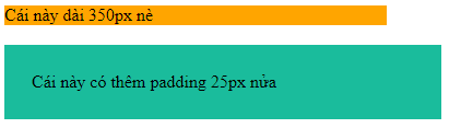
“Unit of length” such as: cm, px, em, etc Percentage (%): this% will depend on the width of the element containing it Inherit: inherits the padding that has been considered in the parent element (or father) fine) There is one more thing to note between padding and width. For example, we give a div with the following property:
div {width: 350px; padding: 25px; } So as mentioned above the width is only considered for each piece of content means that now its content is 350px long excluding padding. So to calculate the length of the div, I have to add 50px half (25px padding on the left and 25px padding on the right) => the total width of the div is 400px.
Border
Border, the next layer of Box Model, ignores its colorful decorative parts, we only consider parts such as border-width or border for the face of the element. First, briefly outline the border structure, it will include:
border-width: the width of the border in units such as: in px, pt, cm, em, etc border-style: style for borders such as lines, dots, dots, … (solid, dotted , double, ..) border-color: the color for the border and it is considered by many ways: color name, hexa value, rgb value or transparent (or transparent) Or the above pile can be rewritten into border: width For example, border color: 2px solid black, that is considered for all 4 sides: top, right, bottom and left, if desired we can consider each side separately with each type as follows:
border-top border-right border-bottom border-left Reviewing the entire border or reviewing on each side will affect the Box Model differently, taking the example of padding earlier.
div {width: 350px; padding: 25px; } As above, we have a div with a width of 400px if we add the border: 5px solid orange, the width of the div will be 410px because it is added 5px of the left border and 5px of the right border. . However, if we only add the border-left: 5px solid orange, the width of the div is only 405px because there is only 5px of left border and the right side, there’s nothing to add.
Margin
The last layer of Box Model is the outer margin layer, margin is an attribute used to create distance around the element to distance the element from other things and the margin will be outside the border. Like padding, margin is also considered in two types, one is:
margin-top margin-right margin-bottom margin-left And the second is the same abbreviation as padding. In terms of units, margin also has the type: “unit of length”,% or inherit as padding. However, the margin also has an additional value, which is margin: auto. When we use this auto, the browser will automatically calculate and set the distance for the element so that it is centered in the container.
One final problem of margin is the margin collapse, we will give an example to be easily explained. For example: We will put h1 and h2 elements in a div with a class of “left” as follows:
Hello
Holle
and continue we will give element h1 with a margin-bottom of 50px and an element h2 with a margin-top of 20px.
div.left h1 {margin-bottom: 50px; } div.left h2 {margin-top: 20px; } If we look at the above, we will think that these two h1 and h2 guys will be 70px apart (50px + 20px). However, due to this margin collapse, our h1 h2 elements are only 50px apart 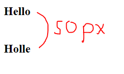
To be clear, we will write another div with class “right” and still with 2 HTML lines of the other h1 and h2. However, we will show h1 with a margin-bottom of 70px for comparison.
div.right h1 {margin-bottom: 70px; } And here is our result:
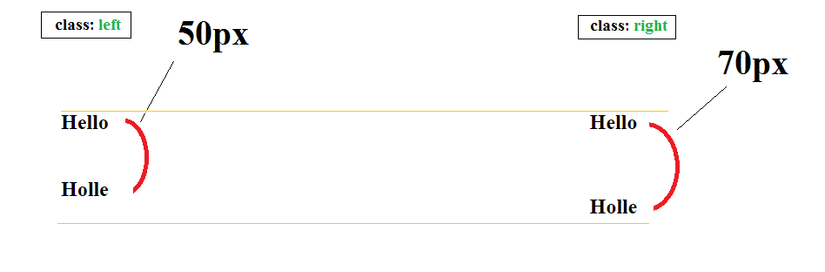
As we have seen, on the “left” class, even though there is both a margin-bottom: 50px of h1 and a margin-top: 20px of h2, the distance is still only 50px smaller than the margin-bottom: 70px of h1 on the “right” class. That is margin collapse.
In a nutshell, based on Box Model knowledge, if we had a div element, for example, it would look like this:
div {background-color: # 1abc9c; width: 300px; padding: 30px; border: 10px solid black; margin: 20px; } Note that the background-color of the body has been changed to # e0e0e0
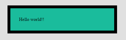
Then its width will be 420px calculated as follows: (temporarily called total) total = width + right padding + left padding + right border + left border + right margin + left margin total = 300px + 30px + 30px + 10px + 10px + 20px + 20px = 420px. This is an important knowledge we need to understand to apply to creating web layouts or to later when the HTML and CSS code will not be confused when the code touches these: 3.