Smartwatch Wars: The Apple Watch versus Android Wear, in screenshots (Part 1)
- Diem Do
No one has really figured out what a smartwatch should look like yet, but one thing is for sure: Google and Apple have taken vasty different routes to getting a computer on your wrist. To show just how different, we put together this gallery of similar screens from the Apple Watch and Android Wear. They should be easy enough to tell apart: the Apple Watch is the square one, while the Android Wear screenshots are all from the Moto 360 and are therefore (mostly) round.

While we know just about everything there is to know about the Moto 360, the Apple Watch isn’t actually a released product yet, so we’re going off our best educated guess for some of these. We had to swipe pictures from Apple’s promotional images (which sadly weren’t a super-high resolution), and it was up to us to crop them into a “screenshot.”
Apple hasn’t released specs for the screen, and where exactly the bezel stops and starts in many of Apple’s promotional shots is up to interpretation. By our calculations, though, and by using enlightening images like this, it looks like the Apple Watch has a 4:5 aspect ratio. The watch OS (we don’t know the operating system’s name yet) usually has a black background picture on a black bezel, so to maximize screen space, Apple often puts UI elements right against the edge of the screen, allowing the bezel to act as the “padding” that would traditionally be in a well-designed interface.
Of course one is round and one is square, but the biggest difference between the two platforms is information density. Google seems content with only a few lines of text OR one button per screen, while Apple seems to want to pack as much into a single screen as it can. It’s almost the complete opposite of what you would expect from the two companies: Google built an airy, picture-heavy OS, while Apple built a more powerful, denser OS with an all-black motif.
Fitt’s law is in full effect here. Google’s huge one-per-screen buttons will be easier to hit in a hurry, but getting to the one you want will require more scrolling. Apple doesn’t require as much scrolling, but tapping the smaller buttons will take more aim and care.
Apple’s watch OS is so dense it has added a side-mounted jog dial (a “digital crown” in Apple-speak), which will let you “tab” through screen options. This means targets don’t need to be large enough for touch and allows users to interact with the screen without covering it. Ironically, smartphone Android supports touchscreens, d-pads, keyboards, mice, trackballs, video game controllers, and nearly every input method on Earth, but none of that made it to Android Wear, which only supports a touchscreen.
Apple is also taking a much more app-centric approach, putting apps on the main screen, just like on a smartphone. Google’s watch OS is primarily notification driven, with the “app drawer” buried several screens deep into the OS or hidden behind a verbal “start [app name].” Apple rarely demoed voice commands—all of its apps and features seem usable with tap or jog dial input—while Android Wear depends on voice input for many features.
Google also seems to want to keep much more control over its OS than Apple. The gateway to features in Android Wear is voice, and only Google can add new voice commands. Apps are really just “providers” for features Google has deemed acceptable to implement on a watch, unless you want to go slog through the clumsy, secondary “start app” ghetto. Apple’s main interface—the app bubbles on the home screen—is seemingly a free-for-all for any app, just like an app drawer. Even the example devices at the unveiling had around 50 apps.
Basically, Google has built a voice command and notification platform, while Apple is building a mini smartphone. The Apple Watch OS has an app-centric layout that will seemingly fling wide the doors to the app ecosystem, allowing third parties to come up with use cases for its watch. Google, on the other hand, judging by the recent interview it gave to CNET, feels it is its own responsibility to come up with smartwatch use cases, which other apps can then plug into.
The good news for consumers is that there will finally be two major platforms for smartwatches—competition is always good. We’ll see who has the better approach in 2015, when the Apple Watch and Android Wear can finally duke it out in the market.
We’ll start off with the biggest difference between the two devices: the home screen. The Apple Watch shows a bunch of app icons, while the 360 shows the time and last notification.
Here’s the Apple Watch app interface versus the Android Wear app interface. Wear buries this interface several taps deep, making apps not much of a focus for the platform.
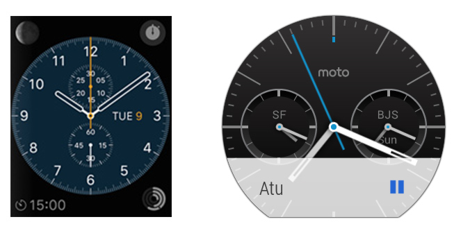
A clock face for each platform. Our understanding is that Apple uses the watch face as a kind of “lock screen” which pops up when you first look at it, but the home button takes you to the app grid.
Part 2
Source : arstechnica.com