When you switch your application from Android to AndroidX, you also switch from using the Design Support Library to using Material Components . It’s also possible that you are lucky to start an AndroidX application from scratch and use these new libraries right away. In both cases, the core utilities that you incorporate into your application are now mostly included in the com.google.android.material package, which contains many themes / style attributes. This article will only cover new theme attributes and per-widget style attributes.
Let’s begin
I. Initial setup
First you need to add this line in the build.gradle file:
implementation "com.google.android.material:material:$material_version"
Material Components for Android is being actively developed. The first release is 1.1.0 and at the time of writing, the latest version is 1.1.0-alpha10. You can follow the new releases on Github .
II. Select Material Components theme
Just like the themes in AppCompat, Material Components themes provide a few variations for you to choose from:
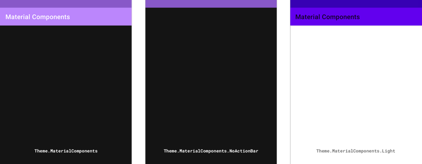
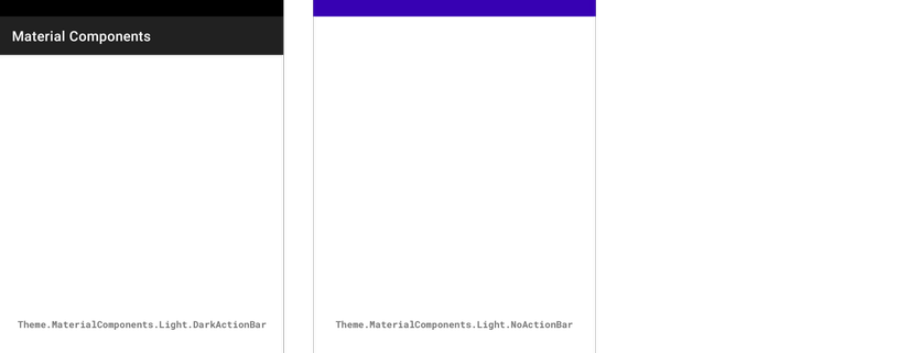
The main differences in each variation are the light / dark palette and the inclusion or exclusion of the ActionBar in each Activity. There are Day / Night variants of these to support automatic light / dark themes.
To start using one of the above themes in your application, add the following lines to the file res/styles.xml :
1 2 3 4 | <span class="token operator"><</span> style name <span class="token operator">=</span> <span class="token string">"AppTheme"</span> parent <span class="token operator">=</span> <span class="token string">"Theme.MaterialComponents.*"</span> <span class="token operator">></span> <span class="token operator"><</span> <span class="token operator">!</span> <span class="token operator">--</span> Add attributes here <span class="token operator">--</span> <span class="token operator">></span> <span class="token operator"><</span> <span class="token operator">/</span> style <span class="token operator">></span> |
Finally, declare in the manifest file as follows:
1 2 3 4 5 6 7 8 | <span class="token operator"><</span> manifest <span class="token punctuation">.</span> <span class="token punctuation">.</span> <span class="token punctuation">.</span> > <span class="token operator"><</span> application android <span class="token operator">:</span> theme <span class="token operator">=</span> <span class="token string">"@style/AppTheme"</span> <span class="token operator">></span> <span class="token punctuation">.</span> <span class="token punctuation">.</span> <span class="token punctuation">.</span> <span class="token operator"><</span> <span class="token operator">/</span> application <span class="token operator">></span> <span class="token operator"><</span> <span class="token operator">/</span> manifest <span class="token operator">></span> |
Note: You can apply android: theme to each <activity> in the Manifest file.
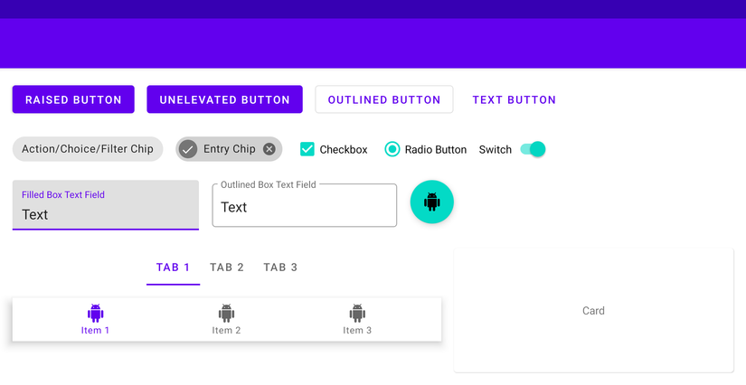
III. Simple playground screen
To illustrate the effects of customizing the properties of Material Components, we need a visual example. We will use the playground screen below, in this screen we will use Theme.MaterialComponents.Light :
IV. Global theme attributes
Material Components themes introduce new properties that can be used to style components on a global scale. They can be divided into 3 groups: color , typography and shape .
1. Color
Color properties include primary , secondary , error , surface and background colors, along with their respective secondary variants. Some of these are reused from AppCompat’s themes (e.g. colorPrimary , colorError and android: colorBackground ):
- colorPrimary : The main color in your application.
- colorPrimaryVariant : A brighter or darker variation of the main color.
- colorOnPrimary : The color used for the components shown above colorPrimary.
- colorSecondary : secondary color in your application, used primarily as a highlight for certain widgets that need to stand out.
- colorOnSecondary : The color used for the components shown on top of colorSecondary.
- colorError : The color used for error messages (Usually red).
- colorOnError : The color used for the components shown above colorError.
- colorSurface : The color used for the surface part.
- colorOnSurface : The color used for the elements shown above your colorSurface.
- android: colorBackground : Background color.
- colorOnBackground : The color used for the elements shown above your background color.
These colors can be added to your theme app as below:
1 2 3 4 5 6 7 8 9 10 11 12 13 14 15 16 | <span class="token operator"><</span> style name <span class="token operator">=</span> <span class="token string">"AppTheme"</span> parent <span class="token operator">=</span> <span class="token string">"Theme.MaterialComponents.Light"</span> <span class="token operator">></span> <span class="token operator"><</span> item name <span class="token operator">=</span> <span class="token string">"colorPrimary"</span> <span class="token operator">></span> # <span class="token number">212121</span> <span class="token operator"><</span> <span class="token operator">/</span> item <span class="token operator">></span> <span class="token operator"><</span> item name <span class="token operator">=</span> <span class="token string">"colorPrimaryVariant"</span> <span class="token operator">></span> # <span class="token number">000000</span> <span class="token operator"><</span> <span class="token operator">/</span> item <span class="token operator">></span> <span class="token operator"><</span> item name <span class="token operator">=</span> <span class="token string">"colorOnPrimary"</span> <span class="token operator">></span> #FFFFFF <span class="token operator"><</span> <span class="token operator">/</span> item <span class="token operator">></span> <span class="token operator"><</span> item name <span class="token operator">=</span> <span class="token string">"colorSecondary"</span> <span class="token operator">></span> # <span class="token number">2962F</span> F <span class="token operator"><</span> <span class="token operator">/</span> item <span class="token operator">></span> <span class="token operator"><</span> item name <span class="token operator">=</span> <span class="token string">"colorSecondaryVariant"</span> <span class="token operator">></span> # <span class="token number">0039</span> CB <span class="token operator"><</span> <span class="token operator">/</span> item <span class="token operator">></span> <span class="token operator"><</span> item name <span class="token operator">=</span> <span class="token string">"colorOnSecondary"</span> <span class="token operator">></span> #FFFFFF <span class="token operator"><</span> <span class="token operator">/</span> item <span class="token operator">></span> <span class="token operator"><</span> item name <span class="token operator">=</span> <span class="token string">"colorError"</span> <span class="token operator">></span> #F44336 <span class="token operator"><</span> <span class="token operator">/</span> item <span class="token operator">></span> <span class="token operator"><</span> item name <span class="token operator">=</span> <span class="token string">"colorOnError"</span> <span class="token operator">></span> #FFFFFF <span class="token operator"><</span> <span class="token operator">/</span> item <span class="token operator">></span> <span class="token operator"><</span> item name <span class="token operator">=</span> <span class="token string">"colorSurface"</span> <span class="token operator">></span> #FFFFFF <span class="token operator"><</span> <span class="token operator">/</span> item <span class="token operator">></span> <span class="token operator"><</span> item name <span class="token operator">=</span> <span class="token string">"colorOnSurface"</span> <span class="token operator">></span> # <span class="token number">212121</span> <span class="token operator"><</span> <span class="token operator">/</span> item <span class="token operator">></span> <span class="token operator"><</span> item name <span class="token operator">=</span> <span class="token string">"android:colorBackground"</span> <span class="token operator">></span> <span class="token annotation punctuation">@color</span> <span class="token operator">/</span> background <span class="token operator"><</span> <span class="token operator">/</span> item <span class="token operator">></span> <span class="token operator"><</span> item name <span class="token operator">=</span> <span class="token string">"colorOnBackground"</span> <span class="token operator">></span> # <span class="token number">212121</span> <span class="token operator"><</span> <span class="token operator">/</span> item <span class="token operator">></span> <span class="token operator"><</span> <span class="token operator">/</span> style <span class="token operator">></span> <span class="token operator"><</span> color name <span class="token operator">=</span> <span class="token string">"background"</span> <span class="token operator">></span> #FAFAFA <span class="token operator"><</span> <span class="token operator">/</span> color <span class="token operator">></span> |
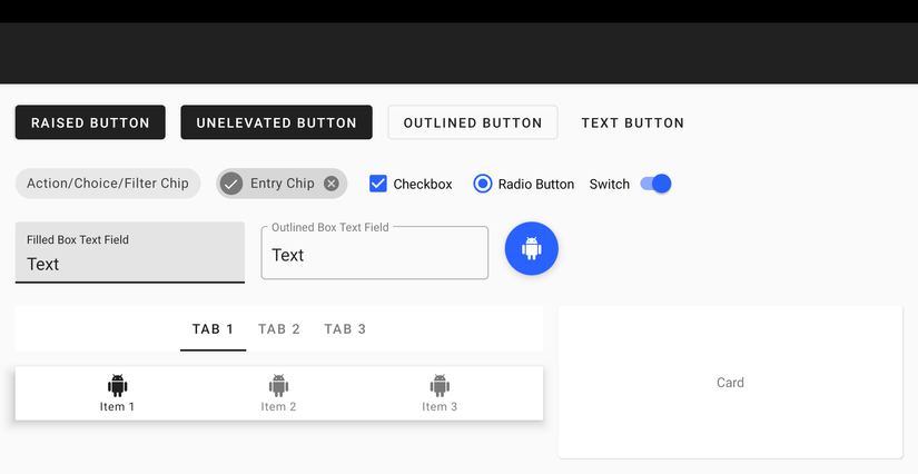
The results can be viewed in the playground screen below:
A great way to quickly preview the appearance of primary / secondary colors is to use Material Color Tools .
2. Typography
All textual properties comply with the Material Type System such as typeface , weight , size , case and letter spacing . Attributes refer to TextAppearance.MaterialComponents.* And are named for different scales:
- textAppearanceHeadline1 : Light, 96sp
- textAppearanceHeadline2 : Light, 60sp
- textAppearanceHeadline3 : Regular, 48sp
- textAppearanceHeadline4 : Regular, 34sp
- textAppearanceHeadline5 : Regular, 24sp
- textAppearanceHeadline6 : Medium, 20sp
- textAppearanceSubtitle1 : Regular, 16sp
- textAppearanceSubtitle2 : Medium, 14sp
- textAppearanceBody1 : Regular, 16sp
- textAppearanceBody2 : Regular, 14sp
- textAppearanceCaption : Regular, 12sp
- textAppearanceButton : Regular, 14sp, all caps
- textAppearanceOverline : Regular, 12sp, all caps
Usually you will want to keep the default weight, size, case, and letter spacing for each style. However, a custom typeface can really make your application stand out. You are thinking of this requiring overwriting each default attribute. Thankfully, this can be done in a more concise manner by adding the following properties to the theme in your application:
1 2 3 4 5 6 | <span class="token operator"><</span> style name <span class="token operator">=</span> <span class="token string">"AppTheme"</span> parent <span class="token operator">=</span> <span class="token string">"Theme.MaterialComponents.Light"</span> <span class="token operator">></span> <span class="token punctuation">.</span> <span class="token punctuation">.</span> <span class="token punctuation">.</span> <span class="token operator"><</span> item name <span class="token operator">=</span> <span class="token string">"fontFamily"</span> <span class="token operator">></span> <span class="token annotation punctuation">@font</span> <span class="token operator">/</span> roboto_mono <span class="token operator"><</span> <span class="token operator">/</span> item <span class="token operator">></span> <span class="token operator"><</span> item name <span class="token operator">=</span> <span class="token string">"android:fontFamily"</span> <span class="token operator">></span> <span class="token annotation punctuation">@font</span> <span class="token operator">/</span> roboto_mono <span class="token operator"><</span> <span class="token operator">/</span> item <span class="token operator">></span> <span class="token operator"><</span> <span class="token operator">/</span> style <span class="token operator">></span> |
These properties refer to the XML Font or Downloadable Font that you add in the res / font directory and will apply a custom font to all utilities and text styles in your application.
However, if you want to customize one of the text appearance types of Material Components, you will do so:
1 2 3 4 5 6 7 8 9 | <span class="token operator"><</span> style name <span class="token operator">=</span> <span class="token string">"AppTheme"</span> parent <span class="token operator">=</span> <span class="token string">"Theme.MaterialComponents.Light"</span> <span class="token operator">></span> <span class="token punctuation">.</span> <span class="token punctuation">.</span> <span class="token punctuation">.</span> <span class="token operator"><</span> item name <span class="token operator">=</span> <span class="token string">"textAppearanceButton"</span> <span class="token operator">></span> <span class="token annotation punctuation">@style</span> <span class="token operator">/</span> AppTextAppearance <span class="token punctuation">.</span> Button <span class="token operator"><</span> <span class="token operator">/</span> item <span class="token operator">></span> <span class="token operator"><</span> <span class="token operator">/</span> style <span class="token operator">></span> <span class="token operator"><</span> style name <span class="token operator">=</span> <span class="token string">"AppTextAppearance.Button"</span> parent <span class="token operator">=</span> <span class="token string">"TextAppearance.MaterialComponents.Button"</span> <span class="token operator">></span> <span class="token punctuation">.</span> <span class="token punctuation">.</span> <span class="token punctuation">.</span> <span class="token operator"><</span> item name <span class="token operator">=</span> <span class="token string">"android:textAllCaps"</span> <span class="token operator">></span> <span class="token boolean">false</span> <span class="token operator"><</span> <span class="token operator">/</span> item <span class="token operator">></span> <span class="token operator"><</span> <span class="token operator">/</span> style <span class="token operator">></span> |
The results can be observed in the playground screen below: 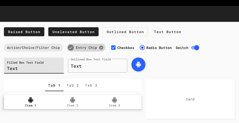
Google Fonts is a great place to start if you’re looking for custom, easy-to-use fonts.
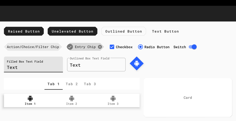
3. Shape
The Shape property refers to the general appearance of each surface in your application. Material Components Corners can be part of the rounded corners (default), or cut cornerFamily and have cornerSize to customize the size. Shape properties refer to ShapeAppearance.MaterialComponents.* Styles:
- shapeAppparentSmallComponent : For small components, such as Buttons and Chips.
- shapeAppparentMediumComponent : For medium components, such as Cards.
- shapeAppparentLargeComponent : For large components, such as Bottom Sheets.
If you want to customize the shape designs of the existing Material Components shapes, you will do the following:
1 2 3 4 5 6 7 8 9 10 11 12 13 14 | <span class="token operator"><</span> style name <span class="token operator">=</span> <span class="token string">"AppTheme"</span> parent <span class="token operator">=</span> <span class="token string">"Theme.MaterialComponents.Light"</span> <span class="token operator">></span> <span class="token punctuation">.</span> <span class="token punctuation">.</span> <span class="token punctuation">.</span> <span class="token operator"><</span> item name <span class="token operator">=</span> <span class="token string">"shapeAppearanceSmallComponent"</span> <span class="token operator">></span> <span class="token annotation punctuation">@style</span> <span class="token operator">/</span> AppShapeAppearance <span class="token punctuation">.</span> SmallComponent <span class="token operator"><</span> <span class="token operator">/</span> item <span class="token operator">></span> <span class="token operator"><</span> item name <span class="token operator">=</span> <span class="token string">"shapeAppearanceMediumComponent"</span> <span class="token operator">></span> <span class="token annotation punctuation">@style</span> <span class="token operator">/</span> AppShapeAppearance <span class="token punctuation">.</span> MediumComponent <span class="token operator"><</span> <span class="token operator">/</span> item <span class="token operator">></span> <span class="token operator"><</span> <span class="token operator">/</span> style <span class="token operator">></span> <span class="token operator"><</span> style name <span class="token operator">=</span> <span class="token string">"AppShapeAppearance.SmallComponent"</span> parent <span class="token operator">=</span> <span class="token string">"ShapeAppearance.MaterialComponents.SmallComponent"</span> <span class="token operator">></span> <span class="token operator"><</span> item name <span class="token operator">=</span> <span class="token string">"cornerFamily"</span> <span class="token operator">></span> cut <span class="token operator"><</span> <span class="token operator">/</span> item <span class="token operator">></span> <span class="token operator"><</span> item name <span class="token operator">=</span> <span class="token string">"cornerSize"</span> <span class="token operator">></span> <span class="token number">8d</span> p <span class="token operator"><</span> <span class="token operator">/</span> item <span class="token operator">></span> <span class="token operator"><</span> <span class="token operator">/</span> style <span class="token operator">></span> <span class="token operator"><</span> style name <span class="token operator">=</span> <span class="token string">"AppShapeAppearance.MediumComponent"</span> parent <span class="token operator">=</span> <span class="token string">"ShapeAppearance.MaterialComponents.MediumComponent"</span> <span class="token operator">></span> <span class="token operator"><</span> item name <span class="token operator">=</span> <span class="token string">"cornerFamily"</span> <span class="token operator">></span> cut <span class="token operator"><</span> <span class="token operator">/</span> item <span class="token operator">></span> <span class="token operator"><</span> item name <span class="token operator">=</span> <span class="token string">"cornerSize"</span> <span class="token operator">></span> <span class="token number">8d</span> p <span class="token operator"><</span> <span class="token operator">/</span> item <span class="token operator">></span> <span class="token operator"><</span> <span class="token operator">/</span> style <span class="token operator">></span> |
The results can be observed in the playground screen below:
V. Summary:
In this article, I have introduced you how to set up Material Components Theme for Android. Hope to be helpful to you  .
.
BECAUSE. References
https://medium.com/over-engineering/setting-up-a-material-components-theme-for-android-fbf7774da739