Responsive Layouts in React Native
- Tram Ho
The responsive layout in the font-end installer is simply a design interface that fits many devices of different sizes and different states. In a mobile setup, doing a responsive layout for multiple mobile devices with multiple devices with different screen sizes and ratios is a relatively difficult task for those who are just starting to get used to the layout. response department.
In part 1, I will share the simplest way to handle responsive layout in case the user rotates the mobile device horizontally.
1. Make a problem
This is the application interface when the device is in portrait state:
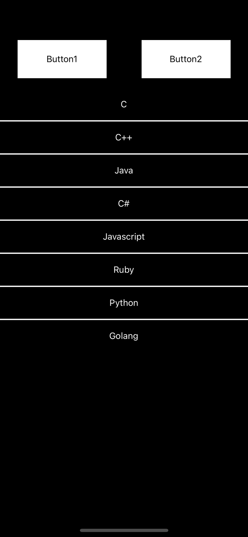
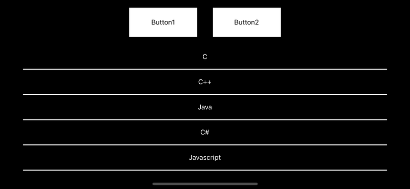
Next is the interface when the device is in landscape state before responding to the response:
Finally, the device interface is in the horizontal screen state after responsive processing:
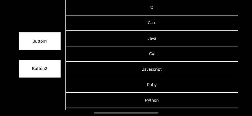
Assuming you’re an app user, which way would you like to use the landscape interface? I have consulted and found that many people will like to use the interface after handling responsive. And this is also proven by the fact that apple has handled the contacts, messages … on its iphone devices in this way.
2. Ideas
To make the interface change when the user rotates the device screen, we need to handle the event related to this operation. After controlling the screen change events on the device, we will proceed to adjust the interface to suit each state.
3. Coding
To catch change events on the screen, I will use the removeEventListener event of Dimensions in react-native
1 2 | static removeEventListener(type, handler) |
This can be used on many screens so I will write a custom hook to use for this:
1 2 3 4 5 6 7 8 9 10 11 12 13 14 15 16 17 | import {useEffect, useState} from 'react'; import {Dimensions} from 'react-native'; export const useOrientation = () => { const [screenInfo, setScreenInfo] = useState(Dimensions.get('screen')); useEffect(() => { const onChange = (res: any) => { setScreenInfo(res.screen); }; Dimensions.addEventListener('change', onChange); return () => Dimensions.removeEventListener('change', onChange); }, []); return { ...screenInfo, isPortrait: screenInfo.height > screenInfo.width, }; }; |
Here I will not explain the custom hook too deeply about the concept, but you can understand that the custom hook in this case will return an object with information related to the screen as follows:
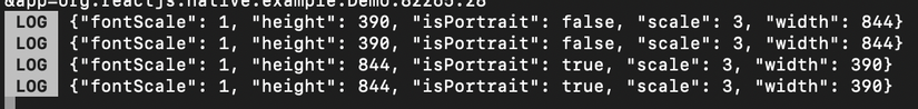
isPortrait : true when the screen is in portrait state, and false when the screen is in landscape state.
Build interface:
1 2 3 4 5 6 7 8 9 10 11 12 13 14 15 16 17 18 19 20 21 22 23 24 25 26 27 28 29 30 31 32 33 34 35 36 37 38 39 | <SafeAreaView style={[ styles.container, {flexDirection: orientation.isPortrait ? 'column' : 'row'}, ]}> <View style={[ styles.buttonContainer, { flexDirection: orientation.isPortrait ? 'row' : 'column', justifyContent: orientation.isPortrait ? 'space-around' : 'center', }, ]}> <TouchableOpacity style={styles.button}> <Text>Button1</Text> </TouchableOpacity> <TouchableOpacity style={styles.button}> <Text>Button2</Text> </TouchableOpacity> </View> {!orientation.isPortrait ? ( <View style={{backgroundColor: '#FFFFFF', height: '100%', width: 2}} /> ) : null} <FlatList<Data> data={[ {key: 'C'}, {key: 'C++'}, {key: 'Java'}, {key: 'C#'}, {key: 'Javascript'}, {key: 'Ruby'}, {key: 'Python'}, {key: 'Golang'}, ]} ItemSeparatorComponent={renderDivider} renderItem={renderItem} /> </SafeAreaView> |
Code style for the interface:
1 2 3 4 5 6 7 8 9 10 11 12 13 14 15 16 17 18 19 20 21 22 23 24 25 26 27 28 | const styles = StyleSheet.create({ container: { flex: 1, backgroundColor: '#000000', }, buttonContainer: { alignItems: 'center', }, button: { height: 60, width: 140, justifyContent: 'center', alignItems: 'center', backgroundColor: '#FFFFFF', margin: 16, }, item: { justifyContent: 'center', alignItems: 'center', height: 50, }, divider: { height: 2, backgroundColor: '#FFFFFF', width: '100%', }, }); |
We will have 2 main views to handle, which are the container (general view of the screen) and buttonContainer (the view that displays the buttons). When the screen is in portrait state, the view will be displayed in ‘column’ state, whereas when the screen is in landscape state, the view will display in ‘row’. The purpose is that when the screen is in landscape state, the buttons will be moved to the left and the rest to the right is the list of items.
With buttonContainer view, when the screen is in portrait state, the buttons will be displayed horizontally and vice versa.
And here is the responsive result when changing the screen state:
4. Conclusion
So in part 1, I shared how to handle responsive layout when the user changes the screen state.
You can refer to the source code at: https://github.com/ducgiangtrankma/ResponsiveLayouts.git
In the next section, I will share how to create a set of size styles according to different screen sizes to handle responsive layout. See you in part 2.