Updated Device Mode (since Chrome 49) is an integral part of DevTools on the first mobile device and extends the main DevTools bar. Learn how to use its controls to simulate a wide range of devices or be fully responsive.
- Test the responsiveness of your website with the screen emulation of Device Mode.
- Save custom presets so you can easily access them later.
- Device mode is not a substitute for actual device testing. Be aware of its limitations.
Use viewport controls
Viewport controls allow you to test your website on a variety of devices, as well as fully responsive. There are two modes:
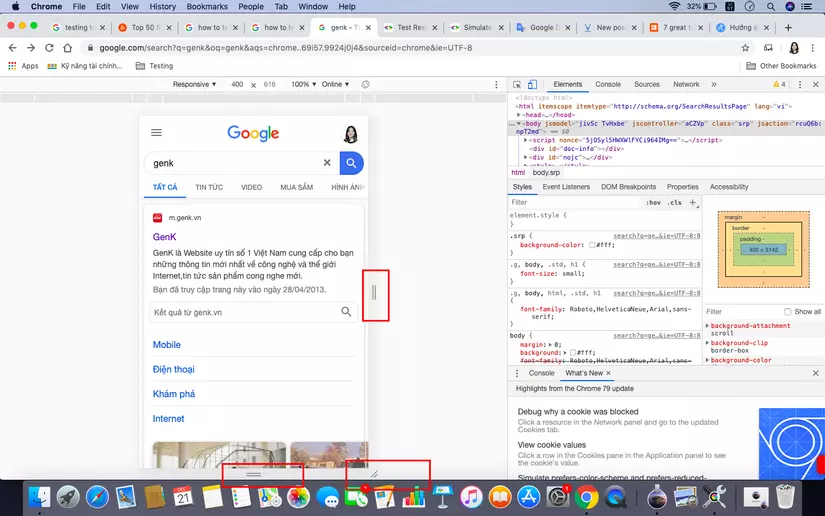
- Responsive: Make Viewport freely resize through large handle on the sides.
- Specific Device: Viewport lock with the exact viewport size of a specific device and simulate certain device characteristics.
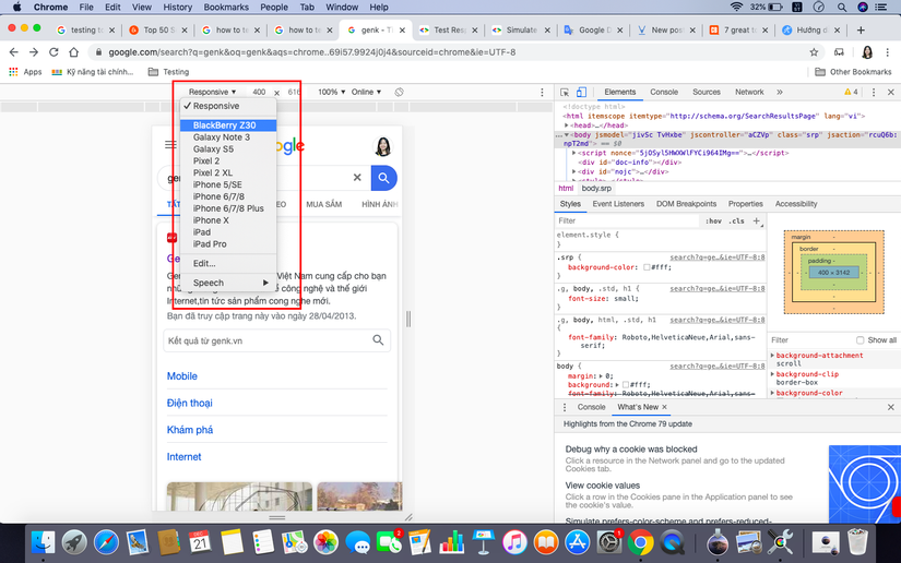
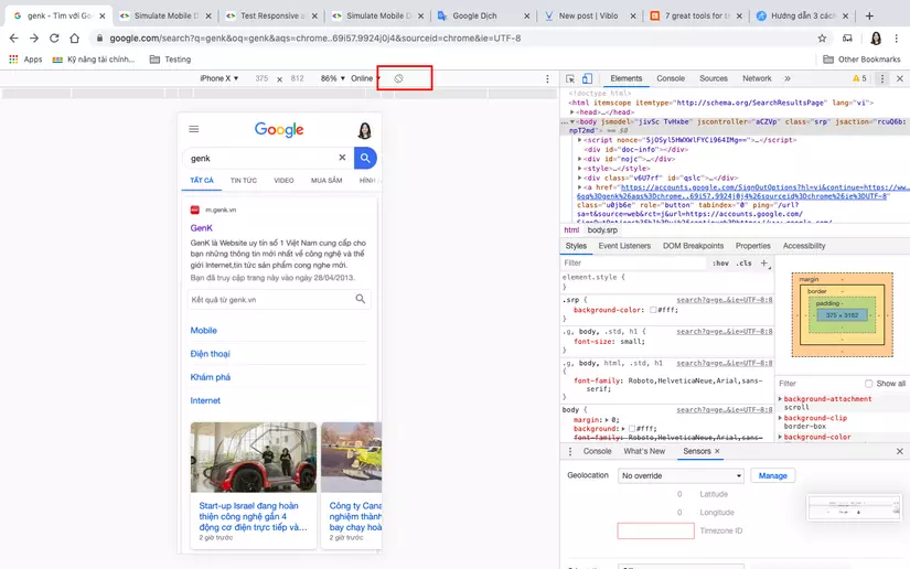
Responsive mode
We recommend using Responsive Mode as the default working mode. Use it in the development process of your website and application and frequently change the viewport size to create a responsive design that freely adapts even and unknown devices in the future. .
To get the most out of Responsive Mode, turn on the Media Queries Bar.
Customize viewport size
Either drag the big resize handles on the viewport or click into the values in the menu bar for finer grained control. Drag the resized handles on the viewport or click the values in the menu bar for more detailed control.
Device-specific mode
Use Device-specific mode when you are about to finish development and want to perfect how your site looks on specific mobile devices (for example, a certain iPhone or Nexus).
Built-in device presets (Built-in device devices)
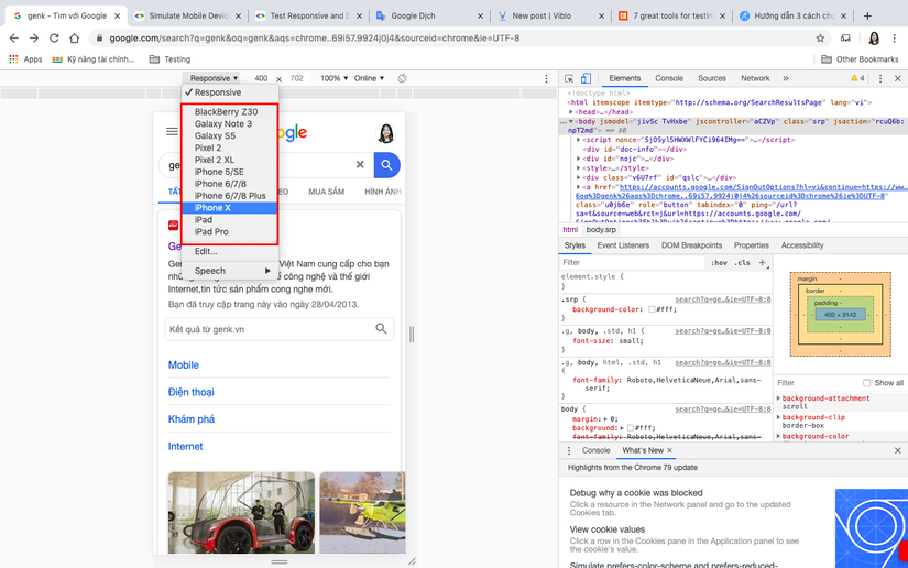
The most popular devices available today are included in the device list. After selecting a device, each such device setting will automatically configure to emulate certain device features:
- Set the string “User Agent” (UA) correctly.
- Set device resolution and DPI (device pixel ratio).
- Simulate touch events (if any).
- Simulate mobile scroll bar and meta viewport.
- Automate text size reduction and reduction for pages without viewport defined.
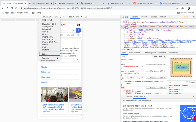
Add custom device settings
Device Mode provides a range of devices to simulate. You can add a customized device if you find an appropriate edge-case device or device that is not guaranteed.
To add a custom device:
- Go to DevTools Settings.
- Click on the Devices tab.
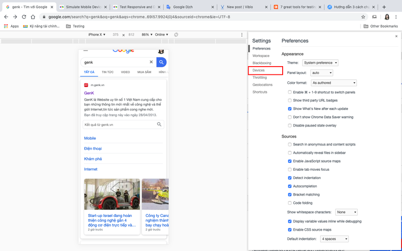
Here you can select additional devices that the tool supports.
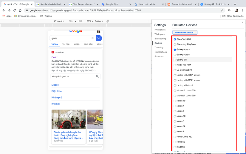
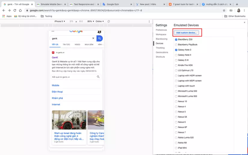
- Click Add custom device to add the device you need to test but not in the tool’s support list.
- Enter the deivce parameters you want to add (device name, width, height, device pixel ratio, and user agent string).
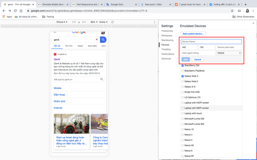
- Click Add. Your custom device is now in the Device dropdown menu.
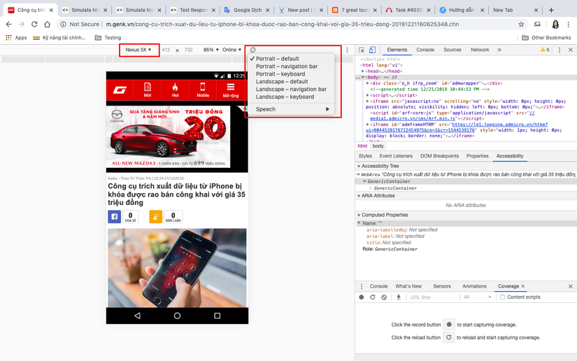
Device status and orientation
When simulating a specific device, the Device Mode toolbar displays an additional control that primarily serves as a way to navigate between landscape and portrait. On selected devices, the control doesn’t just redirect. For supported devices like Nexus 5X, you’ll have a drop-down list that allows you to simulate certain device statuses, like:
- Default browser UI
- With the Chrome navigation bar
- With keyboard open
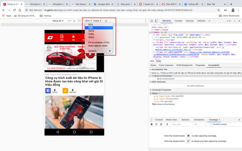
Zoom to fit (Zoom to fit)
Sometimes, you will want to test a device with a resolution greater than the actual available space in your browser window. In these cases, the Zoom to Fit option will be useful:
- Fit to Window will automatically set the zoom level to suit the maximum available space.
- Percentages are obviously useful if you want to check DPI on images, for example.
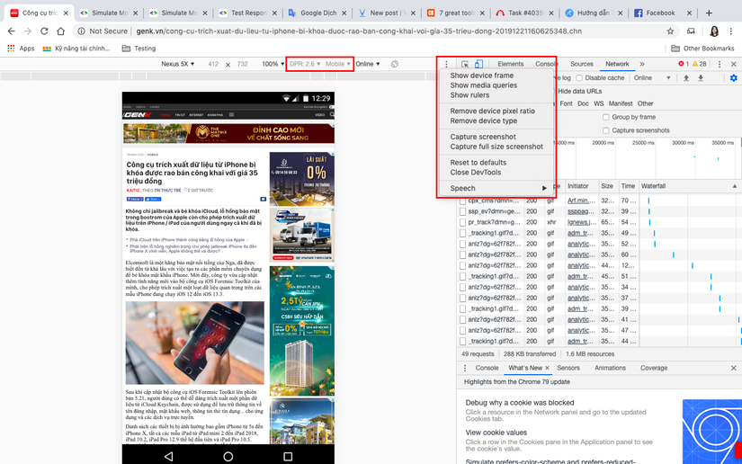
Optional controls (touch, media queries, DPR, …)
Optional controls can be changed or activated by clicking on the three small dots to the right of the device toolbar. Current options include
- User agent type (Emulates UA and touch events)
- Pixel ratio of the device
- Media Queries (Media Queries)
- Rulers
- Configure Network (UA, Network Throttling)
Read on to learn more about specific options.
Device pixel ratio (DPR)
If you want to simulate a Retina device from a device other than Retina or vice versa, adjust the Pixel ratio of the Device. Device aspect ratio (DPR) is the ratio between logical and physical pixels. Devices with Retina displays, such as Nexus 6P, have a higher pixel density than standard devices, which can affect the sharpness and size of image content. Some examples of “Device Pixel Ratio” (DPR) sensitivity on the web are:
Some examples of the sensitivity of the device’s “Pixel ratio” (DPR) on the web:
- CSS media queries like: @media (-webkit-min-device-pixel-ratio: 2), (min-resolution: 192dpi) {…} (* min-resolution resolution minimum)
- CSS image-set rules (CSS image set rules)
- The srcset attribute on the image
- Properties window.devicePixelRatio. If you have the original Retina display, you’ll notice that the “Dots Per Inch” (DPI) assets look low in pixels, while the higher DPI assets are very sharp. To simulate this effect on a standard screen, set DPR to 2 and scale the viewport by zooming in. A 2x property will always look sharp, while a 1x property will look like a pixel.
Media queries
Media queries are an essential part of responsive web design. To view the media query checker, click Show Media queries in the three-dot menu. DevTools detects media queries in your style sheet and displays them as colored bars in the top ruler.
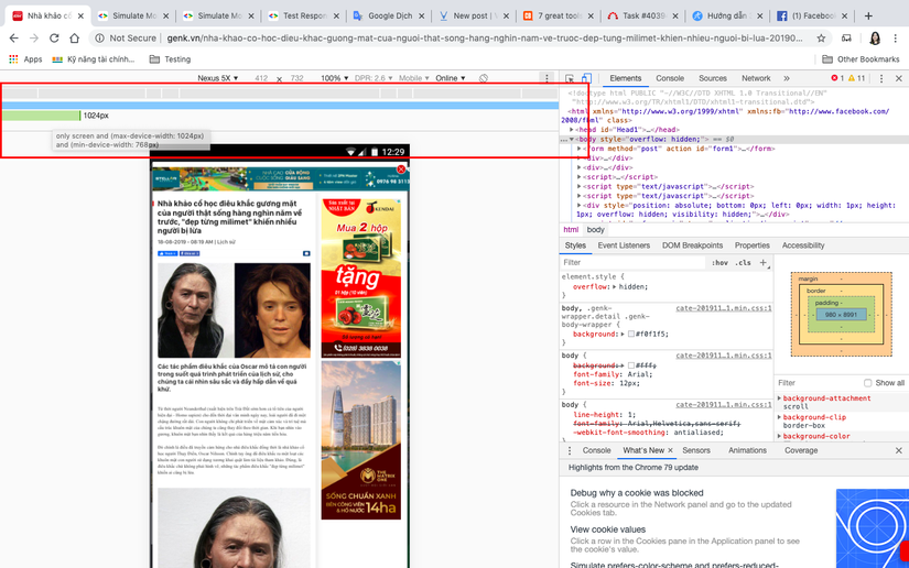
Media queries are color-coded as follows:
| Color | |
|---|---|
| Blue | The query targets the maximum width. |
| Green | Query targeting width in a range. |
| Orange | Query targeting minimum width. |
Quickly preview a media query
Click a media query bar to adjust the viewport size and preview styles for the targeted screen sizes. Click the media query bar to adjust the view size and preview style for the targeted screen size.
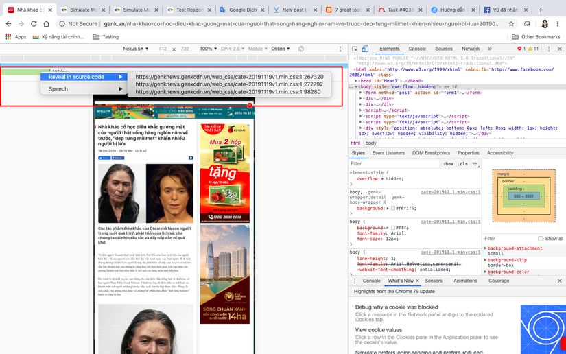
View associated CSS
Right-click on a bar to see where media queries are defined in CSS and navigate to the definition in the source code.
Rulers
Toggle this option to display pixel-based metrics next to viewport.
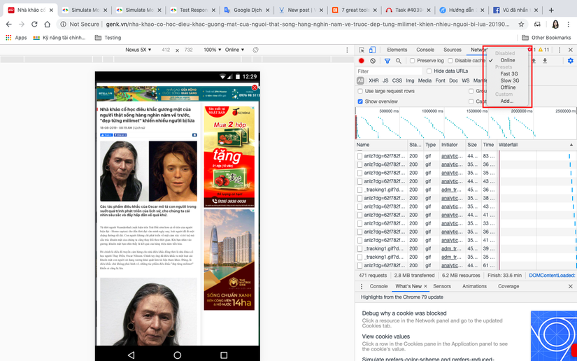
Configure network (UA, network throttling)
Selecting this option opens the Network Conditions drawer, where you can change the following network behaviors:
- Disk Cache: Disabling the Disk Cache prevents pages and their properties from being saved by the browser while DevTools is open.
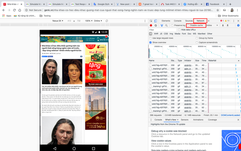
- Network Throttling: Simulate slow network connections.
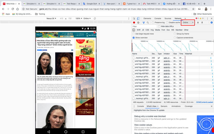
- User Agent: Allows you to override specific UA (User Agent) strings.
Limitations
Device Mode has several limitations:
- Device hardware : The behavior of the GPU and CPU is not simulated.
- Browser UI
- System displays: such as the address bar, cannot be simulated.
- Native displays: such as <select> elements, are not simulated as a method list.
- Some improvements, such as opening keyboard input, may differ from actual device behavior.
- Browser function
- WebGL works in the emulator, but is not supported on iOS 7 devices.
- MathML is not supported in Chrome but is supported on iOS 7 devices.
- HLS playback (HTTP Live Streaming for video) is not supported during simulation, but is supported natively on Android Chrome and iOS.
- IOS 5 orientation zoom error has not been simulated.
- The CSS height line property works in the emulator, but is not supported in Opera Mini.
- CSS rule limits, such as those in Internet Explorer, are not simulated.
- AppCache
- The emulator does not overwrite the UA manifest for AppCache or view the source requests.
Despite these limitations, Device Mode is strong enough for most tasks. When you need to test on real devices, you can use Remote Debugging for more insight.
Reference source :
https://developers.google.com/web/tools/chrome-devtools/device-mode/emulate-mobile-viewports