How many times have you encountered websites with a user interface that looks simple but very nice, extremely “pleasing” to the eyes but don’t really know why? And how many times have you tried designing a UI yourself, feeling frustrated + inhibited, and the end result looked terrible? After all, you still can not escape the dependence on frameworks like Bootstrap that have thousands of pages used exactly the same?
If you are like me, just a backend / frontend developer and have “zero” knowledge of design, but there will still be a time when it comes to design. Perhaps the reason is that the project you join unfortunately lacks designers and developers to design their own, or when you want to make a pet project – your own personal project. These are times when a few small design tips can be very helpful.
During the course of my research, I stumbled upon the book Refactoring UI by Adam Wathan and Steve Schoger. Written exclusively for backend developers or frontend developers who do not specialize in design, the book is less than 300 pages long but summarizes the knowledge – good tips that you can apply in the process of designing your web interface right away. Immediately , not too much depth to the theory (one of the two authors is a developer who used to be very poor in design).
Here, I would like to share a few tips, tricks out of a lot of good knowledge that I have discovered from the book.
1. Which font is appropriate?
The safest solution is to use the system font . The CSS to use a simple system font is as follows:
1 2 3 4 | <span class="token selector">html</span> <span class="token punctuation">{</span> <span class="token property">font-family</span> <span class="token punctuation">:</span> -apple-system, BlinkMacSystemFont, <span class="token string">"Segoe UI"</span> , Roboto, Helvetica, Arial, sans-serif, <span class="token string">"Apple Color Emoji"</span> , <span class="token string">"Segoe UI Emoji"</span> , <span class="token string">"Segoe UI Symbol"</span> <span class="token punctuation">;</span> <span class="token punctuation">}</span> |
The best advantage of using system fonts is that it is both “automatic” and beautiful, while the browser does not need to load more fonts when loading the page, helping to increase page load speed, limiting the display of text. slow or “flashing” font (font phenomenon is changed from fallback font to custom font after it is loaded). This is the solution trusted by GitHub and Medium.
However, it’s not always a good idea to use the default OS font. Sometimes we need to use fonts to impress, identify the brand, … Now, you should find a custom font to use.
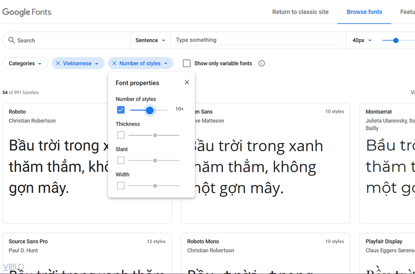
The problem is, it’s not easy to choose a font like that, especially when on Google Fonts there are thousands of different fonts. There is a great tip: try filtering out fonts that have at least 10 styles , which are usually good, beautiful and well-made fonts.
2. Many are not necessarily good
Limit the use of too many font sizes or spacing
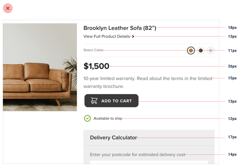
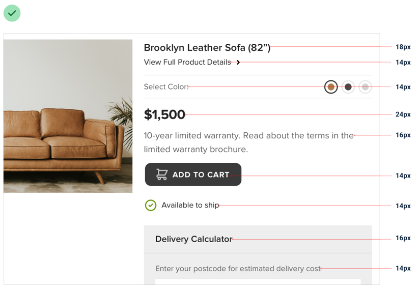
There are times when you wonder which font-size to choose: should this element be 13px or 14px? Is the title in this 20px font too big? This, if repeated, will take a lot of time and cause frustration for yourself.
And the climax of this is that every place you put the font-size one style : although the text is of equal importance, you leave the place at 12px, then 13px, and 14px (?) With pairs. fastidious eyes, when looking at your interface, they will be easy to notice and the feeling of inhibition is inevitable.
In fact, just 7-10 different font-sizes are enough for the need to build a website! So instead of choosing a font-size each time you create an element, try to predefine the font sizes you’ll use throughout the project, giving it memorable names like sm, md, lg, xs ,. ..
The same is true for padding and margin gaps. Instead of thinking of the number of px or em, rem each defining an element, try defining the sizes you will want to use in the project first.
Limit the use of too many colors
Today’s editor or IDE editors are quite modern. When working with CSS, when you need an editor or an IDE, you can open the color picker to make it easy to select inline colors as needed:
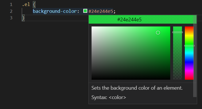
It is easy to see that many newbie when frontend code abuses this feature a lot, each time an element CSS chooses a different color style, so the result is that each color is a style . This inconsistency in color will continue to be a significant inhibitor for fastidious eyes.
The solution continues to be to pre-define the colors you want to use, each with a corresponding color range of 10-12 different shades:
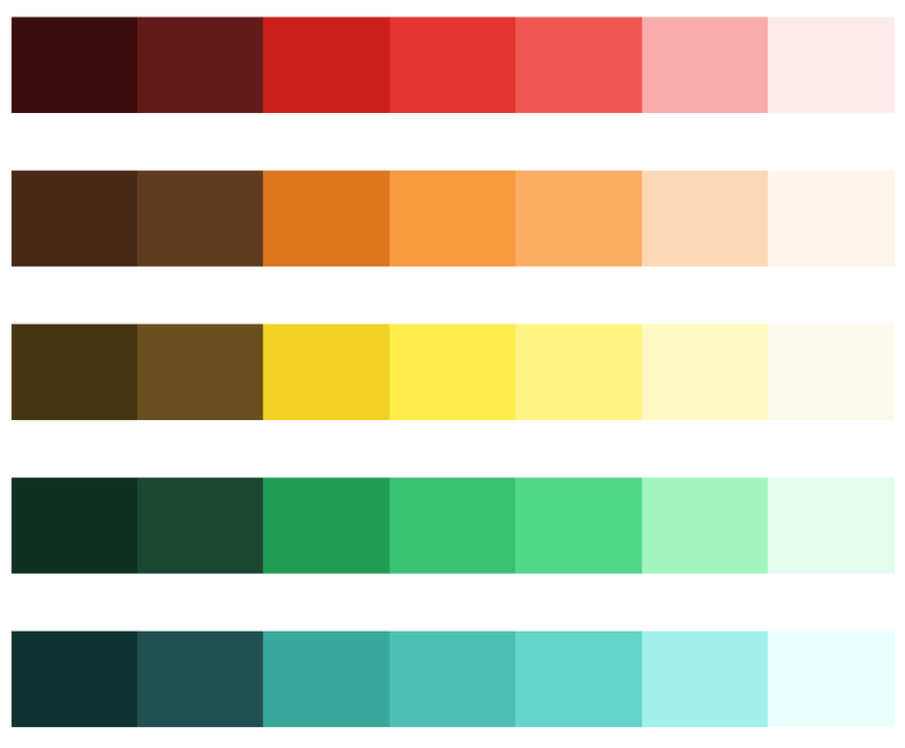
If you find it too difficult to choose, you can refer to the default color palette of Tailwind CSS used, and later customize later according to your preferences. Just for reference, you don’t have to hug the whole Tailwind CSS to the project.
3. Design elements for “more airy”
Limit border use #BordersAreEvil
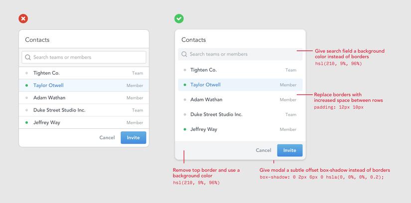
For example, the picture above is enough for you to see that just by removing the border, the above item looks “more open”! Try to use instead of borders when possible:
- With the border surrounding the element to separate the element from the outside, you can use an outer shadow instead.
- To separate the header / footer from the main content, you can set a slightly different background color for that header / footer.
- For the input frames, give it a background-color that is slightly lighter or darker than the background color of the test. Don’t worry, users will easily recognize that it’s an input box!
More generous padding / margin
Chances are you’re designing for elements with too narrow margin / padding.
It is now 2020, most devices have a large screen and is likely to have touch again, ie users manipulate a lot with fingers. Thus spacious margin / padding will give much comfort and feeling of ease of use.
When initially designing, expand the padding / margin of the elements, set the dimensions comfortably, then think about shrinking only when you need it.
(Note: not for all cases).
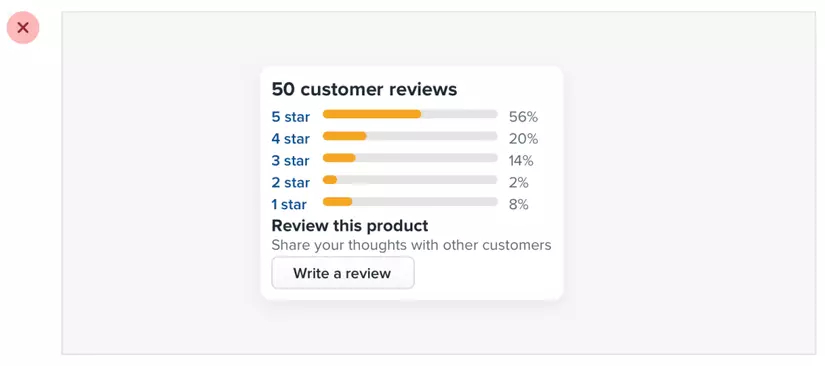
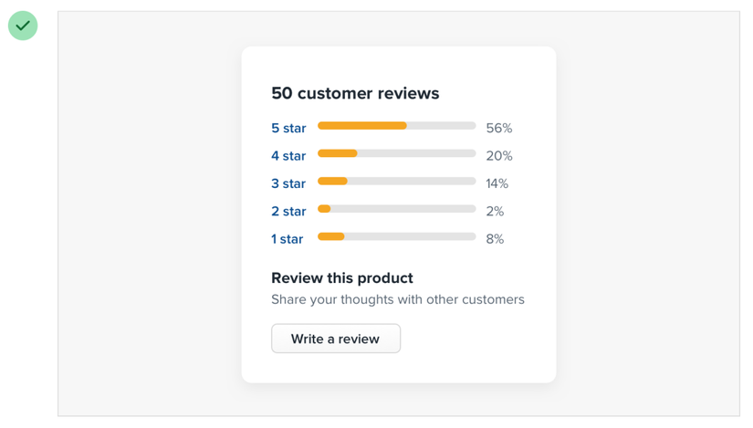
4. UI structure and stratification
Users browsing the web are lazy to “read”. They just glance at the content, look for the main information, then read it more carefully if necessary. Therefore, you always have to design an interface that directs the user’s attention to the content you want. Internal content that makes the content more central and makes it less prominent for sideline content is called hierarchy.
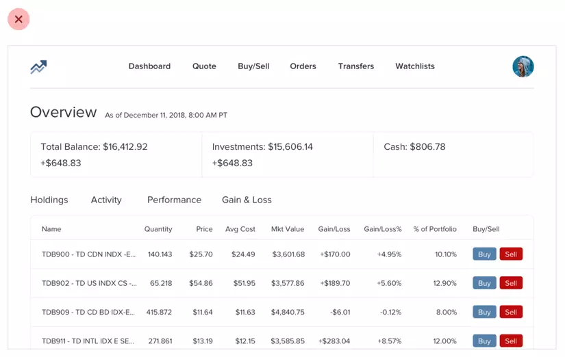
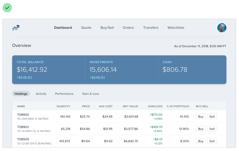
In the dashboard example below, you immediately see that after just a few simple styles, users can look at the dashboard page immediately to check on important content without spending too much time.
Another example is in the Redesigning Laravel.io article, also by the two authors who wrote the Refactoring UI:
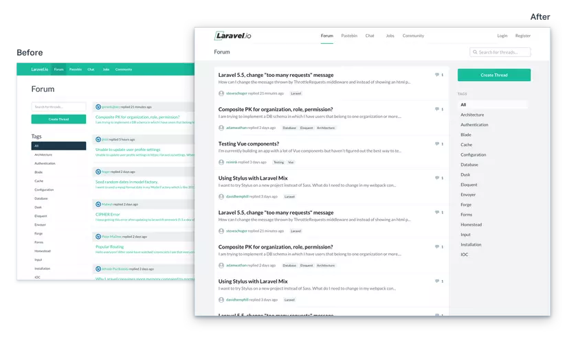
Pay close attention to the difference before and after the redesign, you will immediately see: the focus content (forum posts) has a white background, distinct from the background color of the whole page is light gray. In addition, the sidebar (the Create thread button and the Tags section) is less important and instead of letting them have their own background, they are placed right outside the gray background , helping to avoid distracting readers.
Colors & typography are two very effective tools to help you decentralize the content in the UI effectively. However, I will not go too deeply about it in this article, otherwise it will become a pirated book
5. Find out more where
Of course, ordering Refactoring UI by the author is the best way, but there’s a 99% chance we can’t buy it if we don’t want to download pirate, because book prices are a bit chatable compared to developers in developing countries like India or Vietnam. But there are many other (legal) sources to learn about this design knowledge:
- Referring to the author’s Twitter posts, a lot of valuable information there is a piece of content from the book.
- Read the article on Medium of the author duo.
- Watch the videos on the author’s youtube . Most are extremely useful screencast videos that the author refactor to the interface of many familiar Web sites.
In addition, Tailwind CSS is an atomic CSS framework created by the two authors of the book (but is completely open source and free. Frameworks like Tailwind help you style UI components on your site fast, simple, neat, and unique so I strongly recommend. If you haven’t heard of Tailwind, give it a try.