Movement towards Motion in Website Backgrounds
In recent years, animation has gradually appeared in website design in the form of interactive buttons, accompanied by menus. The latest trend is to take advantage of dynamic background to create excitement and prolong the linger time of viewers.
However, companies need to be more careful with features like this – not making mistakes that can reduce user satisfaction and slow down their operations. Let's explore some websites that have been successful with background videos and why they have been so successful.
Nerisson is mobile friendly
When building a website, the ability to operate on mobile is vital. Mobile operating systems have made great strides and have been able to support a large number of features.
However, the phone still cannot properly display the video background. In some cases, a blank play button appears, while some other backgrounds don't load at all. Instead of using the background video on mobile devices and taking unwanted risks, applying different methods to each mode is still better.
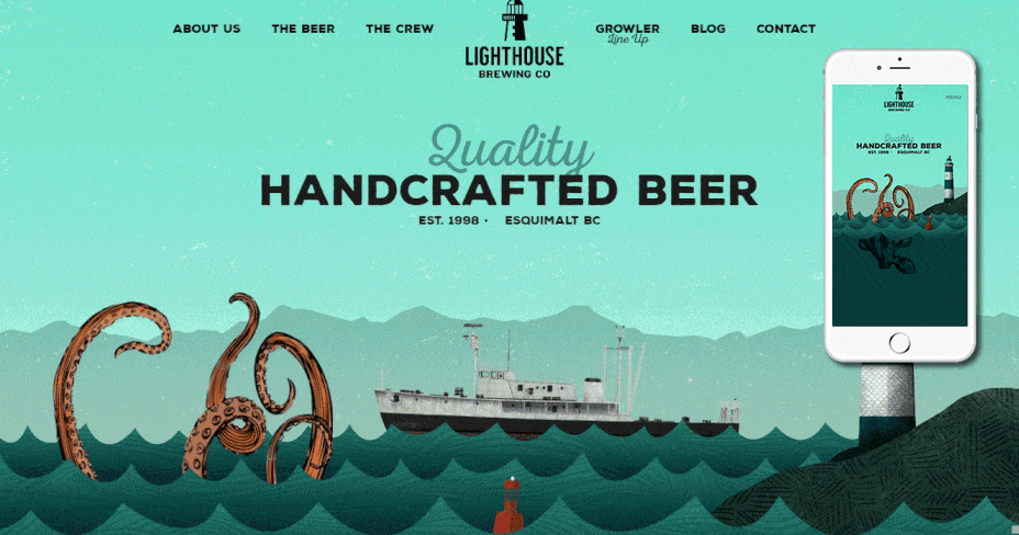
Website: http://www.lighthousebrewing.com/
Nerisson has done a perfect transition from computer to mobile. Their website contains subtle motions that help create extremely stimulating joints. When users move to mobile devices, these animations are replaced by static images, thereby maintaining the consistency of the page.
With JavaScript, your site's developer can access user-agent settings and remove videos from all Android iOS devices.
Y.CO is out there
You need to visualize the correct text on top of what the background will look like. Choose colors that blend well with the overall design of the site but do not sink as part of the video. Applying this color tone to the font to be read on the moving image, and the contrast will make the text easier to read.
If no color matches these criteria, use shadow box to distinguish the text from the background. Website Y.CO is a great example of this technique. Their video is very simple and attractive, while writing is easy to read.

Clearly Stated Y.CO
The Y.CO website also shows the choice of dramatic designs that do not always achieve the desired contrast. By using bold, white-letter characters, they have achieved both complex and neat appearance, which shows the necessary information.
Usability is a major contributor to viewers' satisfaction, and the text is clear and easy to navigate.
Minimalist EagleClean
Sometimes, the attractiveness of new trends is very attractive. Designer must remember the brand identity and add corporate identity elements. Some sites that use background videos are extremely reasonable, while others go too far. EagleClean was able to achieve a balance between attraction and sophistication.
EagleClean website uses a black screen with white gold letters. A yellow glove rises in the lower right corner to 'clean' the other side of the screen. The hand immediately recedes and you can't see it anymore. This action will add humor and excitement to the page, without leaving the brand image. However, this super cool website is built with Flash, not too friendly with search engines.
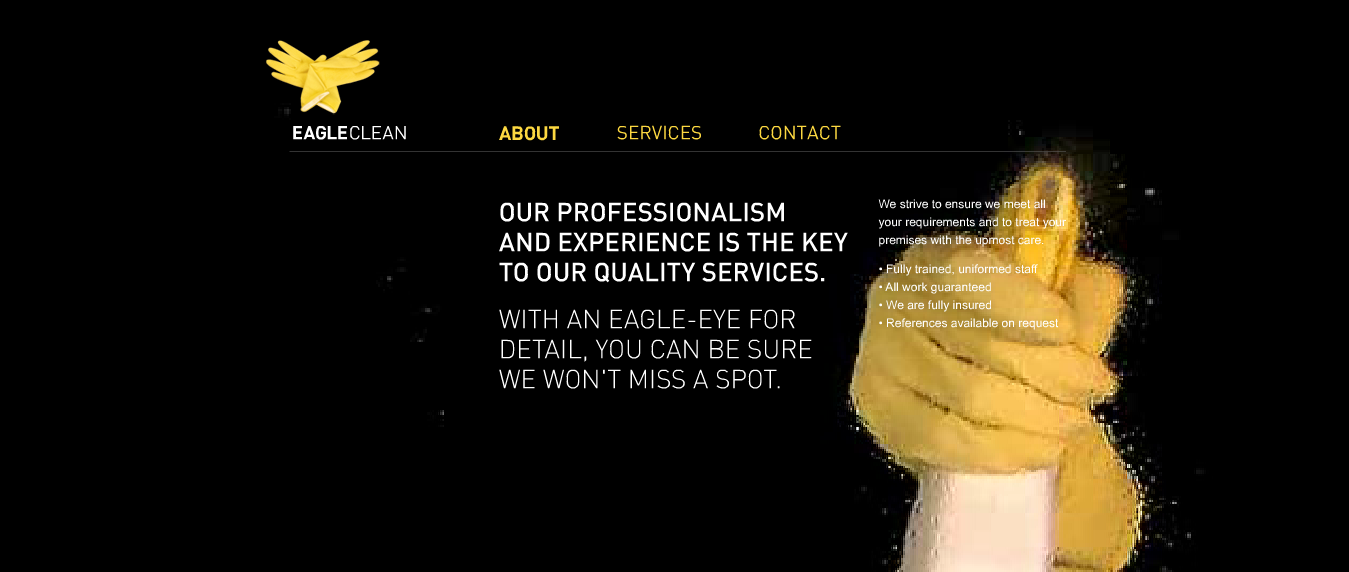
Because EagleClean is a cleaning service, the simple and neat logistics approach is quite appropriate. The company is successfully inserting video without leaving its goals and properties.
If the video constantly matches the company's website, don't be afraid to use it. Websites that contain multiple media files often increase the time that users spend.
However, stay away from videos that are too vibrating or contain too many cutscenes.
Opaque vision of Fernado J. Maclen
A designer in Southern California (Fernando J. Maclen) uses an interesting technique on his website. Maclen takes advantage of a video of himself working in the background, with a menu on one side and bottom of the screen. The fact that all of his videos are intentionally open is intentional.
First of all, the blurring part is more interesting, because looking at the user will be very curious about what's going on. After identifying the main content of the video, someone, the attention quickly moved to the note at the homepage. This is an example site that has gained interest without distracting.

Fernando J. Maclen
If your company is trying to use oversized video, techniques like this will be quite useful. Instead of removing the video completely, reduce the size and edit it to limit quality loss. Powerful filters can also have the same effect.
Overlaying with My Provence
The home page of My Provence starts with a video of many artists returning when traveling around the city. Although very beautiful, some of the videos are quite blurry. My Provence partially solved this problem by placing overlay on the video. By using technology, the website allows Japanese users to see these videos being randomized rather than focusing on quality.
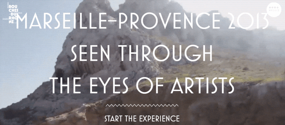
Although My Provence uses the words to inform viewers, there are still many good tips to apply with low quality videos. Semi-transparent overlays are a way to blur images (intentionally) without affecting the content. With complex designs, you can apply the pattern on the image to add fun. Remember that low video quality can be distracting – make appropriate adjustments to avoid losing viewers.
Avoid the following mistakes
The above examples are all cases of very clever background video applications. If you are interested in trying to apply these methods to your website, first note the following important points.
- Decide whether your video will have a sound component. Sound can increase interaction if handled properly. Many websites that set auto-play soundtrack, can be annoying for some users. Consider taking the mute volume, with a clear play button for users to listen to if desired. If not, use auto-sound, but the mute button must stand out. If the user has to "hunt" the mute button, you risk losing users very high.
- Always create a mechanism for the user to turn off the video, even if it's just a background video. Some people think that real movies are distracting, while others feel videos slow down their computers. And the pause button will add sympathy to this user component.
- Even users who are initially interested in the video in the background, may gradually become tired after a long time. Estimate the amount of time users will stay on the page with a background video. If the video appears only on the home page, it is likely that your users will quickly navigate to other parts of the page.
- However, if it is a form page or an information page, the user can stay there for another moment. Consider these time frames and decide at what time the background motion will fade. Users will enjoy the new approach of lighter video and style when the video stops.
- When integrating fade-out technology, you should also use fade-in (again). Unexpected sudden behavior can startle users or be mistaken for pop-ups, which can make them wary and out of favor with the page. Slow effect on a good city will give users time to adapt, thereby increasing the ability to linger on the page.
Let's join
Background video trend proved very interesting and lively for users. However, you always need to remember who the user is and what they like. Let many different personalities appear, and you will ensure a stable user conversion rate. Find a balance between inspiration and "harassment" where the target user is.