MongoDB unveils native data visualization tool
- Linh Le
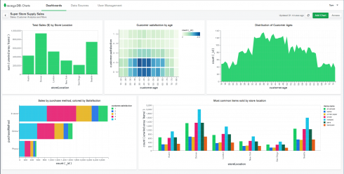
In an effort to remove the technical barriers to data visualization, MongoDB has announced the beta release of MongoDB Charts, a native data visualization tool. MongoDB Charts will be apart of MongoDB Atlas, the company’s database-as-a-service.
According to the company, MongoDB Charts eliminates the need to worry about code, tools, data movement or data duplication when creating and sharing data visualizations.
“The vast majority of tools in the business intelligence space struggle with handling rich JSON data that is becoming increasingly common in modern applications. This not only makes it difficult to extract real-time insights, but puts a technical hurdle in front of non-technical teams because there was no easy way to create data visualization without writing code,” said Grigori Melnik, vice president of product, server and enterprise tools for MongoDB.
The company explained a key feature of the release is its built-in aggregation functionality, which enables users to process data through a variety of different metrics and calculations. In addition, it handles document-based data such as embedded objects and arrays.
Other features include: the ability to connect to any MongoDB instance as a data source, to visually explore data, share dashboards, track KPIs in real time and work with complex data.
“MongoDB Charts natively supports the richness of the document model, including nested and hierarchical data: no more flattening subdocuments and arrays into the tabular structures needed by traditional BI tools. MongoDB Charts makes data manipulation user-friendly by presenting operations that make sense for each data type,” the company wrote on its website.
The company is planning on adding an embedded feature to MongoDB Charts to give developers the ability to create visualizations and embed them into their website and apps.
Source : https://sdtimes.com