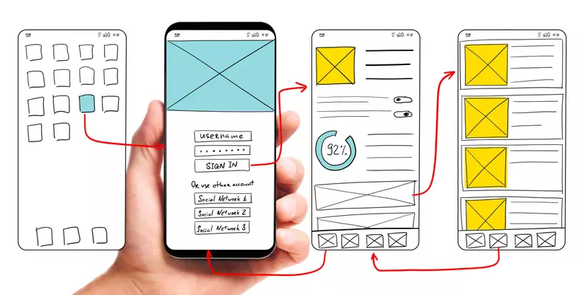
As a mobile developer, you want to develop an app with lots of features. However, with a beautiful small phone, in order to be able to layout and fully show the features without annoying the user, we need to pay attention to some application building principles. for the best possible experience.
Many of us have implicitly understood and applied those principles, and many of us have inadvertently forgotten it. In this article, I will list some principles that I have summarized to help your application get the most satisfaction in UI, UX.
These principles apply to both the web and native apps. I hope that after this article you can apply these principles into practice.
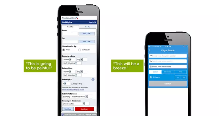
Principle 1: Minimalism
Putting all the necessary UI elements on the smartphone screen without cluttering the interface and inhibiting the user can be very difficult.
We need to arrange UI elements based on priority on each screen, and whatever is omitted is omitted. There are 2 quotes as follows:
“Perfection is achieved not when there is nothing more to add, but when there is nothing left to take away.” – Antoine de Saint-Exupéry
-> I mean: Perfection is achieved not when there is nothing to add, but when there is nothing to leave.
“One of the basic rules of good UX is to reduce the effort users have to put in to get what the want.” – Nick Babich.
-> It means: The basic principle is to reduce the effort of the user to achieve the goal.
Allocate user attention tailored to your needs or users. Too much information can scare and confuse users.
To go to minimalism you need to increase white space, simple elements, elegant fonts, … Simplifying the UI also significantly improves the speed and performance of the website and app. This also significantly affects the user experience. The longer the data loads, the slower the display, the worse the user experience
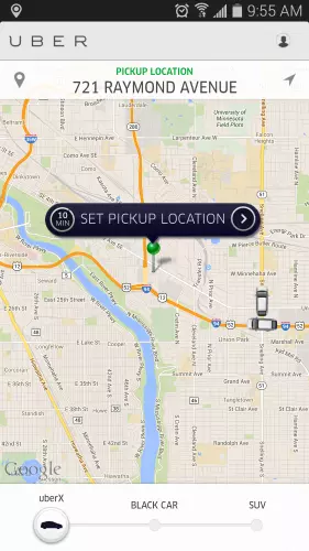
Take Uber for example. Uber knows that the purpose of users using the app is to take a taxi. The app doesn’t overwhelm the user with other information: it automatically detects the user’s location based on the GEO data, and the only thing the user has to do is choose the pick up location.
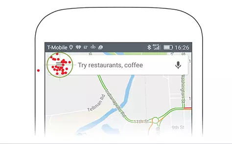
Rule 2: Place the most important elements near the bottom or center
Steven Hoober has tested a lot of interesting research on topics related to smartphone user’s behavior. The results of studies indicate the importance of putting controls within reach of the thumb when using the phone with one hand, although Steven Hoober has also demonstrated that the user holds the phone. in different ways. More details, you can see here.
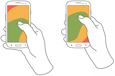
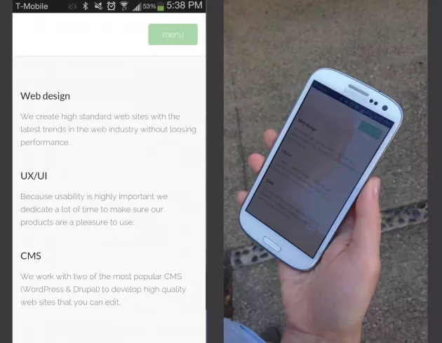
In addition, Steven Hoober shows that when smartphone users have to choose something, they prefer the content displayed vertically and in the center of the screen, applicable to both reading and interacting with. screen.
“I set up a study that let users move the content to the position on the screen where they naturally wanted it to be. Once they had moved he content to the center of the screen, they would tap to select it. ” – Steven Hoober
The developer knows that red spots are the main area of user interaction
Principle 3: Minimize entry requirements
Smartphone users typically have less time to interact with the UI when using a laptop or desktop. They may be on the go or be searching for information in a matter of minutes. So, in order to benefit from using laptops and desktops on a smartphone, you need to keep the form as concise and simple as possible by deleting any unnecessary fields. Use auto-complete and personalized data where appropriate so that users only have to enter minimal information. For example:
- Auto-fill any required fields if you can auto-filled.
- Smart Suggest when users perform input or search
- Filter to reduce extraneous information
- Use date pickers instead of asking for date by rice
Those are just some of the most popular and intuitive examples. And of course, you will be able to discover more by forming a habit of asking yourself questions. For example, can this task remove something or do something else if I want to do less? Enter with less rice? Can this be replaced?

Rule 4: Expand the scope of the action tap
The cursor on the desktop or laptop allows the user to click on even the smallest target on the screen. On the touch screen, however, it’s a lot more difficult.
Not only is the tip of your finger much larger and less accurate than the mouse pointer, but it also covers your target when you try to touch it.
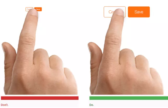
One thing I often see in new friends is that they often ignore this rule of 3. You design the object very stereotypical, but the range of tap on that object is very difficult to receive the action tap. You will never go wrong when designing the largest possible tap target.
Follow the guidelines provided by Apple and Android , suggest that the touching objects are at least 44 x 44 points and 48 x 48 dp (pixel independent of the device) respectively.
The most common way to extend the tap range is to increase the white space around the object instead of increasing the size of the object, increasing the size of the object can make the UI look bad, even the UI interlaced. interstitial, overlapping.
Principle 5: Prioritize legibility
Readability is one of the clearly important things no matter what platform you design. You should always follow the general guidelines for font sizing, line heights, choosing a font for longer format text, etc.
Recommend font size is 16pt . Use any size smaller than that, and you will affect legibility for at least some of your users.
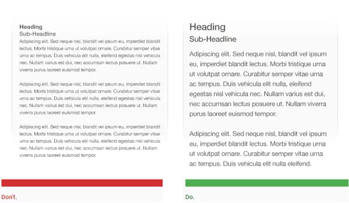
Also, a very important factor that affects legibility is the text color and the background. This depends on the profession that we will design accordingly. However, we also need to be aware of the lighting conditions as mobile users will often use them in different lighting conditions. For example of text color, I usually will not choose color # 000000 but instead will be a slightly softer color to avoid causing eye irritation.
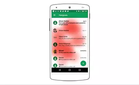
Principle 6: Give immediate – and good (!) – feedback
Designing for poor mobile internet connections can soon be much less worrisome, even now, due to the fast 4G and 5G internet speeds. However, do not expect mobile users to always have a stable, high-speed Internet connection and do not ignore loading loading status. It is necessary to optimize load times and display load status so that the user can recognize it.
Principle 7: Turn on easy error recovery
No matter how well you comply with the above principles, how well you design, user errors will inevitably occur.
Mis-taps and misunderstandings are your responsibility, but you’ll never be able to eliminate them completely -> Say you will never be able to eliminate the error completely. Like a bug is unavoidable in programming
Furthermore, there is always a risk of external error, from the user and the device. Some of these – like the page not loading due to a poor connection – are more likely on mobile.
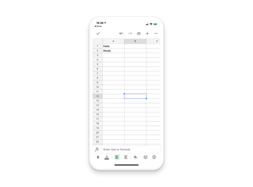
For example, the undo button on Google sheet, you can easily revert to a previous state of the sheet:
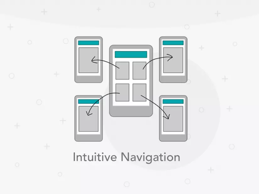
Principle 8: Create intuitive navigation
Quite similar to rules 1 and 3, creating the simplest navigation is also important.
“If the user can’t use it, it doesn’t work.” – Susan Dray
Users are impatient to try to work through complicated steps to get what they want. If it takes too much time or effort to discover how to use the app, you will most likely lose your users. If it was me, but I met a complicated app, then I deleted the app to vote 1 * to keep it cool. So you need to simplify the process and have all the necessary information available.
Principle 9: Re-check the design
Typically, mobile design looks great when viewed on a designer’s screen but as soon as you start viewing and interacting with an actual mobile app, it becomes much less satisfying. . That’s why it’s important to test your app against real users on multiple mobile devices. You should have real users complete tasks on a regular basis, and only then will you see how well the design actually works.

Thus, the above are some of the principles that I have synthesized from sources as well as from my own experience. I feel that applying these principles is very helpful to me in the application development process. I hope with you too. Thank you for taking the time to read this article.
Reference source: