Preface
- Starting from the need to perform the statistical chart function for your admin page, I also have to learn about the libraries that support charting, including some typical names such as Chartjs or Chartist .
- But then I was enlightened by an older brother to a “new” library (to me) and the first impression was that it was quite colorful, eye-catching, and another plus point was that there was built-in for three The current popular javascript library / framework is Angular / React / Vue . That is the Apex Chart .
- So I decided to try the library experience and share with you in this article. Let’s get started!
Content
Learn about the Apex chart
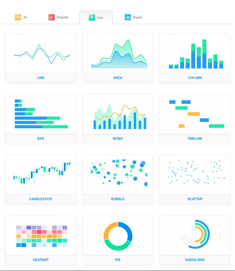
- My first impression of Apex is on aesthetics, compared to the two names I mentioned above are Chartjs and Chartist, you can clearly see that Apex is more beautiful. And depending on your project, Vue / Angular / React / JS , Apex also has demo and sample code for you to refer.
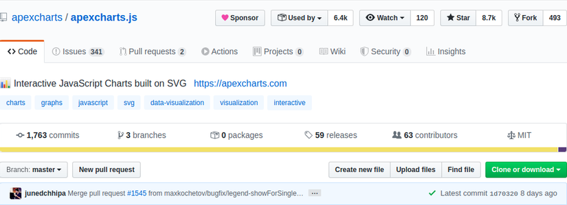
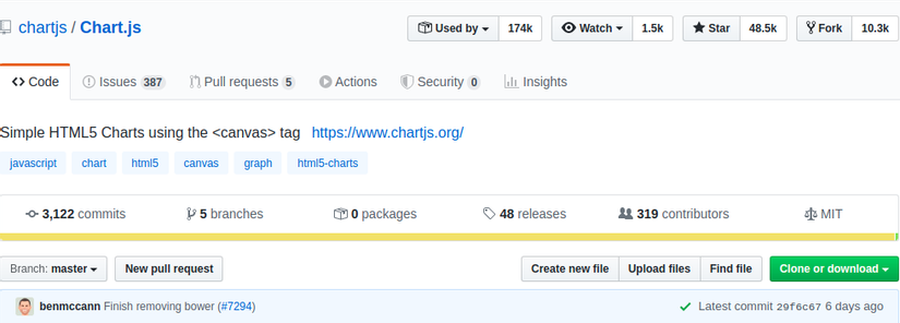
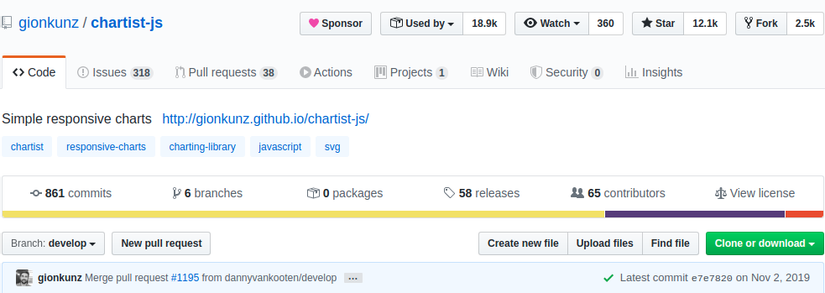
- The next thing people often care about when using a library is the number of users and stars on github. However, due to the different release times, these numbers do not say too much. Instead we will be interested in whether it is “alive” or not, ie is it still being developed or not? Let’s take a look at the repository information of all 3 libraries on github (as of 05/05/2020) for comparison.
- Apex :

- Chartjs :
- Chartist : chartist-js’ last commit is from November 2019, which means it has not been developed for more than half a year. For unknown reasons, the repo owner still comments on issues but does not merge pull requests and resolve them. But anyway, if it’s me, I will not choose to use this library.
Some typical functions
- Above are 2 reasons that I choose Apex, now we will embark on the installation to be able to use Apex offline:
- Method 1 (recommend): install through npm (Node package manager) with the command12<span class="token function">npm</span> <span class="token function">install</span> apexcharts --save
And when using, just import as follows:12<span class="token keyword">import</span> ApexCharts <span class="token keyword">from</span> <span class="token string">'apexcharts'</span> - Method 2: It is embedded directly with <script> tag in html. Many people will find this method simple, easy to eat, and easy to win, but I do not recommend using this method, as it will make the loading speed of the equipment slower.12<span class="token tag"><span class="token tag"><span class="token punctuation"><</span> script</span> <span class="token attr-name">src</span> <span class="token attr-value"><span class="token punctuation">=</span> <span class="token punctuation">"</span> https://cdn.jsdelivr.net/npm/apexcharts <span class="token punctuation">"</span></span> <span class="token punctuation">></span></span> <span class="token tag"><span class="token tag"><span class="token punctuation"></</span> script</span> <span class="token punctuation">></span></span>
- Method 1 (recommend): install through npm (Node package manager) with the command
- Next, let’s learn about some of the main components that make up a complete chart:
1. Series:
- The minimum thing to create a chart is data. And a data set used for charts is called a series. And we have some types like
single data series/multiple data series/...
1.1. Single values:
- This is a simple type of data format, often used with column chart types to compare data between categories. For example, with single values, the
serieswill usually betrục yin the chart andcategorieswill be the x-axis:12345678series <span class="token punctuation">:</span> <span class="token punctuation">[</span> <span class="token punctuation">{</span>data <span class="token punctuation">:</span> <span class="token punctuation">[</span> <span class="token number">23</span> <span class="token punctuation">,</span> <span class="token number">34</span> <span class="token punctuation">,</span> <span class="token number">12</span> <span class="token punctuation">,</span> <span class="token operator">...</span> <span class="token punctuation">,</span> <span class="token number">43</span> <span class="token punctuation">]</span><span class="token punctuation">}</span> <span class="token punctuation">]</span>xaxis <span class="token punctuation">:</span> <span class="token punctuation">{</span>categories <span class="token punctuation">:</span> <span class="token punctuation">[</span> <span class="token string">"Jan"</span> <span class="token punctuation">,</span> <span class="token string">"Feb"</span> <span class="token punctuation">,</span> <span class="token string">"Mar"</span> <span class="token punctuation">,</span> <span class="token operator">...</span> <span class="token punctuation">,</span> <span class="token string">"Dec"</span> <span class="token punctuation">]</span><span class="token punctuation">}</span>
1.2. Paired values:
- The data will be declared as pairs of values
{x, y}in the series and you will need to declare additional data types of the x axis, for example as follows:1234567891011121314151617181920series <span class="token punctuation">:</span> <span class="token punctuation">[</span> <span class="token punctuation">{</span>data <span class="token punctuation">:</span> <span class="token punctuation">[</span> <span class="token punctuation">{</span>x <span class="token punctuation">:</span> <span class="token number">20</span> <span class="token punctuation">,</span>y <span class="token punctuation">:</span> <span class="token number">54</span><span class="token punctuation">}</span> <span class="token punctuation">,</span> <span class="token punctuation">{</span>x <span class="token punctuation">:</span> <span class="token number">30</span> <span class="token punctuation">,</span>y <span class="token punctuation">:</span> <span class="token number">66</span><span class="token punctuation">}</span> <span class="token punctuation">]</span> <span class="token punctuation">,</span><span class="token punctuation">}</span> <span class="token punctuation">]</span> <span class="token punctuation">,</span><span class="token comment">//Ngoài ra có thể khai báo cặp giá trị theo kiểu mảng hai chiều như sau</span>series <span class="token punctuation">:</span> <span class="token punctuation">[</span> <span class="token punctuation">{</span>data <span class="token punctuation">:</span> <span class="token punctuation">[</span> <span class="token punctuation">[</span> <span class="token number">1</span> <span class="token punctuation">,</span> <span class="token number">34</span> <span class="token punctuation">]</span> <span class="token punctuation">,</span> <span class="token punctuation">[</span> <span class="token number">3</span> <span class="token punctuation">,</span> <span class="token number">54</span> <span class="token punctuation">]</span> <span class="token punctuation">,</span> <span class="token punctuation">[</span> <span class="token number">5</span> <span class="token punctuation">,</span> <span class="token number">23</span> <span class="token punctuation">]</span> <span class="token punctuation">,</span> <span class="token operator">...</span> <span class="token punctuation">,</span> <span class="token punctuation">[</span> <span class="token number">15</span> <span class="token punctuation">,</span> <span class="token number">43</span> <span class="token punctuation">]</span> <span class="token punctuation">]</span><span class="token punctuation">}</span> <span class="token punctuation">]</span> <span class="token punctuation">,</span><span class="token comment">//khai báo kiểu dữ liệu của trục x</span>xaxis <span class="token punctuation">:</span> <span class="token punctuation">{</span>type <span class="token punctuation">:</span> <span class="token string">'numeric'</span> <span class="token comment">//kiểu dữ liệu ở đây có thể là numeric hoặc là string</span><span class="token punctuation">}</span>
1.3. Timeline series:
- In some charts, you will need to track data that changes over time (for example, a reputation display chart on a personal viblo page ), so it’s important to deal with timestamps or date data.12345678910111213series <span class="token punctuation">:</span> <span class="token punctuation">[</span> <span class="token punctuation">{</span>data <span class="token punctuation">:</span> <span class="token punctuation">[</span> <span class="token punctuation">{</span>x <span class="token punctuation">:</span> <span class="token string">'05/06/2014'</span> <span class="token punctuation">,</span>y <span class="token punctuation">:</span> <span class="token number">54</span><span class="token punctuation">}</span> <span class="token punctuation">,</span> <span class="token punctuation">{</span>x <span class="token punctuation">:</span> <span class="token string">'05/08/2014'</span> <span class="token punctuation">,</span>y <span class="token punctuation">:</span> <span class="token number">17</span><span class="token punctuation">}</span> <span class="token punctuation">,</span> <span class="token punctuation">{</span>x <span class="token punctuation">:</span> <span class="token string">'05/28/2014'</span> <span class="token punctuation">,</span>y <span class="token punctuation">:</span> <span class="token number">26</span><span class="token punctuation">}</span> <span class="token punctuation">]</span><span class="token punctuation">}</span> <span class="token punctuation">]</span>
- To make sure that the DateTime string data you are passing is correct, try passing the Date.parse () function, if
truereturn is correct.
1.4. Data for Pie / Donuts / RadialBars:
- For some special types of charts such as pie charts, pie charts (Donut), concentric pie charts (RadialBars), the data transmitted is also different from the pie chart {x, y}.
- Then, instead of passing on
xaxis, we will have to pass it intolabels123series <span class="token punctuation">:</span> <span class="token punctuation">[</span> <span class="token number">23</span> <span class="token punctuation">,</span> <span class="token number">11</span> <span class="token punctuation">,</span> <span class="token number">54</span> <span class="token punctuation">,</span> <span class="token number">72</span> <span class="token punctuation">,</span> <span class="token number">12</span> <span class="token punctuation">]</span> <span class="token punctuation">,</span>labels <span class="token punctuation">:</span> <span class="token punctuation">[</span> <span class="token string">"Apple"</span> <span class="token punctuation">,</span> <span class="token string">"Mango"</span> <span class="token punctuation">,</span> <span class="token string">"Banana"</span> <span class="token punctuation">,</span> <span class="token string">"Papaya"</span> <span class="token punctuation">,</span> <span class="token string">"Orange"</span> <span class="token punctuation">]</span>
2. Localization
- Multilingual is a very essential function for a website, as now visitors to a website can use many different languages. Understanding that, Apex provides the
Localizationfunction to be able to customize the date format or paragraphs for each language and region. - To use this function, we have 2 options:
- Embed the corresponding json file in your desired language / country.
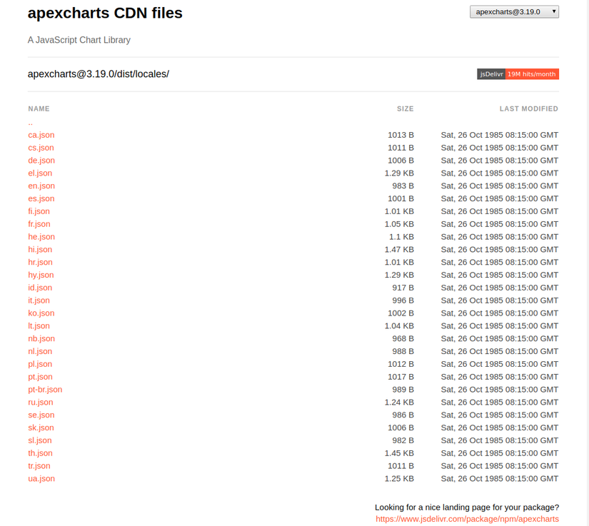
- If you installed Apex through npm, you can find this json file inside the
/dist/locales.12345678<span class="token keyword">var</span> fr <span class="token operator">=</span> <span class="token function">require</span> <span class="token punctuation">(</span> <span class="token string">"apexcharts/dist/locales/fr.json"</span> <span class="token punctuation">)</span><span class="token punctuation">{</span>chart <span class="token punctuation">:</span> <span class="token punctuation">{</span>locales <span class="token punctuation">:</span> <span class="token punctuation">[</span> fr <span class="token punctuation">]</span> <span class="token punctuation">,</span>defaultLocale <span class="token punctuation">:</span> <span class="token string">'fr'</span> <span class="token punctuation">,</span><span class="token punctuation">}</span><span class="token punctuation">}</span> - If you want to use cdn, you can go to https://cdn.jsdelivr.net/npm/apexcharts/dist/locales/ to find the language you need:
- If you installed Apex through npm, you can find this json file inside the
- If you do not want to embed an existing json file, you can create your own locale file (currently not Vietnamese, so you want to learn can try this way) according to the following sample template:1234567891011121314151617181920212223<span class="token keyword">var</span> options <span class="token operator">=</span> <span class="token punctuation">{</span>chart <span class="token punctuation">:</span> <span class="token punctuation">{</span>locales <span class="token punctuation">:</span> <span class="token punctuation">[</span> <span class="token punctuation">{</span><span class="token string">"name"</span> <span class="token punctuation">:</span> <span class="token string">"vi"</span> <span class="token punctuation">,</span><span class="token string">"options"</span> <span class="token punctuation">:</span> <span class="token punctuation">{</span><span class="token string">"months"</span> <span class="token punctuation">:</span> <span class="token punctuation">[</span> <span class="token string">"Tháng 1"</span> <span class="token punctuation">,</span> <span class="token string">"Tháng 2"</span> <span class="token punctuation">,</span> <span class="token string">"Tháng 3"</span> <span class="token punctuation">,</span> <span class="token string">"Tháng 4"</span> <span class="token punctuation">,</span> <span class="token string">"Tháng 5"</span> <span class="token punctuation">,</span> <span class="token string">"Tháng 6"</span> <span class="token punctuation">,</span> <span class="token string">"Tháng 7"</span> <span class="token punctuation">,</span> <span class="token string">"Tháng 8"</span> <span class="token punctuation">,</span> <span class="token string">"Tháng 9"</span> <span class="token punctuation">,</span> <span class="token string">"Tháng 10"</span> <span class="token punctuation">,</span> <span class="token string">"Tháng 11"</span> <span class="token punctuation">,</span> <span class="token string">"Tháng 12"</span> <span class="token punctuation">]</span> <span class="token punctuation">,</span><span class="token string">"shortMonths"</span> <span class="token punctuation">:</span> <span class="token punctuation">[</span> <span class="token string">"T1"</span> <span class="token punctuation">,</span> <span class="token string">"T2"</span> <span class="token punctuation">,</span> <span class="token string">"T3"</span> <span class="token punctuation">,</span> <span class="token string">"T4"</span> <span class="token punctuation">,</span> <span class="token string">"T5"</span> <span class="token punctuation">,</span> <span class="token string">"T6"</span> <span class="token punctuation">,</span> <span class="token string">"T7"</span> <span class="token punctuation">,</span> <span class="token string">"T8"</span> <span class="token punctuation">,</span> <span class="token string">"T9"</span> <span class="token punctuation">,</span> <span class="token string">"T10"</span> <span class="token punctuation">,</span> <span class="token string">"T11"</span> <span class="token punctuation">,</span> <span class="token string">"T12"</span> <span class="token punctuation">]</span> <span class="token punctuation">,</span><span class="token string">"days"</span> <span class="token punctuation">:</span> <span class="token punctuation">[</span> <span class="token string">"Chủ nhật"</span> <span class="token punctuation">,</span> <span class="token string">"Thứ 2"</span> <span class="token punctuation">,</span> <span class="token string">"Thứ 3"</span> <span class="token punctuation">,</span> <span class="token string">"Thứ 4"</span> <span class="token punctuation">,</span> <span class="token string">"Thứ 5"</span> <span class="token punctuation">,</span> <span class="token string">"Thứ 6"</span> <span class="token punctuation">,</span> <span class="token string">"Thứ 7"</span> <span class="token punctuation">]</span> <span class="token punctuation">,</span> <span class="token comment">//hãy nhớ rằng chủ nhật là ngày đầu tuần nhé</span><span class="token string">"shortDays"</span> <span class="token punctuation">:</span> <span class="token punctuation">[</span> <span class="token string">"CN"</span> <span class="token punctuation">,</span> <span class="token string">"t2"</span> <span class="token punctuation">,</span> <span class="token string">"t3"</span> <span class="token punctuation">,</span> <span class="token string">"t4"</span> <span class="token punctuation">,</span> <span class="token string">"t5"</span> <span class="token punctuation">,</span> <span class="token string">"t6"</span> <span class="token punctuation">,</span> <span class="token string">"t7"</span> <span class="token punctuation">]</span> <span class="token punctuation">,</span><span class="token string">"toolbar"</span> <span class="token punctuation">:</span> <span class="token punctuation">{</span> <span class="token comment">//tooltip hiển thị khi bạn hover vào các icon tương ứng</span><span class="token string">"exportToSVG"</span> <span class="token punctuation">:</span> <span class="token string">"Tải định dạng SVG"</span> <span class="token punctuation">,</span><span class="token string">"exportToPNG"</span> <span class="token punctuation">:</span> <span class="token string">"Tải định dạng PNG"</span> <span class="token punctuation">,</span><span class="token string">"zoomIn"</span> <span class="token punctuation">:</span> <span class="token string">"Phóng to"</span> <span class="token punctuation">,</span><span class="token string">"zoomOut"</span> <span class="token punctuation">:</span> <span class="token string">"Thu nhỏ"</span> <span class="token punctuation">,</span><span class="token string">"pan"</span> <span class="token punctuation">:</span> <span class="token string">"Panning"</span> <span class="token punctuation">,</span> <span class="token comment">//cái này mình cũng ko biết dịch sao, đại loại là bạn sẽ click chọn 1 vùng thì sẽ phóng to vùng đấy lên </span><span class="token string">"reset"</span> <span class="token punctuation">:</span> <span class="token string">"Cài đặt lại"</span><span class="token punctuation">}</span><span class="token punctuation">}</span><span class="token punctuation">}</span> <span class="token punctuation">]</span> <span class="token punctuation">,</span>defaultLocale <span class="token punctuation">:</span> <span class="token string">"vi"</span><span class="token punctuation">}</span><span class="token punctuation">}</span>
- Embed the corresponding json file in your desired language / country.
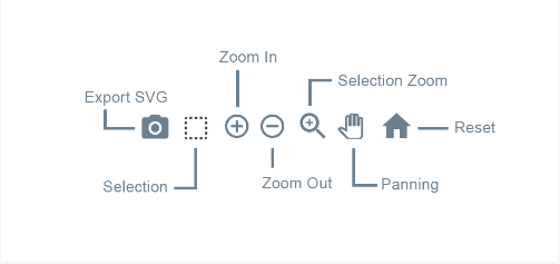
3. Interactivity (interact with the chart)
- This is a function that I find is quite good, enabling users to interact more with the chart instead of just looking at a static chart. As you can see here, you can enlarge, shrink the chart or download the chart in SVG format.
- To be able to customize these functions, you can change the toolbar’s configuration as follows:12345678910111213141516171819chart <span class="token punctuation">:</span> <span class="token punctuation">{</span>toolbar <span class="token punctuation">:</span> <span class="token punctuation">{</span>show <span class="token punctuation">:</span> <span class="token boolean">true</span> <span class="token punctuation">,</span>offsetX <span class="token punctuation">:</span> <span class="token number">0</span> <span class="token punctuation">,</span>offsetY <span class="token punctuation">:</span> <span class="token number">0</span> <span class="token punctuation">,</span>tools <span class="token punctuation">:</span> <span class="token punctuation">{</span>download <span class="token punctuation">:</span> <span class="token boolean">true</span> <span class="token punctuation">,</span>selection <span class="token punctuation">:</span> <span class="token boolean">true</span> <span class="token punctuation">,</span>zoom <span class="token punctuation">:</span> <span class="token boolean">true</span> <span class="token punctuation">,</span>zoomin <span class="token punctuation">:</span> <span class="token boolean">true</span> <span class="token punctuation">,</span>zoomout <span class="token punctuation">:</span> <span class="token boolean">true</span> <span class="token punctuation">,</span>pan <span class="token punctuation">:</span> <span class="token boolean">true</span> <span class="token punctuation">,</span>reset <span class="token punctuation">:</span> <span class="token boolean">true</span> <span class="token operator">|</span> <span class="token string">'<img src="/static/icons/reset.png" width="20">'</span> <span class="token punctuation">,</span>customIcons <span class="token punctuation">:</span> <span class="token punctuation">[</span> <span class="token punctuation">]</span><span class="token punctuation">}</span> <span class="token punctuation">,</span>autoSelected <span class="token punctuation">:</span> <span class="token string">'zoom'</span> <span class="token comment">//tự động sử dụng tools này khi load biểu đồ</span><span class="token punctuation">}</span> <span class="token punctuation">,</span><span class="token punctuation">}</span>
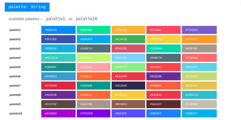
4. Themes
- Another handy feature of Apex is that it provides ~ 10 color schemes for you to choose from, instead of having to spend time customizing colors that can result in an aesthetic disaster.
- Set of colors and specific color codes for 10 palettes: https://apexcharts.com/docs/options/theme/#palette
- Demo 10 palette: https://codesandbox.io/s/qzjkzmzxoj?from-embed
- The minimum thing to create a chart is data. And a data set used for charts is called a series. And we have some types like

summary
- This article I would like to introduce a few floating features that make me choose Apex, hope that this article can convince you and provide you with an option when you need to perform the function of graphing statistics. If you find something interesting, don’t hesitate and share it for yourself and others.
- Thank you for taking the time to read your article

References
- Homepage: https://apexcharts.com/
- Github: https://github.com/apexcharts/apexcharts.js