Learn about the common length units in CSS
CSS currently uses a number of different units for the element's length. Some CSS properties are used to length units such as: width, height, margin, padding, font-size, line-height … Lengths of the position can be divided into 2 types: relative (relative) and absolute units (absolute). Some units of relative length: em, rem,%, vw, vh … Some units of absolute length: px, pt, in, mm …
Note: pixels (px) are relative to the view mode of the device. For low-dpi devices, 1px corresponds to 1 point (dot) displayed by the device. For printers or high resolution screens, 1px corresponds to multiple points (dot) displays of the device.
The difference between px, em and percent:
Pixel is an absolute and unchanging unit of measurement while you are a relative unit of measurement and changes when the length value of the parent element changes. For example, if the font-size of the body is 16px, then 150% or 1.5em corresponds to 24px (1.5 * 16).
When should we use the unit instead of px?
- When we use different font-size values for different screen sizes.
On large desktop screens we can use large-size fonts for titles but on mobile devices, the font-size for the title should be reduced to make it easier for users to read.
Let's say that on the big screen, there are about 30 types of text with different font-sizes using pixels and when displayed on the mobile it needs to be reduced, meaning we have to change the font-size value of 30 elements. this. This causes unnecessary losses.
But when we use the unit for 30 elements, we can use media queries, changing the font-size of the body can change the font-size of all 30 elements according to the font-size of the body.
- When we use the same distance Suppose we use the icon font in design and we want the size of the icon to be proportional to the size of the header on different devices. We cannot use style like padding-left: 20px; because the distance is always fixed at 20px regardless of the font-size of the header. If we use you for padding, we can make this distance change in proportion to the font-size of the header.
The problem of my unit
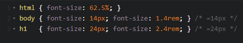
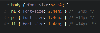
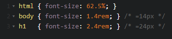
The technique of using the unit is that we will adjust the font-size of the body using%, we will set the font-size of the body to 62.5%, so 1em will correspond to 10px instead of the default of 16px. So we will easily set font size for other elements, for example to set font-size 14px for the word, we use 1.4em.

The problem is that with the font-size when using the unit you will cause some problems. Parts from the cup in another li will no longer be 14px but 20px (10 1.4 1.4 = 19.6 ~ 20). This problem can be solved by declaring font-size for child elements of 1em.
Unit rem
CSS3 has added a few new length units including rem (short for root em). While the unit depends on the element that contains it, the rem unit depends only on the value of the html element. This means that we can set the font-size for the html element and set the unit rem for other elements proportional to the font-size value of html.
There are currently the following browser versions that support rem unit: Safari 5, Chrome, Firefox 3.6+ and even IE9.
For browsers that do not support rem units, we will use the following method