Hello everyone, many of you are wondering if there is any other CSS framework that can replace Bootstrap or not? In my opinion, there are currently many different CSS frameworks, but Bootstrap , Foundation is still the father, the endless inspiration of other CSS frameworks. Recently, we have seen on the market something called Tailwind CSS that helps build websites quickly with the CSS properties that have been assigned to separate classes, when used, we only have to call to use. So the question is why don’t we use Bootstrap to make it traditional? Certainly this CSS framwork must have a strong point what will it be for front-end programmers to use? We will take a look at some of its pros and cons.

What is tailwind CSS?
It is a utility-first CSS framework, it is like Bootstrap, it has built-in classes that we can use. Tailwind CSS has many classes including important and different CSS properties, we can easily extend to create new classes with its own classes.
Why should we use Tailwind?
In general, it is similar to Boostrap but one convenient thing when using this framework is that we have many newer classes more convenient than Boostrap. You can refer here in Tailwind. And what’s more, there are more classes, but with the user-friendly naming rules, users can look at that class and know what this class is all about. We also have to talk about high customization and scalability, which gives us unlimited flexibility.
Install Tailwind in Nextjs
Here I will introduce you how to install Tailwind in Nextjs. If anyone uses Nuxtjs, you can do the same, in a certain angle I see that these two are basically the same.
First you have to create a Nextjs project
1 2 3 | npm init <span class="token operator">-</span> y npm install <span class="token operator">--</span> save next react react <span class="token operator">-</span> dom @zeit <span class="token operator">/</span> next <span class="token operator">-</span> css |
Next we will install tailwind and a few other packages used to complie the CSS
1 2 | npm install tailwindcss autoprefixer postcss <span class="token operator">-</span> loader <span class="token operator">--</span> save <span class="token operator">-</span> dev |
And we also need to install the next-css plugin
1 2 | npm install @zeit <span class="token operator">/</span> next <span class="token operator">-</span> css |
Once we have started the nextjs project, we will create a postcss.config.js file to require the tailwindcss and autoprefixer plugins.
1 2 3 4 5 6 7 | module <span class="token punctuation">.</span> exports <span class="token operator">=</span> <span class="token punctuation">{</span> plugins <span class="token punctuation">:</span> <span class="token punctuation">[</span> <span class="token function">require</span> <span class="token punctuation">(</span> <span class="token string">'tailwindcss'</span> <span class="token punctuation">)</span> <span class="token punctuation">,</span> <span class="token function">require</span> <span class="token punctuation">(</span> <span class="token string">'autoprefixer'</span> <span class="token punctuation">)</span> <span class="token punctuation">,</span> <span class="token punctuation">]</span> <span class="token punctuation">,</span> <span class="token punctuation">}</span> |
Next in the next.config.js file we will configure the following
1 2 3 4 5 6 7 8 9 10 11 12 13 14 15 16 17 18 19 | <span class="token keyword">import</span> path <span class="token keyword">from</span> <span class="token string">'path'</span> <span class="token keyword">import</span> fs <span class="token keyword">from</span> <span class="token string">'fs'</span> <span class="token keyword">import</span> withPlugins <span class="token keyword">from</span> <span class="token string">'next-compose-plugins'</span> <span class="token keyword">import</span> css <span class="token keyword">from</span> <span class="token string">'@zeit/next-css'</span> <span class="token keyword">import</span> less <span class="token keyword">from</span> <span class="token string">'@zeit/next-less'</span> <span class="token keyword">import</span> lessToJS <span class="token keyword">from</span> <span class="token string">'less-vars-to-js'</span> <span class="token keyword">import</span> progressBar <span class="token keyword">from</span> <span class="token string">'next-progressbar'</span> <span class="token keyword">import</span> nextConfig <span class="token keyword">from</span> <span class="token string">'./next.base.config'</span> <span class="token keyword">export</span> <span class="token keyword">default</span> <span class="token function">withPlugins</span> <span class="token punctuation">(</span> <span class="token punctuation">[</span> progressBar <span class="token punctuation">,</span> css <span class="token punctuation">,</span> <span class="token punctuation">[</span> less <span class="token punctuation">,</span> lessConfig <span class="token punctuation">]</span> <span class="token punctuation">,</span> <span class="token punctuation">]</span> <span class="token punctuation">,</span> nextConfig <span class="token punctuation">)</span> |
In the package.json file, you insert this script as follows
1 2 3 4 5 6 | <span class="token string">"scripts"</span> <span class="token punctuation">:</span> <span class="token punctuation">{</span> <span class="token string">"dev"</span> <span class="token punctuation">:</span> <span class="token string">"next"</span> <span class="token punctuation">,</span> <span class="token string">"build"</span> <span class="token punctuation">:</span> <span class="token string">"next build"</span> <span class="token punctuation">,</span> <span class="token string">"start"</span> <span class="token punctuation">:</span> <span class="token string">"next start"</span> <span class="token punctuation">}</span> |
In the assets folder in your project, create styles/less/tailwind.less
1 2 3 4 5 | @tailwind base <span class="token punctuation">;</span> @tailwind utilities <span class="token punctuation">;</span> @tailwind components <span class="token punctuation">;</span> |
Then you create more app.less with the content
1 2 | @ <span class="token keyword">import</span> <span class="token string">"./libs/tailwind.less"</span> <span class="token punctuation">;</span> |
I do not want to introduce each class in tailwind css , it will be time consuming and boring. Instead I will try to create a page and style according to the class, then I will talk specifically for you guys. hehe. Now we will go to the page folder and create a demo.js file
1 2 3 4 5 6 7 8 9 10 11 12 13 14 15 16 17 18 19 20 21 22 23 24 25 26 27 28 29 30 31 32 33 34 35 | <span class="token keyword">import</span> <span class="token string">'~/assets/styles/less/app.less'</span> <span class="token punctuation">;</span> <span class="token keyword">const</span> <span class="token function-variable function">Demo</span> <span class="token operator">=</span> <span class="token punctuation">(</span> <span class="token punctuation">)</span> <span class="token operator">=></span> <span class="token punctuation">(</span> <span class="token operator"><</span> div className <span class="token operator">=</span> <span class="token string">"flex justify-between items-center py-4 bg-blue-900"</span> <span class="token operator">></span> <span class="token operator"><</span> div className <span class="token operator">=</span> <span class="token string">"flex-shrink-0 ml-10 cursor-pointer"</span> <span class="token operator">></span> <span class="token operator"><</span> i className <span class="token operator">=</span> <span class="token string">"fas fa-drafting-compass fa-2x text-orange-500"</span> <span class="token operator">></span> <span class="token operator"><</span> <span class="token operator">/</span> i <span class="token operator">></span> <span class="token operator"><</span> span className <span class="token operator">=</span> <span class="token string">"ml-1 text-3xl text-blue-200 font-semibold"</span> <span class="token operator">></span> Viblo <span class="token operator"><</span> <span class="token operator">/</span> span <span class="token operator">></span> <span class="token operator"><</span> <span class="token operator">/</span> div <span class="token operator">></span> <span class="token operator"><</span> i className <span class="token operator">=</span> <span class="token string">"fas fa-bars fa-2x visible md:invisible mr-10 md:mr-0 text-blue-200 cursor-pointer"</span> <span class="token operator">></span> <span class="token operator"><</span> <span class="token operator">/</span> i <span class="token operator">></span> <span class="token operator"><</span> ul className <span class="token operator">=</span> <span class="token string">"hidden md:flex overflow-x-hidden mr-10 font-semibold"</span> <span class="token operator">></span> <span class="token operator"><</span> li className <span class="token operator">=</span> <span class="token string">"mr-6 p-1 border-b-2 border-orange-500"</span> <span class="token operator">></span> <span class="token operator"><</span> a className <span class="token operator">=</span> <span class="token string">"text-blue-200 cursor-default"</span> href <span class="token operator">=</span> <span class="token string">"#"</span> <span class="token operator">></span> Home <span class="token operator"><</span> <span class="token operator">/</span> a <span class="token operator">></span> <span class="token operator"><</span> <span class="token operator">/</span> li <span class="token operator">></span> <span class="token operator"><</span> li className <span class="token operator">=</span> <span class="token string">"mr-6 p-1"</span> <span class="token operator">></span> <span class="token operator"><</span> a className <span class="token operator">=</span> <span class="token string">"text-white hover:text-blue-300"</span> href <span class="token operator">=</span> <span class="token string">"#"</span> <span class="token operator">></span> Services <span class="token operator"><</span> <span class="token operator">/</span> a <span class="token operator">></span> <span class="token operator"><</span> <span class="token operator">/</span> li <span class="token operator">></span> <span class="token operator"><</span> li className <span class="token operator">=</span> <span class="token string">"mr-6 p-1"</span> <span class="token operator">></span> <span class="token operator"><</span> a className <span class="token operator">=</span> <span class="token string">"text-white hover:text-blue-300"</span> href <span class="token operator">=</span> <span class="token string">"#"</span> <span class="token operator">></span> Projects <span class="token operator"><</span> <span class="token operator">/</span> a <span class="token operator">></span> <span class="token operator"><</span> <span class="token operator">/</span> li <span class="token operator">></span> <span class="token operator"><</span> li className <span class="token operator">=</span> <span class="token string">"mr-6 p-1"</span> <span class="token operator">></span> <span class="token operator"><</span> a className <span class="token operator">=</span> <span class="token string">"text-white hover:text-blue-300"</span> href <span class="token operator">=</span> <span class="token string">"#"</span> <span class="token operator">></span> Team <span class="token operator"><</span> <span class="token operator">/</span> a <span class="token operator">></span> <span class="token operator"><</span> <span class="token operator">/</span> li <span class="token operator">></span> <span class="token operator"><</span> li className <span class="token operator">=</span> <span class="token string">"mr-6 p-1"</span> <span class="token operator">></span> <span class="token operator"><</span> a className <span class="token operator">=</span> <span class="token string">"text-white hover:text-blue-300"</span> href <span class="token operator">=</span> <span class="token string">"#"</span> <span class="token operator">></span> About <span class="token operator"><</span> <span class="token operator">/</span> a <span class="token operator">></span> <span class="token operator"><</span> <span class="token operator">/</span> li <span class="token operator">></span> <span class="token operator"><</span> li className <span class="token operator">=</span> <span class="token string">"mr-6 p-1"</span> <span class="token operator">></span> <span class="token operator"><</span> a className <span class="token operator">=</span> <span class="token string">"text-white hover:text-blue-300"</span> href <span class="token operator">=</span> <span class="token string">"#"</span> <span class="token operator">></span> Contacts <span class="token operator"><</span> <span class="token operator">/</span> a <span class="token operator">></span> <span class="token operator"><</span> <span class="token operator">/</span> li <span class="token operator">></span> <span class="token operator"><</span> <span class="token operator">/</span> ul <span class="token operator">></span> <span class="token operator"><</span> <span class="token operator">/</span> div <span class="token operator">></span> <span class="token punctuation">)</span> <span class="token punctuation">;</span> <span class="token keyword">export</span> <span class="token keyword">default</span> Demo <span class="token punctuation">;</span> |
We will then turn on npm run dev , type the path, and the result will be as follows
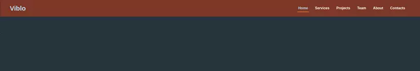
I will go through a few classes as follows: First, we want to create the menu bar, then we will have to create a div with class flex container to contain all the elements in that menu bar, that’s the logo. , navigation like Home, Service, Project, Team, About, Contacts. And let’s not forget the padding style and background for the py-4 menu bar, adding padding for the top and bottom with the parameters py-1 ie padding-top and padding-bottom on each side 0.25rem, similarly we also increase gradually Up from py-1 to py-64, you refer here. Along with that is the bg-orange-900 which is the css background-color attribute in orange and 900 is the intensity of the orange.
We will first come to the logo, we will use the class ml-10 to worry about 2.5 rem from the left margin. and when you hover over this logo icon, the mouse will change to a hand shape when we have the cursor-pointer .
The word Viblo we want to increase the font-size, use the text-3xl class, the font color is relatively light text-blue-200 and a little font-weight: 600 font-semibold
Icon 3 tiles are styled with visible class when the screen width is below 768px, when the screen is bigger, the icon of these 3 tiles will be hidden with md:invisible class. Notice, in tailwind css, when we want to be responsive for screens, we just need to add the prefixes sm:, md:, lg:, xl: before the classes. You refer to more responsive here .
Next is the Home navigation component, Service, Project, Team, About, Contacts, We see most of these navigation links have the same class style but the Home component will be slightly different. by adding style cursor-default . And it should have been a drop-down list, but because of the hidden class, when the screen is 768px or less the list will be hidden, and when the screen is above 768px, the list will appear horizontally with the class md:flex overflow-x-hidden .
New when using Tailwind CSS
As you know, when we use this framework in addition to more classes for us to style, we can also reuse build-in classes in this framework to write a new class. That is when we use the keyword @apply .
Now that we open the assets / styles / less / app.less file again, we will write the following css for the class
1 2 3 4 5 6 7 | @ <span class="token keyword">import</span> <span class="token string">"./libs/tailwind.less"</span> <span class="token punctuation">;</span> <span class="token punctuation">.</span> demo <span class="token punctuation">{</span> @apply flex justify <span class="token operator">-</span> between items <span class="token operator">-</span> center py <span class="token operator">-</span> <span class="token number">4</span> bg <span class="token operator">-</span> blue <span class="token operator">-</span> <span class="token number">900</span> <span class="token punctuation">;</span> <span class="token punctuation">}</span> |
And then after you change the code to the following, you will get the same results as the original
1 2 3 4 5 6 7 8 9 10 11 12 13 14 15 16 17 18 19 20 21 22 23 24 25 26 27 28 29 30 31 32 33 34 | <span class="token keyword">import</span> <span class="token string">'~/assets/styles/less/app.less'</span> <span class="token punctuation">;</span> <span class="token keyword">const</span> <span class="token function-variable function">Demo</span> <span class="token operator">=</span> <span class="token punctuation">(</span> <span class="token punctuation">)</span> <span class="token operator">=></span> <span class="token punctuation">(</span> <span class="token operator"><</span> div className <span class="token operator">=</span> <span class="token string">"demo"</span> <span class="token operator">></span> <span class="token operator"><</span> div className <span class="token operator">=</span> <span class="token string">"flex-shrink-0 ml-10 cursor-pointer"</span> <span class="token operator">></span> <span class="token operator"><</span> i className <span class="token operator">=</span> <span class="token string">"fas fa-drafting-compass fa-2x text-orange-500"</span> <span class="token operator">></span> <span class="token operator"><</span> <span class="token operator">/</span> i <span class="token operator">></span> <span class="token operator"><</span> span className <span class="token operator">=</span> <span class="token string">"ml-1 text-3xl text-blue-200 font-semibold"</span> <span class="token operator">></span> Viblo <span class="token operator"><</span> <span class="token operator">/</span> span <span class="token operator">></span> <span class="token operator"><</span> <span class="token operator">/</span> div <span class="token operator">></span> <span class="token operator"><</span> i className <span class="token operator">=</span> <span class="token string">"fas fa-bars fa-2x visible md:invisible mr-10 md:mr-0 text-blue-200 cursor-pointer"</span> <span class="token operator">></span> <span class="token operator"><</span> <span class="token operator">/</span> i <span class="token operator">></span> <span class="token operator"><</span> ul className <span class="token operator">=</span> <span class="token string">"hidden md:flex overflow-x-hidden mr-10 font-semibold"</span> <span class="token operator">></span> <span class="token operator"><</span> li className <span class="token operator">=</span> <span class="token string">"mr-6 p-1 border-b-2 border-orange-500"</span> <span class="token operator">></span> <span class="token operator"><</span> a className <span class="token operator">=</span> <span class="token string">"text-blue-200 cursor-default"</span> href <span class="token operator">=</span> <span class="token string">"#"</span> <span class="token operator">></span> Home <span class="token operator"><</span> <span class="token operator">/</span> a <span class="token operator">></span> <span class="token operator"><</span> <span class="token operator">/</span> li <span class="token operator">></span> <span class="token operator"><</span> li className <span class="token operator">=</span> <span class="token string">"mr-6 p-1"</span> <span class="token operator">></span> <span class="token operator"><</span> a className <span class="token operator">=</span> <span class="token string">"text-white hover:text-blue-300"</span> href <span class="token operator">=</span> <span class="token string">"#"</span> <span class="token operator">></span> Services <span class="token operator"><</span> <span class="token operator">/</span> a <span class="token operator">></span> <span class="token operator"><</span> <span class="token operator">/</span> li <span class="token operator">></span> <span class="token operator"><</span> li className <span class="token operator">=</span> <span class="token string">"mr-6 p-1"</span> <span class="token operator">></span> <span class="token operator"><</span> a className <span class="token operator">=</span> <span class="token string">"text-white hover:text-blue-300"</span> href <span class="token operator">=</span> <span class="token string">"#"</span> <span class="token operator">></span> Projects <span class="token operator"><</span> <span class="token operator">/</span> a <span class="token operator">></span> <span class="token operator"><</span> <span class="token operator">/</span> li <span class="token operator">></span> <span class="token operator"><</span> li className <span class="token operator">=</span> <span class="token string">"mr-6 p-1"</span> <span class="token operator">></span> <span class="token operator"><</span> a className <span class="token operator">=</span> <span class="token string">"text-white hover:text-blue-300"</span> href <span class="token operator">=</span> <span class="token string">"#"</span> <span class="token operator">></span> Team <span class="token operator"><</span> <span class="token operator">/</span> a <span class="token operator">></span> <span class="token operator"><</span> <span class="token operator">/</span> li <span class="token operator">></span> <span class="token operator"><</span> li className <span class="token operator">=</span> <span class="token string">"mr-6 p-1"</span> <span class="token operator">></span> <span class="token operator"><</span> a className <span class="token operator">=</span> <span class="token string">"text-white hover:text-blue-300"</span> href <span class="token operator">=</span> <span class="token string">"#"</span> <span class="token operator">></span> About <span class="token operator"><</span> <span class="token operator">/</span> a <span class="token operator">></span> <span class="token operator"><</span> <span class="token operator">/</span> li <span class="token operator">></span> <span class="token operator"><</span> li className <span class="token operator">=</span> <span class="token string">"mr-6 p-1"</span> <span class="token operator">></span> <span class="token operator"><</span> a className <span class="token operator">=</span> <span class="token string">"text-white hover:text-blue-300"</span> href <span class="token operator">=</span> <span class="token string">"#"</span> <span class="token operator">></span> Contacts <span class="token operator"><</span> <span class="token operator">/</span> a <span class="token operator">></span> <span class="token operator"><</span> <span class="token operator">/</span> li <span class="token operator">></span> <span class="token operator"><</span> <span class="token operator">/</span> ul <span class="token operator">></span> <span class="token operator"><</span> <span class="token operator">/</span> div <span class="token operator">></span> <span class="token punctuation">)</span> <span class="token punctuation">;</span> <span class="token keyword">export</span> <span class="token keyword">default</span> Demo <span class="token punctuation">;</span> |
This can be said to be a unique feature that I like the most in this framework, because it helps me to use the built-in classes of the framework in a new class, so our code looks a lot cleaner. If using Bootstrap, I will have to write all the built-in classes of the framework I need on that card, so looking at the front-end code I don’t look very neat at all.
Next, you can generate responsive , hover , focus , active , group-hover these classes by we will write in the css file, wrap them with @variants
For example
1 2 3 4 5 6 7 8 9 10 11 12 13 14 15 16 17 18 | <span class="token comment">/* Input */</span> <span class="token atrule"><span class="token rule">@variants</span> hover, focus</span> <span class="token punctuation">{</span> <span class="token selector">.banana</span> <span class="token punctuation">{</span> <span class="token property">color</span> <span class="token punctuation">:</span> yellow <span class="token punctuation">;</span> <span class="token punctuation">}</span> <span class="token punctuation">}</span> <span class="token comment">/* Output */</span> <span class="token selector">.banana</span> <span class="token punctuation">{</span> <span class="token property">color</span> <span class="token punctuation">:</span> yellow <span class="token punctuation">;</span> <span class="token punctuation">}</span> <span class="token selector">.hover:banana:hover</span> <span class="token punctuation">{</span> <span class="token property">color</span> <span class="token punctuation">:</span> yellow <span class="token punctuation">;</span> <span class="token punctuation">}</span> <span class="token selector">.focus:banana:focus</span> <span class="token punctuation">{</span> <span class="token property">color</span> <span class="token punctuation">:</span> yellow <span class="token punctuation">;</span> <span class="token punctuation">}</span> |
Writing 1 that produces many things like this, is short and effective.
Next to responsive it is similar
1 2 3 4 5 6 7 8 9 10 11 12 13 14 15 16 17 18 19 20 21 22 23 24 25 26 27 28 29 30 31 32 33 34 | <span class="token selector">.bg-gradient-brand</span> <span class="token punctuation">{</span> <span class="token property">background-image</span> <span class="token punctuation">:</span> <span class="token function">linear-gradient</span> <span class="token punctuation">(</span> blue, green <span class="token punctuation">)</span> <span class="token punctuation">;</span> <span class="token punctuation">}</span> <span class="token comment">/* ... */</span> <span class="token atrule"><span class="token rule">@media</span> <span class="token punctuation">(</span> <span class="token property">min-width</span> <span class="token punctuation">:</span> 640px <span class="token punctuation">)</span></span> <span class="token punctuation">{</span> <span class="token selector">.sm:bg-gradient-brand</span> <span class="token punctuation">{</span> <span class="token property">background-image</span> <span class="token punctuation">:</span> <span class="token function">linear-gradient</span> <span class="token punctuation">(</span> blue, green <span class="token punctuation">)</span> <span class="token punctuation">;</span> <span class="token punctuation">}</span> <span class="token comment">/* ... */</span> <span class="token punctuation">}</span> <span class="token atrule"><span class="token rule">@media</span> <span class="token punctuation">(</span> <span class="token property">min-width</span> <span class="token punctuation">:</span> 768px <span class="token punctuation">)</span></span> <span class="token punctuation">{</span> <span class="token selector">.md:bg-gradient-brand</span> <span class="token punctuation">{</span> <span class="token property">background-image</span> <span class="token punctuation">:</span> <span class="token function">linear-gradient</span> <span class="token punctuation">(</span> blue, green <span class="token punctuation">)</span> <span class="token punctuation">;</span> <span class="token punctuation">}</span> <span class="token comment">/* ... */</span> <span class="token punctuation">}</span> <span class="token atrule"><span class="token rule">@media</span> <span class="token punctuation">(</span> <span class="token property">min-width</span> <span class="token punctuation">:</span> 1024px <span class="token punctuation">)</span></span> <span class="token punctuation">{</span> <span class="token selector">.lg:bg-gradient-brand</span> <span class="token punctuation">{</span> <span class="token property">background-image</span> <span class="token punctuation">:</span> <span class="token function">linear-gradient</span> <span class="token punctuation">(</span> blue, green <span class="token punctuation">)</span> <span class="token punctuation">;</span> <span class="token punctuation">}</span> <span class="token comment">/* ... */</span> <span class="token punctuation">}</span> <span class="token atrule"><span class="token rule">@media</span> <span class="token punctuation">(</span> <span class="token property">min-width</span> <span class="token punctuation">:</span> 1280px <span class="token punctuation">)</span></span> <span class="token punctuation">{</span> <span class="token selector">.xl:bg-gradient-brand</span> <span class="token punctuation">{</span> <span class="token property">background-image</span> <span class="token punctuation">:</span> <span class="token function">linear-gradient</span> <span class="token punctuation">(</span> blue, green <span class="token punctuation">)</span> <span class="token punctuation">;</span> <span class="token punctuation">}</span> <span class="token comment">/* ... */</span> <span class="token punctuation">}</span> |
Using the theme() for you to access is to retrieve the value in Tailwind config . For example, you have the file tailwind.config.js as follows:
1 2 3 4 5 6 7 8 9 10 11 12 13 14 15 16 17 18 19 20 21 22 23 24 25 26 27 28 29 30 31 32 33 34 35 | module <span class="token punctuation">.</span> exports <span class="token operator">=</span> <span class="token punctuation">{</span> important <span class="token punctuation">:</span> <span class="token boolean">true</span> <span class="token punctuation">,</span> theme <span class="token punctuation">:</span> <span class="token punctuation">{</span> screens <span class="token punctuation">:</span> <span class="token punctuation">{</span> vs <span class="token punctuation">:</span> <span class="token string">'320px'</span> <span class="token punctuation">,</span> sm <span class="token punctuation">:</span> <span class="token string">'576px'</span> <span class="token punctuation">,</span> md <span class="token punctuation">:</span> <span class="token string">'768px'</span> <span class="token punctuation">,</span> lg <span class="token punctuation">:</span> <span class="token string">'992px'</span> <span class="token punctuation">,</span> xl <span class="token punctuation">:</span> <span class="token string">'1200px'</span> <span class="token punctuation">,</span> xxl <span class="token punctuation">:</span> <span class="token string">'1600px'</span> <span class="token punctuation">,</span> <span class="token punctuation">}</span> <span class="token punctuation">,</span> extend <span class="token punctuation">:</span> <span class="token punctuation">{</span> <span class="token punctuation">}</span> <span class="token punctuation">,</span> fontSize <span class="token punctuation">:</span> <span class="token punctuation">{</span> xs <span class="token punctuation">:</span> <span class="token string">'.75rem'</span> <span class="token punctuation">,</span> sm <span class="token punctuation">:</span> <span class="token string">'.875rem'</span> <span class="token punctuation">,</span> tiny <span class="token punctuation">:</span> <span class="token string">'.875rem'</span> <span class="token punctuation">,</span> base <span class="token punctuation">:</span> <span class="token string">'1rem'</span> <span class="token punctuation">,</span> lg <span class="token punctuation">:</span> <span class="token string">'1.125rem'</span> <span class="token punctuation">,</span> xl <span class="token punctuation">:</span> <span class="token string">'1.25rem'</span> <span class="token punctuation">,</span> <span class="token string">'2xl'</span> <span class="token punctuation">:</span> <span class="token string">'1.5rem'</span> <span class="token punctuation">,</span> <span class="token string">'3xl'</span> <span class="token punctuation">:</span> <span class="token string">'1.875rem'</span> <span class="token punctuation">,</span> <span class="token string">'4xl'</span> <span class="token punctuation">:</span> <span class="token string">'2.25rem'</span> <span class="token punctuation">,</span> <span class="token string">'5xl'</span> <span class="token punctuation">:</span> <span class="token string">'3rem'</span> <span class="token punctuation">,</span> <span class="token string">'6xl'</span> <span class="token punctuation">:</span> <span class="token string">'4rem'</span> <span class="token punctuation">,</span> <span class="token string">'7xl'</span> <span class="token punctuation">:</span> <span class="token string">'5rem'</span> <span class="token punctuation">,</span> <span class="token string">'8xl'</span> <span class="token punctuation">:</span> <span class="token string">'6rem'</span> <span class="token punctuation">,</span> <span class="token string">'9xl'</span> <span class="token punctuation">:</span> <span class="token string">'7rem'</span> <span class="token punctuation">,</span> <span class="token string">'10xl'</span> <span class="token punctuation">:</span> <span class="token string">'8rem'</span> <span class="token punctuation">,</span> <span class="token string">'11xl'</span> <span class="token punctuation">:</span> <span class="token string">'9rem'</span> <span class="token punctuation">,</span> <span class="token punctuation">}</span> <span class="token punctuation">,</span> <span class="token punctuation">}</span> <span class="token punctuation">,</span> variants <span class="token punctuation">:</span> <span class="token punctuation">{</span> <span class="token punctuation">}</span> <span class="token punctuation">,</span> plugins <span class="token punctuation">:</span> <span class="token punctuation">[</span> <span class="token punctuation">]</span> <span class="token punctuation">,</span> <span class="token punctuation">}</span> |
Now you have the css file as follows
1 2 3 4 | <span class="token selector">.btn-blue</span> <span class="token punctuation">{</span> <span class="token property">font-size</span> <span class="token punctuation">:</span> <span class="token function">theme</span> <span class="token punctuation">(</span> <span class="token string">'fontSize.11xl'</span> <span class="token punctuation">)</span> <span class="token punctuation">;</span> <span class="token punctuation">}</span> |
It’s easy, isn’t it?
Custom your design
In the nextjs project, we will create a tailwind.config.js file with the following content:
1 2 3 4 5 6 7 8 9 10 11 12 13 14 15 16 17 18 19 20 21 22 23 24 25 26 27 28 29 30 31 32 33 34 35 36 | module <span class="token punctuation">.</span> exports <span class="token operator">=</span> <span class="token punctuation">{</span> important <span class="token punctuation">:</span> <span class="token boolean">true</span> <span class="token punctuation">,</span> theme <span class="token punctuation">:</span> <span class="token punctuation">{</span> screens <span class="token punctuation">:</span> <span class="token punctuation">{</span> vs <span class="token punctuation">:</span> <span class="token string">'320px'</span> <span class="token punctuation">,</span> sm <span class="token punctuation">:</span> <span class="token string">'576px'</span> <span class="token punctuation">,</span> md <span class="token punctuation">:</span> <span class="token string">'768px'</span> <span class="token punctuation">,</span> lg <span class="token punctuation">:</span> <span class="token string">'992px'</span> <span class="token punctuation">,</span> xl <span class="token punctuation">:</span> <span class="token string">'1200px'</span> <span class="token punctuation">,</span> xxl <span class="token punctuation">:</span> <span class="token string">'1600px'</span> <span class="token punctuation">,</span> <span class="token punctuation">}</span> <span class="token punctuation">,</span> extend <span class="token punctuation">:</span> <span class="token punctuation">{</span> <span class="token punctuation">}</span> <span class="token punctuation">,</span> fontSize <span class="token punctuation">:</span> <span class="token punctuation">{</span> xs <span class="token punctuation">:</span> <span class="token string">'.75rem'</span> <span class="token punctuation">,</span> sm <span class="token punctuation">:</span> <span class="token string">'.875rem'</span> <span class="token punctuation">,</span> tiny <span class="token punctuation">:</span> <span class="token string">'.875rem'</span> <span class="token punctuation">,</span> base <span class="token punctuation">:</span> <span class="token string">'1rem'</span> <span class="token punctuation">,</span> lg <span class="token punctuation">:</span> <span class="token string">'1.125rem'</span> <span class="token punctuation">,</span> xl <span class="token punctuation">:</span> <span class="token string">'1.25rem'</span> <span class="token punctuation">,</span> <span class="token string">'2xl'</span> <span class="token punctuation">:</span> <span class="token string">'1.5rem'</span> <span class="token punctuation">,</span> <span class="token string">'3xl'</span> <span class="token punctuation">:</span> <span class="token string">'1.875rem'</span> <span class="token punctuation">,</span> <span class="token string">'4xl'</span> <span class="token punctuation">:</span> <span class="token string">'2.25rem'</span> <span class="token punctuation">,</span> <span class="token string">'5xl'</span> <span class="token punctuation">:</span> <span class="token string">'3rem'</span> <span class="token punctuation">,</span> <span class="token string">'6xl'</span> <span class="token punctuation">:</span> <span class="token string">'4rem'</span> <span class="token punctuation">,</span> <span class="token string">'7xl'</span> <span class="token punctuation">:</span> <span class="token string">'5rem'</span> <span class="token punctuation">,</span> <span class="token string">'8xl'</span> <span class="token punctuation">:</span> <span class="token string">'6rem'</span> <span class="token punctuation">,</span> <span class="token string">'9xl'</span> <span class="token punctuation">:</span> <span class="token string">'7rem'</span> <span class="token punctuation">,</span> <span class="token string">'10xl'</span> <span class="token punctuation">:</span> <span class="token string">'8rem'</span> <span class="token punctuation">,</span> <span class="token string">'11xl'</span> <span class="token punctuation">:</span> <span class="token string">'9rem'</span> <span class="token punctuation">,</span> <span class="token punctuation">}</span> <span class="token punctuation">,</span> <span class="token punctuation">}</span> <span class="token punctuation">,</span> variants <span class="token punctuation">:</span> <span class="token punctuation">{</span> <span class="token punctuation">}</span> <span class="token punctuation">,</span> plugins <span class="token punctuation">:</span> <span class="token punctuation">[</span> <span class="token punctuation">]</span> <span class="token punctuation">,</span> <span class="token punctuation">}</span> |
For example, above, I custome the screen sizes, fontSize things. Similarly you want custome font-family, then you just need to add this file only
1 2 3 4 5 6 7 8 9 10 11 12 13 14 15 16 17 18 19 20 21 22 23 24 25 26 27 28 29 30 31 32 33 34 35 36 37 38 39 40 | module <span class="token punctuation">.</span> exports <span class="token operator">=</span> <span class="token punctuation">{</span> important <span class="token punctuation">:</span> <span class="token boolean">true</span> <span class="token punctuation">,</span> theme <span class="token punctuation">:</span> <span class="token punctuation">{</span> screens <span class="token punctuation">:</span> <span class="token punctuation">{</span> vs <span class="token punctuation">:</span> <span class="token string">'320px'</span> <span class="token punctuation">,</span> sm <span class="token punctuation">:</span> <span class="token string">'576px'</span> <span class="token punctuation">,</span> md <span class="token punctuation">:</span> <span class="token string">'768px'</span> <span class="token punctuation">,</span> lg <span class="token punctuation">:</span> <span class="token string">'992px'</span> <span class="token punctuation">,</span> xl <span class="token punctuation">:</span> <span class="token string">'1200px'</span> <span class="token punctuation">,</span> xxl <span class="token punctuation">:</span> <span class="token string">'1600px'</span> <span class="token punctuation">,</span> <span class="token punctuation">}</span> <span class="token punctuation">,</span> extend <span class="token punctuation">:</span> <span class="token punctuation">{</span> <span class="token punctuation">}</span> <span class="token punctuation">,</span> fontSize <span class="token punctuation">:</span> <span class="token punctuation">{</span> xs <span class="token punctuation">:</span> <span class="token string">'.75rem'</span> <span class="token punctuation">,</span> sm <span class="token punctuation">:</span> <span class="token string">'.875rem'</span> <span class="token punctuation">,</span> tiny <span class="token punctuation">:</span> <span class="token string">'.875rem'</span> <span class="token punctuation">,</span> base <span class="token punctuation">:</span> <span class="token string">'1rem'</span> <span class="token punctuation">,</span> lg <span class="token punctuation">:</span> <span class="token string">'1.125rem'</span> <span class="token punctuation">,</span> xl <span class="token punctuation">:</span> <span class="token string">'1.25rem'</span> <span class="token punctuation">,</span> <span class="token string">'2xl'</span> <span class="token punctuation">:</span> <span class="token string">'1.5rem'</span> <span class="token punctuation">,</span> <span class="token string">'3xl'</span> <span class="token punctuation">:</span> <span class="token string">'1.875rem'</span> <span class="token punctuation">,</span> <span class="token string">'4xl'</span> <span class="token punctuation">:</span> <span class="token string">'2.25rem'</span> <span class="token punctuation">,</span> <span class="token string">'5xl'</span> <span class="token punctuation">:</span> <span class="token string">'3rem'</span> <span class="token punctuation">,</span> <span class="token string">'6xl'</span> <span class="token punctuation">:</span> <span class="token string">'4rem'</span> <span class="token punctuation">,</span> <span class="token string">'7xl'</span> <span class="token punctuation">:</span> <span class="token string">'5rem'</span> <span class="token punctuation">,</span> <span class="token string">'8xl'</span> <span class="token punctuation">:</span> <span class="token string">'6rem'</span> <span class="token punctuation">,</span> <span class="token string">'9xl'</span> <span class="token punctuation">:</span> <span class="token string">'7rem'</span> <span class="token punctuation">,</span> <span class="token string">'10xl'</span> <span class="token punctuation">:</span> <span class="token string">'8rem'</span> <span class="token punctuation">,</span> <span class="token string">'11xl'</span> <span class="token punctuation">:</span> <span class="token string">'9rem'</span> <span class="token punctuation">,</span> <span class="token punctuation">}</span> <span class="token punctuation">,</span> fontFamily <span class="token punctuation">:</span> <span class="token punctuation">{</span> display <span class="token punctuation">:</span> <span class="token punctuation">[</span> <span class="token string">'Gilroy'</span> <span class="token punctuation">,</span> <span class="token string">'sans-serif'</span> <span class="token punctuation">]</span> <span class="token punctuation">,</span> body <span class="token punctuation">:</span> <span class="token punctuation">[</span> <span class="token string">'Graphik'</span> <span class="token punctuation">,</span> <span class="token string">'sans-serif'</span> <span class="token punctuation">]</span> <span class="token punctuation">,</span> <span class="token punctuation">}</span> <span class="token punctuation">,</span> <span class="token punctuation">}</span> <span class="token punctuation">,</span> variants <span class="token punctuation">:</span> <span class="token punctuation">{</span> <span class="token punctuation">}</span> <span class="token punctuation">,</span> plugins <span class="token punctuation">:</span> <span class="token punctuation">[</span> <span class="token punctuation">]</span> <span class="token punctuation">,</span> <span class="token punctuation">}</span> |
It’s as easy as candy, guys  ))
))
Pseudo-Class Variants
This is a point I like very much in this CSS framework because we can write classes for hover, focus, active, disabled, visited, first-child, last-child, odd-child, even-child, focus-within, events. hover, focus, active, disabled, visited, first-child, last-child, odd-child, even-child, focus-within, for the tags.
Like
1 2 3 4 5 6 7 | <span class="token operator"><</span> form <span class="token operator">></span> <span class="token operator"><</span> input <span class="token keyword">class</span> <span class="token operator">=</span> <span class="token string">"bg-gray-200 hover:bg-white hover:border-gray-300 focus:outline-none focus:bg-white focus:shadow-outline focus:border-gray-300 ..."</span> <span class="token operator">></span> <span class="token operator"><</span> button <span class="token keyword">class</span> <span class="token operator">=</span> <span class="token string">"bg-teal-500 hover:bg-teal-600 focus:outline-none focus:shadow-outline ..."</span> <span class="token operator">></span> Sign Up <span class="token operator"><</span> <span class="token operator">/</span> button <span class="token operator">></span> <span class="token operator"><</span> <span class="token operator">/</span> form <span class="token operator">></span> |
The above code is that we create an input box with the Sign up button, instead of having to write long css, we add the hover, focus prefix hover, focus before the class only we can make a style change when hover or focus on the html tag. You refer to the examples here
Conclude
So through that, through some of my research on Tailwind CSS above also helps you somewhat visualize what it is, how to use it, and some of its unique characteristics. Hopefully, through this article, you can use and apply them to the projects you are doing. Thank you for reading my article.