1. Introduction
CSS Grid is a new way to create two-dimensional layouts on the web. With just a few lines of CSS, you can create a grid that would otherwise have been impossible without JavaScript. No plugins or complicated settings, no heavy plugins, not a lot of design limitations due to only 12 columns.
2. What grid types can be used?
You can find a good overview of the most popular Grids here
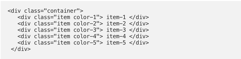
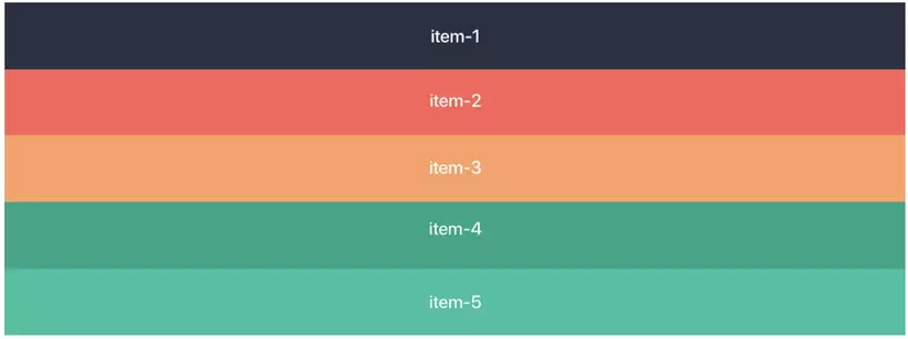
3. Example
Create a grid container by setting the display property to the grid value then all the items inside the grid will become grid item .. If you want, you can experiment directly in CodePen.
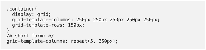
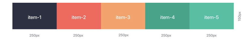
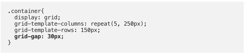
4. Grid, Columns and Rows
With grid-template-columns I activate the desired columns, in this case 5 columns with 250px each. With grid-template-rows , we can set the row height (if necessary) in this case I consider 150px
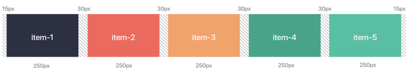
5. Gutters
Any desired spacing between items can be created with grid-gap for all items or separated for horizontal and vertical spacing with grid-gap and row-gap . You can use all common units, for example px for fixed gutters or % for flexible gutters .
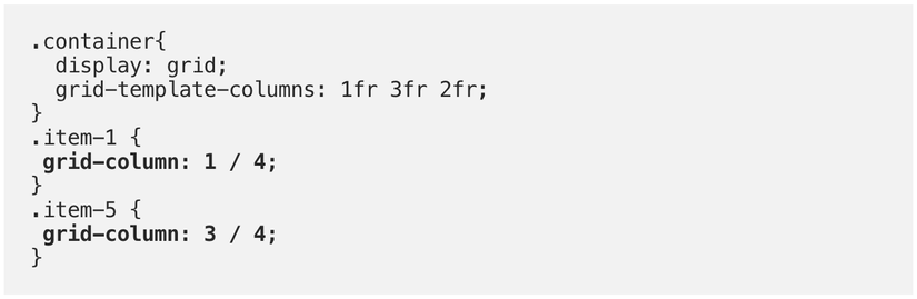
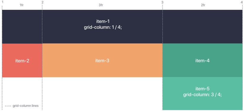
6. Arrange the elements
The best part is, all the items can take up as much space as they want even in the Grid. For this purpose, the starting point is set with grid-column-start and the end point is grid-column-end . Briefly, grid-column: startpoint / endpoint;
7. Conclusion
Hope you have a better overview of grid layout. There are also many grid properties that I have not named. You can refer here .
Thanks for reading my writing. Hope through this article can help you somewhat. Thank you!