Layout in Flutter
- Tram Ho
In Flutter, there are a lot of widgets to display on the screen, but in order for them to display at the position and size we want, in this article I will make a cheat sheet about the layout in fluter for your reference:
Layout in Flutter
Row and Column
MainAxisAlignment
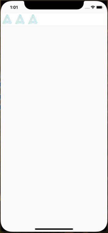
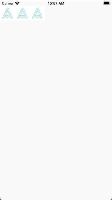
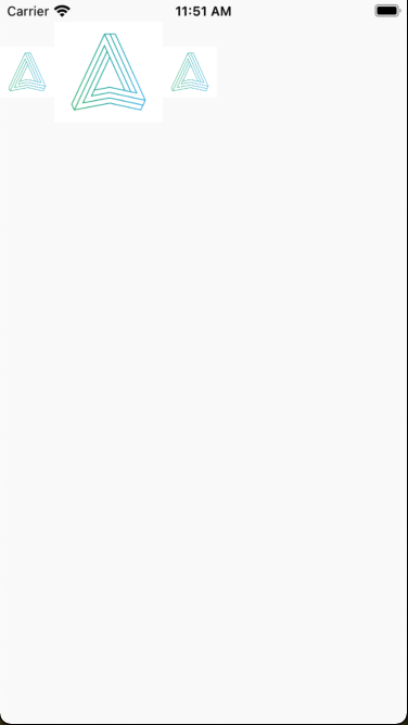
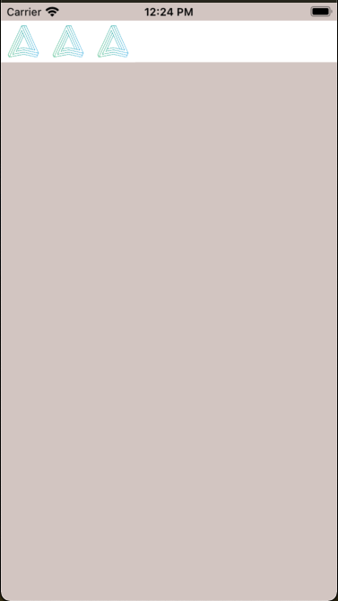
For Row/Column use MainAxisAlignment to align content against the main axis is main axis
1 2 | mainAxisAlignment: MainAxisAlignment.start, |
Row:
Column:
1 2 3 4 5 6 7 8 9 10 11 12 13 14 15 16 17 18 19 20 21 22 23 24 25 | class RowCheatSheet extends StatelessWidget { @override Widget build(BuildContext context) { return Container( child: Row( mainAxisAlignment: MainAxisAlignment.start, children: [ Image( image: AssetImage('images/a.png'), width: 50.0, ), Image( image: AssetImage('images/a.png'), width: 50.0, ), Image( image: AssetImage('images/a.png'), width: 50.0, ), ], ), ); } } |
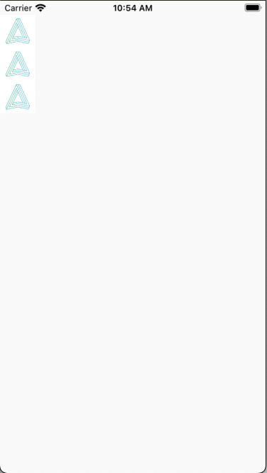
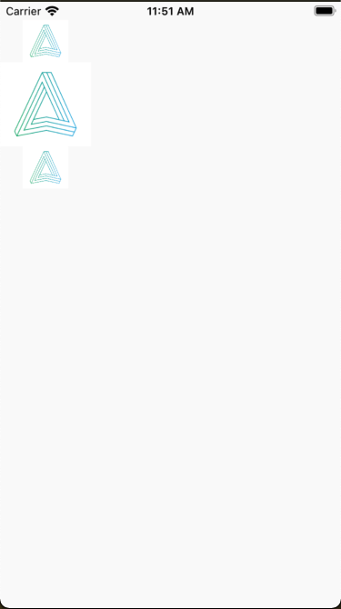
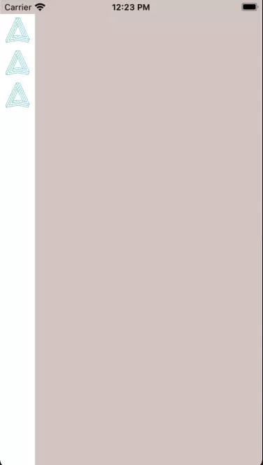
Opposite to start to be end We will get the following:
Row:
Column:
1 2 3 4 5 6 7 8 9 10 11 12 13 14 15 16 17 18 19 20 21 22 23 24 25 | class ColumnCheatSheet extends StatelessWidget { @override Widget build(BuildContext context) { return Container( child: Column( mainAxisAlignment: MainAxisAlignment.end, children: [ Image( image: AssetImage('images/a.png'), width: 50.0, ), Image( image: AssetImage('images/a.png'), width: 50.0, ), Image( image: AssetImage('images/a.png'), width: 50.0, ), ], ), ); } } |
To create space between the widgets in the column we use properties like spaceBetween, spaceEvenly, spaceAround
SpaceBetween: For this property will create equal spacing between the child widgets but the first and last child widget will be close to the outer border:
Row:
Column:
SpaceEvenly: With this property will create equal spacing between child widgets no matter how large the size of the outer widget is.
Row:
Column:
SpaceAround: This property will create a padding around each child widget, depending on the number of widgets and the size of the widget outside it will automatically calculate the space around the outside for each widget.
Row:
Column:
CrossAxisAlignment
Used to specify how the child widgets should be arranged on the cross axis, on the column the vertical axis and the row on the horizontal axis.
1 2 | crossAxisAlignment: CrossAxisAlignment.start, |
Row:
Column:
1 2 | crossAxisAlignment: CrossAxisAlignment.end, |
Row:
Column:
1 2 | crossAxisAlignment: CrossAxisAlignment.center, |
Center: Will put all the child widgets inside to the center
Row:
Column:
1 2 3 4 5 6 7 8 9 10 11 12 13 14 15 16 17 18 19 20 21 22 23 24 25 | class ColumnCheatSheet extends StatelessWidget { @override Widget build(BuildContext context) { return Container( child: Column( crossAxisAlignment: CrossAxisAlignment.center, children: [ Image( image: AssetImage('images/a.png'), width: 50.0, ), Image( image: AssetImage('images/a.png'), width: 100.0, ), Image( image: AssetImage('images/a.png'), width: 50.0, ), ], ), ); } } |
MainAxisSize
Size of external widget widget
1 2 | mainAxisSize: MainAxisSize.min, |
Row:
Column:
1 2 | mainAxisSize: MainAxisSize.max, |
Row:
Column:
1 2 3 4 5 6 7 8 9 10 11 12 13 14 15 16 17 18 19 20 21 22 23 24 25 26 | class RowCheatSheet extends StatelessWidget { @override Widget build(BuildContext context) { return Container( color: Colors.white, child: Row( mainAxisSize: MainAxisSize.max, children: [ Image( image: AssetImage('images/a.png'), width: 50.0, ), Image( image: AssetImage('images/a.png'), width: 50.0, ), Image( image: AssetImage('images/a.png'), width: 50.0, ), ], ), ); } } |
Expanded
Expanded is a widget that automatically fills the space of the Row / Column content, in case there are many child widgets, it will automatically align evenly or we can also use the property flex to set the percentage that the content of the child widget will take up.
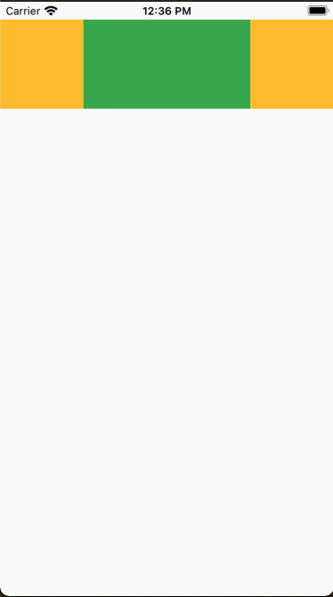
1 2 3 4 5 6 7 8 9 10 11 12 13 14 15 16 17 18 19 20 21 22 23 24 25 26 27 28 29 30 31 32 33 34 | class RowExpandCheatSheet extends StatelessWidget { @override Widget build(BuildContext context) { return Container( child: Row( mainAxisSize: MainAxisSize.max, children: [ Expanded( flex: 1, child: Container( color: Colors.amber, height: 100, ), ), Expanded( flex: 2, child: Container( color: Colors.green, height: 100, ), ), Expanded( flex: 1, child: Container( color: Colors.amber, height: 100, ), ), ], ), ); } } |
Container
Container is a widget to contain only 1 widget in it, this widget if there are no child widgets will automatically be the size of the parent widget and if there are child widgets inside, this widget will automatically trim the size. according to the content of the child widget. This is similar to div html side.
- Does not contain any child widgets:
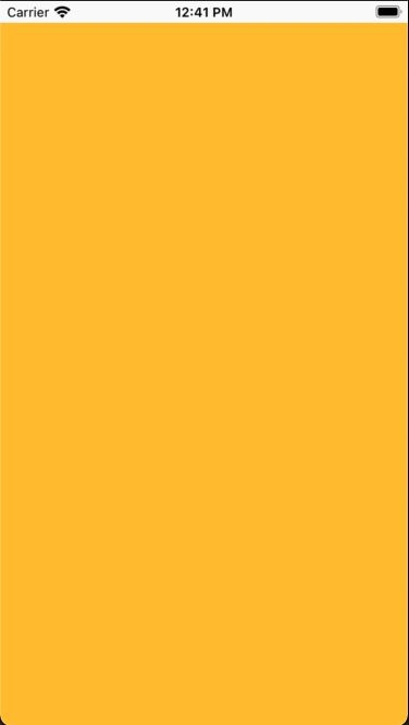
1 2 3 4 5 6 7 8 9 | class ContainerCheatSheet extends StatelessWidget { @override Widget build(BuildContext context) { return Container( color: Colors.amber, ); } } |
- Contains child widgets:
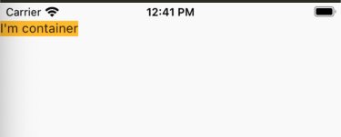
1 2 3 4 5 6 7 8 9 10 | class ContainerCheatSheet extends StatelessWidget { @override Widget build(BuildContext context) { return Container( color: Colors.amber, child: Text("I'm container"), ); } } |
SizedBox
SizedBox is quite similar to Container but it will not be able to set properties like padding, margin, color
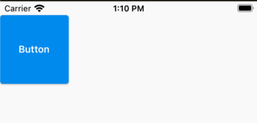
1 2 3 4 5 6 7 8 9 10 11 12 13 14 15 16 | class SizedBoxCheatSheet extends StatelessWidget { @override Widget build(BuildContext context) { return Container( child: SizedBox( width: 100, height: 100, child: ElevatedButton( child: Text("Button"), onPressed: () {}, ), ), ); } } |
SafeArea
In case we want the widget content not to be covered by the status bar of Android or Notch iPhone, this is a very useful widget.