One of the most interesting things about vector graphics (apart from scaling without losing quality) is that when you know the basics, you can handle simple shapes code quite easily, without Open a graphical application.
With just a few lines of code you can get your own custom icons, and you’ll know exactly how each icon is created.
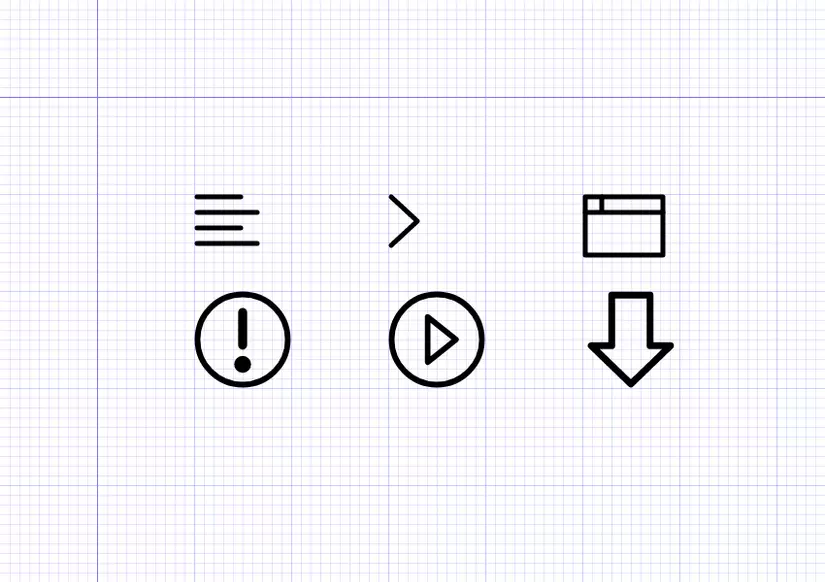
In this tutorial we will learn all the basic principles of writing SVG code by hand, but I won’t bother you with a dry presentation explaining only the relevant shapes and attributes. Quan. Instead you will learn how to handle SVG code manually through practice, creating the six icons you see at the beginning of this article ( see demo ). During the implementation, you will use all the basic components necessary for writing SVG code manually.
Talk about those basic ingredients, see a short introduction to each of them.
The basic SVG components
You can face a lot of complexity with SVG, but it is not necessary for the icons that we will create. The list below outlines the blocks we will need.
<svg>Enclose and define the entire image.<svg>is a vector graphic where<html>is a web page.<line>Create single lines.<polyline>Create multi-segmented lines.<rect>Create rectangles and squares.<ellipse>Create circle and oval.<polygon>Create polygons, with three or more edges.<path>Create any shape you like by defining points and lines between them.<defs>Define<defs>resources. Nothing in the<defs>is displayed.<defs>is a vector where<head>is a web page.<g>Combine multiple shapes into a group. Put the groups in the<defs>to allow them to be reused.<symbol>Link a group, but with some extra features. Typically placed in<defs>.<use>Get the resources defined within the<defs>and make them visible in SVG.
When we start creating the icons, we will work with these components in the order seen above.
File start
Before we begin, let’s get a copy of the GitHub repo files . You can download the .zip file, or clone repo, to your system.
We will start with a document that has some basic HTML and CSS available. This will give us some styles for SVG that we will create, and will also set up a small grid on the page. We will create icons above this grid, and hopefully it will help you to visually arrange it when creating SVG.
When you open “handcodesvg.html” from the source folder “Starter Files” you will see the following:
Quickly identify x and y values
When working in 2D space on a web page, the horizontal axis is represented by x and the vertical axis is represented by y . These axial positions are represented by numbers. If you want to move something to the right, we will need to increase the x value, and to move to the left we will decrease x . Similarly, to move something down we will increase y and to move up we will decrease y .
A common abbreviation for representing x and y of a point is (x, y) . For example, a point for generating x coordinates of 10 and y 50 may be written as follows (10, 50) . I will use this abbreviation throughout this article.
Notice the two darkest lines on our grid? We will place the SVG so that the upper left corner is aligned with the position where they intersect. Thus, the point of intersection will represent the position x = 0 and y = 0 , or (0,0) in our SVG.
Grid background
Each lightest grid line represents 10px , and the thickest grid lines represent 100px . So if we want to move an object from one road down to road design thickness, we will increase its position in the Middle y by 100px .
If that still seems unclear, don’t worry this will become obvious once we start practicing SVG icons creation.
SVG Style Default
Note that in the initial HTML file there are some CSS with default styles for the SVG icons we are about to do:
1 2 3 4 5 6 7 8 | svg { stroke: #000; stroke-width: 5; stroke-linecap: round; stroke-linejoin: round; fill: none; } |
This will set our icons to no fill, and the 5px thick black troke with rounded as cap and join.
1. Set up SVG
The first step in creating any SVG is to build an <svg></svg> element tag. Anything you want your SVG to display will have to be inside these two tags. There are some properties that you can use on this element, but we’ll keep things simple and only use width and height .
Add the following code to the <body> of the HTML document:
1 2 3 4 | <svg width="750" height="500"> </svg> |
Note: The CSS in the start file will move this SVG down and to the right 100px so that its upper left corner will be placed at the intersection of the two darkest lines on our background grid. And the values inside the demo on CodePen throughout this tutorial can be a bit different – but be comfortable with them.
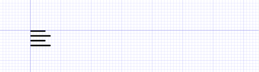
2. Create Icon “Align Left”
Let’s start by using the <line> element to create this left alignment icon:
The line element has four properties that you will need to use:
x1starting point on the horizontal axisy1starting point on the vertical axisx2end points on the horizontal axisy2end point on vertical axis
In a nutshell, you use the properties x1 and y1 to set where the line begins, and x2 and y2 to set where the line ends.
Let’s start the first line, the top one. We will create a 45px long line, but the 5px stroke we will use will add some extra pixels around the outside of the line. Just as we will need to move our line down and to the right 3px to make sure there are no extra pixels due to the troke being cut.
For that reason, we will start our line at a position 3 on the x axis and 3 on the y . We can set the starting point to (3,3) by using the attribute x1-"3" y1="3" .
We want the line to be 45px long, so we’ll add 45 to the x starting position of 3 , giving us 48 is the value we want to set for x2 . We want the line to complete at the same position on the horizontal axis, so we’ll set y2 3 , similar to the value set for y1 . We will add this endpoint (48,3) through the attribute x2=48" y2="3" .
The complete code for the first line will look like this:
1 2 | <line x1="3" y1="3" x2="48" y2="3"></line> |
Review your browser and you’ll see a black 45px long line with rounded ends.
Now we can continue adding the next three lines to our icon. We want to end with a total of four lines. The first and third will be 45px long, and the second and fourth will be 62px . We also want a distance of 16px between each line.
We can do this with the following code:
1 2 3 4 5 | <line x1="3" y1="3" x2="48" y2="3"></line> <line x1="3" y1="19" x2="65" y2="19"></line> <line x1="3" y1="35" x2="48" y2="35"></line> <line x1="3" y1="51" x2="65" y2="51"></line> |
Note: the y value of each line is increased by 16px to create the required distance.
Review your browser preview and you’ll see all four. You can also edit SVG directly in this pen:
Temporarily convert Icon to Comment
With that code, your first icon has been completed. We’re ready to move on to the next icon, and we’ll want to create it in the same position on the grid, but right now the left alignment icon is in the way. Thus, now just comment its code to spread out the space. We will fly back and uncomment it after we convert our icon into reusable resources.
You will need to do the same for each icon as we continue, commenting it when you’re done creating it. For that reason, it may be a good idea to add a little caption above the code for each icon so you know which one is when you return to it later.
3. Create Icon “Larger Sign”
For this icon, use the next transformation of the <line> element: <polyline> . We will use it to create a larger marker.
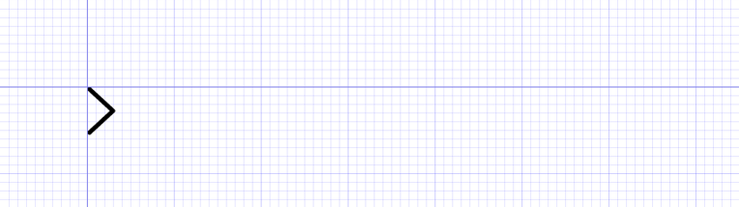
The <polyline> element has only one attribute: points . In this you use pairs of numbers to set up a series of points. Line will automatically be drawn between them. Number pairs are simply written one number after another within the points property. Does not require commas to separate, however it can still use commas. For clarity, you may also want to place a pair of values on its own line.
We will start our polyline at the same position where we started the previous icon, which is (3,3) to ensure the stroke and cap are not cut. We want the second point to move to the right, and down to 25px , so we set it to (30,28) . Our third point will be centered vertically from the first one, and move below 25px , so it will be set to (3,53) .
We can add these points to the points property of the polyline as follows:
1 2 3 4 5 6 | <polyline points=" 3 3 30 28 3 53 "></polyline> |
If you want more concise code, you can also write the code above as follows:
1 2 | <polyline points="3 3, 30 28, 3 53"></polyline> |
or
1 2 | <polyline points="3 3 30 28 3 53"></polyline> |
Take a look back on your browser and you will see the larger icon displayed: one more icon is completed, it’s that simple!
Again, comment it out and give it a little comment so you know which one before proceeding to the next icon.
4. Create a “Browser” Icon
Now that we’ve worked with the line, let’s create some shapes, starting with a rectangle ( <rect> ). We will use it in conjunction with some <line> to create a browser icon.
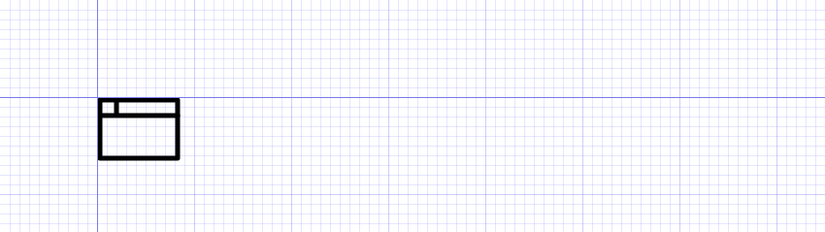
Rectangles and squares can be created with the <rect> element, which has four attributes you will need to provide:
xupper left corner is onxaxisythe upper left corner is on theyaxiswidthwidth of the imageheightthe width of the image
Note: you can also use the rx and ry properties to create rounded corners if you like.
We will create a rectangle with its upper left corner moving 3px in both directions, again limiting the stroke removal, so we will use the x="3" y="3" attributes. x="3" y="3" . We want it to be 80px wide and 60px high, so we’ll also use the width="80" height="60" properties.
So the full code for the rectangle is:
1 2 | <rect x="3" y="3" width="80" height="60"></rect> |
Save your code and review it in the browser. You will see a small rectangle on it.
Now all we need to do is add a horizontal line at the top, add a vertical line near the upper left corner. We will use the same line creation method as we did, the complete code for the browser icon will be:
1 2 3 4 | <rect x="3" y="3" width="80" height="60"></rect> <line x1="3" y1="19" x2="83" y2="19"></line> <line x1="20" y1="3" x2="20" y2="17"></line> |
Take some time to see the coordinates provided in the properties of the two lines, and can change their values so you can see how they work in this icon.
To continue … (Please wait for part 2 ^^)