4. Creating Wrapper Components with children
In this step, you will create a wrapper component, which can group unknown components as prop. This will give you the ability to incorporate components like standard HTML, and it will give you a pattern for creating reusable wrappers that allow you to create a variety of different components that need common design but internal flexible loss. React gives you a built-in prop called children that collects any child components. Using this makes creating wrapper components intuitive and easy to read.
To start, let’s create a new component called Card. This will be a wrapper component that creates a standard style for any new card component.
Create a directory: mkdir src / components / Card create file: touch src / components / Card / Card.js
Create a component that takes children and title as props and wraps them in a div by adding the following code
1 2 3 4 5 6 7 8 9 10 11 12 13 14 15 16 17 18 19 20 21 22 23 | import React from 'react'; import PropTypes from 'prop-types'; import './Card.css'; export default function Card({ children, title }) { return( <div className="card"> <div className="card-details"> <h2>{title}</h2> </div> {children} </div> ) } Card.propTypes = { children: PropTypes.oneOfType([ PropTypes.arrayOf(PropTypes.element), PropTypes.element.isRequired ]), title: PropTypes.string.isRequired, } |
Children’s PropTypes is new. The Children prop can be a JSX element or an array of JSX elements. Title is a string.
Add style to the Touch src / components / Card / Card.css card
1 2 3 4 5 6 7 8 9 10 11 12 | .card { border: black solid 1px; margin: 10px; padding: 10px; width: 200px; } .card-details { border-bottom: gray solid 1px; margin-bottom: 20px; } |
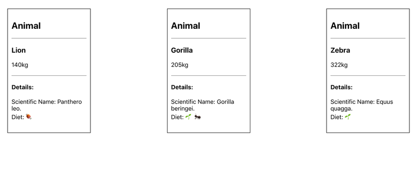
Now you have the component you need to use. You can wrap each AnimalCard card with the card component in App.js, but since the AnimalCard name implies that it’s already a Card, it’s better to use the card component inside the AnimalCard.
Unlike the other props, you don’t explicitly pass the children. Instead, you include JSX as if they were children elements of HTML. In other words, you just need to nest them inside the element, like so: File: src / components / AnimalCard / AnimalCard.js
Revise as follows:
1 2 3 4 5 6 7 8 9 10 11 12 13 14 15 16 17 18 19 20 21 22 | import React from 'react'; import PropTypes from 'prop-types'; import Card from '../Card/Card'; import AnimalDetails from '../AnimalDetails/AnimalDetails'; export default function AnimalCard({ name, size, ...props }) { return( <Card title="Animal"> <h3>{name}</h3> <div>{size}kg</div> <AnimalDetails {...props} /> </Card> ) } AnimalCard.propTypes = { name: PropTypes.string.isRequired, size: PropTypes.number.isRequired, } |
Unlike a React component, you don’t need to have a single root element like a child. That’s why Card’s PropType specifies it can be an array of elements or a single element. In addition to converting the children as nested components you are setting the Animal’s standard title.
F5 browser you will see the updated card component.
You now have a reusable Card component that can take any number of nested children. The main advantage of this is that you can reuse the Card with any arbitrary component. If you want to create a Plant Card, you can do so by wrapping plant information with the Card component. If you want to reuse the Card component in another app that lists things like music or account data, you can do that too. The card element doesn’t care what children are; you are reusing the wrapper element, in this case the style border and title. The downside to using children is that you only have one example of children prop. Sometimes, you will want a component with JSX custom in many places. Fortunately, you can do that by turning JSX and React components as prop, which will be covered in the next step.
5. Passing Components as Props
In this step, you will modify the Card component to take other components as prop. This will give your component the maximum flexibility of rendering unknown components or JSXs in multiple positions across the page. Unlike children, you can only use it once, you can have multiple components as prop, making the wrapper component adaptable to many different needs while preserving the standard look and structure.
After this step, you will have a component that can wrap children components and also display other components in the card. This template will give you the flexibility when you need to create components that need more complex information than simple strings and integers.
Let’s modify the Card component to get an optional React element called detail. Open the nano src / components / Card / Card.js file
1 2 3 4 5 6 7 8 9 10 11 12 13 14 15 16 17 18 19 20 21 22 23 24 25 26 27 28 29 | import React from 'react'; import PropTypes from 'prop-types'; import './Card.css'; export default function Card({ children, details, title }) { return( <div className="card"> <div className="card-details"> <h2>{title}</h2> {details} </div> {children} </div> ) } Card.propTypes = { children: PropTypes.oneOfType([ PropTypes.arrayOf(PropTypes.element), PropTypes.element.isRequired ]), details: PropTypes.element, title: PropTypes.string.isRequired, } Card.defaultProps = { details: null, } |
This prop will have the same type as children, but it must be optional. For optional, you add the default value of null. In this case, if the user doesn’t pass the details, the component will still have a value and won’t show anything more.

1 2 3 4 5 6 7 8 9 10 11 12 13 14 15 16 | import React from 'react'; ... export default function AnimalCard({ name, size, ...props }) { return( <Card title="Animal" details={<em>Mammal</em>}> <h3>{name}</h3> <div>{size}kg</div> <AnimalDetails {...props} /> </Card> ) } ... |
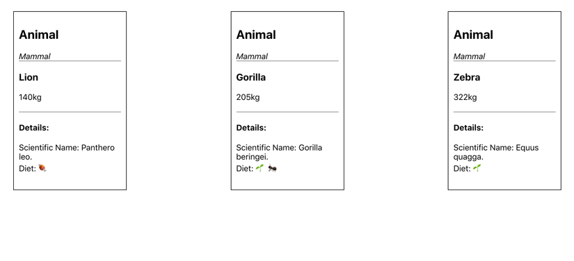
Browser F5 and you will see the following update:
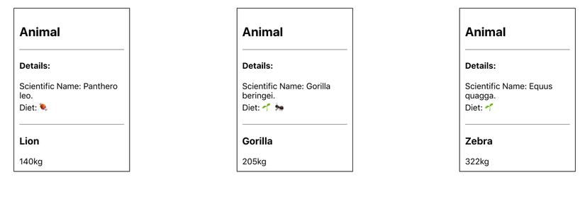
1 2 3 4 5 6 7 8 9 10 11 12 13 14 15 16 17 18 19 20 | import React from 'react'; ... export default function AnimalCard({ name, size, ...props }) { return( <Card title="Animal" details={ <AnimalDetails {...props} /> } > <h3>{name}</h3> <div>{size}kg</div> </Card> ) } ... |
AnimalDetails is more complicated and has several markup lines. If you add it directly to details, it will significantly increase prop and make it difficult to read.
F5 browser will have detailed information appear at the top of the card.
You now have a card component that can take your custom JSX and put it in multiple positions. You’re not limited to one prop; You can switch the elenment to as many prop as you like. This gives you the ability to create flexible wrap components that can give other developers the opportunity to customize a component while preserving its overall style and functionality.
Converting a componet as prop is not perfect. It’s a bit more difficult to read and not as clear as passing children, but they are very flexible and you can use as many as you like in a component. You should use children first, but don’t hesitate to get back to the prop if that isn’t enough.
In this step, you learned how to convert JSX and React components as prop to other components. This will give your component the flexibility to handle many situations where a wrapper component component may need a lot of prop to handle JSX or components.