Try Thanks instead of simply confirming completion
Thank you to everyone who can make you, your business, your products, or your user interface feel more human, because that shows you appreciate and care. 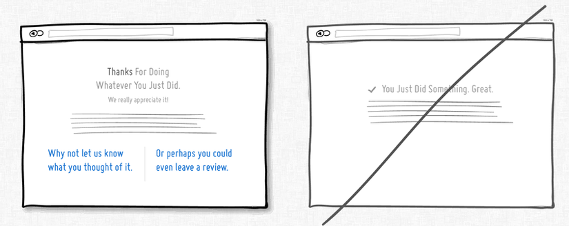
Try Give Feedback instead of silence.
When users perform an action or a task, they want to know if the action performed successfully or failed. So please respond when action is taken 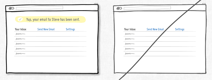
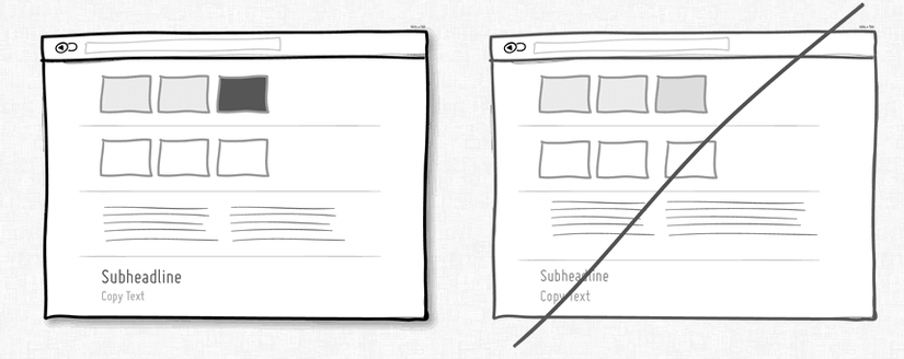
Try adding spacing instead of crowded elements.
Spacing can definitely make content and data more readable. When the elements are somewhat separate from each other, they begin to be allowed to be perceived individually. This makes your content more distinguishable 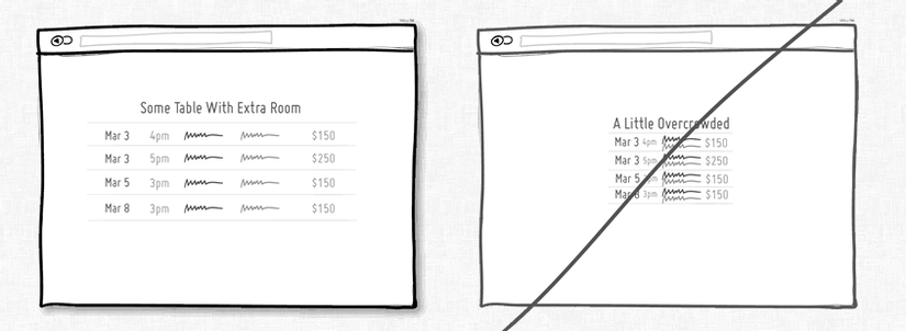
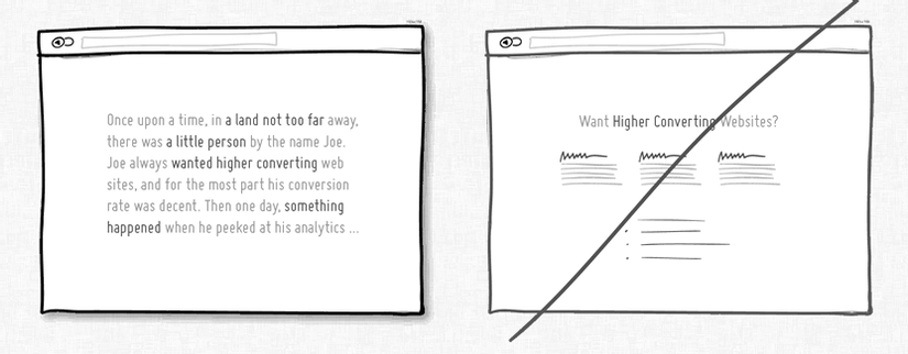
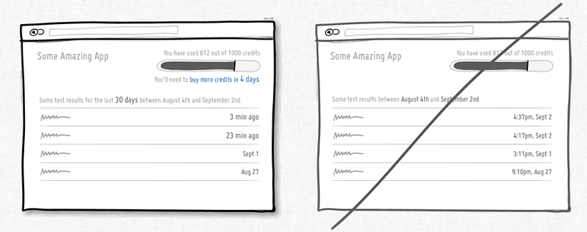
Try telling stories instead of listing events.
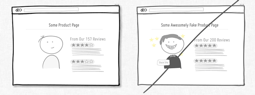
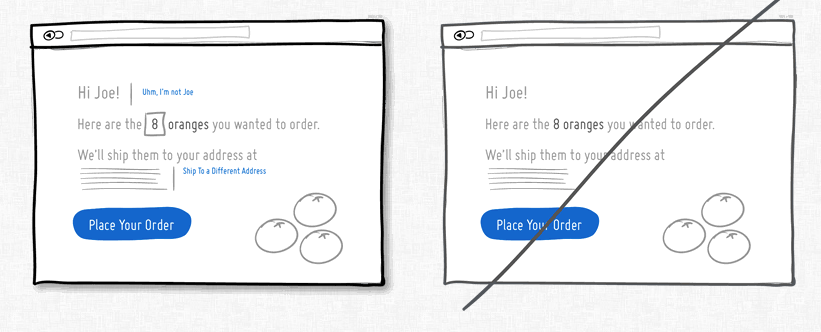
Try Authentication instead of fake.
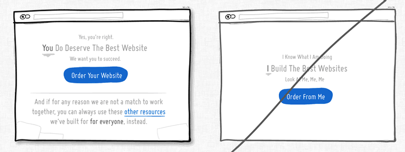
Try putting other people first instead of being self-centered.
Try suggestions instead of nothing
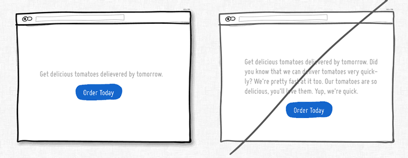
Try summarizing the brief content instead of using unnecessary words
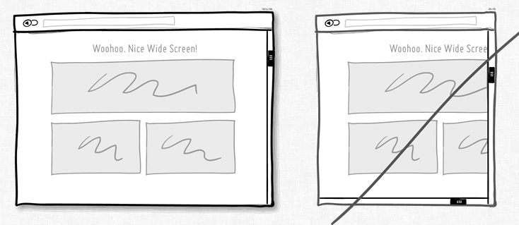
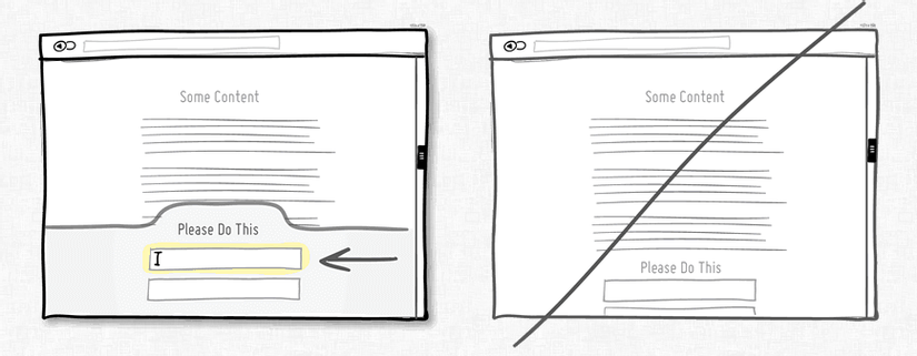
Try manually adjusting the size instead of using a scroll bar
Try for users to change content instead of a rigid content
Try giving users multiple opportunities instead of only one
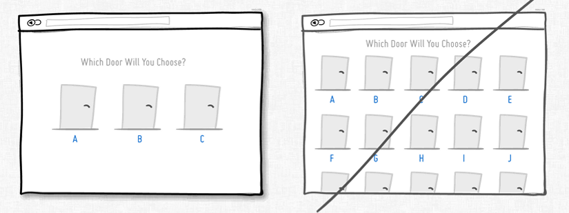
Try fewer options instead of giving too many options
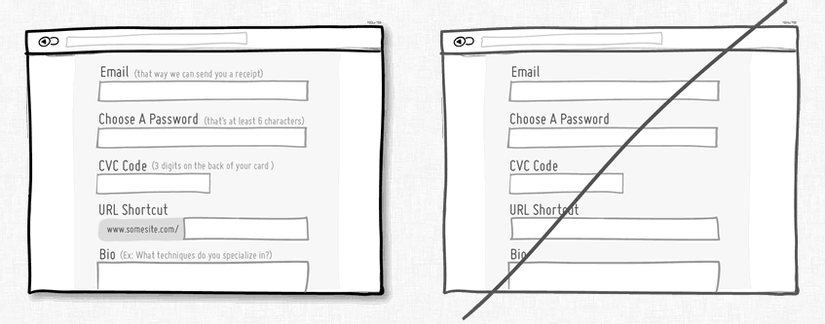
Try to be visually clear instead of vague
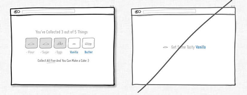
Try Collections instead of standalone items.
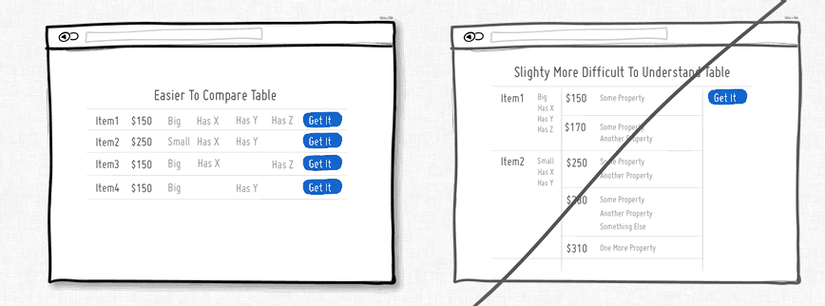
Try a more friendly comparison instead of making everything confusing
Try to get attention instead of being easy to forget
Try calculating first instead of letting the user calculate it yourself
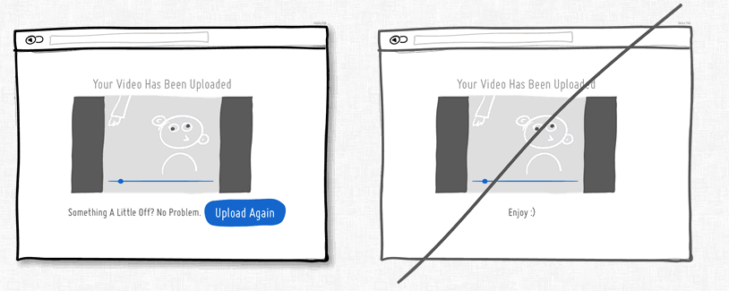
Try to reassure the user instead of assuming all is well
When you are finished selling, add some guarantees. Guaranteed, tell your customers that they will be satisfied, tell them that payment is safe, have free shipping and can withdraw money at any time without risk. All is well and all will be well 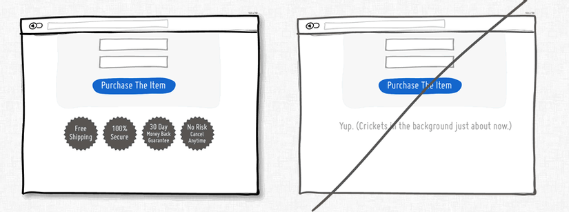
Conclusion
Source: https://goodui.org/
Part 3 is also the end of the series that introduces great user interfaces. Thanks for watching. The following table I will introduce people to another topic