The UI is an important part of any product. If it’s good, you don’t even notice it, if it’s not good you’ll have to find a way to get over it in order to use the product effectively. Like a regular wall clock, it won’t take a few seconds to know what time it is, but if it lacks a few numbers or a triangle, for example, it will take you longer to read the time.
In software or website design, UI becomes even more important, because it is what determines whether users want to stay on your website longer or not. Almost designers will follow a certain number of rules to increase efficiency. In this article, the author shares 4 golden rules in design drawn from many famous articles, applicable to any system. That is:
- Let the user control the interface
- Create comfort when interacting with products
- Reduce unnecessary thoughts
- Consistency
1. Let the user control the interface
A good UI gives users a sense of control, making it easy for them to grasp and master the product.
Allows to undo the actions
This rule means users should always be able to go back whatever they are doing. This allows users to explore the product without fear of making a mistake – when the user knows that errors can be undone, it encourages them to explore unfamiliar options. Conversely, if the user has to be extremely careful with his actions – they easily become stressed out, even give up when they do something wrong.
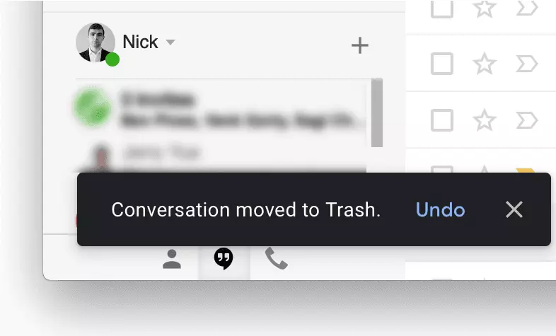
Undo can be extremely helpful when the user chooses the wrong function. In this case it will be like “’emergency exit”, which helps the user get rid of the unexpected situation. A typical example is the Gmail mailbox with Undo function when the user accidentally deletes the wrong email.
The interface is easy to navigate
Navigation must be clear. Users may enjoy exploring the look and feel of any product, a good UI that will bring users into their comfort zones by providing the edge where they are, have gone and to:
- Provides visual cues
Visual cues act as reminders for the user. The page title, highlight option are currently selected, and other visual aids help users instantly know their current position. Never let a user ask “Where am I?” or “How do I get to this screen?”.
- The ability to predict
The user must be given indicators to predict the outcome of their action. Do not let users wonder “Where to click to complete an order?” or “What is this button for?”
Provide feedback
The response will usually appear after each specific user action. Feedback should be clear and meaningful.
However, depending on the action that we will have different responses. For frequent actions, the response can be modest. For example, when the user clicks on a button, we only need to provide an indication that this action has been performed, like changing the button color. Failure to respond will leave the user unaware of whether an action has been taken.
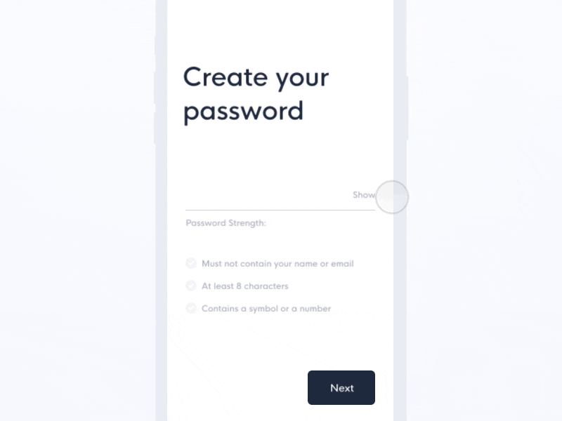
For infrequent or important actions, the response needs to be clearer. For example, when entering passwords at registration, a good UI can provide the user with password requirements
Displays the status of the system
The status display is essential when the user performs an action that the system takes time to complete. The continuous progress update helps users feel more comfortable, the feeling of waiting will also decrease.
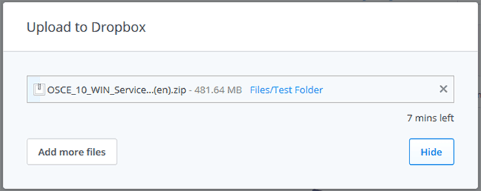
Like Dropbox, they show users the status of document upload: current progress and time remaining.
2. Create comfort when interacting with products
Eliminate all the elements that are not useful to the user
Interface should not contain irrelevant or rarely used information, it will cause interference, competition, reduce the efficiency of important information. Try to design anything that is visible on the screen as valuable and relevant. This is also the current trend of minimalism. A prime example of this trend is iA Writer.
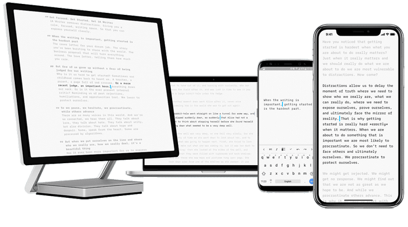
IA Writer’s interface is just a screen for typing, it allows users to simply focus on what they are writing and hide everything else.
Don’t force users to re-enter what they used to be
Users easily feel uncomfortable when they have to re-enter the information they used to enter. A good interface is do the most work with minimal information.
Avoid using confusing terms
When designing, the most important thing is to use language that is easy to understand, read, and familiar to the user.
Apply Fitts rule to interactive elements
Fitts’ law states that the time the goal is reached is a function of the distance to the target and the size of the target. Simply put, with important functions, the larger design, the larger buttons are always easier to press.
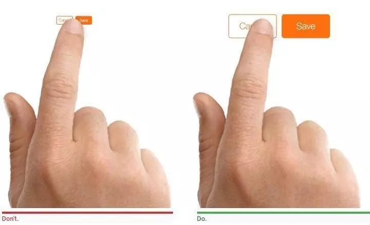
Also remember that goal completion time is the total time for completing the steps. Therefore, when designing a UI, in addition to reducing the distance and increasing the target size, it is also necessary to reduce the number of steps the user needs to interact with in order to reach the goal.
Use metaphor with the real world
Linking UI interface to the real world helps users feel familiar and easier to use. Like the trash can app on your computer, it’s not the real trash, but it’s also a place for unused items, or like a shopping cart icon, you can guess what it’s used for right. are not?
Efficiently report errors
Error is unavoidable during user use. Error handling combined with useless error messages can frustrate users and abandon your app. Effective error messages are the combination of a clear message and a hint of problem solving.
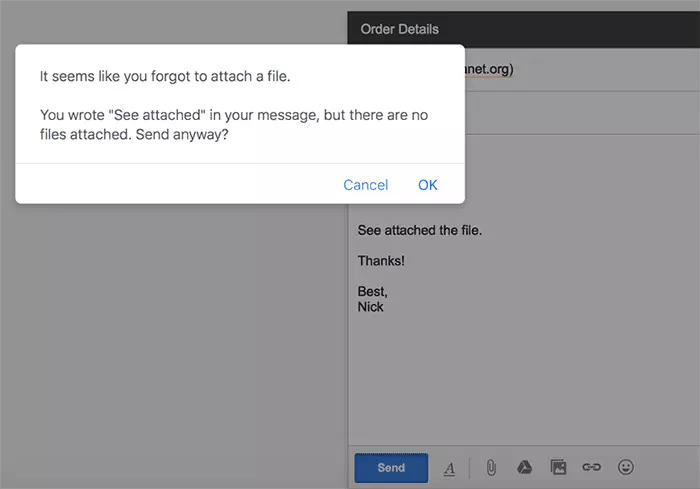
Even better than reporting the error, is to prevent it from happening in the first place. Attempt to remove the condition that caused the error or check and issue a popup confirm before the user takes action. For example, Gmail will notify you if you forget to attach a file:
Make sure users don’t lose what they did
Users should not lose what they have done, whether it is due to any error, from the user side or from the system side. For example, the viblo automatically saves what you write, avoiding a natural power outage that can’t be saved in time.
3. Reduce unnecessary thoughts
Separate the information chain
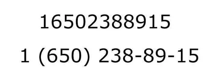
Simply put, for example, we want the user to enter the phone number but write immediately without space, it will be easier to be confused than the grouping 2 – 3 numbers into 1 cluster. It is often difficult for people to spot errors in a phrase with 10 or more digits. Therefore, with long strings like phone numbers, card numbers, … we should have cluster splitting.
Reduce the number of actions required to achieve your goal
The above also talked about this one. We need to remember the 3-click rule, which means that users can find the information they need with up to 3 clicks.
4. Consistency
Consistency is essential to a good UI design.
Interface consistency
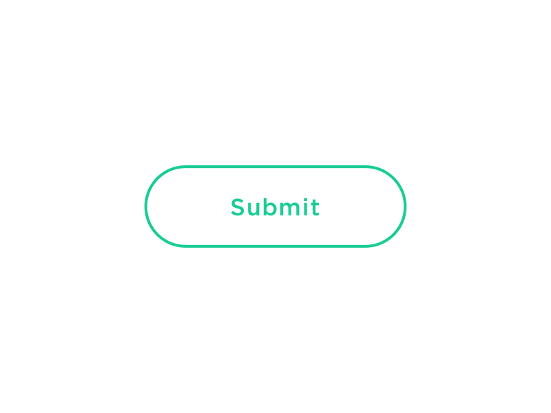
A product must have all fonts, colors, and icons the same. For example, the Submit button on a page must look like in all other pages. Arbitrarily changing the style may cause users to wonder if the Submit button in this screen is the same as the Submit button on the other screen.
Functional consistency
Functional consistency is that an object behaves the same way in the entire interface. For example, buttons or menus cannot be changed within a product. Users do not like the surprise in familiar actions, they easily get frustrated when it does not work as expected. Keep actions consistent with the principle of least surprise so the product works the way users expect it to.
In line with user expectations
People have certain expectations for the app / website they use. If a user expects it to look / behave in a different way, it will be difficult to change those expectations. If your approach is not working, then follow what your users expect.
- Follow the basic principles
- Don’t reinvent the pattern
For most design problems, there is a solution, which we often call it a template. These patterns became popular conventions and users are also familiar with them. Not using these solutions but creating your own can cause users difficulties, sometimes even annoyances, resulting in users not using them, just because they are not used to it.
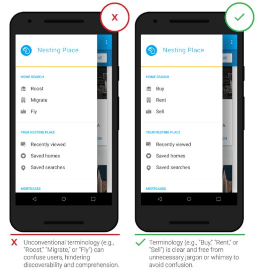
- Don’t create terms
Avoid using new terms when you already have a word that the user is familiar with. Users spend most of their time in other web and apps, so naming differently can confuse them.

Shopping cart is quite close while Shopping center is confusing when they are buying online.
The goal of UI designers is to create user-friendly interfaces: interfaces that encourage discovery without negative consequences, so most of the principles listed in this article remain. will be applied. Hope this article is useful to you.
Source: https://xd.adobe.com/ideas/process/ui-design/4-golden-rules-ui-design/