Introduce
In the first part of the article we have explored the first 13 articles in the series. Enhance CSS knowledge from the top 50 articles . In the article today we will continue to learn more. If you haven’t seen the first part of the series, you can see it at
Enhance CSS knowledge from the top 50 articles in 2019 (Part 1)
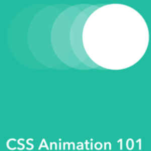
CSS Animation
Learn to create animations in CSS
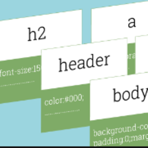
CSS Performance
LinkedIn’s open source project helps increase the performance of Stylesheet.
Debugging
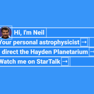
CSS Object Model
Learn about CSS Object Model
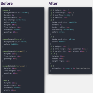
Architecture
When we work on large projects or with teams, we often find that our code is confusing, difficult to read and difficult to expand. So what many people have done is that they have created CSS architectures to help make CSS more readable. SMACSS is an extensible and modular architecture for CSS, which aims to accomplish that.
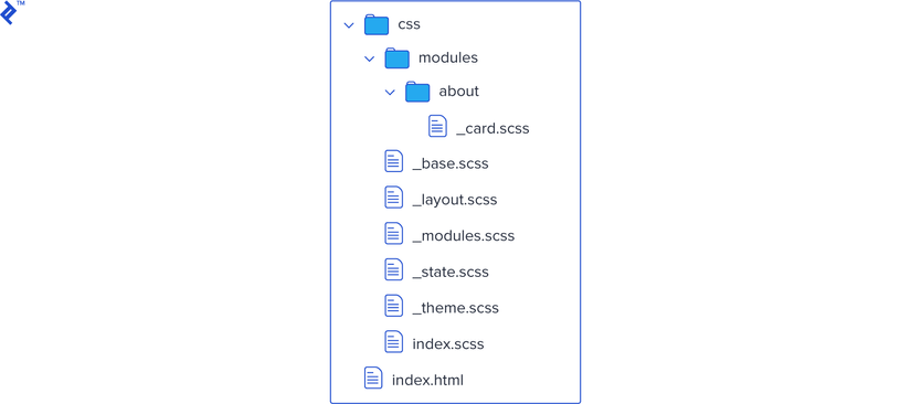
Each SMACSS project structure uses 5 parts:
- Base
- Layout
- Modules
- State
- Theme
Base
Base identifies the most common elements on the page. If you use CSS reset, this ensures that the style is the same across browsers even though there are differences between basic CSS defaults. In base style, you should only include element selectors or selectore classes, not including ID selector.
1 | html { margin: 0; font-family: sans-serif; } a { color: #000; } button { color: #ababab; border: 1px solid #f2f2f2; } |
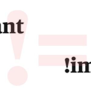
So it should include size sizes, margins, colors, borders and any other default values you intend to use on your website. I strongly recommend avoiding !important
Layout
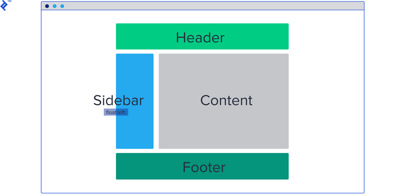
The layout will divide the page into the main sections, not the sections like the menu or possibly the accordion, which is the highest division: header, sidebar, content / main, and footer.
Here’s an example:
1 | #header { background: #fcfcfc; } #header .l-right { float: right; } #header .l-align-center { text-align: center; } |
Modules SMACSS modules are smaller pieces of code that can be reused on the page and they are part of a layout. These are parts of the CSS that we store in a separate folder, because we will use a lot on a page.
Consider the following example:
1 | .article { background: #f32; } .article--title { font-size: 16px; } .article--text { font-size: 12px; } |
State
The state defined in SMACSS is a way to describe what our modlues look like in different situations. So this part is really for interactivity: We want different behavior if an element is considered hidden, expanded or modified.
1 | <header id="header"> <ul class="nav"> <li class="nav--item is-selected">Contact</li> <li class="nav--item">About</li> </ul> </header> |
1 | .nav--item.is-selected { color: #fff; } |
In the above example we use .nav--item.is-selected to style the element whose status is selected.
Theme
This is the most obvious, because it is used to contain rules of primary colors, shapes, borders, shadows, etc. Mostly repeating elements on the entire web page. We don’t want to redefine them every time we create them. Instead, we define a single class that we only add later to a default element.
1 | .button-large { width: 60px; height: 60px; } |
1 | <button class="button-large">Like</button> |


Conclude
So in part 2 of this article, I introduced you to the top articles guiding CSS-related techniques. See you guys in the next section.
Article reference : https://medium.mybridge.co/learn-css-from-top-50-articles-for-the-past-year-v-2019-4570d9da53c