Last night I was free to surf twitter playing casually and saw the article showing how to create charts to visualize data in the most ciuu way. So I tried it today. In fact, when clicking right on that article, the visualize data looks lovely and extremely eye-catching. In this article I will share with everyone an extremely cute package of python like hand-drawn style everyone =)). My name is: cutecharts ~ it sounds cute too.
Let’s start to see.
A little introduction
Unlike popular libraries like Matplotlib, seaborn or Plotly, the cutecharts library looks more like a hand-drawn style and in some cases can be useful in some cases. However, I see that looking cute and eye-catching is also a part of increasing interest in myself when reading the data already (who has the same mind?). Cute charts are both cute and interactive so we can interact directly on the chart (this point is quite similar to this plotly). When you hover the mouse on the chart, it is possible to display the numbers as visually as possible.

Figure 1: Figure illustrating
As you can see in Figure 1, this package is really cute. Also, I find it quite approachable .
What’s cool about Cutecharts?
How to install
Like other packages, you can install it in just a few minutes.
- pip install
1 2 | $ pip install cutecharts |
Or you can install from the author’s source code
1 2 3 4 5 | $ git clone https://github.com/cutecharts/cutecharts.py.git $ cd cutecharts.py $ pip install -r requirements.txt $ python setup.py install |
Import library
1 2 | import cutecharts.charts as ctc |
Data
I use the GDP of Southeast Asian countries to visualize for simplicity. Everyone can download it here . His sources refer here .
1 2 | data_gdp = pd.read_excel('GDP.xlsx') |
Let’s try visualize with this package.
How to visualize with cutecharts?
Draw bar chart
Draw a bar chart with the data set above
1 2 3 4 5 6 7 8 9 10 | chart = ctc.Bar('GDP DNA',width='1000px',height='800px') chart.set_options( labels=list(data_gdp['Country']), x_label='Country', y_label='GDP_2009' , colors=['#1EAFAE' for i in range(len(train))] ) chart.add_series('GDP_2009',list(data_gdp[2009])) chart.render_notebook() |
Let’s see how the show looks like
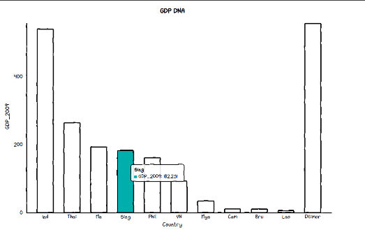
Figure 2: Bar chart showing GDP GDP of 2009
In this chart I am choosing 1 color for all columns if all want more colors we can change the param colors as shown below.
1 2 3 4 5 6 7 8 9 10 | chart = ctc.Bar('GDP DNA',width='1000px',height='800px') chart.set_options( labels=list(data_gdp['Country']), x_label='Country', y_label='GDP_2009' , colors=['#1EAFAE', '#FFF1C9', '#FFF1C9','#F7B7A3','#EA5F89','#9B3192','#57167E','#47B39C','#00529B'] ) chart.add_series('GDP_2009',list(data_gdp[2009])) chart.render_notebook() |
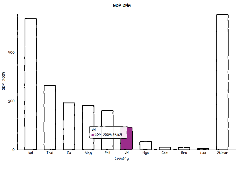
Figure 3: Bar chart with various colors used
You just need to click on the different columns to see the difference between the columns, I find it quite interesting.
Line chart
In order to compare the development of countries in 2009 and 2011, we will use the line chart to make it more intuitive. I will draw two graph lines of GDP in 2009 and 2011.
1 2 3 4 5 6 7 8 9 | chart = ctc.Line('GDP DNA 2009 & 2011',width='1000px',height='800px') chart.set_options( labels=list(data_gdp['Country']), x_label='Country', y_label='GDP_2009' ) chart.add_series('GDP 2009', list(data_gdp[2009])) chart.add_series('GDP 2011', list(data_gdp[2011])) chart.render_notebook() |
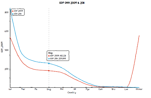
Figure 4: Line chart of 2009 and 2011
When you hover the mouse over the chart, the chart will automatically show the labels as shown in Figure 4 , besides that the show gives us the dotted line in the middle to be able to see the difference between the 2 years more clearly.
Pie Chart
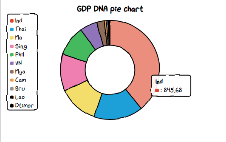
Draw Pie Chart of GDP of Southeast Asian countries.
1 2 3 4 5 6 7 8 | chart = ctc.Pie('GDP DNA pie chart',width='500px',height='400px') chart.set_options( labels=list(data_gdp['Country']), inner_radius=0 ) chart.add_series(list(data_gdp[2011])) chart.render_notebook() |
Figure 5: Pie chart
You can change the color of the fields like in the bar chart above. And if you want to draw a pie chart like a donut chart. You just need to change the inner_radius parameter. Like the picture below.
Radar Chart
Actually, I have never used the Radar chart but this package provides 5 types of charts, so I added them. Maybe he didn’t leave you: p. People can refer to the meaning of Radar chart here .
1 2 3 4 5 6 7 8 9 10 | chart = ctc.Radar('GDP DNA',width='700px',height='600px') chart.set_options( labels=list(data_gdp['Country']), is_show_legend=True, legend_pos = 'upRight' ) chart.add_series('GDP_2009',list(data_gdp[2009])) chart.add_series('GDP_2011',list(data_gdp[2011])) chart.render_notebook() |
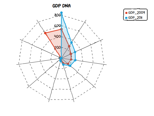
Image: Radar chart.
Scatter Plot
Here I use the example in the article to see the relationship between the weather temperature and the amount of ice cream sold.
1 2 3 4 | #data Temperature = [14.2,16.4,11.9,15.2,18.5,22.1,19.4,25.1,23.4,18.1,22.6,17.2] Sales = [215,325,185,332,406,522,412,614,544,421,445,408] |
Draw scatter charts
1 2 3 4 5 6 7 8 9 10 | chart = ctc.Scatter('Ice Cream Sales vs Temperature',width='500px',height='600px') chart.set_options( x_label='Temperature (Celcius)', y_label='Icecream Sales' , colors=['#1EAFAE'], is_show_line = False, dot_size=1) chart.add_series('Temperature', [(z[0], z[1]) for z in zip(Temperature, Sales)]) chart.render_notebook() |
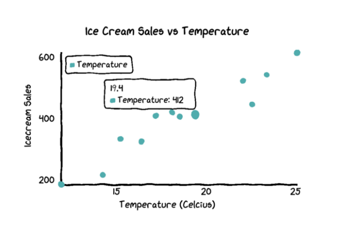
Image: Scatter Plot
We can see that the hotter the weather, the more ice cream is sold. ps: this is obvious =))
Conclude
There are actually many packages that support visualize models like matplotlib, seaborn or plotly, etc. However, I find this package quite lovely. We can use it to show cute drawings for our posts on viblo or when the EDA data makes me more interested in analyzing each field of data. The downside of this package is that the amount of graphs drawn is still limited compared to other packages such as matplotlib, …. Anw, I hope everyone will be more interested in visualizing data with this package.