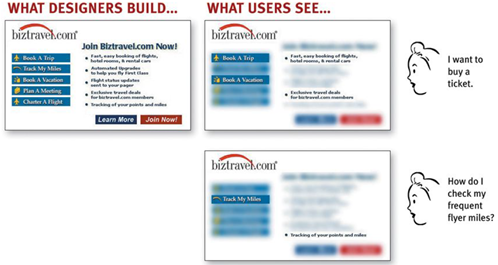
To create a best seller, you have to rely on the needs of potential customers. In the same principle, a Web site cannot succeed when built according to the designer’s perception, but all the interfaces and functions that need to come from user behavior (or commonly called User). ). This article will share with you useful information about the golden principles to create a “standard” Web design.
How do users really interact with the Web?
This is the most important question that any designer needs to answer before he wants to start building a “hot Website”.
FACT # 1: The user only scans the house … no, scans the information
When we create websites, we often think that users will go through each page, read all the pages carefully and attentively, find out how we organize everything and consider the select before deciding on a particular function. However, what the User actually does is mostly “browse” each page, glance at a few places and click on the first link that interests them or most closely resembles what they look for. This also means that there are almost always parts of the page that the user does not look at.

Why so?
- Because they have a specific purpose: Most of the need to use the Web is related to getting things done and is often done quickly. As a result, users tend to act like sharks: They have to keep moving, or they will die. They do not have much time to read except what is needed.
- Users know they don’t need to read everything: Users only search for parts that match their interests or tasks, other parts of the page are considered irrelevant. So, “Scan” is the way User chooses to quickly find the relevant part with minimum time.

- The user is very good at “scanning”: It is a basic skill: When you learn to read, you also learn to scan. Users have also regularly “scanned” newspapers, magazines and books, or if the User is under the age of 25, perhaps reddit, Tumblr or Facebook, is the channel where they spend most of their time surfing information and searching for sections. I care and know it helps.
FACT # 2: The optimal plan? No, that makes sense
In fact, most users do not choose the best, they choose the first logical, the so-called satisfaction. As soon as the User finds a link that appears to lead to what they’re looking for, they’ll click right away.
FACT # 3: The user doesn’t understand anything. In fact, they also do not want to understand.
Very few people take the time to read the instructions. Instead, they keep doing it even though they themselves are very vague about what they are doing. And the fact is, works in the same way that get done. There are many people who use software, websites and consumer products effectively in ways that are not what the Web designers originally intended. Like you would use a paper stapler as a paperweight, for example, and that becomes a very reasonable utility.
If the User finds something effective, they will stick to it. Once we find something that works, no matter what, we tend to not look for better ways.
And 3 immortal principles …
1. “Don’t make me think!” When a user looks at a web page, it must be obvious. Clearly. Explain yourself.
What is obvious ?
When a user looks at a page without making them think, all thoughts in their head must be affirmative sentences. “Ah, this is part A. Ok, that one is function B, …”

But when User looks at a page that makes them think, all thoughts in the head have question marks in it.

When you create a website, your job is to eliminate the questions. Such as naming a link or function name.

Obviously, the first way of naming is easier to identify than the third way of naming.
In addition, links and buttons also play a big part. It helps the User to make sure they are clickable.

These are some questions that the User does not want to spend time thinking about, as well as a way to help you check the clarity of Web design.
. Where am I?
. Where should I start?
. Where did they put function A?
. What are the most important things on this page?
. Why do they call it that?
. Is it an ad or part of the site?
2. “As long as clicking is not too troublesome, as many as you like”
In the past, the “clicks” method was always considered a useful method. However, the problem is not the number of clicks (although the number of clicks should be limited), but that each click should not cause confusion and force the User to think more.
In general, the User does not mind many clicks as long as each click makes them comfortable (in an irresponsible way) and makes them believe they are on the right track. Unfortunately, many of the Web options are not very clear and always make User unsure that they are in the right place.
If it is difficult to avoid giving the User complex options, you need to make every effort to provide the User with the instructions that are truly necessary.
. Summary : The smallest amount of information will help the User
. Timely : Be in the right place for users to meet when needed
. Inevitable : Formatted in a way that ensures that the User will pay attention to it
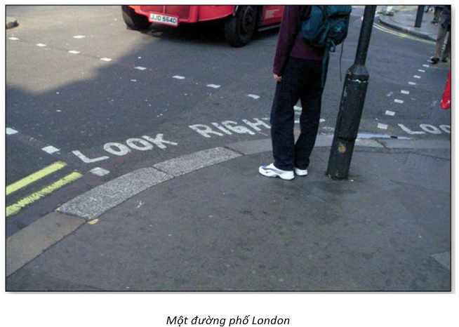
This is an example of very good application of the above criteria. It’s brief (LOOK RIGHT and an arrow to the right), timely (you see it right away) and inevitable (you almost always glanced down when you stepped off the curb).
3. “Please remove unnecessary words”
The following is a guide found when the User begins to conduct a survey on the site:

Let’s analyze this introduction:
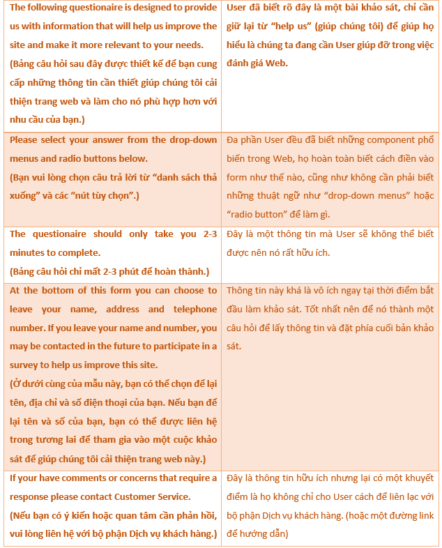
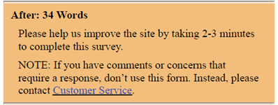
The following is a truncated version, with only 34 words left:
Eliminating all words that no one reads has some beneficial effects:
. It increases the focus of the page.
. It makes useful content more prominent.
. It makes pages shorter, allowing users to see each page faster without scrolling much.
The article is based on the book “Don’t make me think – 2nd edition” by Steve Krug.