In a very normal day, I sat on Facebook like usual and suddenly read a post of the previous leader sharing made. After reading it, I feel very satisfied and want to apply these readings to existing products immediately. But of course, to apply it needs a reasonable understanding and application, so I turned to write in series about it. This article is quite long so I will write a series. The reference you can read here, with the first article because the writing time is quite short so the content will be extracted and self-made mainly. The go to the Interfaces and its own practical application.
“Design Fluid Interfaces”
The first thing I feel after reading the original article is my “backward”. Design Fluid Interfaces is a concept introduced and presented at WWDC 2018 and now , I can read and feel about it 2 years later. You can read the original article above, and look back to the present article in WWDC 2018 here . The following article is my personal feeling. Speaking of Fluid Interfaces , it’s quite vague, it’s described by adjectives as nhanh , mượt mà , tự nhiên or kì diệu . But in fact, to be easy to imagine, we can relate to the experience on the notch of the iPhone (Experience of the home key, the experience of present view on iOS 13, etc. and so on)
This is a pretty clear example of this experience, the user can close the app while the app is starting up. In terms of interface, we can see that the interface completely interacts very quickly with the operation of the user, and can stop at a certain point in their process. Everything is very smooth and natural, actually the experience of the Home key on these models gives me a great feeling when using the physical Home movie. Through the above example, perhaps you have envisioned a bit about Fluid Interfaces . We can summarize 3 things about it like this:
- Fluid Interfaces will enhance the user experience, they make everything feel very fast and smooth
- They give users the feeling that they can control them
- Of course, to do such things we will have more construction work already.
This article will introduce 8 interfaces that can help you increase the user experience. Of course, don’t apply them rigidly. Due to the length of the article, I will only introduce the first intefaces in this article.
Interface # 1: Calculator Button
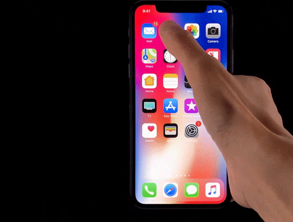
Have you ever used the number keys in the iPhone calculator app? Do you feel that those buttons are different from the buttons you are developing every day? If your answer is the same, then this interface can help you to make the previously dried buttons become softer. The buttons I made before felt mostly very dry, mostly setTitle , setTitleColor , border , cornerRadius , … all just changed the appearance of that Button, and when I clicked on a What about the button? Button just switches from color to color, text to text? It all happened instantly and when I read this article I thought I could do it but the previous buttons got a little better. Now let’s try looking at the button of our calculator with something special:

- Highlights immediately upon user touch
- Continuous taping is possible even when animation highlights are still happening
- The user can
touch downthendrag outsideto cancel the operation - User can
drag backto perform operation
Hmm, it sounds like more than the boring buttons I have done before. These complex things are created on the premise that users think and act in tandem. Interesting hypothesis, try to analyze it:
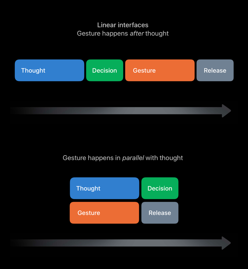
Here we will see 2 serial and parallel action streams. In the above flow we are assuming that, after the user has finished thinking -> makes a decision -> then takes action -> then releases (is to release the button without clicking). This is a very common flow to the right, just like the water flow so it is true in its situation. But when do you press a button and you realize, “Oh no, I don’t want to do this, I want to cancel it!”. I think there will be and a lot of other things, that’s the hypothesis in the lower stream. The fact that the user thinks or makes a decision happens concurrently with the gesture or the hand is faster than the brain and if our decision is not in accordance with the gesture made earlier, our thinking will be how to cancel the action. The bottom line of these interfaces is great and increases the user experience in that users can cancel actions or execute them in succession.
Try coding out an Apple branded auth button like a bit
Critical Code
Because we customize the button interaction, the first thing we need to do is to create a subclass of UIButton
1 2 3 4 5 6 7 | CalculatorButton: UIControl { public var value: Int = 0 { didSet { label.text = “(value)” } } private lazy var label: UILabel = { ... }() } |
We will then group these actions into two main actions, touchDown and touchUp
1 2 3 | addTarget(self, action: #selector(touchDown), for: [.touchDown, .touchDragEnter]) addTarget(self, action: #selector(touchUp), for: [.touchUpInside, .touchDragExit, .touchCancel]) |
With touchDown , we will cancel the current animation if it exists and set highlight immediately for the button. With touchUp , we will create a new animator and run it.
1 2 3 4 5 6 7 8 9 10 11 12 | private var animator = UIViewPropertyAnimator() @objc private func touchDown() { animator.stopAnimation(true) backgroundColor = highlightedColor } @objc private func touchUp() { animator = UIViewPropertyAnimator(duration: 0.5, curve: .easeOut, animations: { self.backgroundColor = self.normalColor }) animator.startAnimation() } |
Conclude
This article only introduces one of the 8 interfaces mentioned, but hopefully it will help you somewhat understand and feel like changing something more productive. After studying and applying it, we found that in addition to the appearance of the button as designed, we can make it even better by paying more attention to switching between states of buttons or animations when switching between / gesture states.