Introduction
As we all know, navigation bar is an important component, indispensable in most applications today. However, the default iOS navigation bar sometimes fails to meet the UI design needs. Therefore, the custom navigation bar is a basic task that any iOS developer should know.
In this article, we will learn about the structure of navigation bar as well as the simplest ways to customize.
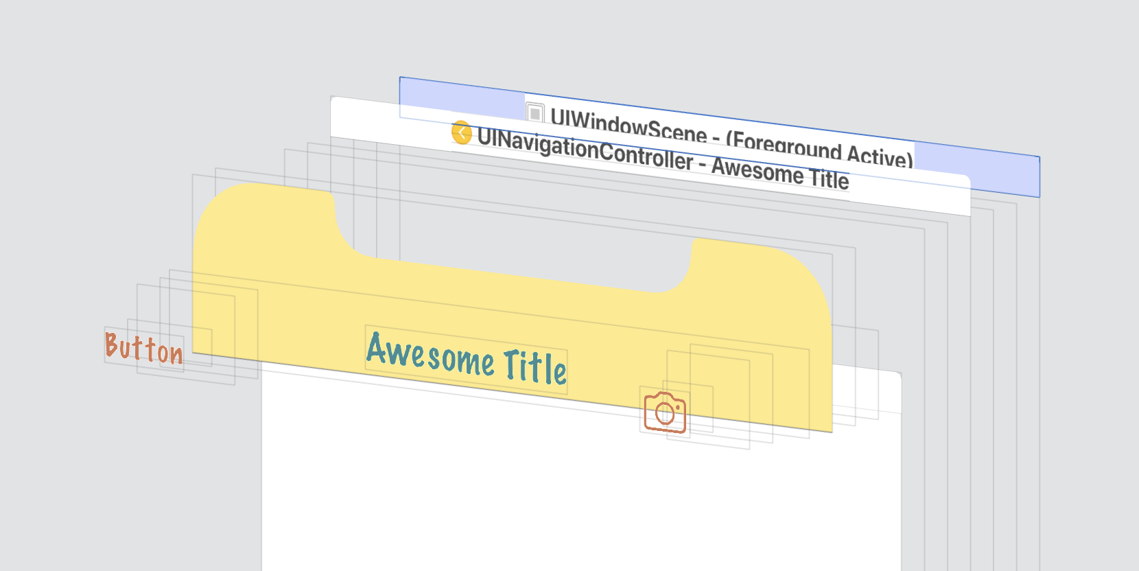
The parts of a navigation bar
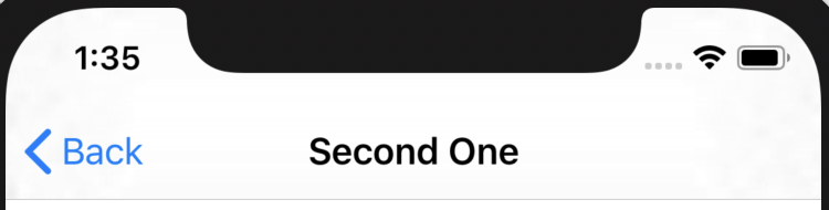
The default navigation bar will have the following interface:
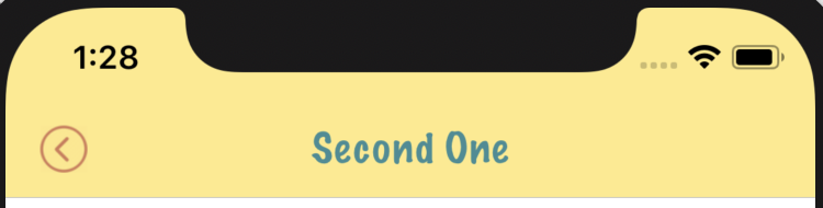
A customized navigation bar:
A basic navigation bar consists of the following main components:
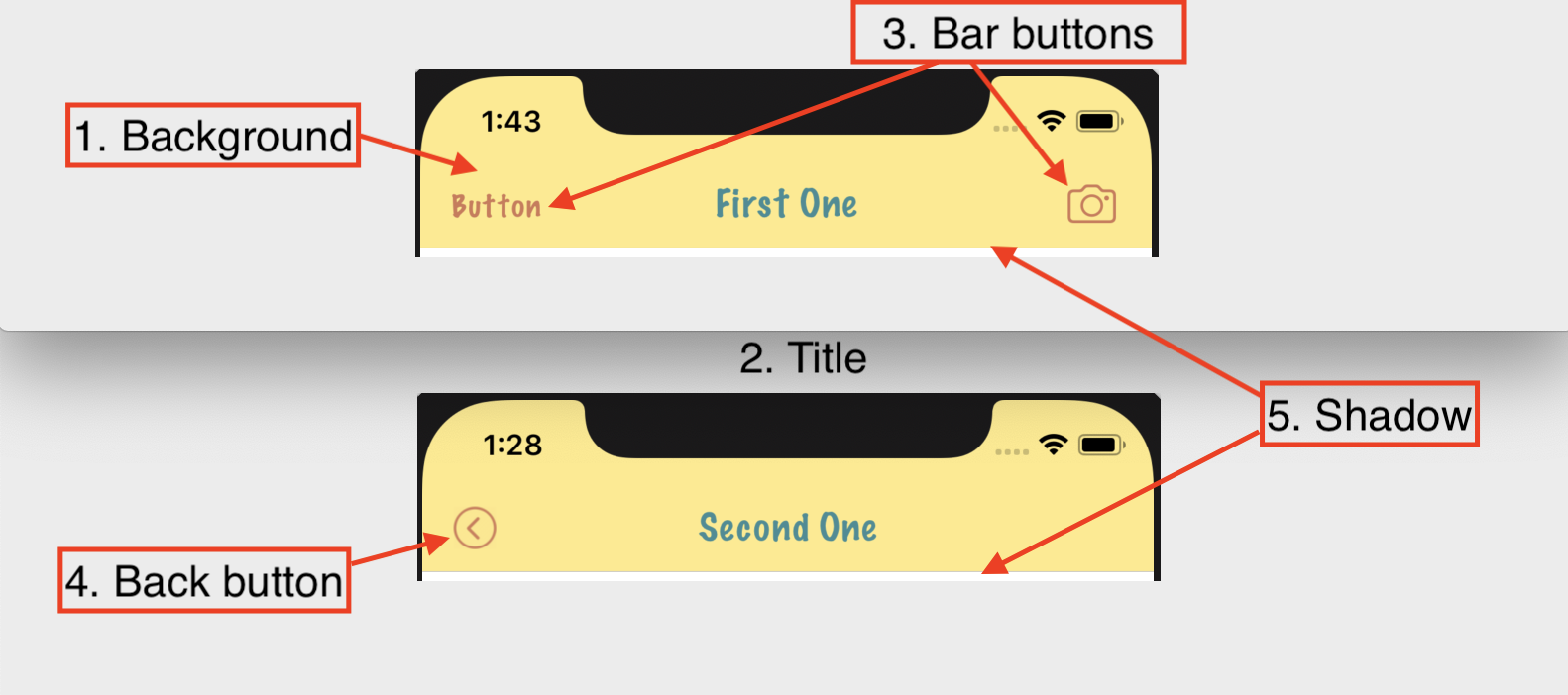
- Background
- Title
- Bar buttons
- Back button
- Shadow, separator
Background
Changing the background color of the navigation bar requires the following simple code:
1 2 3 | navigationController <span class="token operator">?</span> <span class="token punctuation">.</span> navigationBar <span class="token punctuation">.</span> barTintColor <span class="token operator">=</span> <span class="token punctuation">.</span> yellow navigationController <span class="token operator">?</span> <span class="token punctuation">.</span> navigationBar <span class="token punctuation">.</span> isTranslucent <span class="token operator">=</span> <span class="token boolean">false</span> |
It is worth noting that the correct use of the barTintColor property is barTintColor . Unlike the normal UIView just change the backgroundColor or tintColor property, with the navigation bar, we should use barTintColor .
Title
The simplest way to customize the appearance of title and status bar is to change the bar style:
1 2 | navigationController <span class="token punctuation">.</span> navigationBar <span class="token punctuation">.</span> barStyle <span class="token operator">=</span> <span class="token punctuation">.</span> black |
The .default of this property will allow to display the navigation bar with a white background and content (title and status bar) in black. Conversely, if you change the style to .black style, the title and status bar will turn white.
To be able to customize the navigation bar title deeper, we can use its property text attributes as follows:
1 2 3 4 5 | navigationController <span class="token punctuation">.</span> navigationBar <span class="token punctuation">.</span> titleTextAttributes <span class="token operator">=</span> <span class="token punctuation">[</span> <span class="token punctuation">.</span> foregroundColor <span class="token punctuation">:</span> <span class="token punctuation">.</span> black <span class="token punctuation">,</span> <span class="token punctuation">.</span> font <span class="token punctuation">:</span> <span class="token function">UIFont</span> <span class="token punctuation">(</span> name <span class="token punctuation">:</span> <span class="token string">"MarkerFelt-Thin"</span> <span class="token punctuation">,</span> size <span class="token punctuation">:</span> <span class="token number">20</span> <span class="token punctuation">)</span> <span class="token operator">!</span> <span class="token punctuation">]</span> |
Using text attributes, we can not only change text color or font but also customize baseline offset, spelling, shadow and many other settings .
If you do not want to display the title on the navigation bar, we can create normal views, customize as you like, then set the titleView with the newly created view.
1 2 3 4 | <span class="token keyword">let</span> customTitleView <span class="token operator">=</span> <span class="token function">UIView</span> <span class="token punctuation">(</span> <span class="token punctuation">)</span> <span class="token comment">// Custom title view</span> navigationItem <span class="token punctuation">.</span> titleView <span class="token operator">=</span> customTitleView |
Bar buttons
UIBarButtonItem can be instantiated in several ways.
1 2 3 4 5 6 7 | navigationItem <span class="token punctuation">.</span> rightBarButtonItem <span class="token operator">=</span> <span class="token function">UIBarButtonItem</span> <span class="token punctuation">(</span> title <span class="token punctuation">:</span> <span class="token string">"Hello"</span> <span class="token punctuation">,</span> style <span class="token punctuation">:</span> <span class="token punctuation">.</span> plain <span class="token punctuation">,</span> target <span class="token punctuation">:</span> <span class="token keyword">self</span> <span class="token punctuation">,</span> action <span class="token punctuation">:</span> # <span class="token function">selector</span> <span class="token punctuation">(</span> button <span class="token punctuation">)</span> <span class="token punctuation">)</span> |
Depending on the value of the property style is .plain or .done , the font will be regular or bold.
To change the color of the bar button, we should use the .tintColor property of the navigation bar:
1 2 | navigationController <span class="token operator">?</span> <span class="token punctuation">.</span> navigationBar <span class="token punctuation">.</span> tintColor <span class="token operator">=</span> <span class="token punctuation">.</span> red |
In addition, to customize the bar button, we can still use text attibutes similar to the navigation bar title:
1 2 3 4 5 6 7 8 | <span class="token keyword">let</span> regularBarButtonTextAttributes <span class="token punctuation">:</span> <span class="token punctuation">[</span> <span class="token builtin">NSAttributedString</span> <span class="token punctuation">.</span> <span class="token builtin">Key</span> <span class="token punctuation">:</span> <span class="token builtin">Any</span> <span class="token punctuation">]</span> <span class="token operator">=</span> <span class="token punctuation">[</span> <span class="token punctuation">.</span> foregroundColor <span class="token punctuation">:</span> <span class="token punctuation">.</span> warm <span class="token punctuation">,</span> <span class="token punctuation">.</span> font <span class="token punctuation">:</span> <span class="token function">UIFont</span> <span class="token punctuation">(</span> name <span class="token punctuation">:</span> <span class="token string">"MarkerFelt-Thin"</span> <span class="token punctuation">,</span> size <span class="token punctuation">:</span> <span class="token number">16</span> <span class="token punctuation">)</span> <span class="token operator">!</span> <span class="token punctuation">]</span> <span class="token keyword">let</span> leftButton <span class="token operator">=</span> navigationItem <span class="token punctuation">.</span> leftBarButtonItem leftButton <span class="token punctuation">.</span> <span class="token function">setTitleTextAttributes</span> <span class="token punctuation">(</span> regularBarButtonTextAttributes <span class="token punctuation">,</span> <span class="token keyword">for</span> <span class="token punctuation">:</span> <span class="token punctuation">.</span> normal <span class="token punctuation">)</span> leftButton <span class="token punctuation">.</span> <span class="token function">setTitleTextAttributes</span> <span class="token punctuation">(</span> regularBarButtonTextAttributes <span class="token punctuation">,</span> <span class="token keyword">for</span> <span class="token punctuation">:</span> <span class="token punctuation">.</span> highlighted <span class="token punctuation">)</span> |
It should be noted that the bar buttons are properties of the navigation item of the view controller, not the navigation bar.
Button with default system design
iOS also provides system bar buttons with available designs . For example, to create a camera image right bar button item:
1 2 3 4 5 6 | navigationItem <span class="token punctuation">.</span> rightBarButtonItem <span class="token operator">=</span> <span class="token function">UIBarButtonItem</span> <span class="token punctuation">(</span> barButtonSystemItem <span class="token punctuation">:</span> <span class="token punctuation">.</span> camera <span class="token punctuation">,</span> target <span class="token punctuation">:</span> <span class="token constant">nil</span> <span class="token punctuation">,</span> action <span class="token punctuation">:</span> <span class="token constant">nil</span> <span class="token punctuation">)</span> |
This is sometimes very useful. First, when using these system bar button items, we will not need to care about the design, image … of the basic actions like “cancel”, “save” or “edit”. Because iOS will automatically display the buttons according to the theme, the default style of the system, very friendly and easy to understand with the user. When the new iOS version is updated, the theme style changes, these buttons will also be applied to the new style automatically.
Button icon
If you want to change the icon image of the bar button item, you can use the following:
1 2 3 4 5 6 7 | navigationItem <span class="token punctuation">.</span> rightBarButtonItem <span class="token operator">=</span> <span class="token function">UIBarButtonItem</span> <span class="token punctuation">(</span> image <span class="token punctuation">:</span> <span class="token function">UIImage</span> <span class="token punctuation">(</span> named <span class="token punctuation">:</span> <span class="token string">"yourImage"</span> <span class="token punctuation">)</span> <span class="token punctuation">,</span> style <span class="token punctuation">:</span> <span class="token punctuation">.</span> plain <span class="token punctuation">,</span> target <span class="token punctuation">:</span> <span class="token keyword">self</span> <span class="token punctuation">,</span> action <span class="token punctuation">:</span> # <span class="token function">selector</span> <span class="token punctuation">(</span> buttonTapped <span class="token punctuation">)</span> <span class="token punctuation">)</span> |
The color of the icon will be .tintColor by the .tintColor property of the navigation bar. Image sizes for screen models can be found here .
Button with a custom view
If you still want to customize the bar button item further, we can initialize the bar button item with an arbitrary customView . For example:
1 2 3 4 | <span class="token keyword">let</span> button <span class="token operator">=</span> <span class="token function">UIButton</span> <span class="token punctuation">(</span> <span class="token punctuation">)</span> button <span class="token punctuation">.</span> <span class="token function">setImage</span> <span class="token punctuation">(</span> <span class="token function">UIImage</span> <span class="token punctuation">(</span> named <span class="token punctuation">:</span> <span class="token string">"rainbow-circle"</span> <span class="token punctuation">)</span> <span class="token punctuation">,</span> <span class="token keyword">for</span> <span class="token punctuation">:</span> <span class="token punctuation">.</span> normal <span class="token punctuation">)</span> navigationItem <span class="token punctuation">.</span> rightBarButtonItem <span class="token operator">=</span> <span class="token function">UIBarButtonItem</span> <span class="token punctuation">(</span> customView <span class="token punctuation">:</span> button <span class="token punctuation">)</span> |
Bar buttons created with a custom view of UIButton will not be affected by the .tintColor property. So we can customize the UI for different states ( .normal , .highlighted ) of the bar button item as a normal button.
Back button
The back button is still a bar button item, but has some special features such as:
- By default, this bar button item will always have both the image icon and the title label.
- There is a separate property in
navigationItemis.backBarButtonItem. - When clicking this button, the navigation controller will
popViewController(animated:), return to the previous view controller. - Combine with a back swipe gesture of the navigation controller. Allow swipe from the left edge of the screen to pop view controller slowly.
When pushing a new view controller into the stack of the navigation controller, this back button will be automatically added by iOS. The default title of the back button will be the title of the view controller before it is in the navigation controller
If the previous controller has no title, the back button simply does not have a title label. In case the title of the new view controller is pushed and the title of the previous view controller is too long, there is not enough room to display both, the system will prioritize the display of the current view controller and change the title label of the back button to “Back” localized.
To customize the back button, for example, change the default title label, just create a new bar button item and set it back into the .backBarButtonItem property of the navigation item.
1 2 3 4 5 6 7 8 9 10 11 12 13 14 15 16 | <span class="token keyword">class</span> <span class="token class-name">ViewController</span> <span class="token punctuation">:</span> <span class="token builtin">UIViewController</span> <span class="token punctuation">{</span> <span class="token keyword">override</span> <span class="token keyword">func</span> <span class="token function">viewDidLoad</span> <span class="token punctuation">(</span> <span class="token punctuation">)</span> <span class="token punctuation">{</span> <span class="token keyword">super</span> <span class="token punctuation">.</span> <span class="token function">viewDidLoad</span> <span class="token punctuation">(</span> <span class="token punctuation">)</span> <span class="token comment">// ...</span> navigationItem <span class="token punctuation">.</span> backBarButtonItem <span class="token operator">=</span> <span class="token function">UIBarButtonItem</span> <span class="token punctuation">(</span> title <span class="token punctuation">:</span> <span class="token string">"Go back"</span> <span class="token punctuation">,</span> style <span class="token punctuation">:</span> <span class="token punctuation">.</span> plain <span class="token punctuation">,</span> target <span class="token punctuation">:</span> <span class="token keyword">self</span> <span class="token punctuation">,</span> action <span class="token punctuation">:</span> # <span class="token function">selector</span> <span class="token punctuation">(</span> popViewController <span class="token punctuation">)</span> <span class="token punctuation">)</span> <span class="token punctuation">}</span> <span class="token comment">// ...</span> <span class="token punctuation">}</span> |
If you want to hide the back button title, just set the title with an empty string:
1 2 3 4 5 6 7 | navigationItem <span class="token punctuation">.</span> backBarButtonItem <span class="token operator">=</span> <span class="token function">UIBarButtonItem</span> <span class="token punctuation">(</span> title <span class="token punctuation">:</span> <span class="token string">""</span> <span class="token punctuation">,</span> style <span class="token punctuation">:</span> <span class="token punctuation">.</span> plain <span class="token punctuation">,</span> target <span class="token punctuation">:</span> <span class="token keyword">self</span> <span class="token punctuation">,</span> action <span class="token punctuation">:</span> # <span class="token function">selector</span> <span class="token punctuation">(</span> popViewController <span class="token punctuation">)</span> <span class="token punctuation">)</span> |
In addition, when customize back button, we can also add arbitrary processing code when performing pop view controller.
1 2 3 4 5 | <span class="token atrule">@objc</span> <span class="token keyword">private</span> <span class="token keyword">func</span> <span class="token function">popViewController</span> <span class="token punctuation">(</span> <span class="token punctuation">)</span> <span class="token punctuation">{</span> <span class="token comment">// Add custom logic code</span> navigationController <span class="token operator">?</span> <span class="token punctuation">.</span> <span class="token function">popViewController</span> <span class="token punctuation">(</span> animated <span class="token punctuation">:</span> <span class="token boolean">true</span> <span class="token punctuation">)</span> <span class="token punctuation">}</span> |
When you need to change the default image icon back, let’s create a new UIBarButtonItem that doesn’t use text but uses images:
1 2 3 4 5 6 7 | navigationItem <span class="token punctuation">.</span> backBarButtonItem <span class="token operator">=</span> <span class="token function">UIBarButtonItem</span> <span class="token punctuation">(</span> image <span class="token punctuation">:</span> <span class="token function">UIImage</span> <span class="token punctuation">(</span> named <span class="token punctuation">:</span> <span class="token string">"back"</span> <span class="token punctuation">)</span> <span class="token punctuation">,</span> style <span class="token punctuation">:</span> <span class="token punctuation">.</span> plain <span class="token punctuation">,</span> target <span class="token punctuation">:</span> <span class="token keyword">self</span> <span class="token punctuation">,</span> action <span class="token punctuation">:</span> # <span class="token function">selector</span> <span class="token punctuation">(</span> popViewController <span class="token punctuation">)</span> <span class="token punctuation">)</span> |
However, when running the app, we can see that the custom back button has the newly set image and the default back button of iOS overlap.
So, instead of the set bar button item that just created the back button, set the .leftBarButtonItem of the navigation item.
1 2 3 4 5 6 7 | navigationItem <span class="token punctuation">.</span> leftBarButtonItem <span class="token operator">=</span> <span class="token function">UIBarButtonItem</span> <span class="token punctuation">(</span> image <span class="token punctuation">:</span> <span class="token function">UIImage</span> <span class="token punctuation">(</span> named <span class="token punctuation">:</span> <span class="token string">"back"</span> <span class="token punctuation">)</span> <span class="token punctuation">,</span> style <span class="token punctuation">:</span> <span class="token punctuation">.</span> plain <span class="token punctuation">,</span> target <span class="token punctuation">:</span> <span class="token keyword">self</span> <span class="token punctuation">,</span> action <span class="token punctuation">:</span> # <span class="token function">selector</span> <span class="token punctuation">(</span> popViewController <span class="token punctuation">)</span> <span class="token punctuation">)</span> |
Build and run the app, everything looks good. Except for one thing, that swipe gesture from the left edge of the screen will no longer work.
To re-enable this swipe gesture, we only need to set the following delegate and conform to the current view view with the UIGestureRecognizerDelegate protocol without implementing any additional delegate methods.
1 2 3 4 | <span class="token keyword">class</span> <span class="token class-name">ViewController</span> <span class="token punctuation">:</span> <span class="token builtin">UIViewController</span> <span class="token punctuation">,</span> <span class="token builtin">UIGestureRecognizerDelegate</span> <span class="token punctuation">{</span> <span class="token comment">/// ...</span> <span class="token punctuation">}</span> |
1 2 | navigationController <span class="token operator">?</span> <span class="token punctuation">.</span> interactivePopGestureRecognizer <span class="token operator">?</span> <span class="token punctuation">.</span> delegate <span class="token operator">=</span> <span class="token keyword">self</span> |
Shadow / Separator
The shadow of the navigation bar, also known as the separator bar, separates the navigation bar and the view below. However, in some UI designs, we need to hide this separator bar.
The UINavigationBar class has a property named shadowImage . The document on the Apple homepage describes the following:
The default value is nil, which corresponds to the default shadow image. When non-nil, this property represents a custom shadow image to show instead of the default.
The default value of shadowImage is nil, this navigation will display the default separator bar as we often see.
To change the shadow image, create a mono color image with the code:
1 2 3 4 5 6 7 8 9 10 11 12 | <span class="token keyword">extension</span> <span class="token builtin">UIImage</span> <span class="token punctuation">{</span> <span class="token keyword">class</span> <span class="token class-name">func</span> <span class="token function">imageWithColor</span> <span class="token punctuation">(</span> color <span class="token punctuation">:</span> <span class="token builtin">UIColor</span> <span class="token punctuation">)</span> <span class="token operator">-</span> <span class="token operator">></span> <span class="token builtin">UIImage</span> <span class="token punctuation">{</span> <span class="token keyword">let</span> rect <span class="token punctuation">:</span> <span class="token builtin">CGRect</span> <span class="token operator">=</span> <span class="token function">CGRectMake</span> <span class="token punctuation">(</span> <span class="token number">0</span> <span class="token punctuation">,</span> <span class="token number">0</span> <span class="token punctuation">,</span> <span class="token number">1</span> <span class="token punctuation">,</span> <span class="token number">1</span> <span class="token punctuation">)</span> <span class="token function">UIGraphicsBeginImageContextWithOptions</span> <span class="token punctuation">(</span> <span class="token function">CGSizeMake</span> <span class="token punctuation">(</span> <span class="token number">1</span> <span class="token punctuation">,</span> <span class="token number">1</span> <span class="token punctuation">)</span> <span class="token punctuation">,</span> <span class="token boolean">false</span> <span class="token punctuation">,</span> <span class="token number">0</span> <span class="token punctuation">)</span> color <span class="token punctuation">.</span> <span class="token function">setFill</span> <span class="token punctuation">(</span> <span class="token punctuation">)</span> <span class="token function">UIRectFill</span> <span class="token punctuation">(</span> rect <span class="token punctuation">)</span> <span class="token keyword">let</span> image <span class="token punctuation">:</span> <span class="token builtin">UIImage</span> <span class="token operator">=</span> <span class="token function">UIGraphicsGetImageFromCurrentImageContext</span> <span class="token punctuation">(</span> <span class="token punctuation">)</span> <span class="token function">UIGraphicsEndImageContext</span> <span class="token punctuation">(</span> <span class="token punctuation">)</span> <span class="token keyword">return</span> image <span class="token punctuation">}</span> <span class="token punctuation">}</span> |
Also, to delete the separator between the navigation bar and the view. Simple, just set:
1 2 | navigationController <span class="token operator">?</span> <span class="token punctuation">.</span> navigationBar <span class="token punctuation">.</span> shadowImage <span class="token operator">=</span> <span class="token function">UIImage</span> <span class="token punctuation">(</span> <span class="token punctuation">)</span> |
From iOS 11 and earlier, in addition to the shadow image set above, we also had to set the background image for the navigation bar:
1 2 3 4 | <span class="token keyword">let</span> emptyImage <span class="token operator">=</span> <span class="token function">UIImage</span> <span class="token punctuation">(</span> <span class="token punctuation">)</span> navigationController <span class="token operator">?</span> <span class="token punctuation">.</span> navigationBar <span class="token punctuation">.</span> <span class="token function">setBackgroundImage</span> <span class="token punctuation">(</span> emptyImage <span class="token punctuation">,</span> <span class="token keyword">for</span> <span class="token punctuation">:</span> <span class="token punctuation">.</span> <span class="token keyword">default</span> <span class="token punctuation">)</span> navigationController <span class="token operator">?</span> <span class="token punctuation">.</span> navigationBar <span class="token punctuation">.</span> shadowImage <span class="token operator">=</span> emptyImage |
Since iOS 11, there’s no need to set a background image, just a shadow image is enough.
Incapsulating the customization
The code customize navigation bar can be synthesized and written after initializing the navigation controller. For example:
1 2 3 4 5 6 7 8 9 10 | <span class="token keyword">let</span> navigationController <span class="token operator">=</span> <span class="token function">UINavigationController</span> <span class="token punctuation">(</span> rootViewController <span class="token punctuation">:</span> yourRootViewController <span class="token punctuation">)</span> navigationController <span class="token punctuation">.</span> navigationBar <span class="token punctuation">.</span> isTranslucent <span class="token operator">=</span> <span class="token boolean">false</span> navigationController <span class="token punctuation">.</span> navigationBar <span class="token punctuation">.</span> barTintColor <span class="token operator">=</span> <span class="token builtin">UIColor</span> <span class="token punctuation">.</span> white navigationController <span class="token punctuation">.</span> navigationBar <span class="token punctuation">.</span> tintColor <span class="token operator">=</span> <span class="token builtin">UIColor</span> <span class="token punctuation">.</span> warm navigationController <span class="token punctuation">.</span> navigationBar <span class="token punctuation">.</span> titleTextAttributes <span class="token operator">=</span> <span class="token builtin">ViewController</span> <span class="token punctuation">.</span> titleTextAttributes navigationController <span class="token punctuation">.</span> navigationBar <span class="token punctuation">.</span> shadowImage <span class="token operator">=</span> <span class="token function">UIImage</span> <span class="token punctuation">(</span> <span class="token punctuation">)</span> window <span class="token operator">?</span> <span class="token punctuation">.</span> rootViewController <span class="token operator">=</span> navigationController |
This approach applies only to the navigation bar of an instance navigation controller, not to all. If we want to reuse the code, we can create the utility method as follows:
1 2 3 4 5 6 | <span class="token keyword">func</span> <span class="token function">createMyCustomizedNavigationController</span> <span class="token punctuation">(</span> rootViewController <span class="token punctuation">:</span> <span class="token builtin">UIViewController</span> <span class="token punctuation">)</span> <span class="token operator">-</span> <span class="token operator">></span> <span class="token builtin">UINavigationController</span> <span class="token punctuation">{</span> <span class="token keyword">let</span> navigationController <span class="token operator">=</span> <span class="token function">UINavigationController</span> <span class="token punctuation">(</span> rootViewController <span class="token punctuation">:</span> rootViewController <span class="token punctuation">)</span> <span class="token comment">// Apply all specific customization</span> <span class="token keyword">return</span> navigationController <span class="token punctuation">}</span> |
After initializing each navigation controller, just call the above method and pass the newly created navigation controller to apply the customization.
Another way is to create a base class for UINavigationController .
1 2 3 4 5 6 7 8 9 | <span class="token keyword">class</span> <span class="token class-name">MyNavigationController</span> <span class="token punctuation">:</span> <span class="token builtin">UINavigationController</span> <span class="token punctuation">{</span> <span class="token keyword">override</span> <span class="token keyword">func</span> <span class="token function">viewDidLoad</span> <span class="token punctuation">(</span> <span class="token punctuation">)</span> <span class="token punctuation">{</span> <span class="token keyword">super</span> <span class="token punctuation">.</span> <span class="token function">viewDidLoad</span> <span class="token punctuation">(</span> <span class="token punctuation">)</span> <span class="token comment">// Apply all specific customization</span> <span class="token punctuation">}</span> <span class="token punctuation">}</span> <span class="token keyword">let</span> navigationController <span class="token operator">=</span> <span class="token function">MyNavigationController</span> <span class="token punctuation">(</span> rootViewController <span class="token punctuation">:</span> rootViewController <span class="token punctuation">)</span> |
Or maybe create extension method for UINavigationController .
1 2 3 4 5 6 7 8 9 | <span class="token keyword">extension</span> <span class="token builtin">UINavigationController</span> <span class="token punctuation">{</span> <span class="token keyword">func</span> <span class="token function">customiseForPromoStyle</span> <span class="token punctuation">(</span> <span class="token punctuation">)</span> <span class="token punctuation">{</span> <span class="token comment">// Apply all specific customization</span> <span class="token punctuation">}</span> <span class="token punctuation">}</span> <span class="token keyword">let</span> navigationController <span class="token operator">=</span> <span class="token function">UINavigationController</span> <span class="token punctuation">(</span> rootViewController <span class="token punctuation">:</span> rootViewController <span class="token punctuation">)</span> navigationController <span class="token punctuation">.</span> <span class="token function">customiseForPromoStyle</span> <span class="token punctuation">(</span> <span class="token punctuation">)</span> |
Source article: https://dmtopolog.com/navigation-bar-customization/