You may have noticed the number of CSS effect examples available on web pages has increased recently. The effect has created an online splash and is set to become one of today’s important web design trends. All over the web, designers are creating and using CSS animations to bring personality to their websites, explain complex ideas quickly and easily, and guide user actions. .
These animations don’t need to be inflated – even a subtle motion can have a big impact (most still originated in 12 classic Disney effect principles ).
In this article, I’ve gathered a series of CSS animation examples from some of the largest websites around and learn about how to implement these effects yourself. ;;;;;;;
1. Blow bubbles
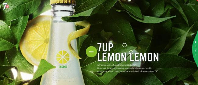
The CSS bubble effect included in 7UP is a beautiful example of branding through website design animation. Several factors: SVG drawings of bubbles and then two animations applied to each bubble.
The first animation changes the bubble opacity and moves it vertically in the view box; The second creates a wobbly effect for additional realism. Offsetting is handled by targeting each bubble and applying different animation durations and durations.
To create the bubbles I will use SVG. In SVG, I create two layers of bubbles: one for bigger bubbles and one for smaller bubbles. Inside the SVG, locate all the bubbles at the bottom of the view box.
1 2 3 4 5 6 7 8 9 10 11 12 13 14 | <g class="bubbles-large" stroke-width="7"> <g transform="translate(10 940)"> <circle cx="35" cy="35" r="35"/> </g> ... </g> <g class="bubbles-small" stroke-width="4"> <g transform="translate(147 984)"> <circle cx="15" cy="15" r="15"/> </g> </g> ... </g> |
To apply two separate animations to SVG, both using transform properties, we need to apply the animations to separate elements. The <g> element in SVG can be used like a div in HTML; We need to wrap each of our bubbles (already in a group) in a group card.
1 2 3 4 5 6 | <g> <g transform="translate(10 940)"> <circle cx="35" cy="35" r="35"/> </g> </g> |
To create the wobble effect, we just need to move (or translate) the bubble left and right, just in the right amount – too much will make the animation look too hard and disconnected, while too Little will not get much attention. Experimenting is the key when working with animation.
1 2 3 4 5 6 7 8 9 | @keyframes wobble { 33% { transform: translateX(-50px); } 66% { transform: translateX(50px); } } |
To apply animation to bubbles, I will use the groups I used before and the help of the nth type to identify each bubble group individually. I started by applying the opacity value to the bubbles and the properties will change to use hardware acceleration.
1 2 3 4 5 6 7 | .bubbles-large > g { opacity: 0; will-change: transform, opacity;} .bubbles-large g:nth-of-type(1) {...} ... .bubbles-small g:nth-of-type(10) {...} |
I want to keep all the effect time and delay within seconds of each other and set them to repeat infinitely. Finally, I applied the easy timing function to my animation to make it look a bit more natural.
1 2 3 4 5 6 7 8 9 10 11 12 13 14 | .bubbles-large g:nth-of-type(1) { animation: up 6.5s infinite; } .bubbles-large g:nth-of-type(1) circle { animation: wobble 3s infinite ease-in-out; } ... bubbles-small g:nth-of-type(9) circle { animation: wobble 3s 275ms infinite ease-in-out; } .bubbles-small g:nth-of-type(10) { animation: up 6s 900ms infinite; } |
2. Move the mouse
A subtle scrolling mouse animation can provide direction to the user when they first visit the site. Although this can be done using HTML elements and attributes, we will use SVG because this is more suitable for drawing.
Inside SVG we need a rectangle with rounded corners and a circle for the element we are going to animate, using SVG we can extend the icon to any size they are. I need it.
1 2 3 4 5 6 7 | <svg class="mouse" xmlns="..." viewBox="0 0 76 130" preserveAspectRatio="xMidYmid meet"> <g fill="none" fill-rule="evenodd"> <rect width="70" height="118" x="1.5" y="1.5" stroke="#FFF" stroke-width="3" rx="36"/> <circle cx="36.5" cy="31.5" r="4.5" fill="#FFF"/> </g> </svg> |
Now I need to apply some simple styles to control the size and position of the icons in the container. I wrapped a link around the mouse SVG and positioned it at the bottom of the screen.
1 2 3 4 5 6 7 8 9 10 11 12 | .scroll-link { position: absolute; bottom: 1rem; left: 50%; transform: translateX(-50%); } .mouse { max-width: 2.5rem; width: 100%; height: auto; } |
Next we will create animation. At 0 and 20 percent of the path through the effect, I want to set the state of the element when it starts. By setting it to 20% of the path passed, it will remain for a fraction of the time when repeated infinitely.
1 2 3 4 5 6 | @keyframes scroll { 0%, 20% { transform: translateY(0) scaleY(1); } } |
We need to add an opacity start point and then convert both the position Y and the vertical scale at 100%, ending our animation. The last thing we need to do is reduce the opacity to fade our circle.
1 2 3 4 5 6 7 8 9 10 11 | @keyframes scroll { ... 10% { opacity: 1; } 100% { transform: translateY(36px) scaleY(2); opacity: 0.01; } } |
Finally, I applied animation to the circle.
1 2 3 4 5 6 7 8 9 | .scroll { animation-name: scroll; animation-duration: 1.5s; animation-timing-function: cubic-bezier(0.650, -0.550, 0.250, 1.500); animation-iteration-count: infinite; transform-origin: 50% 20.5px; will-change: transform; } |
3. Dynamic writing
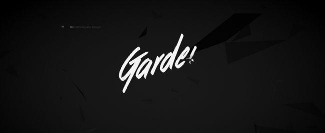
The Garden Eight website uses a common effect technique, whereby the text appears to be written out. To achieve the effect, I switched to SVG. There are two approaches here: convert text to path to animate or use SVG text. Both approaches have their pros and cons.
4. Flying birds
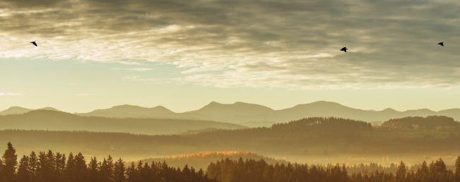
I started with perfectly straight lines, drawing each frame of my cartoon, depicting birds in different states of the flight. Then I manipulated the vector points and rounded the lines and edges. Finally, I placed each frame into an equal sized box and placed them side by side. Export the file as SVG.
Setting up HTML is really simple, just wrap each bird into a container to apply multiple animations – one to make the bird fly and the other to move it across the screen.
1 2 3 4 | <div class="bird-container"> <div class="bird"></div> </div> |
1 2 3 4 5 6 7 8 9 10 11 12 13 | .bird { background-image: url('bird.svg'); background-size: auto 100%; width: 88px; height: 125px; will-change: background-position; } @keyframes fly-cycle { 100% { background-position: -900px 0; } } |
CSS animations have a few tricks you may not know. We can use animation-timing-function to display images in steps – like scrolling through pages in a notebook to refer to animation.
1 2 3 4 5 6 | animation-name: fly-cycle; animation-timing-function: steps(10); animation-iteration-count: infinite; animation-duration: 1s; animation-delay: -0.5s; |
Now that I have created the flight cycle, the bird is currently flapping its wings but is not going anywhere. To move across the screen, I created another keyframe animation. This animation will move the bird on the screen horizontally while also changing the vertical position and proportions to allow the bird to bend more realistic.
1 2 3 4 5 6 7 8 9 | .bird--one {; animation-duration: 1s; animation-delay: -0.5s; } .bird--two { animation-duration: 0.9s; animation-delay: -0.75s; } |
5. Menu and close
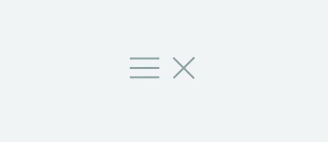
This animation is used throughout the web, turning three lines into a cross or close symbol. Until recently, most implementations were achieved using HTML elements, but SVG is actually more suited to this type of animation – no longer having to highlight your button code with multiple spans. .
We will rely on converting two properties: opacity and rotation. First of all, we want to blur lines 1 and 4, we can target by using the selector: nth-child.
1 2 3 4 | .menu-icon.is-active {element-type}:nth-child(1), .menu-icon.is-active {element-type}:nth-child(4) { opacity: 0; } |
The only thing left to do is aim for the two middle lines and rotate them 45 degrees in the opposite direction.
1 2 3 4 5 | .menu-icon.is-active {element-type}:nth-child(2) { transform: rotate(45deg); } .menu-icon.is-active {element-type}:nth-child(3) { transform: rotate(-45deg); } |
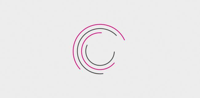
6. Chasing circles
Code | Review
Dynamic loading icon is made up of four circles. The circle has no fill, but there are alternating stroke colors.
1 2 3 4 5 6 7 | <svg class="loader" xmlns="http://www.w3.org/2000/svg" viewBox="0 0 340 340"> <circle cx="170" cy="170" r="160" stroke="#E2007C"/> <circle cx="170" cy="170" r="135" stroke="#404041"/> <circle cx="170" cy="170" r="110" stroke="#E2007C"/> <circle cx="170" cy="170" r="85" stroke="#404041"/> </svg> |
1 2 3 4 5 6 7 8 9 10 11 12 | circle:nth-of-type(1) { stroke-dasharray: 550; } circle:nth-of-type(2) { stroke-dasharray: 500; } circle:nth-of-type(3) { stroke-dasharray: 450;} circle:nth-of-type(4) { stroke-dasharray: 300; } |
Next, we need to create the keyframe animation. My effect is simple: rotate the circle 360 degrees. By placing the switch at 50% of the animation, the circle will also return to its original position.
1 2 3 4 5 6 | @keyframes preloader { 50% { transform: rotate(360deg); } } |
1 2 3 4 5 | animation-name: preloader; animation-duration: 3s; animation-iteration-count: infinite; animation-timing-function: ease-in-out; |
Generate delay using the Sass loop.
1 2 3 4 5 | @for $i from 1 through 4 { &:nth-of-type(#{$i}) { animation-delay: #{$i * 0.15}s; } } |
Due to the delay, the circle now takes effect, creating an illusion of the circles chasing each other. The only problem with this is that when the page loads for the first time, the circles are static, then they start moving, one by one. We can achieve the same offset effect, but stop unwanted pauses in our animation by simply setting the delay for a negative value.
animation-delay: -#{$i * 0.15}s;
Continue …