CSS – Grid Layout
- Tram Ho
In this article we will learn about Grid, its properties as well as how to use Grid in practice.
What is Grid?
CSS Grid Layout is a two-dimensional grid layout system, thanks to the introduction of Grid, it has completely changed the way the layout of the website is designed. In the past, when designing websites, we often used table, float, position but the above methods will miss some important functions (vertical centering of elements, …). Flexbox can also be used to design very good layouts, but in some cases using Grid will be much faster and more convenient.
Some important concepts
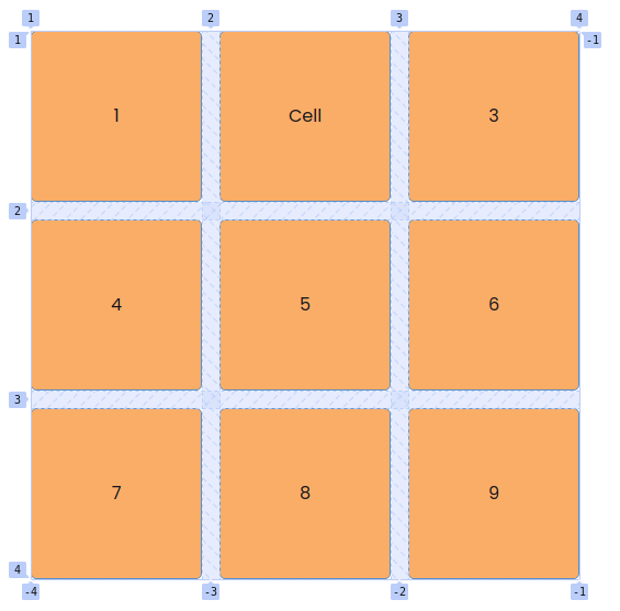
Grid Container
1 2 3 4 5 6 7 8 9 10 11 12 | <span class="token tag"><span class="token punctuation"><</span>div <span class="token attr-name">class</span><span class="token attr-value"><span class="token punctuation">=</span><span class="token punctuation">"</span>grid-container<span class="token punctuation">"</span></span><span class="token punctuation">></span></span> <span class="token tag"><span class="token punctuation"><</span>div <span class="token attr-name">class</span><span class="token attr-value"><span class="token punctuation">=</span><span class="token punctuation">"</span>grid-item<span class="token punctuation">"</span></span><span class="token punctuation">></span></span>1<span class="token tag"><span class="token punctuation"></</span>div<span class="token punctuation">></span></span> <span class="token tag"><span class="token punctuation"><</span>div <span class="token attr-name">class</span><span class="token attr-value"><span class="token punctuation">=</span><span class="token punctuation">"</span>grid-item<span class="token punctuation">"</span></span><span class="token punctuation">></span></span>2<span class="token tag"><span class="token punctuation"></</span>div<span class="token punctuation">></span></span> <span class="token tag"><span class="token punctuation"><</span>div <span class="token attr-name">class</span><span class="token attr-value"><span class="token punctuation">=</span><span class="token punctuation">"</span>grid-item<span class="token punctuation">"</span></span><span class="token punctuation">></span></span>3<span class="token tag"><span class="token punctuation"></</span>div<span class="token punctuation">></span></span> <span class="token tag"><span class="token punctuation"><</span>div <span class="token attr-name">class</span><span class="token attr-value"><span class="token punctuation">=</span><span class="token punctuation">"</span>grid-item<span class="token punctuation">"</span></span><span class="token punctuation">></span></span>4<span class="token tag"><span class="token punctuation"></</span>div<span class="token punctuation">></span></span> <span class="token tag"><span class="token punctuation"><</span>div <span class="token attr-name">class</span><span class="token attr-value"><span class="token punctuation">=</span><span class="token punctuation">"</span>grid-item<span class="token punctuation">"</span></span><span class="token punctuation">></span></span>5<span class="token tag"><span class="token punctuation"></</span>div<span class="token punctuation">></span></span> <span class="token tag"><span class="token punctuation"><</span>div <span class="token attr-name">class</span><span class="token attr-value"><span class="token punctuation">=</span><span class="token punctuation">"</span>grid-item<span class="token punctuation">"</span></span><span class="token punctuation">></span></span>6<span class="token tag"><span class="token punctuation"></</span>div<span class="token punctuation">></span></span> <span class="token tag"><span class="token punctuation"><</span>div <span class="token attr-name">class</span><span class="token attr-value"><span class="token punctuation">=</span><span class="token punctuation">"</span>grid-item<span class="token punctuation">"</span></span><span class="token punctuation">></span></span>7<span class="token tag"><span class="token punctuation"></</span>div<span class="token punctuation">></span></span> <span class="token tag"><span class="token punctuation"><</span>div <span class="token attr-name">class</span><span class="token attr-value"><span class="token punctuation">=</span><span class="token punctuation">"</span>grid-item<span class="token punctuation">"</span></span><span class="token punctuation">></span></span>8<span class="token tag"><span class="token punctuation"></</span>div<span class="token punctuation">></span></span> <span class="token tag"><span class="token punctuation"><</span>div <span class="token attr-name">class</span><span class="token attr-value"><span class="token punctuation">=</span><span class="token punctuation">"</span>grid-item<span class="token punctuation">"</span></span><span class="token punctuation">></span></span>9<span class="token tag"><span class="token punctuation"></</span>div<span class="token punctuation">></span></span> <span class="token tag"><span class="token punctuation"></</span>div<span class="token punctuation">></span></span> |
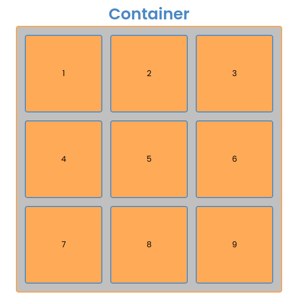
As in the picture and the code you can see container is the entire section with an orange border and a gray background containing all the grid-item nice container is an element with a CSS attribute assigned to it display: grid.
Grid Item
Grid items are the first level child elements of the container of contaier.
1 2 3 4 5 6 7 8 | <span class="token tag"><span class="token punctuation"><</span>div <span class="token attr-name">class</span><span class="token attr-value"><span class="token punctuation">=</span><span class="token punctuation">"</span>grid-container<span class="token punctuation">"</span></span><span class="token punctuation">></span></span> <span class="token tag"><span class="token punctuation"><</span>div <span class="token attr-name">class</span><span class="token attr-value"><span class="token punctuation">=</span><span class="token punctuation">"</span>grid-item<span class="token punctuation">"</span></span><span class="token punctuation">></span></span> <span class="token tag"><span class="token punctuation"><</span>div <span class="token attr-name">class</span><span class="token attr-value"><span class="token punctuation">=</span><span class="token punctuation">"</span>not-child<span class="token punctuation">"</span></span><span class="token punctuation">></span></span>1<span class="token tag"><span class="token punctuation"></</span>div<span class="token punctuation">></span></span> <span class="token tag"><span class="token punctuation"></</span>div<span class="token punctuation">></span></span> <span class="token tag"><span class="token punctuation"><</span>div <span class="token attr-name">class</span><span class="token attr-value"><span class="token punctuation">=</span><span class="token punctuation">"</span>grid-item<span class="token punctuation">"</span></span><span class="token punctuation">></span></span>2<span class="token tag"><span class="token punctuation"></</span>div<span class="token punctuation">></span></span> <span class="token tag"><span class="token punctuation"><</span>div <span class="token attr-name">class</span><span class="token attr-value"><span class="token punctuation">=</span><span class="token punctuation">"</span>grid-item<span class="token punctuation">"</span></span><span class="token punctuation">></span></span>3<span class="token tag"><span class="token punctuation"></</span>div<span class="token punctuation">></span></span> <span class="token tag"><span class="token punctuation"></</span>div<span class="token punctuation">></span></span> |
As in the code, div with class not-child not grid item.
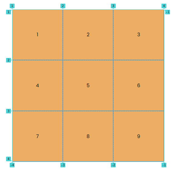
Grid Line
Horizontal or vertical lines form the structure and divide the grid-item called grid line. As you can see the blue line with the numbers below it is grid line.
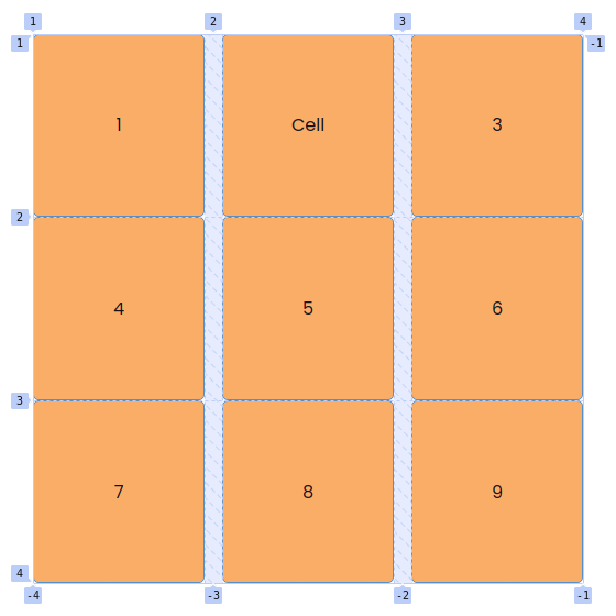
Grid Cell
Grid cell is the distance between rows and columns of grid line. But box 1 to 9 below picture is grid-cell.
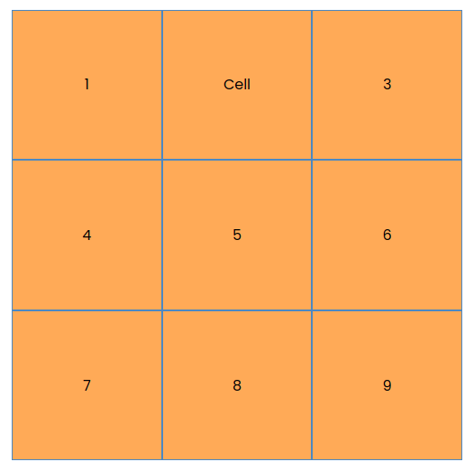
Grid Area
Grid area is an area consisting of grid-cell. For example, the area including cells 4, 5, 7, 8 above is a grid area.
Some attributes of Grid
Container
grid-template-columns
grid-template-columns Used to define columns in the grid layout. The values are the size of the column and are separated by spaces.
grid-template-columns: value value ...
1 2 3 4 5 6 7 8 9 10 11 | <span class="token selector">.grid-container</span> <span class="token punctuation">{</span> // Container sẽ được chia đều ra làm 3 phần mỗi cột một phần <span class="token property">grid-template-columns</span><span class="token punctuation">:</span> 1fr 1fr 1fr<span class="token punctuation">;</span> // Container sẽ có 3 cột với độ rộng tương ứng <span class="token property">grid-template-columns</span><span class="token punctuation">:</span> 20% 50% 30%<span class="token punctuation">;</span> // Các cột có độ rộng lần lượt là 200px<span class="token punctuation">,</span> 150px<span class="token punctuation">,</span> 400px <span class="token property">grid-template-columns</span><span class="token punctuation">:</span> 200px 150px 400px<span class="token punctuation">;</span> <span class="token punctuation">}</span> |
grid-template-rows
grid-template-rows Used to define rows in the grid layout. The values are the size of the row and are separated by spaces.
grid-template-rows: value value ...
1 2 3 4 5 6 7 8 9 10 11 | <span class="token selector">.grid-container</span> <span class="token punctuation">{</span> // Container sẽ được chia đều ra làm 3 phần <span class="token punctuation">(</span>chiều dọc<span class="token punctuation">)</span> mỗi hàng một phần <span class="token property">grid-template-rows</span><span class="token punctuation">:</span> 1fr 1fr 1fr<span class="token punctuation">;</span> // Container sẽ có 3 hàng với độ cao tương ứng <span class="token property">grid-template-rows</span><span class="token punctuation">:</span> 20% 50% 30%<span class="token punctuation">;</span> // Các hàng có độ cao lần lượt là 200px<span class="token punctuation">,</span> 150px<span class="token punctuation">,</span> 400px <span class="token property">grid-template-rows</span><span class="token punctuation">:</span> 200px 150px 400px<span class="token punctuation">;</span> <span class="token punctuation">}</span> |
grid-template-areas
grid-template-areas Used to define a template grid that helps to align the layout more intuitively and often comes with the attribute grid-area live grid-item.
1 2 3 4 5 | <span class="token property">grid-template-areas</span><span class="token punctuation">:</span> <span class="token string">"col1 col2 col3"</span> <span class="token string">"col4 col5 col6"</span> ... |
Suppose we want to create a layout with 2 rows and 3 columns with the first cell having a width of 2 cells, we will have the following template.
1 2 3 4 | <span class="token property">grid-template-areas</span><span class="token punctuation">:</span> <span class="token string">"col1 col1 col2"</span> <span class="token string">"col3 col4 col5"</span> |
grid-column-gap
grid-column-gap is the space between columns in the grid layout.
grid-column-gap: <value>
1 2 3 4 | <span class="token selector">.grid-container</span> <span class="token punctuation">{</span> <span class="token property">grid-column-gap</span><span class="token punctuation">:</span> 1rem<span class="token punctuation">;</span> <span class="token punctuation">}</span> |
We can see that the distance between the columns has been set to 1 rem.
grid-row-gap
Similar to grid-cloumn-gap then grid-row-gap is for rows.
grid-row-gap: <value>
gap
I can use gap to stand for 2 attributes is grid-column-gap and grid-row-gap.
gap: <grid-row-gap> <grid-column-gap> / <value> (cho cả 2 row và column)
1 2 3 4 | <span class="token selector">.grid-container</span> <span class="token punctuation">{</span> <span class="token property">gap</span><span class="token punctuation">:</span> 1rem<span class="token punctuation">;</span> <span class="token punctuation">}</span> |
grid-auto-columns and grid-auto-rows
These two properties are used to specify the size of the column or row.
grid-auto-columns/rows: min-content | max-content | auto | <value>
place-items
place-items is the shorthand of align-items: start | end | center | stretch (vertically aligned(column)) and justify-items: start | end | center | stretch (horizontally aligned (row)).
place-items: <align-items> / <justify-items>
1 2 3 4 | <span class="token selector">.grid-container</span> <span class="token punctuation">{</span> <span class="token property">place-items</span><span class="token punctuation">:</span> center<span class="token punctuation">;</span> <span class="token punctuation">}</span> |
Item
grid-column
I use grid-column to determine if the CSS cell has a length of grid-line (line vertically).
grid-column: grid-line-start(số bắt đầu)/grid-line-end(số kết thúc)
1 2 3 4 5 6 7 8 | <span class="token selector">.grid-item:first-child</span> <span class="token punctuation">{</span> <span class="token property">grid-column</span><span class="token punctuation">:</span> 1/3<span class="token punctuation">;</span> <span class="token punctuation">}</span> <span class="token selector">.grid-item:last-child</span> <span class="token punctuation">{</span> <span class="token property">grid-column</span><span class="token punctuation">:</span> 2/4<span class="token punctuation">;</span> <span class="token punctuation">}</span> |
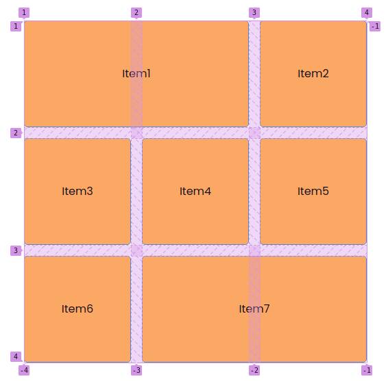
We can see that the first cell has a width extending from line 1 to line 3 and the last cell has a width extending from line 2 to line 4.
grid-row
I use grid-row to determine how tall the cell gets the CSS to be equal to grid-line (line vertically).
grid-row: grid-line-start(số bắt đầu)/grid-line-end(số kết thúc)
1 2 3 4 5 | <span class="token selector">.grid-item:first-child</span> <span class="token punctuation">{</span> <span class="token property">grid-column</span><span class="token punctuation">:</span> 1/3<span class="token punctuation">;</span> <span class="token property">grid-row</span><span class="token punctuation">:</span> 1/4<span class="token punctuation">;</span> <span class="token punctuation">}</span> |
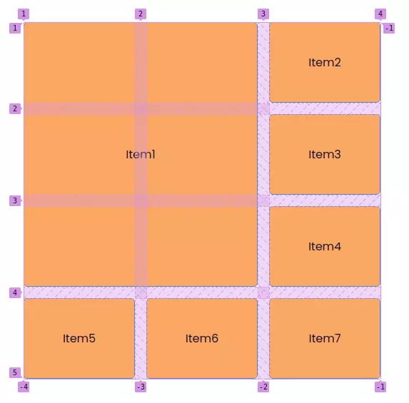
Similar to the above, we see that the first cell has the length from line 1 to line 3 and the height from line 1 to line 4.
grid-area
Give the name defined in the template grid-template-areas, grid-item that will have the same layout as in the template.
grid-area: <name-in-template>.
1 2 3 4 5 6 7 8 9 10 11 12 13 14 15 16 17 18 19 20 21 22 23 24 25 26 27 28 29 30 31 32 33 34 | <span class="token selector">.grid-container</span> <span class="token punctuation">{</span> <span class="token property">width</span><span class="token punctuation">:</span> 500px<span class="token punctuation">;</span> <span class="token property">height</span><span class="token punctuation">:</span> 500px<span class="token punctuation">;</span> <span class="token property">display</span><span class="token punctuation">:</span> grid<span class="token punctuation">;</span> <span class="token property">gap</span><span class="token punctuation">:</span> 1rem<span class="token punctuation">;</span> <span class="token property">grid-template-columns</span><span class="token punctuation">:</span> 1fr 1fr 1fr<span class="token punctuation">;</span> <span class="token property">grid-template-rows</span><span class="token punctuation">:</span> 2fr 1fr 2fr<span class="token punctuation">;</span> <span class="token property">grid-template-areas</span><span class="token punctuation">:</span> <span class="token string">"img1 img2 img3"</span> <span class="token string">"img1 img5 img5"</span> <span class="token string">"img4 img5 img5"</span> <span class="token punctuation">;</span> <span class="token punctuation">}</span> <span class="token selector">.grid-item:first-child</span> <span class="token punctuation">{</span> <span class="token property">grid-area</span><span class="token punctuation">:</span> img1<span class="token punctuation">;</span> <span class="token punctuation">}</span> <span class="token selector">.grid-item:nth-child(2)</span> <span class="token punctuation">{</span> <span class="token property">grid-area</span><span class="token punctuation">:</span> img2<span class="token punctuation">;</span> <span class="token punctuation">}</span> <span class="token selector">.grid-item:nth-child(3)</span> <span class="token punctuation">{</span> <span class="token property">grid-area</span><span class="token punctuation">:</span> img3<span class="token punctuation">;</span> <span class="token punctuation">}</span> <span class="token selector">.grid-item:nth-child(4)</span> <span class="token punctuation">{</span> <span class="token property">grid-area</span><span class="token punctuation">:</span> img4<span class="token punctuation">;</span> <span class="token punctuation">}</span> <span class="token selector">.grid-item:last-child</span> <span class="token punctuation">{</span> <span class="token property">grid-area</span><span class="token punctuation">:</span> img5<span class="token punctuation">;</span> <span class="token punctuation">}</span> |
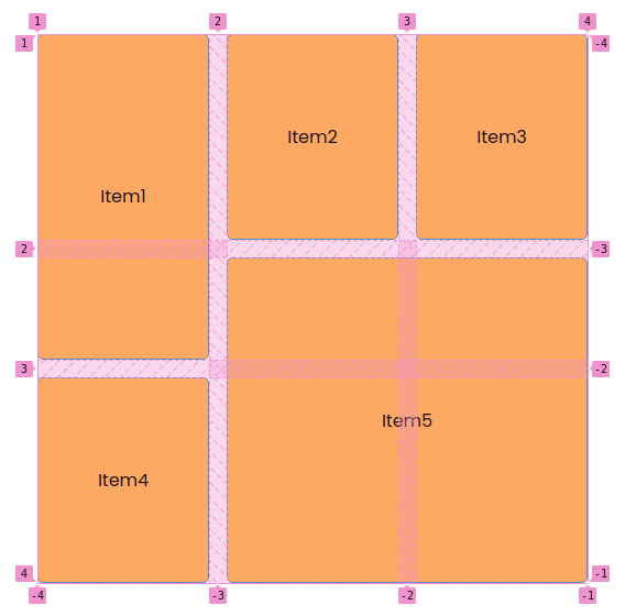
As we can see it’s easy to create a layout by taking the name defined in grid-template-areas to assign a value to grid-area belong to grid-item.
Practice
I will create a simple example of using grid to be responsive.
1 2 3 4 5 6 7 8 9 10 11 12 13 14 15 16 17 18 19 20 | <span class="token tag"><span class="token punctuation"><</span>div <span class="token attr-name">class</span><span class="token attr-value"><span class="token punctuation">=</span><span class="token punctuation">"</span>grid-container<span class="token punctuation">"</span></span><span class="token punctuation">></span></span> <span class="token tag"><span class="token punctuation"><</span>div <span class="token attr-name">class</span><span class="token attr-value"><span class="token punctuation">=</span><span class="token punctuation">"</span>grid-item<span class="token punctuation">"</span></span><span class="token punctuation">></span></span>1<span class="token tag"><span class="token punctuation"></</span>div<span class="token punctuation">></span></span> <span class="token tag"><span class="token punctuation"><</span>div <span class="token attr-name">class</span><span class="token attr-value"><span class="token punctuation">=</span><span class="token punctuation">"</span>grid-item<span class="token punctuation">"</span></span><span class="token punctuation">></span></span>2<span class="token tag"><span class="token punctuation"></</span>div<span class="token punctuation">></span></span> <span class="token tag"><span class="token punctuation"><</span>div <span class="token attr-name">class</span><span class="token attr-value"><span class="token punctuation">=</span><span class="token punctuation">"</span>grid-item<span class="token punctuation">"</span></span><span class="token punctuation">></span></span>3<span class="token tag"><span class="token punctuation"></</span>div<span class="token punctuation">></span></span> <span class="token tag"><span class="token punctuation"><</span>div <span class="token attr-name">class</span><span class="token attr-value"><span class="token punctuation">=</span><span class="token punctuation">"</span>grid-item<span class="token punctuation">"</span></span><span class="token punctuation">></span></span>4<span class="token tag"><span class="token punctuation"></</span>div<span class="token punctuation">></span></span> <span class="token tag"><span class="token punctuation"><</span>div <span class="token attr-name">class</span><span class="token attr-value"><span class="token punctuation">=</span><span class="token punctuation">"</span>grid-item<span class="token punctuation">"</span></span><span class="token punctuation">></span></span>5<span class="token tag"><span class="token punctuation"></</span>div<span class="token punctuation">></span></span> <span class="token tag"><span class="token punctuation"><</span>div <span class="token attr-name">class</span><span class="token attr-value"><span class="token punctuation">=</span><span class="token punctuation">"</span>grid-item<span class="token punctuation">"</span></span><span class="token punctuation">></span></span>6<span class="token tag"><span class="token punctuation"></</span>div<span class="token punctuation">></span></span> <span class="token tag"><span class="token punctuation"><</span>div <span class="token attr-name">class</span><span class="token attr-value"><span class="token punctuation">=</span><span class="token punctuation">"</span>grid-item<span class="token punctuation">"</span></span><span class="token punctuation">></span></span>7<span class="token tag"><span class="token punctuation"></</span>div<span class="token punctuation">></span></span> <span class="token tag"><span class="token punctuation"><</span>div <span class="token attr-name">class</span><span class="token attr-value"><span class="token punctuation">=</span><span class="token punctuation">"</span>grid-item<span class="token punctuation">"</span></span><span class="token punctuation">></span></span>8<span class="token tag"><span class="token punctuation"></</span>div<span class="token punctuation">></span></span> <span class="token tag"><span class="token punctuation"><</span>div <span class="token attr-name">class</span><span class="token attr-value"><span class="token punctuation">=</span><span class="token punctuation">"</span>grid-item<span class="token punctuation">"</span></span><span class="token punctuation">></span></span>9<span class="token tag"><span class="token punctuation"></</span>div<span class="token punctuation">></span></span> <span class="token tag"><span class="token punctuation"><</span>div <span class="token attr-name">class</span><span class="token attr-value"><span class="token punctuation">=</span><span class="token punctuation">"</span>grid-item<span class="token punctuation">"</span></span><span class="token punctuation">></span></span>10<span class="token tag"><span class="token punctuation"></</span>div<span class="token punctuation">></span></span> <span class="token tag"><span class="token punctuation"><</span>div <span class="token attr-name">class</span><span class="token attr-value"><span class="token punctuation">=</span><span class="token punctuation">"</span>grid-item<span class="token punctuation">"</span></span><span class="token punctuation">></span></span>11<span class="token tag"><span class="token punctuation"></</span>div<span class="token punctuation">></span></span> <span class="token tag"><span class="token punctuation"><</span>div <span class="token attr-name">class</span><span class="token attr-value"><span class="token punctuation">=</span><span class="token punctuation">"</span>grid-item<span class="token punctuation">"</span></span><span class="token punctuation">></span></span>12<span class="token tag"><span class="token punctuation"></</span>div<span class="token punctuation">></span></span> <span class="token tag"><span class="token punctuation"><</span>div <span class="token attr-name">class</span><span class="token attr-value"><span class="token punctuation">=</span><span class="token punctuation">"</span>grid-item<span class="token punctuation">"</span></span><span class="token punctuation">></span></span>13<span class="token tag"><span class="token punctuation"></</span>div<span class="token punctuation">></span></span> <span class="token tag"><span class="token punctuation"><</span>div <span class="token attr-name">class</span><span class="token attr-value"><span class="token punctuation">=</span><span class="token punctuation">"</span>grid-item<span class="token punctuation">"</span></span><span class="token punctuation">></span></span>14<span class="token tag"><span class="token punctuation"></</span>div<span class="token punctuation">></span></span> <span class="token tag"><span class="token punctuation"><</span>div <span class="token attr-name">class</span><span class="token attr-value"><span class="token punctuation">=</span><span class="token punctuation">"</span>grid-item<span class="token punctuation">"</span></span><span class="token punctuation">></span></span>15<span class="token tag"><span class="token punctuation"></</span>div<span class="token punctuation">></span></span> <span class="token tag"><span class="token punctuation"><</span>div <span class="token attr-name">class</span><span class="token attr-value"><span class="token punctuation">=</span><span class="token punctuation">"</span>grid-item<span class="token punctuation">"</span></span><span class="token punctuation">></span></span>16<span class="token tag"><span class="token punctuation"></</span>div<span class="token punctuation">></span></span> <span class="token tag"><span class="token punctuation"><</span>div <span class="token attr-name">class</span><span class="token attr-value"><span class="token punctuation">=</span><span class="token punctuation">"</span>grid-item<span class="token punctuation">"</span></span><span class="token punctuation">></span></span>17<span class="token tag"><span class="token punctuation"></</span>div<span class="token punctuation">></span></span> <span class="token tag"><span class="token punctuation"></</span>div<span class="token punctuation">></span></span> |
1 2 3 4 5 6 7 8 9 10 11 12 13 14 15 16 17 18 | <span class="token selector">.grid-container</span> <span class="token punctuation">{</span> <span class="token property">display</span><span class="token punctuation">:</span> grid<span class="token punctuation">;</span> <span class="token property">gap</span><span class="token punctuation">:</span> 1rem<span class="token punctuation">;</span> <span class="token property">grid-template-columns</span><span class="token punctuation">:</span> <span class="token function">repeat</span><span class="token punctuation">(</span>auto-fit<span class="token punctuation">,</span> <span class="token function">minmax</span><span class="token punctuation">(</span>250px<span class="token punctuation">,</span> 1fr<span class="token punctuation">)</span><span class="token punctuation">)</span><span class="token punctuation">;</span> <span class="token property">grid-auto-rows</span><span class="token punctuation">:</span> 150px<span class="token punctuation">;</span> <span class="token punctuation">}</span> <span class="token selector">.grid-item</span> <span class="token punctuation">{</span> <span class="token property">width</span><span class="token punctuation">:</span> 100%<span class="token punctuation">;</span> <span class="token property">height</span><span class="token punctuation">:</span> 100%<span class="token punctuation">;</span> <span class="token property">background-color</span><span class="token punctuation">:</span> #FFAA4C<span class="token punctuation">;</span> <span class="token property">border</span><span class="token punctuation">:</span> 1px solid #5089C6<span class="token punctuation">;</span> <span class="token property">display</span><span class="token punctuation">:</span> flex<span class="token punctuation">;</span> <span class="token property">justify-content</span><span class="token punctuation">:</span> center<span class="token punctuation">;</span> <span class="token property">align-items</span><span class="token punctuation">:</span> center<span class="token punctuation">;</span> <span class="token punctuation">}</span> |
Here I use repeat(), minmax() and auto-fit to be responsive. The columns of the grid will have widths ranging from 250px to 1fr and auto=fit Here, when the length of the block is larger than the container, the blocks will automatically go down the line and expand. The results can be viewed here.
Summary
So through this article, I have helped you learn about Grid. It helps us to layout easily. There are also some other useful properties of Grid that I haven’t mentioned, you can refer to here. I hope through this article you can use Grid for your projects. Thank you for following the article to the end.