Preamble
This is the last article in the series about my CSS Box Model. If the previous posts focused on an in-depth analysis of an element and its properties, this article will help you have a better overview of the relationship between the elements on the site, they push each other or attract. How together, so that you can layout the elements to the most accurate position.
You can follow all the posts of the Box model series here:
Part 1: CSS Box Model – Basic for beginners
Part 2: What is CSS Box Model and box-sizing: border-box?
Part 3: CSS Box Model – Ways of displaying elements with display properties
Block and Inline
Most of you are probably familiar with these two basic types of boxes: block and inline. If you do not recognize them, then maybe you will recognize CSS lines such as display: block and display: inline
So how is block and inline different, a p tag is different from a span tag? Let’s analyze a little theory to better understand offline.
If an element has a display property of block , it will:
- Element will drop a new line.
- The Element will expand to its maximum, until it fills the void in the container that holds it. Normally we will see that the element will have the same width as its parent container.
- The properties
widthandheightboth have an effect on the element (of course, to change its width and height). - Padding, margin and border (if any) of the element will push the surrounding elements away from it.
Many tags are already block by default, such as p , h1 , h2 , div , so by default these tags will render with properties as described above. Naturally when we call it “default”, that means we can change it.
Next, if an element has a display property of inline , then it will:
- Element will not drop new lines on the page.
- The
widthandheightattributes will not work, so it is useless to try to assign dimensions to inline elements. - Padding, margin, borders in the vertical direction (top and bottom) still work but will not push other inline elements away from it.
- Padding, margin and borders in the horizontal direction (left and right) still work and will still push other inline boxes away from it.
A simple example is the most visible:
Block direction and Inline direction
If talking about blocks and inline but not in the direction they are arranged, it is a bit flawed. However, this problem has many things to discuss (outside the purpose of the article), so I just mentioned some basic ideas here.
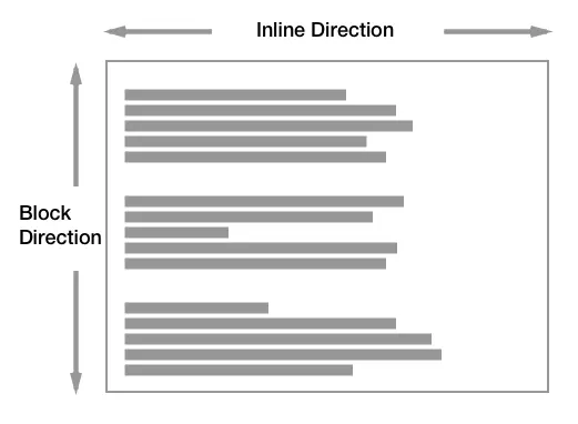
By default, when you visit a website, most of them have writing-mode as horizontal-tb , meaning that the content will be sorted from left to right (horizontal) and from top to bottom (tb: top bottom). Often we pay little attention to this, because the Vietnamese and English languages both follow this direction.
With block direction, the blocks will be vertically stacked (the latter element is below the upper element). As for inline direction, the elements will be arranged side by side in a horizontal row.
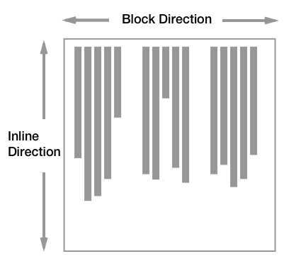
Add for reference purposes: with writing-mode as vertical, the direction of the blocks will follow horizontally. However, the nature of the way it works does not change.
Attributes displayed inside (inner) and outside (outer)
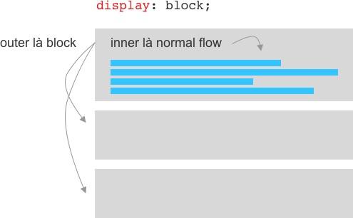
Do you know that an element has 2 types of attributes that are visible inside and outside? When you write display: block; , 2 things will happen:
- Outer: you are declaring that your element is a block when interacting with surrounding elements.
- Inner: You are declaring that its direct children will be arranged in the normal way as described above (called normal flow).
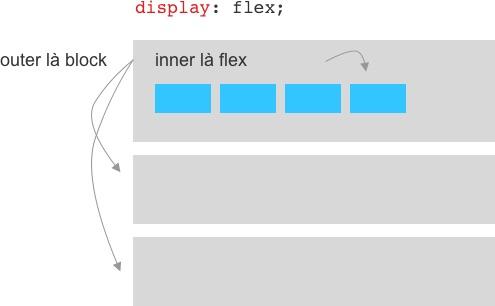
Do you find it strange? Another example, when you write display: flex; , also 2 things will happen:
- Outer: you are declaring that your element is a block when interacting with surrounding elements.
- Inner: You are declaring that its direct child elements will become flex items and are arranged based on the flexbox rules.
For example
Let’s take a look at a simple example below:
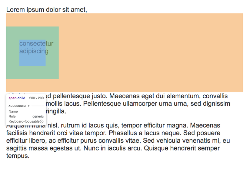
1 2 3 | <span class="token tag"><span class="token tag"><span class="token punctuation"><</span> p</span> <span class="token punctuation">></span></span> Lorem ipsum dolor sit amet, <span class="token tag"><span class="token tag"><span class="token punctuation"><</span> span</span> <span class="token attr-name">class</span> <span class="token attr-value"><span class="token punctuation">=</span> <span class="token punctuation">"</span> child <span class="token punctuation">"</span></span> <span class="token punctuation">></span></span> consectetur adipiscing <span class="token tag"><span class="token tag"><span class="token punctuation"></</span> span</span> <span class="token punctuation">></span></span> elit. Integer sed pellentesque justo... <span class="token tag"><span class="token tag"><span class="token punctuation"></</span> p</span> <span class="token punctuation">></span></span> <span class="token tag"><span class="token tag"><span class="token punctuation"><</span> p</span> <span class="token punctuation">></span></span> Aliquam nulla nisl, rutrum id lacus quis, tempor efficitur magna... <span class="token tag"><span class="token tag"><span class="token punctuation"></</span> p</span> <span class="token punctuation">></span></span> |
1 2 3 4 5 6 7 8 | <span class="token selector">.child</span> <span class="token punctuation">{</span> <span class="token property">background-color</span> <span class="token punctuation">:</span> lightblue <span class="token punctuation">;</span> <span class="token property">width</span> <span class="token punctuation">:</span> 100px <span class="token punctuation">;</span> <span class="token property">height</span> <span class="token punctuation">:</span> 100px <span class="token punctuation">;</span> <span class="token property">padding</span> <span class="token punctuation">:</span> 50px <span class="token punctuation">;</span> <span class="token property">margin</span> <span class="token punctuation">:</span> 50px 0 <span class="token punctuation">;</span> <span class="token punctuation">}</span> |
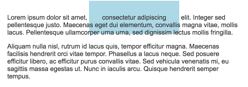
In the example above, the default span tag is an inline box, so:
- It is in line with other content
- Width and height are completely ignored. Note that the CSS code does not fail in this case, it just doesn’t work.
- With the padding of 50px, you see it pushes the text around far away, but the vertical doesn’t, even though it still exists (as evidenced by its background color).
- With margin top and bottom at 100px, it’s completely ignored.
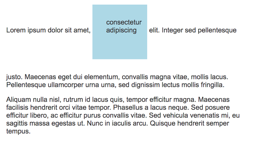
Next, we try to convert it to block:
1 2 3 4 5 6 7 8 9 | <span class="token selector">.child</span> <span class="token punctuation">{</span> <span class="token property">display</span> <span class="token punctuation">:</span> block <span class="token punctuation">;</span> <span class="token comment">/* thêm dòng này */</span> <span class="token property">background-color</span> <span class="token punctuation">:</span> lightblue <span class="token punctuation">;</span> <span class="token property">width</span> <span class="token punctuation">:</span> 100px <span class="token punctuation">;</span> <span class="token property">height</span> <span class="token punctuation">:</span> 100px <span class="token punctuation">;</span> <span class="token property">padding</span> <span class="token punctuation">:</span> 50px <span class="token punctuation">;</span> <span class="token property">margin</span> <span class="token punctuation">:</span> 50px 0 <span class="token punctuation">;</span> <span class="token punctuation">}</span> |
- Because it is a block, it falls down on a new line.
- Width and height now work.
- With the padding of 50px, you see it pushes the text around away from it both horizontally and vertically.
- The margin now works.
display: inline-block
In some cases, you will want to reconcile block and inline effects. For example, you still want to customize the size of the element with width and height , but you still want it to be inline with other elements. With display: inline-block , you help the element have some properties of both block and inline.
Conclude
The article is quite long, so I do not want to cover other related issues such as “Margin collapsing”. As you can see, the basic knowledge of layout is actually very simple but maybe because it was not taught at university (in my time), very few people can understand and apply it properly. However, it is quite simple, so please take the time to understand it.