There is no music if there is no space between notes. Imagine if the notes were played at the same time, or played so quickly that we couldn’t tell which one was the next, this ” chorus ” would be very painful. Zappa once said, ” There must be a space between the notes ” so that each sound is clear and outstanding in its own way.
“Frank Vincent Zappa is an American musician, composer, activist and filmmaker.”
For the tune, we need reasonable spacing. Music is more than just melody, it’s a balance between distance and sound. Without both, the music would not exist.
This is especially true when it comes to imaging. Without negative space, your design elements will not only stand out, but also become a mess.
This is especially true when it comes to imaging. Without gaps, the elements in your design not only don’t stand out, but they also become a mess.

Today, I will share to you the topic of spacing . After nearly 5 years working as Frontend in the field of “markup”, I have made and witnessed the change of the website. From layouts that spend a lot of content, letters, to forms that try to cram a lot of information to give users … to layouts that give users a certain focus, less content. the clear spaces are very emotional.
That is the general view of UI / UX, while with website or more specifically in CSS, there are two main types of spacing, which are outer-space and inner-space . I will call it ” outer ” and ” inner ” for short.
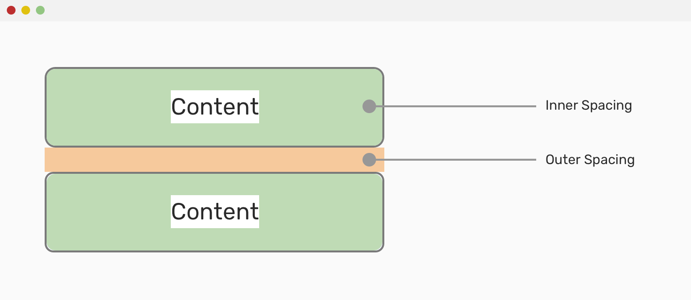
For example in the image above, the space outside is outer and inside is inner. Suppose with 2 div tags, we can use a simple CSS as follows:
1 2 3 4 5 | <span class="token selector">.box </span><span class="token punctuation">{</span> <span class="token property">padding</span> <span class="token punctuation">:</span> 20px 40px <span class="token punctuation">;</span> <span class="token comment">// inner</span> <span class="token property">margin-bottom</span> <span class="token punctuation">:</span> 25px <span class="token punctuation">;</span> <span class="token comment">// outer</span> <span class="token punctuation">}</span> |
This is the knowledge of box-model , if you do not know it, you can learn it (also quite briefly). Because it is a very important thing, if you do not know it, you will face it  I will talk more about “inner-space” and “outer-space” right now.
Margin – Outer space
Margin is often used when you want to create distance between one element compared to other elements. As the example above, I have used margin-bottom: 25px to create distance from the div below.
Surely you already know that margin can be used in the top, right, bottom, left and top, right, bottom, left directions and we should understand these basic things to be able to apply them well in real projects.
The problem of margin collapse
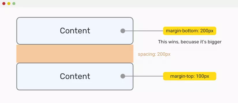
When going to a good interview with everyone in the team, I often quiz with you guys the question “now I have 2 divs, the div is margin-bottom 200px above the margin-bottom 200px , the div is below the margin-top: 100px . The distance between 2 how much is the div
The question is quite funny, but the person who answered with a face full of doubt is equally humorous. And you, how would you answer?
Simply put, margin collapse occurs when we have 2 elements next to each other and the spacing is defined by margin . Then, the distance will not be cumulative, but will take the element with the larger margin .
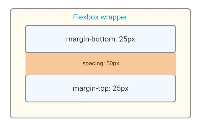
So, normally in this case, it is advisable to only set the margin for an element to create space. However, margin collapse will not happen when the adjacent outer wrapper is flexbox .
1 2 3 4 5 6 7 8 9 | <span class="token tag"><span class="token tag"><span class="token punctuation"><</span> style</span> <span class="token punctuation">></span></span><span class="token style"><span class="token language-css"> <span class="token selector">.item</span> <span class="token punctuation">{</span> <span class="token property">margin</span> <span class="token punctuation">:</span> 25px <span class="token punctuation">;</span> <span class="token punctuation">}</span> </span></span><span class="token tag"><span class="token tag"><span class="token punctuation"></</span> style</span> <span class="token punctuation">></span></span> <span class="token tag"><span class="token tag"><span class="token punctuation"><</span> div</span> <span class="token attr-name">class</span> <span class="token attr-value"><span class="token punctuation">=</span> <span class="token punctuation">"</span> item <span class="token punctuation">"</span></span> <span class="token punctuation">></span></span> Content <span class="token tag"><span class="token tag"><span class="token punctuation"></</span> div</span> <span class="token punctuation">></span></span> <span class="token tag"><span class="token tag"><span class="token punctuation"><</span> div</span> <span class="token attr-name">class</span> <span class="token attr-value"><span class="token punctuation">=</span> <span class="token punctuation">"</span> item <span class="token punctuation">"</span></span> <span class="token punctuation">></span></span> Content <span class="token tag"><span class="token tag"><span class="token punctuation"></</span> div</span> <span class="token punctuation">></span></span> |
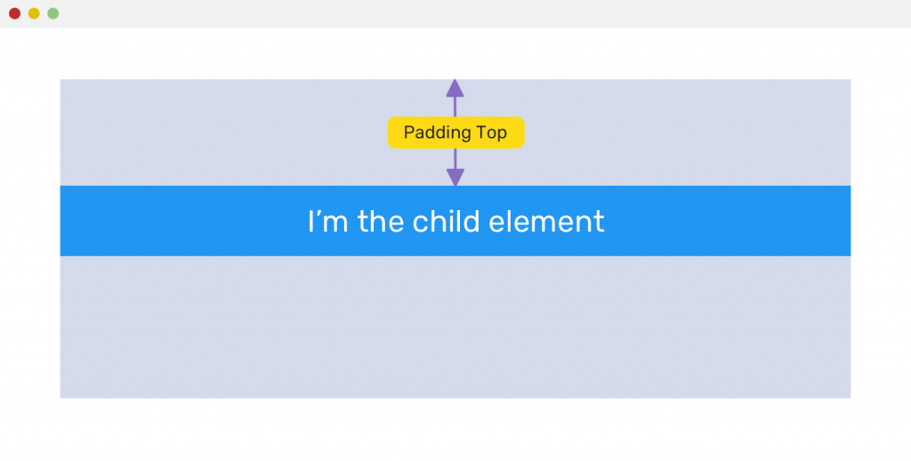
Children than home, the house will be in ruins
Another problem is the use of margin for paternity.
1 2 3 4 | <span class="token tag"><span class="token tag"><span class="token punctuation"><</span> div</span> <span class="token attr-name">class</span> <span class="token attr-value"><span class="token punctuation">=</span> <span class="token punctuation">"</span> parent <span class="token punctuation">"</span></span> <span class="token punctuation">></span></span> <span class="token tag"><span class="token tag"><span class="token punctuation"><</span> div</span> <span class="token attr-name">class</span> <span class="token attr-value"><span class="token punctuation">=</span> <span class="token punctuation">"</span> child <span class="token punctuation">"</span></span> <span class="token punctuation">></span></span> I'm the child element <span class="token tag"><span class="token tag"><span class="token punctuation"></</span> div</span> <span class="token punctuation">></span></span> <span class="token tag"><span class="token tag"><span class="token punctuation"></</span> div</span> <span class="token punctuation">></span></span> |
1 2 3 4 5 6 7 8 9 10 | <span class="token selector">.parent </span><span class="token punctuation">{</span> <span class="token property">margin</span> <span class="token punctuation">:</span> 50px auto 0 auto <span class="token punctuation">;</span> <span class="token property">width</span> <span class="token punctuation">:</span> 400px <span class="token punctuation">;</span> <span class="token property">height</span> <span class="token punctuation">:</span> 120px <span class="token punctuation">;</span> <span class="token punctuation">}</span> <span class="token selector">.child </span><span class="token punctuation">{</span> <span class="token property">margin</span> <span class="token punctuation">:</span> 50px 0 <span class="token punctuation">;</span> <span class="token punctuation">}</span> |
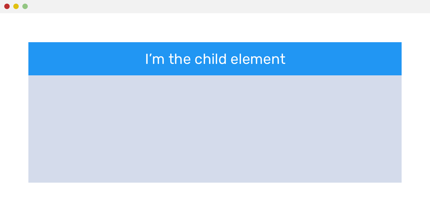
You see that the child element has a margin: 50px 0 but it is not way above the parent element, it is because the father’s margin collapse affects the son.
To solve this case, we can CSS the son to display: inline-block or best for the father padding-top: 50px – this way he or she used to treat the son is quite OK.
Negative Margin
Margin can be used in negative units. This will use negative numbers in the margin value. If you’ve ever used Bootstrap you will notice that the bootstrap grid uses this.
1 2 3 4 5 6 7 8 9 10 11 12 13 14 15 | <span class="token selector">.container </span><span class="token punctuation">{</span> <span class="token property">padding-left</span> <span class="token punctuation">:</span> 15px <span class="token punctuation">;</span> <span class="token property">padding-right</span> <span class="token punctuation">:</span> 15px <span class="token punctuation">;</span> <span class="token punctuation">}</span> <span class="token selector">.row </span><span class="token punctuation">{</span> <span class="token property">margin-left</span> <span class="token punctuation">:</span> -15px <span class="token punctuation">;</span> <span class="token property">margin-right</span> <span class="token punctuation">:</span> -15px <span class="token punctuation">;</span> <span class="token punctuation">}</span> <span class="token selector">.col-* </span><span class="token punctuation">{</span> <span class="token comment">// col-1 -> col-12</span> <span class="token property">padding-left</span> <span class="token punctuation">:</span> 15px <span class="token punctuation">;</span> <span class="token property">padding-right</span> <span class="token punctuation">:</span> 15px <span class="token punctuation">;</span> <span class="token punctuation">}</span> |
Find the answer to the question ” What is the relationship between container, row, col in bootstrap? “. Maybe you will encounter that
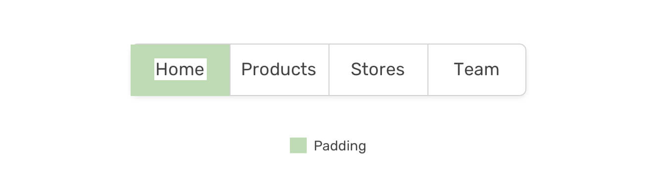
Padding – Inner Spacing
Padding is also called inner space inside the element. Used in many cases. For example, the image below illustrates when we use padding for tag a to expand the click range of tag a.
Padding problems
- Padding has no negative units.
- Will not work with
display: inlineelements e.g. withspan, a, img,...tags
Practical application
Handle the margin-bottom
I send you a tip, assuming you have a list of many items. Each item will be separated by a space of 30px , except the last item has no space, I will do the following to optimize.
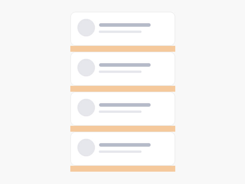
1 2 3 4 | . <span class="token property">item</span> <span class="token punctuation">:</span> <span class="token function">not</span> <span class="token punctuation">(</span> <span class="token punctuation">:</span> last-child <span class="token punctuation">)</span> <span class="token punctuation">{</span> <span class="token property">margin-bottom</span> <span class="token punctuation">:</span> 30px <span class="token punctuation">;</span> <span class="token comment">// selector đến các phần tử, trừ thằng cuối cùng ra</span> <span class="token punctuation">}</span> |
However, this way will work correctly when displaying a column, but if the interface of 2 columns or more then it is no longer correct, here is the number 4 still has bottom margin.
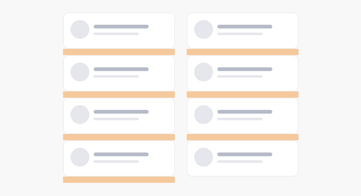
The most optimal way to solve it is in the father to wrap the margin-bottom of the negative number with the bottom margin of the son as follows:
1 2 3 4 | <span class="token selector">.wrapper </span><span class="token punctuation">{</span> <span class="token property">margin-bottom</span> <span class="token punctuation">:</span> -30px <span class="token punctuation">;</span> <span class="token punctuation">}</span> |
summary
In general, a slide for a presentation, or a website that gets the user’s heart through the eyes full of art, cannot lack subtle spaces. Many novice designers will want to fill the void with color graphics or something. More experienced designers will advise you to use more space and know how to moderate. There will be some people looking at the design and complaining that there’s too much space there.

For example, with this layout, I was very impressed by the harmonious colors and very clear viewing distances.
There will be times when it makes sense to fill in the spaces in the design. You need to consider the combination of website content and media.
The article is referenced at: