In this article we will learn the two most important types of values that CSS can apply to HTML elements: color and sizing. It allows us to control the colors of the elements and their colors. Most declarations and CSS values are self-explanatory, for example: text-align: left . However, there are quite a few exceptions, and the quirky way of determining values.
CSS color
We often know the words describing colors like: red, green, and lightgray … And CSS also supports a large number of different color names, you can see the online documentation here – color . However, this is not a flexible and universal CSS color definition, let’s learn about the most powerful / best ways to apply colors in CSS.
Hexadecimal colors
One common method for determining color is, hexadecimal RGB (red-green-blue). Hearing it seems complicated, but the concept is also quite simple. A quick way to understand how hexadecimal color works is to try changing the color of a tag from red to the corresponding hexadecimal RGB color.
1
2
3
4
<span class="token comment">/* GLOBAL STYLES */</span>
When saving and reloading the page, we see that the a tag is still the same red color
The reason for calling this color system hexadecimal RGB is because it uses base 16, not the usual base 10. (“Hexadecimal” is a combination of Greek and Latin, “six” (hex) and “tenth” (decimal)). The letters “af” represent the numbers 10 through 15.
0
first
2
3
4
5
6
7
8
9
ten
11
twelfth
13
14
15
0
first
2
3
4
5
6
7
8
9
a
b
c
d
e
f
Counting in hex.
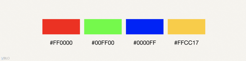
In the base 10 system, we can count from 0 to 99 with 2 digits, where 99 = 10² – 1. Similarly hexadecimal (hex) allows us to count from 0 to ff (= 16² – 1 = 255). In other words, placing 2 hex numbers next to each other allows us to count from 0 to 255 using just 2 characters. With 00 = 0 and FF or ff = 255. (hex CSS is not case sensitive, so you can use uppercase or lowercase letters.) Computer monitors consist of picture elements (or pixels ) and display colors by combining light from the red, green (green), and blue (blue) elements of a pixcel. . Hexadecimal RGB puts 3 sets of 2 hex numbers side by side to define red, green, and blue values to create a unique one. So # ff0000 can be read as red = ff , green = 00 , blue = 00 or red = 255, green = 0, blue = 0.
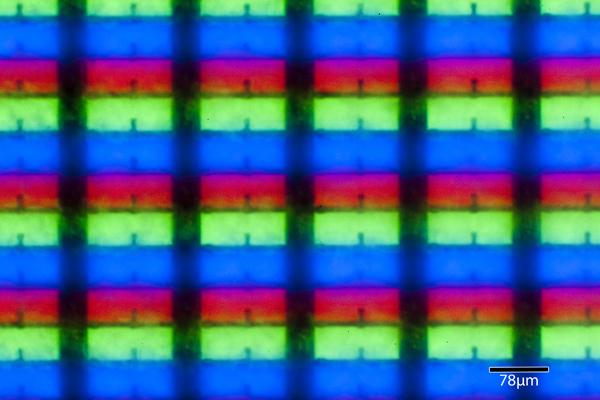
Elements in a computer screen pixel
If all 3 colors are enabled (that is, each color is ff , all 3 are #ffffff ) the pixcel will be white. If all 3 colors are turned off (that is, each color is 00 , all 3 is # 000000 ) then that pixcel will be black. The combination of these 3 colors will create the colors you see. This is some hexadecimal color.
CSS also supports shorthand in case of the same hex number. For example, if the same number is, #222222, #cccccc, hoặc #aa22ff , you can shorten it all to 3 digits, like this : #222, #ccc, hoặc #a2f . When the browser sees a 3-digit format like this, it will automatically fill in the missing numbers. Therefore, when written # f00 instead of # ff0000, it is all red.
1
2
3
4
5
6
7
8
9
10
11
.
.
.
<span class="token comment">/* GLOBAL STYLES */</span>
At first, the RGB color system may seem confusing, but with a lot of practice, you will understand how these 3 values combine to produce different colors, and different shades. To create more complex colors, we can use the color picker tool. However, for some common colors you should keep in mind. For example, the grayscale spectrum from black to white always has 3 identical hex numbers, for example if all is 00 (#000000) then all black, all ff (#ffffff) are white, and the number in the middle #979797 it is gray. Gray scale in Hexadecimal
Setting color and transparency via rgb () and rgba ()
In addition to using RGB hex, you can use RGB directly using the rgb() , which allows you to use decimals instead of hex. In short, rgb(255, 255, 255) will give the same color as #ffffff . But the main reason for using RGB directly is that it allows us to set transparency via the rgba() . In rgba()a stands for alpha , because the conventional name for transparency level in image processing is alpha level . And the alpha level is indicated by a number from 0 to 1, where 0 is transparent, 1 is opaque, and the values in between are the level of transparency (e.g., 50% is 0.5, 25% is 0.25, … etc.) For example, we will try to change the color of the a tag to gray, using rgba() . I’ll try to choose a fairly dark gray color with RGB value of 150, and set the opacity to 1.
Actually, there are other ways to set colors in CSS (eg HSL and HSLa). However, in this article we will not go into them deeply, because in practice they are rarely used.
Introduction to sizing
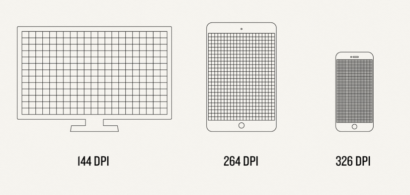
We often use pixels to measure and size elements like fonts, margins, or padding, but in practice there are a lot of different confusing ways to size elements. Because multiple versions of HTML have to be displayed on different computers and devices, browsers are a complex set of standards that are too many to imagine. If you think it is possible to simply specify everything in pixcel ( px ), are screens just a large network of pixels? We can set the size this way if all the devices in the world have the same screen sizes and resolutions. Unfortunately, however, it varies widely across devices, some monitors even combine multiple physical pixels into a smaller number of virtual pixels. That means, when you resize it looks great on your screen already, but someone using a monitor with a smaller screen resolution may find that the element size is huge – to the level cannot be used. But if someone uses high-resolution devices (like Retina on an iPhone or iMac), they find them quite small.
The screens have different sizes, the pixel density is also different.
The good news is that today’s browsers all allow us to zoom in or zoom out for better display, but that can also cause pages that use absolute sizes to break the layout. On modern devices it can edit the outputs on its own, making something with an extremely high pixel density that works well on devices with lower resolutions. In recent years, the most popular method has been to use relative sizes. It is that the size of one element will be based on the size of another, or even based on the size of each screen. This type of relative sizes helps to solve the problem of different screen ratios, and it also makes it easy to resize the page. If we really want to, we can still use absolute sizes anywhere, however, we should stick to relative sizes better.
Pixels (and their less-used cousin, the point)
Pixels (px) and point (pt) are absolute units of measure, with 1 pixcel = 1/96 inch, and 1 point = 1/72 inch. In this article we will not cover point (since it is in fact not used in web sizing, but more commonly used in print.)
Style Note: The anti-pixelists In learning about web development, you will inevitably meet people with dislike and anti-pixel thinking. They believe that absolute size should never be used, but relative size. In fact, sometimes we feel there are elements that are more sensible and better if using pixels, like margins or padding. Theoretically, it is possible to set the size of any element to relative size. Actually, there is no mandatory decision, but it depends on your project requirements. If using pixels and the page still displays well, the layout is not broken, and you are used to it, then keep using it. However, if the enduser complains that it was causing the layout to break, then there’s a chance you need to re-size it to relative.
The use of absolute dimensions, helps you to set the element’s size independently, regardless of the size of the browser, screen resolution, or any other elements on the page. But, this can lead to the situation where your element size doesn’t match the enduser terminal at all. Using absolute measurement / units is not all just bad or good. Just keep in mind that elements that use absolute sizes will not automatically resize to other elements on the page – many websites today also combine absolute and relative sizes. It is crucial to know when to use which size. For example, you have banner ads on your website, and you sell ad space based on the size of the element (one of the most popular banner sizes is 728x90px). In this situation, you will need to determine absolute, not relative, size to ensure that more subscribers get more ad space.
Ad sizes like this one must have seen in many places.
Percentages
You probably already know how to set sizes in percentages (%). It is very useful when we want to use relative size, to force an element to fill in a void. There are a few points to note, you need to know the following:
This percentage will be based on the parent container that is wrapping it – but it is not determined by the browser or the entire page.
We rarely use the height ratio, as it requires setting height on the parent element – but we cannot assume height as assuming vertical.
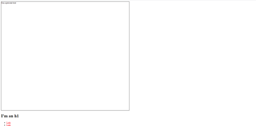
To understand how the% dimensioning works, we’ll create a new div tag with the class name .bio-wrapper , wrapping the div tag of the .bio-box class.
You may have seen him shredding guitar live with Capital Cities on Jimmy
Kimmel<span class="token punctuation">,</span>Conan<span class="token punctuation">,</span>orThe Ellen Show<span class="token punctuation">,</span>but rest assured Nick isatruenerd at
heart.He<span class="token string">'s just as happy shredding well-spec'</span>dlines of code fromatour
Here .bio-wrapper will be the parent container and define the size of children .bio-boxes . And we’ll set the width of the new class to 500px, and change the width of the .bio-box from 200px (quite cramped) to 50%.
Looks like it’s still quite cramped, right?
The reason the box looks so small is because it’s taking 50% of 500px to 250px. To make it larger, we need to make its parent bigger. There is a simple way that we delete the width of the .bio-wrapper class then save and refresh. The browser will automatically assume that a percentage of the width of the .bio-boxes is based on the width of the browser.
As we learned above, we found that the% works well when setting dimensions for width, but it works quite differently for height, and not for thickness. Therefore, we cannot use the% unit for border. For the% height dimension to work, we need to set the height for its parent first. So in case you want to set the height of the box to the browser, what do you do? Set height: 100%? it won’t work. Let’s try the code below:
1
2
3
4
5
6
7
8
9
10
11
.
.
.
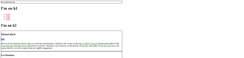
<div style=<span class="token string">"border:1px solid #000;width: 50%;height:100%;"</span>>I'm a percent
test</div>
<h1>I'man h1</h1>
.
.
.
We will get the width of 50% of the page, but the height is only equal to the height of the content in the div. (not as I expected.)
We’ll try to see what happens if we set the height of the body tag, as shown below:
1
2
3
4
5
6
7
8
9
10
11
.
.
.
<span class="token comment">/* GLOBAL STYLES */</span>
Through the code above we see that, when using% for height, the parent container must be set to the height first for the height% of children to take effect. If not, the browser will spend the necessary height to accommodate the content.
Percentage fonts
We can use% to set the size of the text, but please note that the font size will not be based on the pixel size of the container, it will be based on the font-size of the inherited container. . For example, the height of the box is 1000px, but it inherits the 16px font, so if you set the font size of the child element to 50% then it will be 8px (50% of 16px) instead of 500px. many people misunderstand. Generally people use% as a way to format the size of boxy things, and use a different sizing method for fonts (eg using em units).
children
em is the relative unit for setting the size of the text, and it is a popular and preferred unit. The name is derived from the approximate width of the letter m, , however this use is more historical. In CSS, an em , represents the number of pixels equal to the current font size of any parent container of the given element. For the pure text size (not the h1, h2 header type) the default text size is 16px , so the default size of one child is also 16px . For example, the font size inheriting the parent container is 16px, if the size is set to 0.5em, 50% of 16px will be 8px. And 2.25em would be 225% of 16px which is 36px … etc One of the reasons that makes em so much more useful than pixels is that it will automatically change the value based on the inherited font size of the parent object. This means that if you use em for your entire website, you can edit an entire text of your website simply by editing the font size base, and then all fonts in the sub-container will automatically proportional change of this new edit. In case you’ve used pixels for everything, then you have to manually change all the places that need to be changed. For example we try to set font size of .bio-copy class to 0.5em . And because the default font size of the entire page is 16px , the font size after set becomes 8px .
1
2
3
4
5
6
7
8
9
10
11
12
13
14
.
.
.
<span class="token comment">/* BIO STYLES*/</span>
And now let’s see how it will change if we change the font size of the parent element. We will add again the .bio-wrapper class to wrap the .bio-box class, so we can reset the base font size, by adding a CSS rule. That is, we will change the default font size from 16px to 24px. So the .bio-box that has a 0.5em (50% of 24px) font size becomes 12px.
1
2
3
4
5
6
7
8
9
10
11
<span class="token comment">/* BIO STYLES */</span>
To determine what the font size is, the browser gathers font data from child to parent until it finds the absolute font, then calculates the tree backwards to get the correct font. . As mentioned above, if such absolute value is not found, the browser will take the default font size of 16px, but we have changed the parent div to 24px, so the sizes of the child elements are also will change accordingly. As a result, the font size 0.5 em is not 50% of 16px anymore, but becomes 50% of 24px, which is 12px. So the font size of the .bio-box automatically increases from 8px to 12px, as shown below:
One of the important attributes of the em unit is that it is cumulative. If an element is set to 0.5em font size, placed within another element with 0.5em font size, the final font size will be 0.5 × 0.5 = 0.25em. For example, if the base size is 24px, the deepest nested element is 25% by 24, or 6px. This cumulative effect can be helpful, or it can also inadvertently cause rendering errors, so be careful with it. Our current code is including nested div tags, which is .bio-copy in .bio-box and in .bio-wrapper . Above we changed the font size of the .bio-copy to 0.5em, if now we keep changing the font size of the .bio-box to 0.5em, the result will be 50% of 50% of 24px , is 6px.
At this point the font size will become quite small:
As mentioned above, the browser will start from .bio-copy, it goes up one level to the parent class, it detects that the font set command is relative 50%, it goes up one more level. to find the absolute font size, and it finds that the .bio-wrapper class is setting the absolute size to 24px. So it will go back to the .bio-box child element and set the font size to 12px, it goes back to the last .bio-copy child and sets the font size to 6px. Or it might work in a different way too, if we set the font of .bio-box and .bio-copy to 1.5 em, then the browser will display very large font 54px (by calculating 24 × 1.5 × 1.5 = 54px).
Font is too big, right? We can set a more suitable font size to be about 1em.
 This is some hexadecimal color.
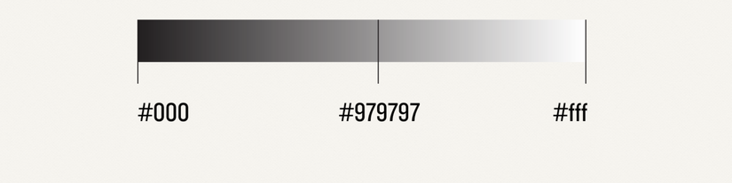 Gray scale in Hexadecimal