The article will guide Flutter newbies to understand:
- Layout layout in Flutter.
- How to layout vertically and horizontally.
- How to build a layout in Flutter.
We will build the layout according to this app:
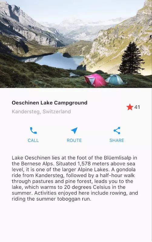
In this article, I will explain the Flutter approach, about the layout and show how to place a widget on the screen. Then will introduce some commonly used layout widgets.
Step 0: Create an app base
If you haven’t set up your environment yet, follow this tutorial:
- Create a basic “Hello World” Flutter app.
- Change app bar title and app title to:

Step 1: Layout layout
The first step is to break the layout into the basic components:
- Identify rows and columns.
- Does the layout include grid?
- Are there any components lying on top of each other?
- Are there tabs?
- Note areas with alugnment, padding, or borders.
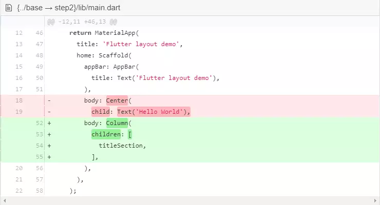
First, identify the big components first. In the example below, 4 elements are arranged in a column: 1 image, 2 rows, and 1 block of text.
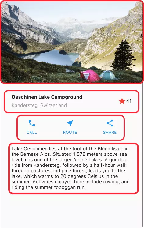
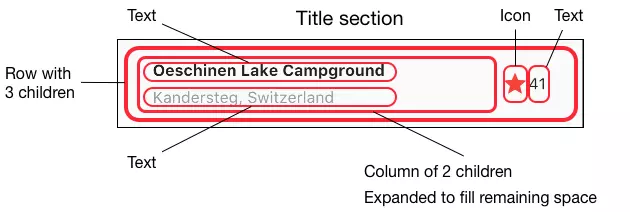
Next, diagram each row. The first row – Title – has 3 children: 1 text column, a star icon, and a number. Its first child component is a column of two lines of text. The first column takes up a lot of space so it will have to be wrapped in the Expanded widget.
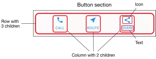
The second row – Button – also has 3 children: Each child component is a column consisting of icons and text.
Once the layout has been determined, the easiest way to implement it is to write the UI from the bottom up. To make it easier to see and avoid getting confused by nesting lots of code, put some code in different variables and functions.
Step 2: Implement title row
First, you’ll build the column to the left of the title area. Add the following code at the top of the build () function in the MyApp class:
1 2 3 4 5 6 7 8 9 10 11 12 13 14 15 16 17 18 19 20 21 22 23 24 25 26 27 28 29 30 31 32 33 34 35 36 37 38 | Widget titleSection <span class="token operator">=</span> <span class="token function">Container</span> <span class="token punctuation">(</span> padding <span class="token punctuation">:</span> <span class="token keyword">const</span> EdgeInsets <span class="token punctuation">.</span> <span class="token function">all</span> <span class="token punctuation">(</span> <span class="token number">32</span> <span class="token punctuation">)</span> <span class="token punctuation">,</span> child <span class="token punctuation">:</span> <span class="token function">Row</span> <span class="token punctuation">(</span> children <span class="token punctuation">:</span> <span class="token punctuation">[</span> <span class="token function">Expanded</span> <span class="token punctuation">(</span> <span class="token comment">/*1*/</span> child <span class="token punctuation">:</span> <span class="token function">Column</span> <span class="token punctuation">(</span> crossAxisAlignment <span class="token punctuation">:</span> CrossAxisAlignment <span class="token punctuation">.</span> start <span class="token punctuation">,</span> children <span class="token punctuation">:</span> <span class="token punctuation">[</span> <span class="token comment">/*2*/</span> <span class="token function">Container</span> <span class="token punctuation">(</span> padding <span class="token punctuation">:</span> <span class="token keyword">const</span> EdgeInsets <span class="token punctuation">.</span> <span class="token function">only</span> <span class="token punctuation">(</span> bottom <span class="token punctuation">:</span> <span class="token number">8</span> <span class="token punctuation">)</span> <span class="token punctuation">,</span> child <span class="token punctuation">:</span> <span class="token function">Text</span> <span class="token punctuation">(</span> <span class="token string">'Oeschinen Lake Campground'</span> <span class="token punctuation">,</span> style <span class="token punctuation">:</span> <span class="token function">TextStyle</span> <span class="token punctuation">(</span> fontWeight <span class="token punctuation">:</span> FontWeight <span class="token punctuation">.</span> bold <span class="token punctuation">,</span> <span class="token punctuation">)</span> <span class="token punctuation">,</span> <span class="token punctuation">)</span> <span class="token punctuation">,</span> <span class="token punctuation">)</span> <span class="token punctuation">,</span> <span class="token function">Text</span> <span class="token punctuation">(</span> <span class="token string">'Kandersteg, Switzerland'</span> <span class="token punctuation">,</span> style <span class="token punctuation">:</span> <span class="token function">TextStyle</span> <span class="token punctuation">(</span> color <span class="token punctuation">:</span> Colors <span class="token punctuation">.</span> grey <span class="token punctuation">[</span> <span class="token number">500</span> <span class="token punctuation">]</span> <span class="token punctuation">,</span> <span class="token punctuation">)</span> <span class="token punctuation">,</span> <span class="token punctuation">)</span> <span class="token punctuation">,</span> <span class="token punctuation">]</span> <span class="token punctuation">,</span> <span class="token punctuation">)</span> <span class="token punctuation">,</span> <span class="token punctuation">)</span> <span class="token punctuation">,</span> <span class="token comment">/*3*/</span> <span class="token function">Icon</span> <span class="token punctuation">(</span> Icons <span class="token punctuation">.</span> star <span class="token punctuation">,</span> color <span class="token punctuation">:</span> Colors <span class="token punctuation">.</span> red <span class="token punctuation">[</span> <span class="token number">500</span> <span class="token punctuation">]</span> <span class="token punctuation">,</span> <span class="token punctuation">)</span> <span class="token punctuation">,</span> <span class="token function">Text</span> <span class="token punctuation">(</span> <span class="token string">'41'</span> <span class="token punctuation">)</span> <span class="token punctuation">,</span> <span class="token punctuation">]</span> <span class="token punctuation">,</span> <span class="token punctuation">)</span> <span class="token punctuation">,</span> <span class="token punctuation">)</span> <span class="token punctuation">;</span> |
/ 1 / Place Column inside the Expanded widget so that the column spans all the rows of the row. Set the crossAxisAlignment property to CrossAxisAlignment.start to put the column at the beginning of the row.
/ 2 / Put the first row of text inside a Container so you can padding. The second child in the column is also text, displaying gray.
/ 3/2 final items in title row is the star icon, the red and the text “41”. Both rows are in a Container and are 32 pixels from each side.
Step 3: Implement button row
The button row area consists of 3 columns that use the same layout – an icon above a row of text. The columns in this row are spaced evenly, the text and icons are primary colors.
The code for each column is identical, so we create a private helper method named buildButtonColumn , get color, Icon and Text, return a column with widgets with the color of the received color.
1 2 3 4 5 6 7 8 9 10 11 12 13 14 15 16 17 18 19 20 21 22 23 24 25 26 27 28 | <span class="token keyword">class</span> <span class="token class-name">MyApp</span> <span class="token keyword">extends</span> <span class="token class-name">StatelessWidget</span> <span class="token punctuation">{</span> <span class="token metadata symbol">@override</span> Widget <span class="token function">build</span> <span class="token punctuation">(</span> BuildContext context <span class="token punctuation">)</span> <span class="token punctuation">{</span> <span class="token comment">// ···</span> <span class="token punctuation">}</span> Column <span class="token function">_buildButtonColumn</span> <span class="token punctuation">(</span> Color color <span class="token punctuation">,</span> IconData icon <span class="token punctuation">,</span> String label <span class="token punctuation">)</span> <span class="token punctuation">{</span> <span class="token keyword">return</span> <span class="token function">Column</span> <span class="token punctuation">(</span> mainAxisSize <span class="token punctuation">:</span> MainAxisSize <span class="token punctuation">.</span> min <span class="token punctuation">,</span> mainAxisAlignment <span class="token punctuation">:</span> MainAxisAlignment <span class="token punctuation">.</span> center <span class="token punctuation">,</span> children <span class="token punctuation">:</span> <span class="token punctuation">[</span> <span class="token function">Icon</span> <span class="token punctuation">(</span> icon <span class="token punctuation">,</span> color <span class="token punctuation">:</span> color <span class="token punctuation">)</span> <span class="token punctuation">,</span> <span class="token function">Container</span> <span class="token punctuation">(</span> margin <span class="token punctuation">:</span> <span class="token keyword">const</span> EdgeInsets <span class="token punctuation">.</span> <span class="token function">only</span> <span class="token punctuation">(</span> top <span class="token punctuation">:</span> <span class="token number">8</span> <span class="token punctuation">)</span> <span class="token punctuation">,</span> child <span class="token punctuation">:</span> <span class="token function">Text</span> <span class="token punctuation">(</span> label <span class="token punctuation">,</span> style <span class="token punctuation">:</span> <span class="token function">TextStyle</span> <span class="token punctuation">(</span> fontSize <span class="token punctuation">:</span> <span class="token number">12</span> <span class="token punctuation">,</span> fontWeight <span class="token punctuation">:</span> FontWeight <span class="token punctuation">.</span> w400 <span class="token punctuation">,</span> color <span class="token punctuation">:</span> color <span class="token punctuation">,</span> <span class="token punctuation">)</span> <span class="token punctuation">,</span> <span class="token punctuation">)</span> <span class="token punctuation">,</span> <span class="token punctuation">)</span> <span class="token punctuation">,</span> <span class="token punctuation">]</span> <span class="token punctuation">,</span> <span class="token punctuation">)</span> <span class="token punctuation">;</span> <span class="token punctuation">}</span> <span class="token punctuation">}</span> |
This function adds the icons directly to the column. Text is in Container with margin top-only, splitting text with icon.
Place a row containing the columns by calling the function and passing in the color, Icon and text that identifies that column. Align columns by the main axis using MainAxisAlignment.spaceEvenly to arrange the spaces evenly before, during and after each column. Add the code below titleSection in the build () function:
1 2 3 4 5 6 7 8 9 10 11 12 13 | Color color <span class="token operator">=</span> Theme <span class="token punctuation">.</span> <span class="token function">of</span> <span class="token punctuation">(</span> context <span class="token punctuation">)</span> <span class="token punctuation">.</span> primaryColor <span class="token punctuation">;</span> Widget buttonSection <span class="token operator">=</span> <span class="token function">Container</span> <span class="token punctuation">(</span> child <span class="token punctuation">:</span> <span class="token function">Row</span> <span class="token punctuation">(</span> mainAxisAlignment <span class="token punctuation">:</span> MainAxisAlignment <span class="token punctuation">.</span> spaceEvenly <span class="token punctuation">,</span> children <span class="token punctuation">:</span> <span class="token punctuation">[</span> <span class="token function">_buildButtonColumn</span> <span class="token punctuation">(</span> color <span class="token punctuation">,</span> Icons <span class="token punctuation">.</span> call <span class="token punctuation">,</span> <span class="token string">'CALL'</span> <span class="token punctuation">)</span> <span class="token punctuation">,</span> <span class="token function">_buildButtonColumn</span> <span class="token punctuation">(</span> color <span class="token punctuation">,</span> Icons <span class="token punctuation">.</span> near_me <span class="token punctuation">,</span> <span class="token string">'ROUTE'</span> <span class="token punctuation">)</span> <span class="token punctuation">,</span> <span class="token function">_buildButtonColumn</span> <span class="token punctuation">(</span> color <span class="token punctuation">,</span> Icons <span class="token punctuation">.</span> share <span class="token punctuation">,</span> <span class="token string">'SHARE'</span> <span class="token punctuation">)</span> <span class="token punctuation">,</span> <span class="token punctuation">]</span> <span class="token punctuation">,</span> <span class="token punctuation">)</span> <span class="token punctuation">,</span> <span class="token punctuation">)</span> <span class="token punctuation">;</span> |
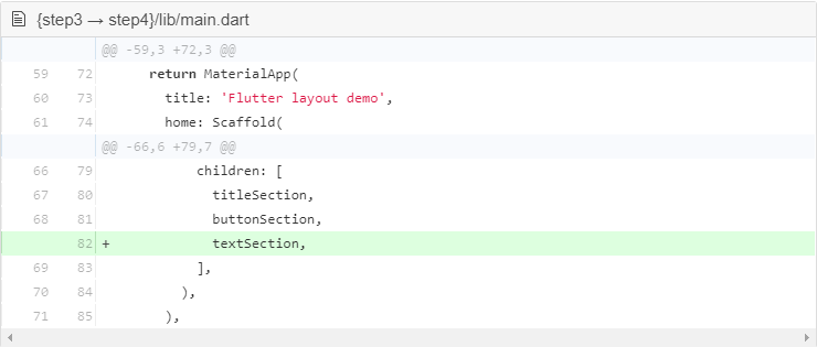
Add button section to body:

Step 4: Implement text section
Specify the text section as a variable. Place the text in the Container and add padding on each side. Add the code below buttonSection :
1 2 3 4 5 6 7 8 9 10 11 12 13 | Widget textSection <span class="token operator">=</span> <span class="token function">Container</span> <span class="token punctuation">(</span> padding <span class="token punctuation">:</span> <span class="token keyword">const</span> EdgeInsets <span class="token punctuation">.</span> <span class="token function">all</span> <span class="token punctuation">(</span> <span class="token number">32</span> <span class="token punctuation">)</span> <span class="token punctuation">,</span> child <span class="token punctuation">:</span> <span class="token function">Text</span> <span class="token punctuation">(</span> <span class="token string">'Lake Oeschinen lies at the foot of the Blüemlisalp in the Bernese '</span> <span class="token string">'Alps. Situated 1,578 meters above sea level, it is one of the '</span> <span class="token string">'larger Alpine Lakes. A gondola ride from Kandersteg, followed by a '</span> <span class="token string">'half-hour walk through pastures and pine forest, leads you to the '</span> <span class="token string">'lake, which warms to 20 degrees Celsius in the summer. Activities '</span> <span class="token string">'enjoyed here include rowing, and riding the summer toboggan run.'</span> <span class="token punctuation">,</span> softWrap <span class="token punctuation">:</span> <span class="token boolean">true</span> <span class="token punctuation">,</span> <span class="token punctuation">)</span> <span class="token punctuation">,</span> <span class="token punctuation">)</span> <span class="token punctuation">;</span> |
Setting softwrap = true , the text line will fill the column width before wrap at word boundaries. Add section text to the body:
Step 5: Implement image section
3 out of 4 components have been completed, leaving only the image. Add an image file to the following example:
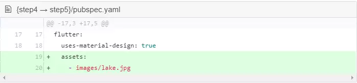
- Create images folder in the top folder of the project.
- Add lake.jpg .
- Update pubspec.yaml file to include assets tag. This will make the image available in the code.
Now you can reference the image in the code:
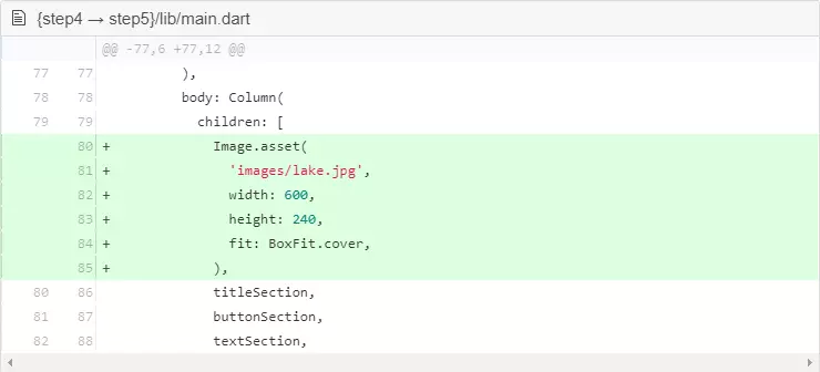
BoxFit.cover shows that the image will be as small as possible but will fill the void surrounding it.
Step 6: Complete
This is the final step, placing all the components in a ListView rather than Column because ListView supports scrolling when the app runs on small screen devices.

Here is finished. You can check the code to see if you did it right here:
Dart code : main.dart
Image : images
Pubspec : pubspec.yaml
Hot reload and you will see the app layout will look like the image at the top of this article.
Thank you everyone for reading my post 