As you know on the interface design Flutter application is mainly widgets and layout the widgets that are reasonable. In this article, you’ll discover some basic widgets that are used to build layouts in the Flutter application.
Layout in Flutter
Layout in Flutter includes a hierarchy of widgets with external widgets that often handle alignment and structure while internal elements are often elements displayed on that page itself, such as buttons and images. , etc.
1 | <span class="token keyword">new</span> <span class="token class-name">Center</span> <span class="token punctuation">(</span> child <span class="token punctuation">:</span> <span class="token keyword">new</span> <span class="token class-name">Column</span> <span class="token punctuation">(</span> mainAxisAlignment <span class="token punctuation">:</span> MainAxisAlignment <span class="token punctuation">.</span> center <span class="token punctuation">,</span> children <span class="token punctuation">:</span> <span class="token operator"><</span> Widget <span class="token operator">></span> <span class="token punctuation">[</span> <span class="token keyword">new</span> <span class="token class-name">Text</span> <span class="token punctuation">(</span> <span class="token string">'You have pushed the button this many times:'</span> <span class="token punctuation">,</span> <span class="token punctuation">)</span> <span class="token punctuation">,</span> <span class="token keyword">new</span> <span class="token class-name">Text</span> <span class="token punctuation">(</span> <span class="token string">'$_counter'</span> <span class="token punctuation">,</span> style <span class="token punctuation">:</span> Theme <span class="token punctuation">.</span> <span class="token function">of</span> <span class="token punctuation">(</span> context <span class="token punctuation">)</span> <span class="token punctuation">.</span> textTheme <span class="token punctuation">.</span> display1 <span class="token punctuation">,</span> <span class="token punctuation">)</span> <span class="token punctuation">,</span> <span class="token punctuation">]</span> <span class="token punctuation">,</span> <span class="token punctuation">)</span> <span class="token punctuation">,</span> <span class="token punctuation">)</span> <span class="token punctuation">,</span> |
In this example, there are three widgets: Center, Column and Text.
The Center and Column handle the structure and arrange the components within them while the text is the only component visible directly in the application to the user.
A widget usually has properties to change alignment, type, and properties.
Now let’s dive into individual widgets and see what they do.
We will divide the widget into two categories:
- Widgets display element
- Widgets structure and alignment
Widgets display element
Here are a few commonly used Widgets
1. Text
A text widget just keeps some text.
1 | <span class="token keyword">new</span> <span class="token class-name">Text</span> <span class="token punctuation">(</span> <span class="token string">'Hello, World!'</span> <span class="token punctuation">,</span> textAlign <span class="token punctuation">:</span> TextAlign <span class="token punctuation">.</span> center <span class="token punctuation">,</span> style <span class="token punctuation">:</span> <span class="token keyword">new</span> <span class="token class-name">TextStyle</span> <span class="token punctuation">(</span> fontWeight <span class="token punctuation">:</span> FontWeight <span class="token punctuation">.</span> bold <span class="token punctuation">)</span> <span class="token punctuation">,</span> <span class="token punctuation">)</span> |
Text can be aligned using the textAlign attribute. Style properties allow customizing text including fonts, font size, font weight, color, word spacing, and more.
2. Button
A Button widget allows users to perform some actions when clicking. Flutter has no direct “Button” utility, but instead has buttons like the FlatButton and RaisedButton.
1 | <span class="token keyword">new</span> <span class="token class-name">FlatButton</span> <span class="token punctuation">(</span> child <span class="token punctuation">:</span> <span class="token function">Text</span> <span class="token punctuation">(</span> <span class="token string">"Click here"</span> <span class="token punctuation">)</span> <span class="token punctuation">,</span> onPressed <span class="token punctuation">:</span> <span class="token punctuation">(</span> <span class="token punctuation">)</span> <span class="token punctuation">{</span> <span class="token comment">// Do something here</span> <span class="token punctuation">}</span> <span class="token punctuation">,</span> <span class="token punctuation">)</span> <span class="token punctuation">,</span> |
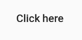
The FlatButton
The onPressed attribute allows some actions to be performed when clicking on the button.
1 | <span class="token keyword">new</span> <span class="token class-name">RaisedButton</span> <span class="token punctuation">(</span> child <span class="token punctuation">:</span> <span class="token function">Text</span> <span class="token punctuation">(</span> <span class="token string">"Click here"</span> <span class="token punctuation">)</span> <span class="token punctuation">,</span> elevation <span class="token punctuation">:</span> <span class="token number">5.0</span> <span class="token punctuation">,</span> onPressed <span class="token punctuation">:</span> <span class="token punctuation">(</span> <span class="token punctuation">)</span> <span class="token punctuation">{</span> <span class="token comment">// Do something here</span> <span class="token punctuation">}</span> <span class="token punctuation">,</span> <span class="token punctuation">)</span> <span class="token punctuation">,</span> |
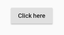
The RaisedButton
RaisedButton’s elevation change will change its highlight level.
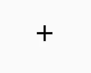
3. Image
The icon utility (icon) is a container for an icon in Flutter.
1 | <span class="token keyword">new</span> <span class="token class-name">Icon</span> <span class="token punctuation">(</span> Icons <span class="token punctuation">.</span> add <span class="token punctuation">,</span> size <span class="token punctuation">:</span> <span class="token number">36.0</span> <span class="token punctuation">,</span> <span class="token punctuation">)</span> |
It also contains a size attribute to enlarge the icon.
Widgets structure and alignment
1. Column
Column is a widget that arranges all its sub widgets in a vertical stack. It can empty widgets by mainAxisAlocation and crossAxisAlocation . Here, the main axis of the main axis of the main axis is a vertical axis and the main axis of the axis is a horizontal axis.
1 | <span class="token function">Column</span> <span class="token punctuation">(</span> mainAxisAlignment <span class="token punctuation">:</span> MainAxisAlignment <span class="token punctuation">.</span> center <span class="token punctuation">,</span> children <span class="token punctuation">:</span> <span class="token operator"><</span> Widget <span class="token operator">></span> <span class="token punctuation">[</span> <span class="token function">Text</span> <span class="token punctuation">(</span> <span class="token string">"Element 1"</span> <span class="token punctuation">)</span> <span class="token punctuation">,</span> <span class="token function">Text</span> <span class="token punctuation">(</span> <span class="token string">"Element 2"</span> <span class="token punctuation">)</span> <span class="token punctuation">,</span> <span class="token function">Text</span> <span class="token punctuation">(</span> <span class="token string">"Element 3"</span> <span class="token punctuation">)</span> <span class="token punctuation">,</span> <span class="token punctuation">]</span> <span class="token punctuation">,</span> <span class="token punctuation">)</span> <span class="token punctuation">,</span> |
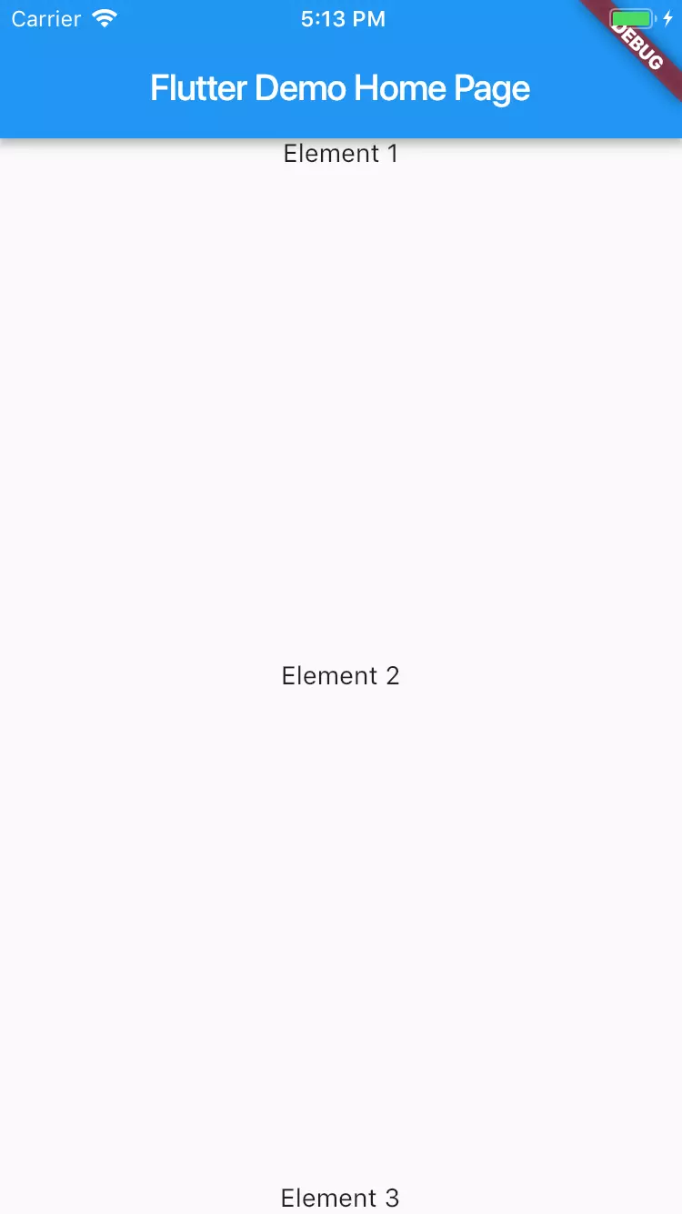
The column has 3 text widgets within it and mainAxisAlocation is set to center .
Here, it looks like:
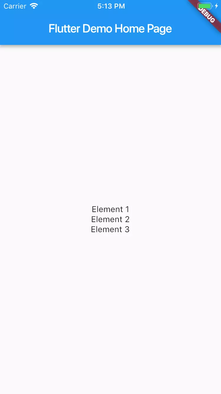
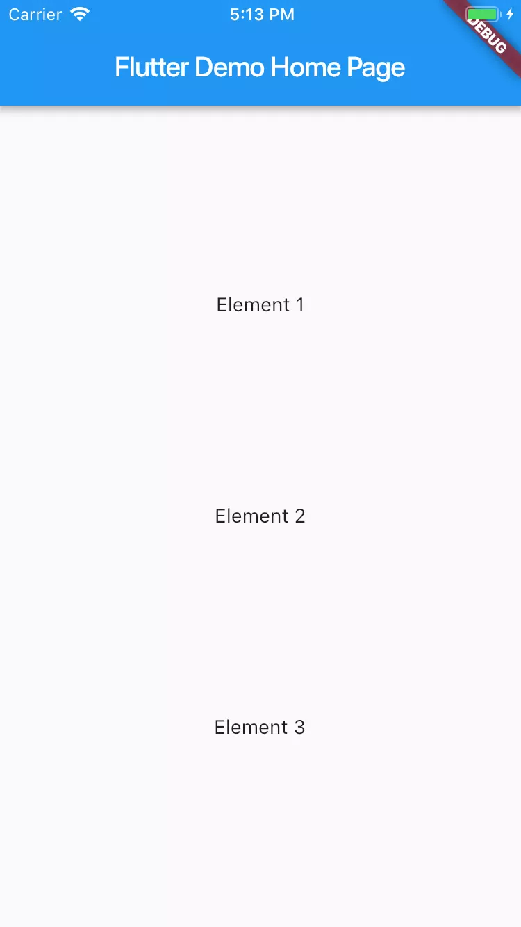
Since mainAxisAlocation is central, it focuses all widgets. Let try something else spaceBetween
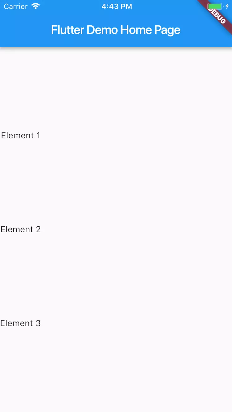
Now they are too far apart, try to use spaceEvenly .
To place it between the left and right of the screen, you must use crossAxisAlocation .
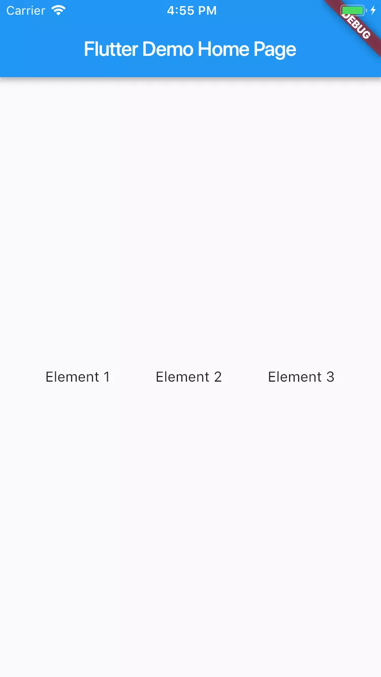
2. Row
1 | <span class="token function">Row</span> <span class="token punctuation">(</span> mainAxisAlignment <span class="token punctuation">:</span> MainAxisAlignment <span class="token punctuation">.</span> spaceEvenly <span class="token punctuation">,</span> children <span class="token punctuation">:</span> <span class="token operator"><</span> Widget <span class="token operator">></span> <span class="token punctuation">[</span> <span class="token function">Text</span> <span class="token punctuation">(</span> <span class="token string">"Element 1"</span> <span class="token punctuation">)</span> <span class="token punctuation">,</span> <span class="token function">Text</span> <span class="token punctuation">(</span> <span class="token string">"Element 2"</span> <span class="token punctuation">)</span> <span class="token punctuation">,</span> <span class="token function">Text</span> <span class="token punctuation">(</span> <span class="token string">"Element 3"</span> <span class="token punctuation">)</span> <span class="token punctuation">,</span> <span class="token punctuation">]</span> <span class="token punctuation">,</span> <span class="token punctuation">)</span> <span class="token punctuation">,</span> |
A row is like a column but builds a row of horizontal objects instead of a column. The main difference here is that the main axis is the horizontal axis, not the vertical axis. The cross axis is the vertical axis.
3. Center
A Central widget simply focuses on the child inside it. All previous examples include rows and columns in a widget Center . If it is not in the Center , it will move to the left. Here’s an example:
Column has no Center widget
Column has Center widget
1 | <span class="token function">Center</span> <span class="token punctuation">(</span> child <span class="token punctuation">:</span> <span class="token function">Column</span> <span class="token punctuation">(</span> mainAxisAlignment <span class="token punctuation">:</span> MainAxisAlignment <span class="token punctuation">.</span> spaceEvenly <span class="token punctuation">,</span> children <span class="token punctuation">:</span> <span class="token operator"><</span> Widget <span class="token operator">></span> <span class="token punctuation">[</span> <span class="token function">Text</span> <span class="token punctuation">(</span> <span class="token string">"Element 1"</span> <span class="token punctuation">)</span> <span class="token punctuation">,</span> <span class="token function">Text</span> <span class="token punctuation">(</span> <span class="token string">"Element 2"</span> <span class="token punctuation">)</span> <span class="token punctuation">,</span> <span class="token function">Text</span> <span class="token punctuation">(</span> <span class="token string">"Element 3"</span> <span class="token punctuation">)</span> <span class="token punctuation">,</span> <span class="token punctuation">]</span> <span class="token punctuation">,</span> <span class="token punctuation">)</span> <span class="token punctuation">,</span> <span class="token punctuation">)</span> <span class="token punctuation">,</span> |
A central widget simply takes a child and focuses it on the available space.
4. Padding
Unlike in normal Android development where every view has its own padding attribute, padding is a widget that covers other widget to give them padding in all or specified directions. This gives the textual buffer a 8.0 widget in all directions.
1 | <span class="token function">Padding</span> <span class="token punctuation">(</span> padding <span class="token punctuation">:</span> <span class="token keyword">const</span> EdgeInsets <span class="token punctuation">.</span> <span class="token function">all</span> <span class="token punctuation">(</span> <span class="token number">8.0</span> <span class="token punctuation">)</span> <span class="token punctuation">,</span> child <span class="token punctuation">:</span> <span class="token keyword">new</span> <span class="token class-name">Text</span> <span class="token punctuation">(</span> <span class="token string">"Element 1"</span> <span class="token punctuation">,</span> <span class="token punctuation">)</span> <span class="token punctuation">,</span> <span class="token punctuation">)</span> <span class="token punctuation">,</span> |
Padding in specific directions is also allowed.
1 | <span class="token function">Padding</span> <span class="token punctuation">(</span> padding <span class="token punctuation">:</span> EdgeInsets <span class="token punctuation">.</span> <span class="token function">fromLTRB</span> <span class="token punctuation">(</span> <span class="token number">8.0</span> <span class="token punctuation">,</span> <span class="token number">0.0</span> <span class="token punctuation">,</span> <span class="token number">0.0</span> <span class="token punctuation">,</span> <span class="token number">0.0</span> <span class="token punctuation">)</span> <span class="token punctuation">,</span> child <span class="token punctuation">:</span> <span class="token keyword">new</span> <span class="token class-name">Text</span> <span class="token punctuation">(</span> <span class="token string">"Element 1"</span> <span class="token punctuation">,</span> <span class="token punctuation">)</span> <span class="token punctuation">,</span> <span class="token punctuation">)</span> <span class="token punctuation">,</span> |
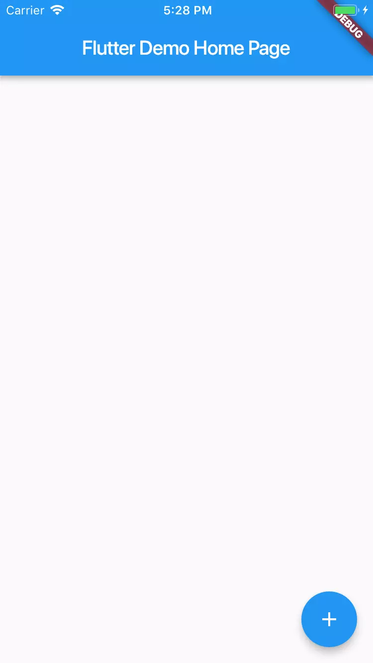
5. Scaffold
Widget Scaffold is a framework for adding popular widget design elements such as AppBars , Drawers , Floating Action Buttons , Bottom Navigation , etc.
1 | <span class="token keyword">new</span> <span class="token class-name">Scaffold</span> <span class="token punctuation">(</span> appBar <span class="token punctuation">:</span> <span class="token keyword">new</span> <span class="token class-name">AppBar</span> <span class="token punctuation">(</span> title <span class="token punctuation">:</span> <span class="token keyword">new</span> <span class="token class-name">Text</span> <span class="token punctuation">(</span> widget <span class="token punctuation">.</span> title <span class="token punctuation">)</span> <span class="token punctuation">,</span> <span class="token punctuation">)</span> <span class="token punctuation">,</span> body <span class="token punctuation">:</span> <span class="token function">Center</span> <span class="token punctuation">(</span> <span class="token punctuation">)</span> <span class="token punctuation">,</span> floatingActionButton <span class="token punctuation">:</span> <span class="token function">FloatingActionButton</span> <span class="token punctuation">(</span> child <span class="token punctuation">:</span> <span class="token function">Icon</span> <span class="token punctuation">(</span> Icons <span class="token punctuation">.</span> add <span class="token punctuation">)</span> <span class="token punctuation">,</span> onPressed <span class="token punctuation">:</span> <span class="token punctuation">(</span> <span class="token punctuation">)</span> <span class="token punctuation">{</span> <span class="token punctuation">}</span> <span class="token punctuation">)</span> <span class="token punctuation">,</span> <span class="token punctuation">)</span> |
6. Stack
A Stack is used to overlap widgets, like a button on a gradient background. Stack is a very important widget and we will go into more details in a future article.
These are the basic widgets needed to create an application that works well in Flutter. Flutter also allows you to create your own widgets if you need any other functions or if you want to reuse some repeating widget templates.
For a complete list of Flutter utilities, visit this link.
Thank for reading!