A comprehensive introduction to Google Material Design’s and mobile app design
- Tram Ho
Through this article TechTalk shares how Material Design was born to impact mobile app design companies around the globe. You will know the guiding principles that Google Material Design is based on, Material Design differs from flat design. And finally, how to incorporate Material Design into your mobile application.
UI and UX are two elements of a mobile app that determine the present and future of not just the app but also the mobile app design company that designed and developed it.
The way your app is designed is what affects the emotions of the experience users are faced with working within your app.
Now when it comes to creating and including interactive design elements that bring the feel of the Material world, Google with its Material Design , has brought Mobile application developers. help is needed.
The design world once ruled by minimal flatness has now been replaced by the elements of minimalistic Material that interact with the introduction of Material Design (material design).
Before we dive deeper into Google's Material Design UI and its tips and tricks, let's quickly look back at how it started.
Google has been notoriously broken when it understands the importance of Design. And today, it's impossible to think of a good design (even on iOS) that doesn't come from Google.
This new design is the result of efforts that Larry Page made when he came to the office to make things better and more connected.
A directive leading to the creation of a design standard that is currently followed and loved by the world – Google Material Design.
Google, previously behind Apple when designing intuitive and experimental Android applications, is now well ahead of the start with Material Design.
Material Design shows how engineering and physical laws can be added to design elements to develop mobile app user interfaces that provide an enjoyable experience for users.
Material Design is what Flat Design can never be, which takes us to the next section – Material Design vs. Flat Design (Material Design vs Flat Design.).
Differences between Material Design versus Flat Design
The whole difference between Material Design and Flat Design lies in their core.
When we compare flat design applications with material design applications, one striking difference that users will find is the presence of glossy and multidimensional in an aesthetic plane.
While both Android Material Design and Flat Design are minimalist, when implementing them in Android app design, decisions between both are often made based on user needs.
Meanwhile, Material Design UI is preferred for the development of complex, powerful and interactive mobile applications; Flat design UIs are preferred by mobile app design companies because of their simple needs.
Now that we've seen the difference between Google's Material Design and Apple's Flat Design, let's dive deeper into Material Design.
Google's document design principles
The material design application is guided by the three principles below. The guidelines are declared by all leading Android Application Design Companies worldwide.
Material is metaphor
The fantasy principle is based on the study of materials and how they look different in different amounts of light, how they look when stacked.
Rules are supported by attributes such as edge, shadow, size, etc.
Bold, Intentional, Graphic
The white space is intentional in design, using a bold set of colors, matching colors and graphics from one screen to another.
The meaning of the motion
Animation in Material Design is something that doesn't interfere with other design elements, nor is it forced . They appear as a result of the user's main actions and follow the user's follow.
Although these are the three main principles of Material Design, there are two other principles that also define the globally accepted design standards – L works on other platforms and Multi-platforms.
Works on other platforms
Material Design comes with the advantage of customizing code, allowing mobile app user interface designers to add their brand elements to the design.
Cross-Platform
Material Design helps maintain the same user interface across different platforms, helping to use UI components that are shared across all – Android, Flutter, iOS and the Web.
So here are the 5 guiding principles of Material Design for Android Apps. To speed up your approach to understanding these guidelines, consider all of Google's Material Design applications that are trending in the market.
The best Google apps with Material Design Principles
1. Google Calendar
Google Calendar is the most important application that has received truly impressive changes over the years with the implementation of Google's Material Design principles. The app has many useful highlights such as graphics and maps automatically included in events and a simple auto-suggestion system that makes it easy to add a new appointment.
2. Gmail
Thanks to Material Design, emails in Google Gmail are categorized according to the card-style interface. In addition, a brand new slide-out menu is added to the interface along with a floating button to create new messages, reminders or perform any other actions.
3. Lyft
Lyft is another application that uses the power of Material Design. The app displays a series of controls and maps that display mandatory information by following Google's Material Design guidelines without disturbing the UI.
And now, since you now know the various applications revamped (or improved) using Google Material Design and related principles, it's time to consider how you can apply them in design delivery. User interface of its mobile applications in a reasonable manner.
Here are tips that will help you build your Google Material Design mobile app and emerge as a design star of your mobile app design company.
Tips that will help you build mobile apps with Google Material Design
1. Use Shadows to show hierarchy

Realistic edges, surfaces and shadows are considered UI Design's main tools. Use shadows to show the hierarchy of elements to show which elements appear above and below and emphasize it.
2. Bold colors
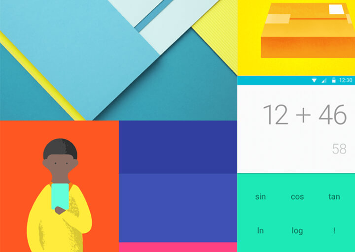
Intentional, Graphic, and Bold are the motto of deploying Google's new tmaterial design when developing mobile UI / UX. The use of bold colors enhances everything that is interactive and interesting for the user, while making the app enjoyable to use.
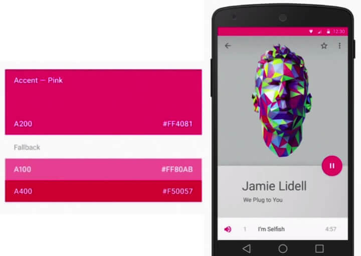
3. Use primary and accent colors
The Google Material documentation requires mobile app designers to use three main shades and one of those accents.
4. Combining motion
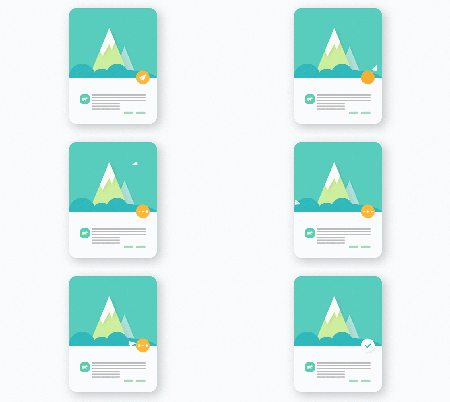
Google is very interested in using motion in application UI design. It makes us understand how things move in the application and how users should interact with the application.
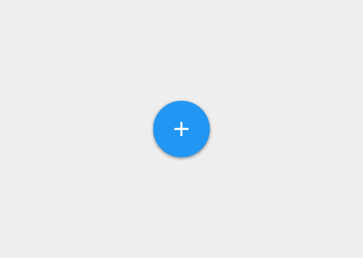
5. Make things float
6. Use the right font
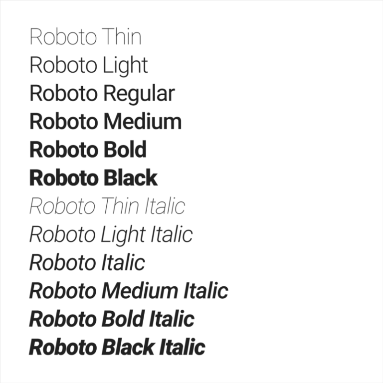
If you're just getting started with the idea of developing Material Design Android Apps, what we recommend is sticking to Roboto and Noto typefaces.
summary
After changing the standards of the design world with Google's Material design guidelines, Google once again brought about a change in its structure with Material design 2.0.
The second generation of Material design, which will be released online to the world, will feature rectangular interfaces and continue with rounded mobile user interface designs.
With its new app design guide, Google is planning to provide an upgrade to all its important products like Gmail, Google Search, Google Maps, etc.
TechTalk hope this post you will understand more about Google's Material design and some ways to apply it
Its homepage for you to refer.
Source : Techtalk
