Maybe you are interested
Responsive HTML with a CSS line
Recreate Medium’s article layout with CSS Grid
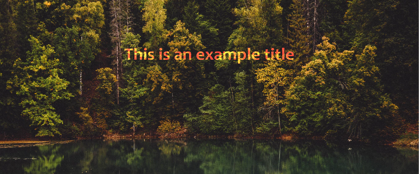
5. Parallax Images
This eye-catching effect is increasingly popular and it can be used to bring a page’s fun to the user scrolling through it.
Although the normal image of a page moves as the user scrolls, the parallax image seems to remain fixed – only the window that it can see moves.
CSS-only Example The required attribute for the simplest version of this effect is background-attachment: fixed, fixing the background image on the background in the view-port. (The opposite effect is achieved by using background-attachment: scroll).
CSS + JavaScript Example For more advanced effects, you can use JavaScript to add motion to the image when the user scrolls.
6. Animation with Cropped Images
Like the footer, it is difficult to crop images before CSS3 version. Now, we have two properties that make it easy to cut, object-fit and object-position, allowing you to resize the image without affecting the frame rate.
In the past, it was always possible to crop your images in a photo editor, but a big advantage of cropping them in the browser is the ability to resize images as part of animation.
The following example activates the effect using the <input type = “checkbox”> tag. That way, we can take advantage of the pseudo-class: checked and we don’t need to use any JavaScript code:
7. Blend Modes
If you have experience using Photoshop, you can know how powerful its different blend modes can be to create interesting effects. But did you know that most blending modes in Photoshop are also available in CSS?
Here, the Medium homepage looks like when the background-color of the images is lightblue and the blend-mode differs: 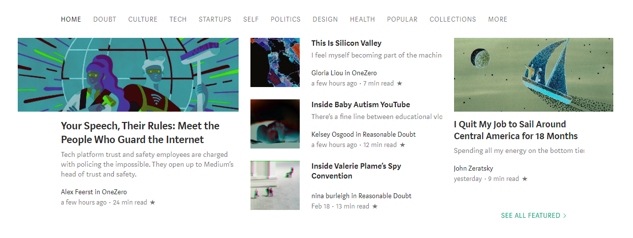
In addition, backgrounds are the only way you can use blend-modes. The mix-blend-mode attribute allows you to mix elements with their existing background. So, for example, you can create effects like this, using mix-blend-mode of color-dodge and the background of lightalmon.
 Before CSS3, it’s hard to believe that web pages might look like this!
8. Pinterest-style Image Board
CSS Grid and Flexbox make it easy to create different types of response layouts and allow us to easily align elements vertically on a page – this is very difficult before.
However, a rather peculiar layout is used by Pinterest, in which the vertical position of each component changes based on the height of the element above it. 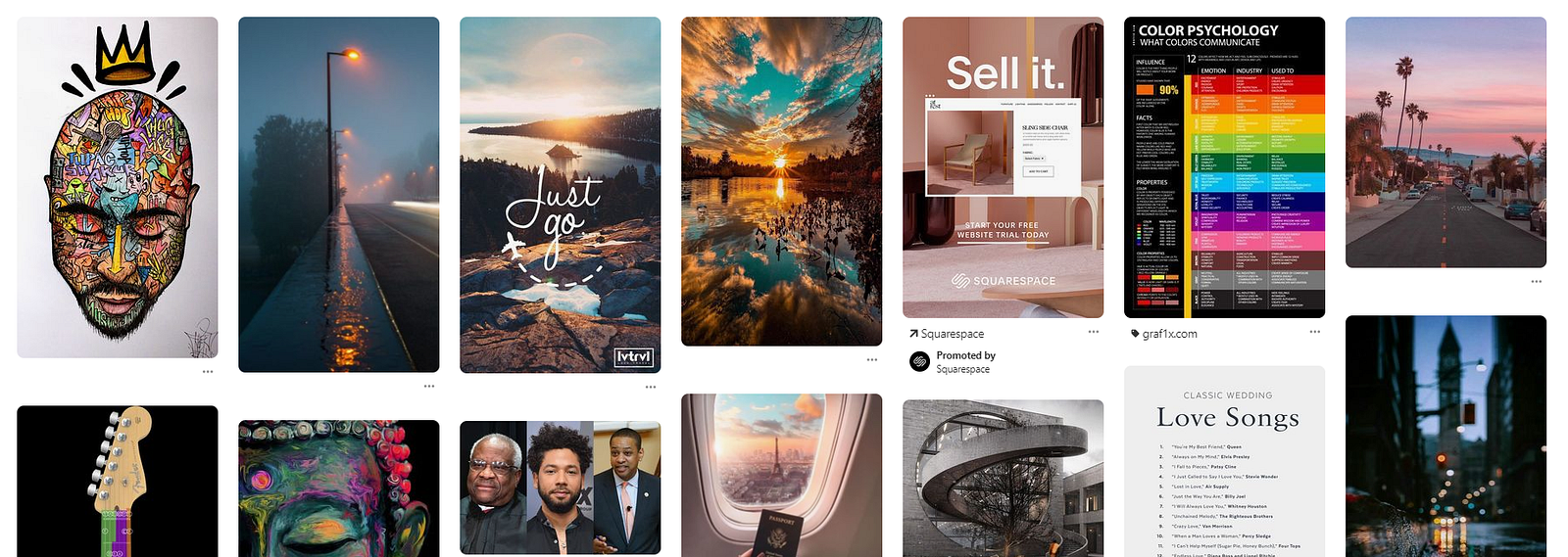
The best way to achieve this is to use the column attribute. They are most commonly used to create multiple newspaper-style text columns, but this is another great use case.
To do this, you need to wrap your elements in a div and give the column-width and column-gap wrapper an attribute.
Then, to prevent any element from being split between the two columns, add the column-break-inside: avoid attribute to the individual elements.