5 website design trends in 2017
Website design is like fashion, it is constantly changing, and that movement brings new design trends and new rules every year. Here I would like to introduce you to the 5 web design trends in 2017. Hope it helps shape the presence of your website better.
1. Small but effective interactions for a great design.
Micro-interaction has appeared a few years ago, so technically it's not something new. In 2017, what begins as youthful and unexpected pleasures will quickly become flattened requirements in new website design projects.
A micro interaction is any commitment based on unique tasks with your website. It is usually a small animation used to convey feedback or results of a user action. It is not always necessary, but a good micro-interactive design is there to make the experience more intuitive.
Micro-interactivity must feel quick and easy, attracting users without making them feel excited. Next year, we will see many interactive microphones that are not only interesting but designed more carefully with both simple and detailed directions.
2. The hidden menu – expect to see more
Popularized by the emergence of mobile phones, the hamburger menu emerged as a practical approach to saving valuable space on mobile devices. It is a trend that is also creeping into the desktop versions, where navigation is hidden until done on the first click.
The benefits are quite obvious: it helps create a more sleek, so aesthetically more attractive sites. However, it limits the ability to explore. Users can leave if redirecting the path is not easy to identify. Consequences can be harmful for e-commerce websites in particular, where detection of these types and items is very important.
The single hamburger debate never ends. We acknowledge that it is not the absolute right for every website. However, it is certainly not a "dead" trend. Most users are familiar enough with models, and in 2017, web designers will continue to experiment with ways to improve to work well.
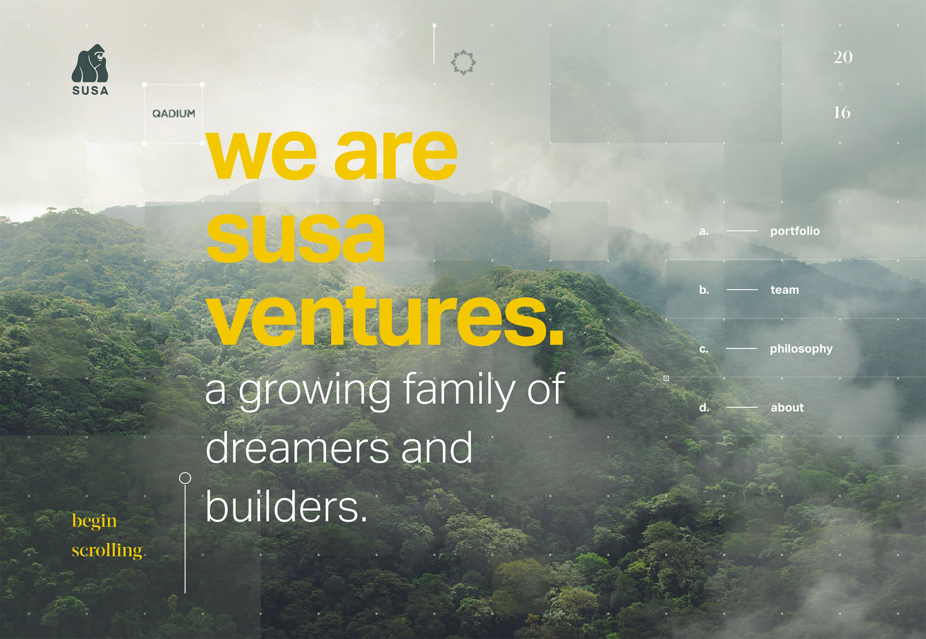
3. Break the grid-thinking outside the rules and limits
There is a fundamental difference between adopting a design trend to enhance the user experience and to be "fresh" and "trendy". Overlapping and breaking networks is no exception.
With a grid layout, users can view each element one by one in an organized and logical manner. Therefore, despite its growing popularity, many people still find the trend of breaking the net more than a style choice rather than reality.
However, the idea of breaking away from a tightly structured layout has no value. For one thing, it seems to be more open, giving web designers more space to describe creative and artistic choices. It enriches the identity of a website, distinguishing one from a conventional structured competitor.

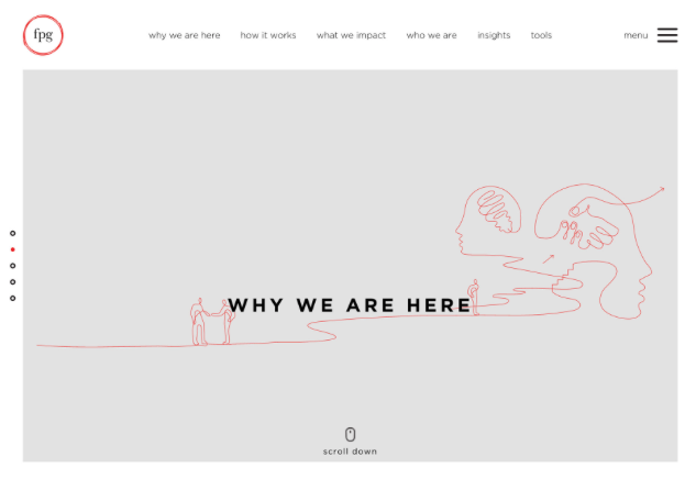
4. Limit scrollable content bar

It used to think that displaying all the important elements on the fold is the right way to go because only a small percentage of people actually move down to the bottom of a website. But the trend, as well as the taste of the user, has been diverted towards long moves because of the popularity of mobile browsers.
If you're a fan of storytelling, you'll love long rolls. It entices users to stay longer by making the content flow smoothly around storytelling, supported by scroll-activated animations and other illustrations.
That being said, it can ruin your SEO because it is not recommended by Google. In addition, for e-commerce sites, it diverges from the fast trading experience.
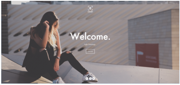
5. Add a lot of impressive illustrations, eye-catching images
It used to think that displaying all the important elements on the fold is the right way to go because only a small percentage of people actually move down to the bottom of a website. But the trend, as well as the taste of the user, has been diverted towards long moves because of the popularity of mobile browsers.
If you're a fan of storytelling, you'll love long rolls. It entices users to stay longer by making the content flow smoothly around storytelling, supported by scroll-activated animations and other illustrations.
That being said, it can ruin your SEO because it is not recommended by Google. In addition, for e-commerce sites, it diverges from the fast trading experience.