
Hello everyone, I am back and continue with part 19 of the series about some CSS tricks that Frontend itself may not even know.
Let’s get started!
1. My computer is weak, I want to turn off animation on the web, what should I do?
On both desktop and mobile operating systems, publishers are improving and providing users with the ability to “turn off the effects (motion, animation)” on the operating system.
And in response to that movement, browsers are also gradually improving and releasing to the web development community a media query called prefers-reduced-motion.
It is not yet common in all the browsers we usually serve, including IE, but because this is an enhancement-style feature, the better it is, the better it will be. there. Because it does not directly affect the user experience, so if the browser does not support, then there is nothing to worry about.
The mechanism of action of this feature is extremely easy to understand, assuming you have 1 CSS code writing the hover effect then the transform box rotates 1 round:
1 2 3 4 5 6 7 8 9 | <span class="token selector">.box </span> <span class="token punctuation">{</span> ... các thuộc tính khác <span class="token property">transition</span> <span class="token punctuation">:</span> .5s <span class="token punctuation">;</span> <span class="token selector"><span class="token parent important">&</span> :hover </span> <span class="token punctuation">{</span> <span class="token property">transform</span> <span class="token punctuation">:</span> <span class="token function">rotate</span> <span class="token punctuation">(</span> 1turn <span class="token punctuation">)</span> <span class="token punctuation">;</span> <span class="token punctuation">}</span> <span class="token punctuation">}</span> |
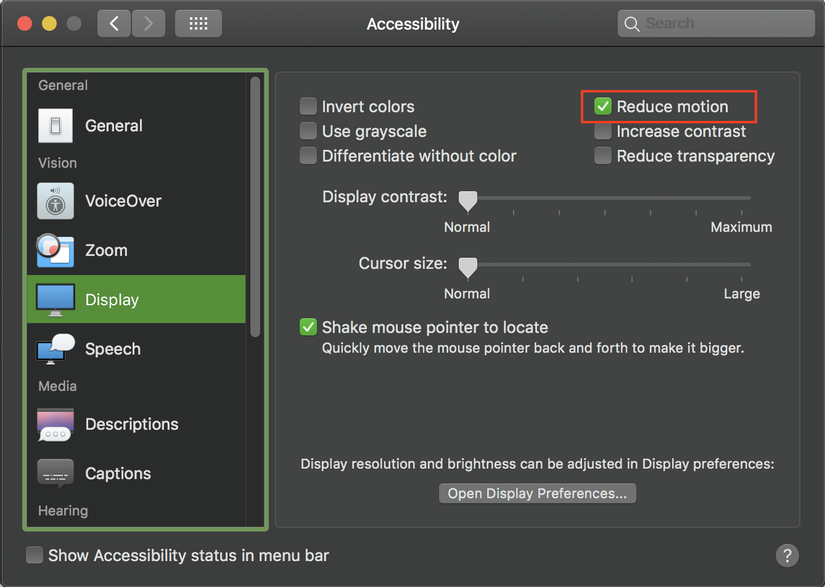
Assuming users here are using MacOS, they tend to tick Reduce Motion to disable the effect.
For other operating systems, you can see the User Preferences section on this link to know how to choose this feature.
Then when they returned to the web, they wanted the hover effect to no longer work (the other .box did not rotate). Now our code will need to use media query prefers-reduced-motion as follows:
1 2 3 4 5 6 7 8 9 10 11 12 13 | <span class="token selector">.box </span> <span class="token punctuation">{</span> ... các thuộc tính khác <span class="token property">transition</span> <span class="token punctuation">:</span> .5s <span class="token punctuation">;</span> <span class="token selector"><span class="token parent important">&</span> :hover </span> <span class="token punctuation">{</span> <span class="token property">transform</span> <span class="token punctuation">:</span> <span class="token function">rotate</span> <span class="token punctuation">(</span> 1turn <span class="token punctuation">)</span> <span class="token punctuation">;</span> <span class="token atrule"><span class="token rule">@media</span> <span class="token punctuation">(</span> <span class="token property">prefers-reduced-motion</span> <span class="token punctuation">:</span> reduce <span class="token punctuation">)</span></span> <span class="token punctuation">{</span> <span class="token property">transform</span> <span class="token punctuation">:</span> none <span class="token punctuation">;</span> <span class="token punctuation">}</span> <span class="token punctuation">}</span> <span class="token punctuation">}</span> |
If she’s using Chrome or Firefox with the latest versions, then the code above probably works.
And that’s the case I suppose for you to understand (the effect seems to be quite simple, not enough to turn it off), but in reality there will be websites that customers want to have many effects. , and somewhere it is eating up RAM and making your computer feel slower, the experience on the site is no longer smooth, or sometimes jerky if the device is a little weak configuration.
Browser Support: NO MATTER
As explained above, this is a feature that helps to improve the user experience better, so whichever browser supports it the better.
https://caniuse.com/#feat=mdn-css_at-rules_media_prefers-reduced-motion
Read more
- https://developers.google.com/web/updates/2019/03/prefers-reduced-motion
- https://developer.mozilla.org/en-US/docs/Web/CSS/@media/prefers-reduced-motion
2. Write shorter @keyframes
@keyframes is considered to be the most important thing in the animation attribute, but I am sure that for a long time when you define 1 @keyframes without @keyframes attention to take advantage of the inherent capabilities of the animation ‘s child properties such as animation-fill-mode or animation-direction bring. Here are a few discoveries I have learned:
2.1. animation-fill-mode: forwards
With the fade-in type of motion effect familiar to many developers and commonly used, you will often write in the style:
1 2 3 4 5 6 7 8 9 10 11 12 13 14 15 16 | <span class="token atrule"><span class="token rule">@keyframes</span> fadeIn</span> <span class="token punctuation">{</span> <span class="token keyword">from</span> <span class="token punctuation">{</span> <span class="token property">opacity</span> <span class="token punctuation">:</span> 0 <span class="token punctuation">;</span> <span class="token punctuation">}</span> <span class="token selector">to </span> <span class="token punctuation">{</span> <span class="token property">opacity</span> <span class="token punctuation">:</span> 1 <span class="token punctuation">;</span> <span class="token punctuation">}</span> <span class="token punctuation">}</span> <span class="token selector">.box </span> <span class="token punctuation">{</span> ... các thuộc tính khác <span class="token property">opacity</span> <span class="token punctuation">:</span> 1 <span class="token punctuation">;</span> <span class="token property">animation</span> <span class="token punctuation">:</span> fadeIn 2s <span class="token punctuation">;</span> <span class="token punctuation">}</span> |
But in this case, the animation-fill-mode attribute with a value of forwards will @keyframes above @keyframes definition from having to declare the from { ... } .
1 2 3 4 5 6 7 8 9 10 11 12 13 | <span class="token atrule"><span class="token rule">@keyframes</span> fadeIn</span> <span class="token punctuation">{</span> <span class="token selector">to </span> <span class="token punctuation">{</span> <span class="token property">opacity</span> <span class="token punctuation">:</span> 1 <span class="token punctuation">;</span> <span class="token punctuation">}</span> <span class="token punctuation">}</span> <span class="token selector">.box </span> <span class="token punctuation">{</span> ... các thuộc tính khác <span class="token property">opacity</span> <span class="token punctuation">:</span> 0 <span class="token punctuation">;</span> <span class="token property">animation</span> <span class="token punctuation">:</span> fadeIn 2s forwards <span class="token punctuation">;</span> <span class="token punctuation">}</span> |
2.2. animation-direction: alternate
Continuing another motion case, this time I want the background color to move from red to yellow and for continuous motion (infinite)
Previously, I always wrote like this:
1 2 3 4 5 6 7 8 9 10 11 12 13 14 15 16 17 18 | <span class="token atrule"><span class="token rule">@keyframes</span> bgColorTransition</span> <span class="token punctuation">{</span> <span class="token selector">0% </span> <span class="token punctuation">{</span> <span class="token property">background-color</span> <span class="token punctuation">:</span> red <span class="token punctuation">;</span> <span class="token punctuation">}</span> <span class="token selector">50% </span> <span class="token punctuation">{</span> <span class="token property">background-color</span> <span class="token punctuation">:</span> yellow <span class="token punctuation">;</span> <span class="token punctuation">}</span> <span class="token selector">100% </span> <span class="token punctuation">{</span> <span class="token property">background-color</span> <span class="token punctuation">:</span> red <span class="token punctuation">;</span> <span class="token punctuation">}</span> <span class="token punctuation">}</span> <span class="token selector">.box </span> <span class="token punctuation">{</span> ... các thuộc tính khác <span class="token property">animation</span> <span class="token punctuation">:</span> bgColorTransition 2s linear infinite <span class="token punctuation">;</span> <span class="token punctuation">}</span> |
But when I learned the beauty of the animation-direction: alternate attribute, my code greatly reduced the unnecessary lines  , and the effect is still as expected.
1 2 3 4 5 6 7 8 9 10 11 12 13 | <span class="token atrule"><span class="token rule">@keyframes</span> bgColorTransition</span> <span class="token punctuation">{</span> <span class="token selector">to </span> <span class="token punctuation">{</span> <span class="token property">background-color</span> <span class="token punctuation">:</span> yellow <span class="token punctuation">;</span> <span class="token punctuation">}</span> <span class="token punctuation">}</span> <span class="token selector">.box </span> <span class="token punctuation">{</span> ... các thuộc tính khác <span class="token property">background-color</span> <span class="token punctuation">:</span> red <span class="token punctuation">;</span> <span class="token property">animation</span> <span class="token punctuation">:</span> bgColorTransition 1s linear infinite alternate <span class="token punctuation">;</span> <span class="token punctuation">}</span> |
Browser Support: GOOD SUPPORT
The tips above are all
animationproperties, butanimationare already supported on popular browsers (IE10 and above also support).
Read more
- https://developer.mozilla.org/en-US/docs/Web/CSS/animation-fill-mode
- https://developer.mozilla.org/en-US/docs/Web/CSS/animation-direction
- https://twitter.com/anatudor/status/1213449962610147330
3. Creating distance for a component with CONDITIONS IS
You can imagine this type of situation, you often divide sections on the page into separate components to be reuse, as well as easy to code, maintain, and read.
1 2 3 4 5 6 7 8 9 10 11 12 13 14 15 | <span class="token comment"><!-- Trang 1 --></span> <span class="token tag"><span class="token tag"><span class="token punctuation"><</span> div</span> <span class="token punctuation">></span></span> <span class="token tag"><span class="token tag"><span class="token punctuation"><</span> ComponentA</span> <span class="token punctuation">/></span></span> <span class="token tag"><span class="token tag"><span class="token punctuation"><</span> ComponentB</span> <span class="token punctuation">/></span></span> <span class="token tag"><span class="token tag"><span class="token punctuation"><</span> ComponentC</span> <span class="token punctuation">/></span></span> <span class="token tag"><span class="token tag"><span class="token punctuation"></</span> div</span> <span class="token punctuation">></span></span> <span class="token comment"><!-- Trang 2 --></span> <span class="token tag"><span class="token tag"><span class="token punctuation"><</span> div</span> <span class="token punctuation">></span></span> <span class="token tag"><span class="token tag"><span class="token punctuation"><</span> ComponentB</span> <span class="token punctuation">/></span></span> <span class="token tag"><span class="token tag"><span class="token punctuation"><</span> ComponentC</span> <span class="token punctuation">/></span></span> ^ <span class="token tag"><span class="token tag"><span class="token punctuation"><</span> ComponentA</span> <span class="token punctuation">/></span></span> <span class="token tag"><span class="token tag"><span class="token punctuation"></</span> div</span> <span class="token punctuation">></span></span> |
When I built ComponentA, I didn’t set the margin-top because I looked at the overall design, it was usually at the top and there was no distance from the top, but there were a few cases when it went under and unfortunately. is when ComponentA is below ComponentC , the 2 components stick together, looks pretty bad interface, now I will have to find a way to create a margin for these 2 components.
This case to handle is not difficult at all, the dev will think of many ways, like:
- Set extra
classfor componentA , for example a utility class of typemt-30(margin-top: 30px) and attach the class when calling ComponentA under ComponentC . - If you are working with React or Vue, then maybe you think of
marginTop1 props as amarginTop.
The above way seems to be ok then, but I want it to auto 1 bit, just have to do that when the other 2 components go adjacent ( ComponentA adjacent to ComponentC ), the CSS set margin-top into it.
Speaking of adjacent, I only think of the selector + in CSS !!!
And the code here is:
1 2 3 4 | <span class="token selector">.ComponentC + .ComponentA </span> <span class="token punctuation">{</span> <span class="token property">margin-top</span> <span class="token punctuation">:</span> 30px <span class="token punctuation">;</span> <span class="token punctuation">}</span> |
The above code means that ComponentA can only eat CSS margin-top: 30px when it is placed on the same level and is adjacent to ComponentC .
Browser Support: 100% FEED
The
+sign is a selector for CSS 2.1, so there’s nothing to discuss about Browser Support anymore
summary
Hope everyone adds CSS skills with these 3 tips.